

Elsie’s is an organic milk brand that connects modern homes with the rustic simplicity of heritage farming. Affogato Brand Design developed a playful identity and packaging system centred around Elsie, a free-roaming cow who gives the brand its own voice and personality.
Bringing the Farm to Everyday Life
For Elsie’s, we wanted to create an identity that felt honest, warm, and full of character. The brand’s connection to organic farming and traditional agricultural practices gave us a starting point, but we wanted to express these values in a way that felt approachable and memorable for modern households.
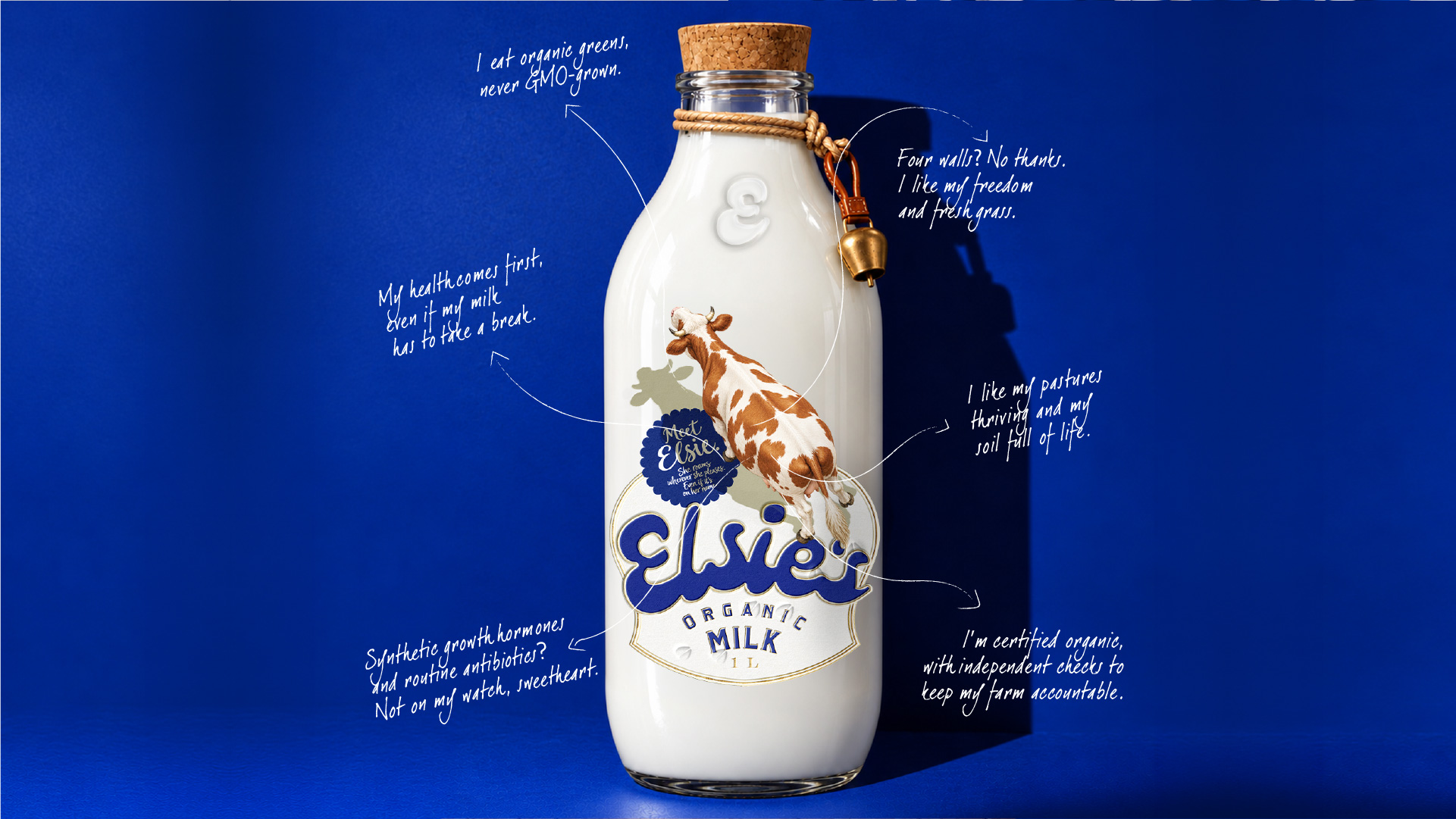
At the centre of the identity is Elsie, a cow who does more than simply represent the product. She becomes the voice of the brand, speaking directly to consumers and bringing a sense of humour and personality to an everyday essential.
A Mascot That Stands for Freedom
The idea of a walking cow was an important part of the concept. It reflects the freedom associated with organic farming practices, where cows can move around and graze in open pastures. Rather than presenting the cow as a static illustration on a milk carton, we wanted Elsie to feel active, happy, and full of life.
This idea carries through to the packaging, where Elsie stands directly on the brand name. Her placement gives the impression that she is free to roam, turning the label into a small scene rather than a conventional product layout. It also gives her a distinct presence, making the character an integral part of the brand identity.
By giving Elsie a point of view, we could build the brand’s communication around her personality. Instead of speaking about the product in a purely functional way, the brand has a character who can share its world with a little more warmth and playfulness.
Typography Inspired by Nature
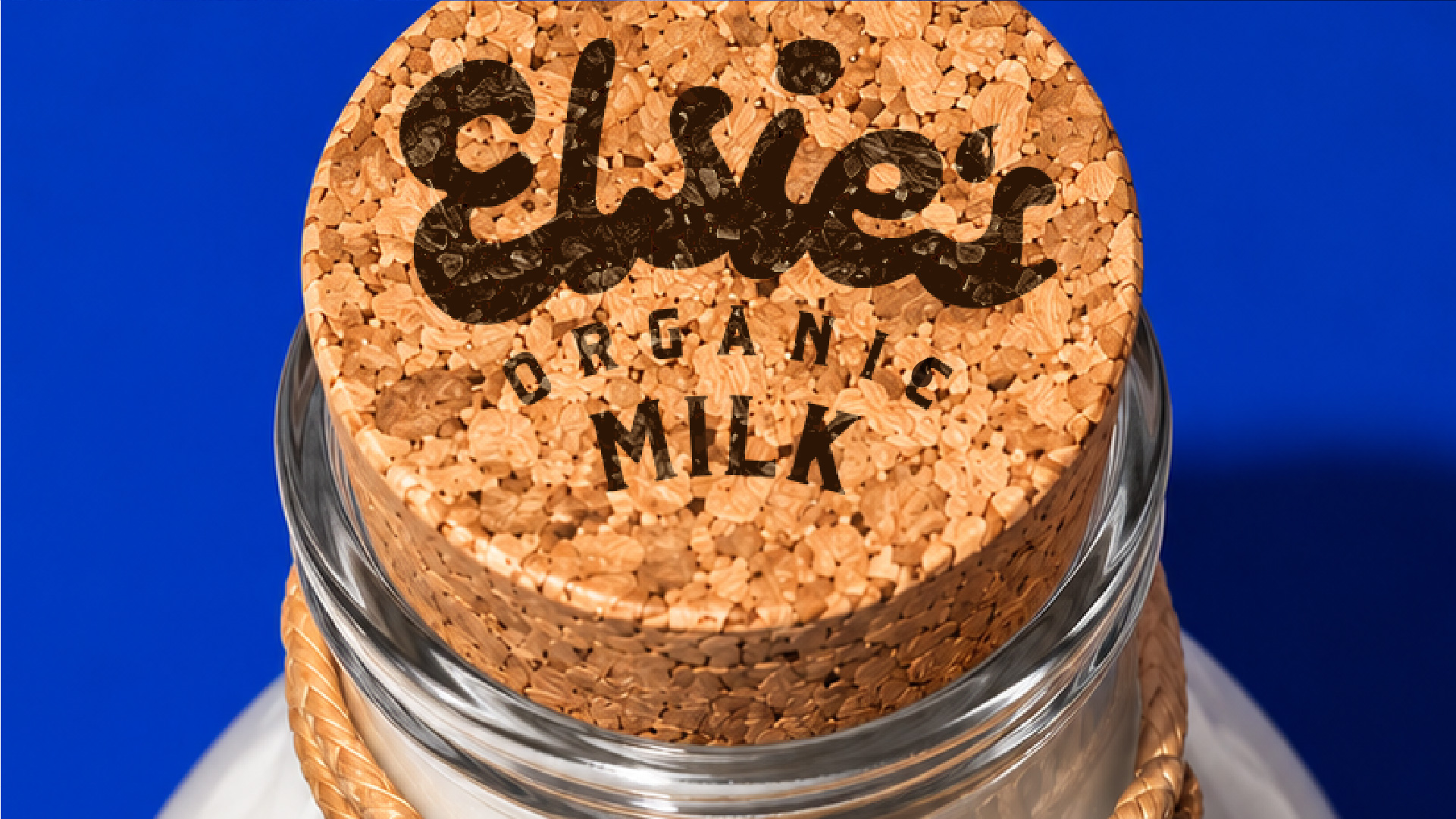
We wanted the typography to feel as connected to Elsie as the illustration itself. The custom lettering draws inspiration from the natural markings found on a cow, translating their organic shapes into soft curves and distinctive letterforms.
This approach helped bring the wordmark and mascot together within one visual language. The typography feels playful without losing legibility, while its rounded, flowing forms reinforce the approachable personality we wanted the brand to have.
Rather than treating the illustration and lettering as separate elements, we designed them to work together, giving Elsie’s a recognisable identity across its packaging.
Packaging with Personality
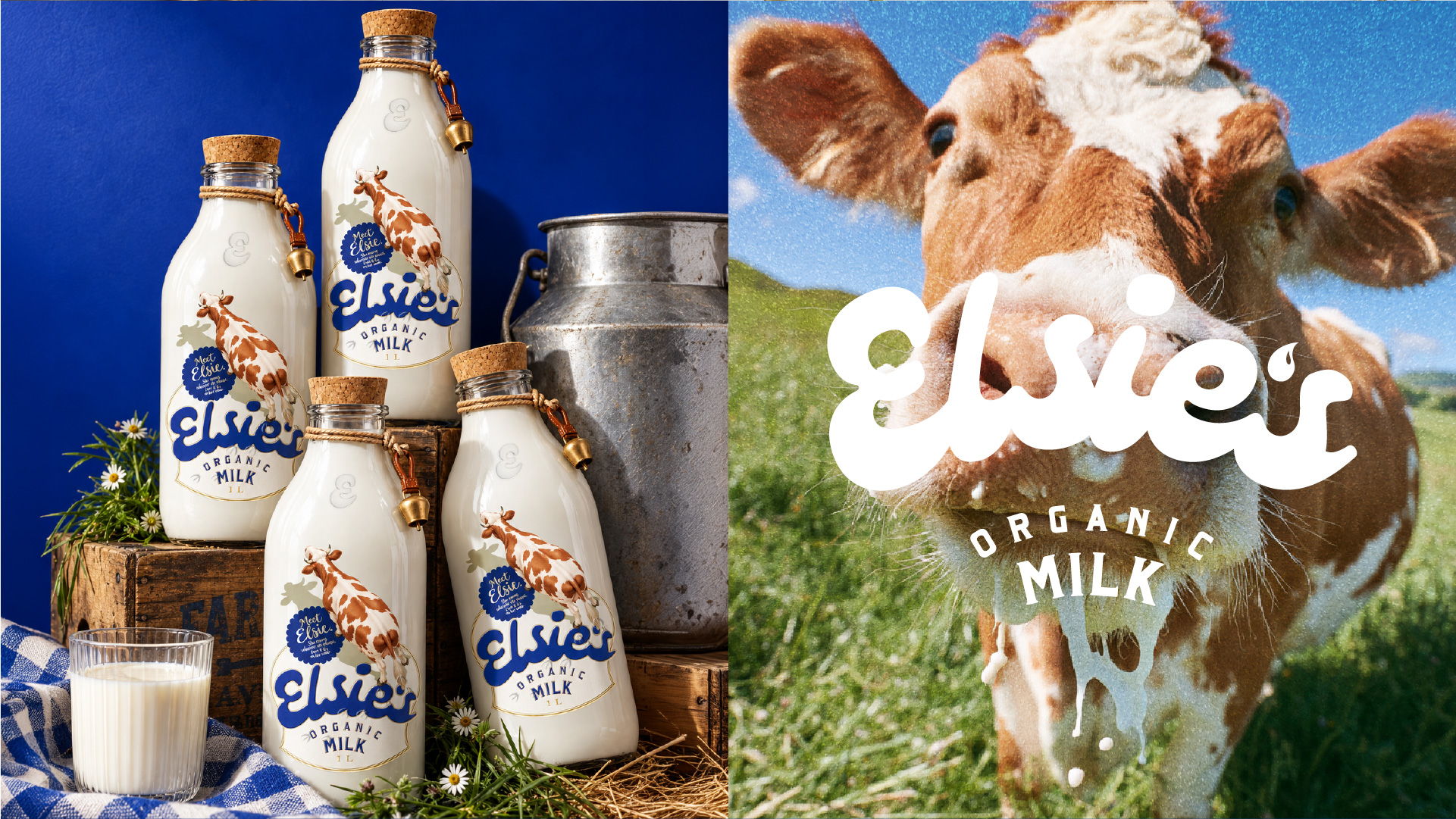
The packaging became the primary space for Elsie’s character to come to life. By allowing Elsie to interact with the brand name and giving the label a sense of movement, we created a design that feels lively and engaging on shelf.
The overall visual language balances the honesty associated with farm-produced milk with a more expressive, contemporary personality. Elsie’s expressions and the characterful typography help make the product feel approachable, while the emphasis on organic farming keeps the identity connected to the brand’s roots.
Our aim was to bring a little of the farm into everyday life, creating packaging that feels familiar yet distinctive, and giving consumers a character they can recognise and connect with.
Through Elsie, we wanted to show that even a product as familiar as milk can have a story, a voice, and a personality of its own.

 alchimistestudioParis
 Estudio Argo
 Modern Theory
 monther al omari
 Ohmybrand
 Tancybox
 waanrong
 nazystudio
 Daria Fox
 g.apolly
 sahildoesartt
 Stiandco
 BREAK DESIGN
 ShreyaDighe
 Sameh Elnahas
 Minim Brand Design
 Ebbi
 Shabouk Printing & Packaging (Shabouk Carton Boxes – شعبوق)
 Brandegree
 Abbydraw Designs Unique Conceptual Branding & Packaging Designing Ideas
 bilel tkouri
 NEV
 Stefano Bracci
 Alina