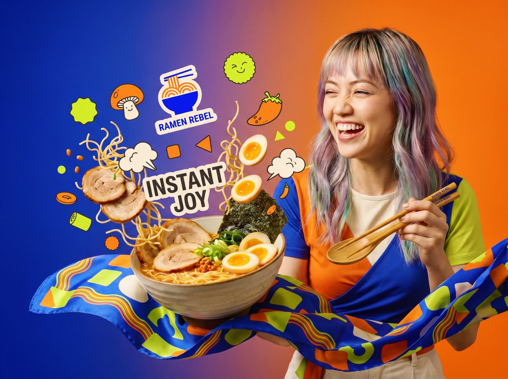

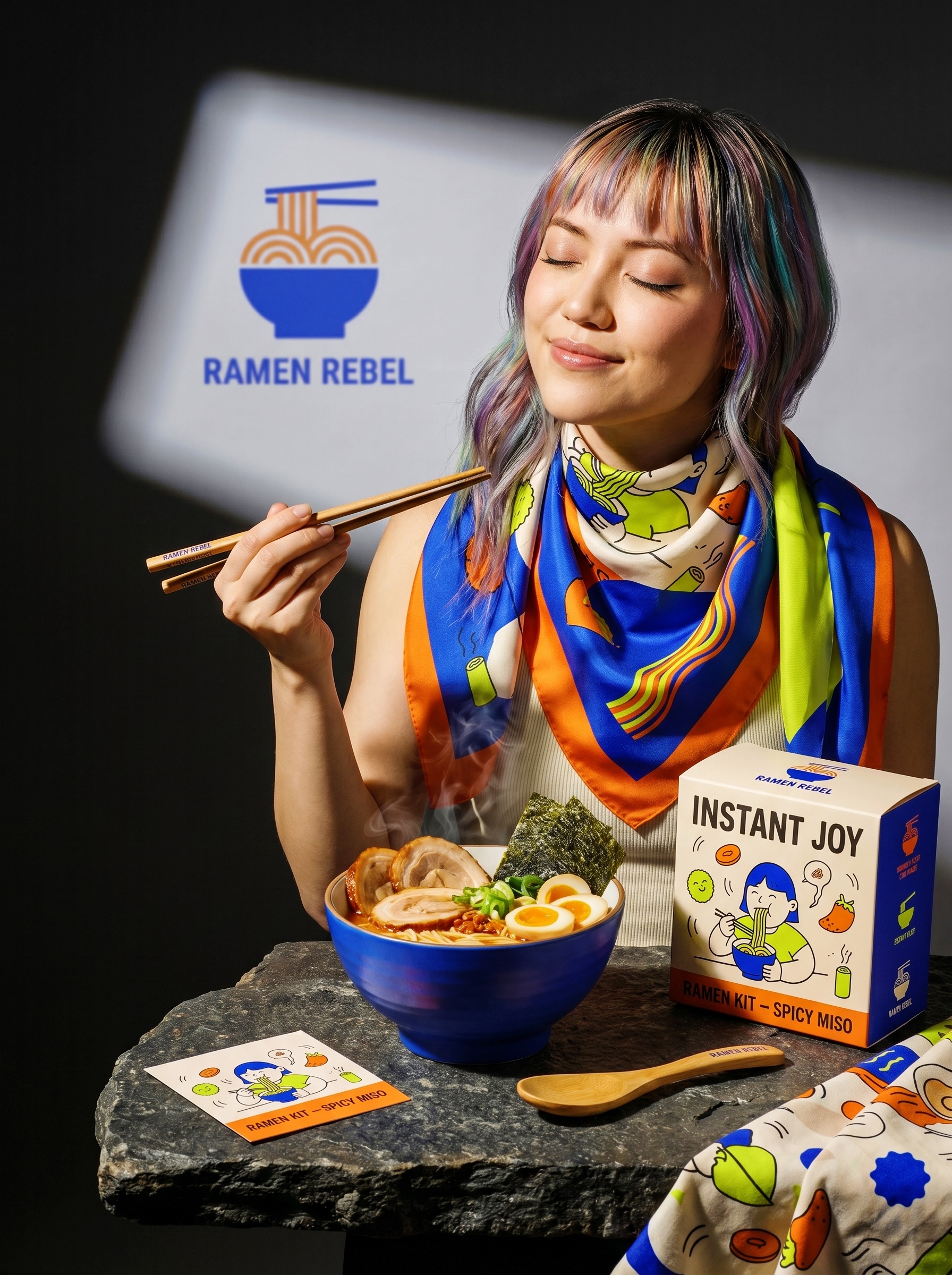
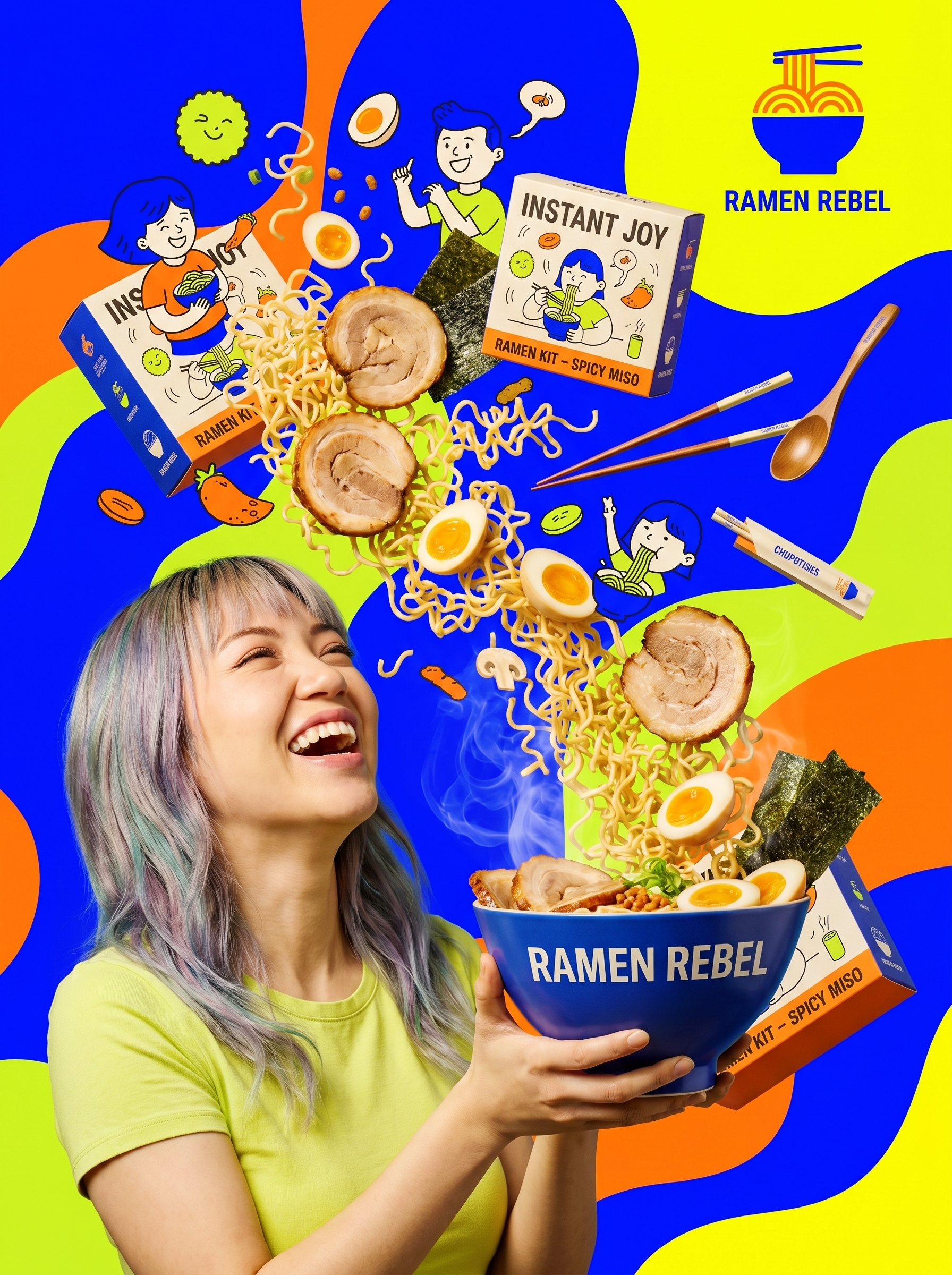
RAMEN REBEL is an instant ramen brand built around a simple question: if a bowl of instant noodles weren’t a food product but a streetwear item, what would it look like?
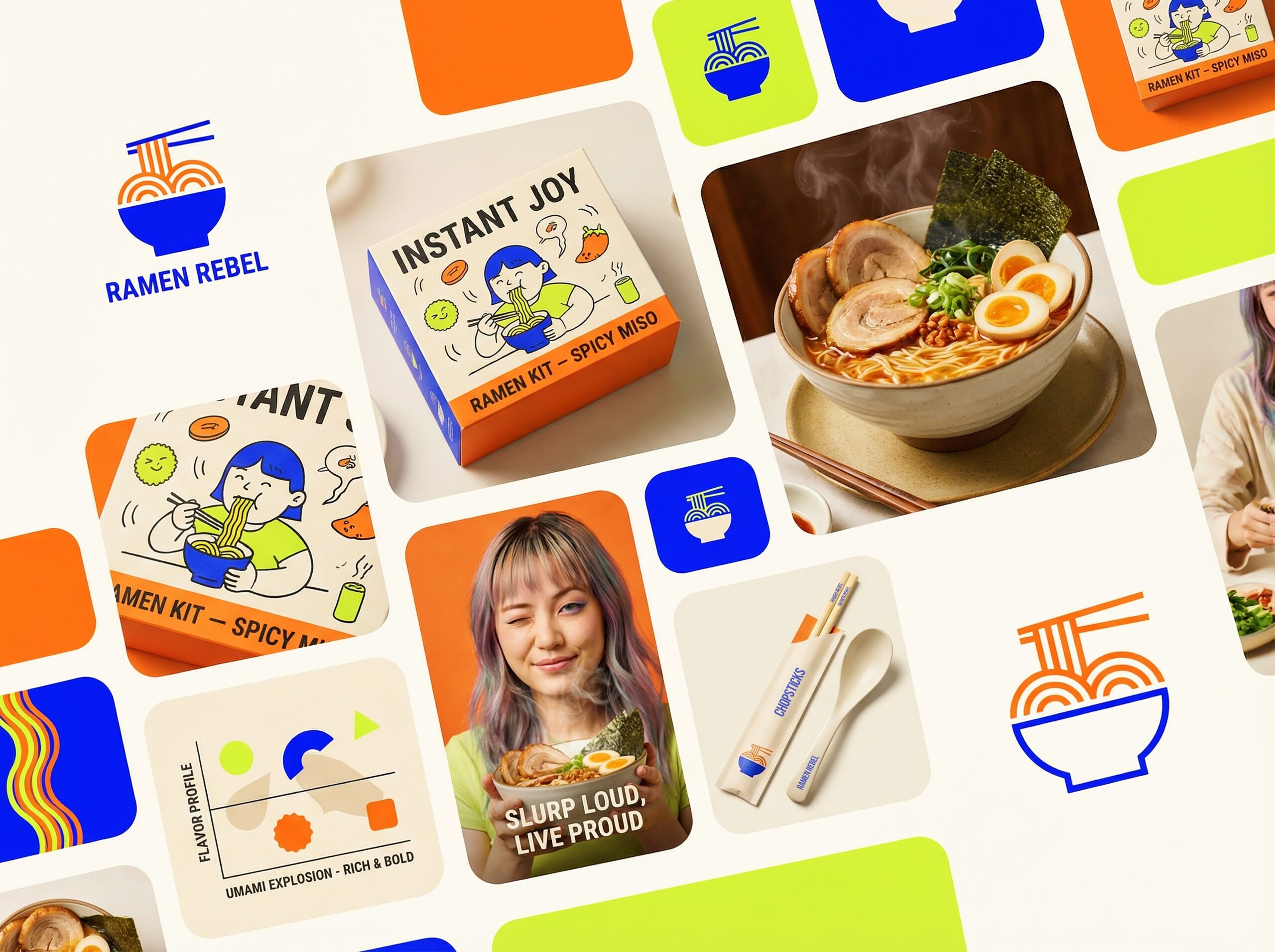
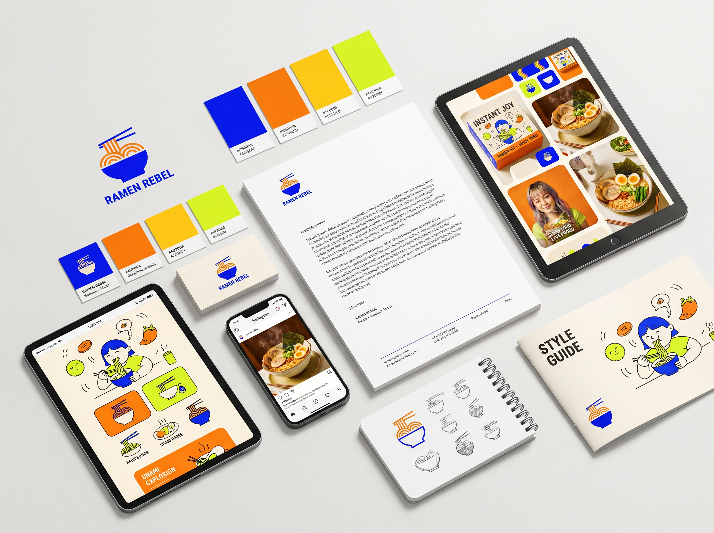
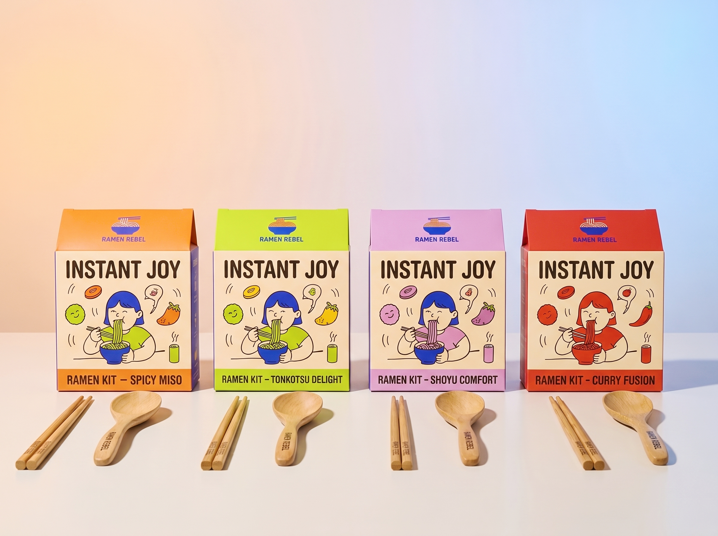
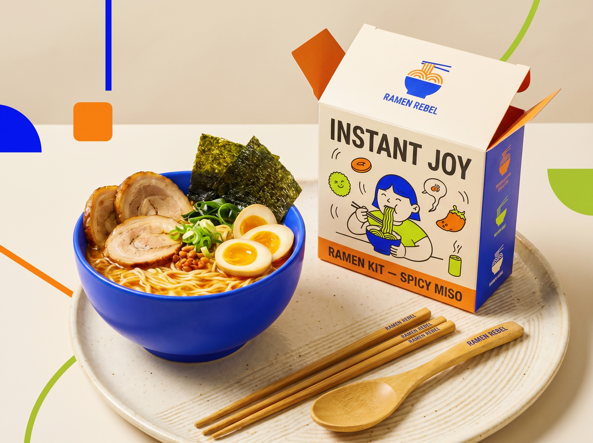
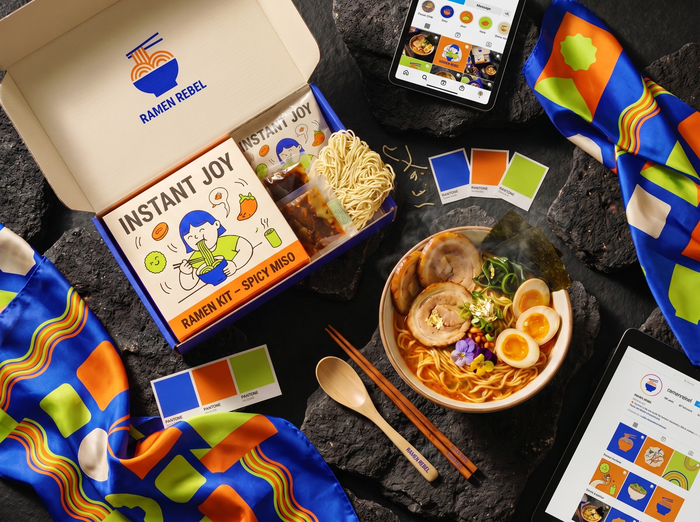
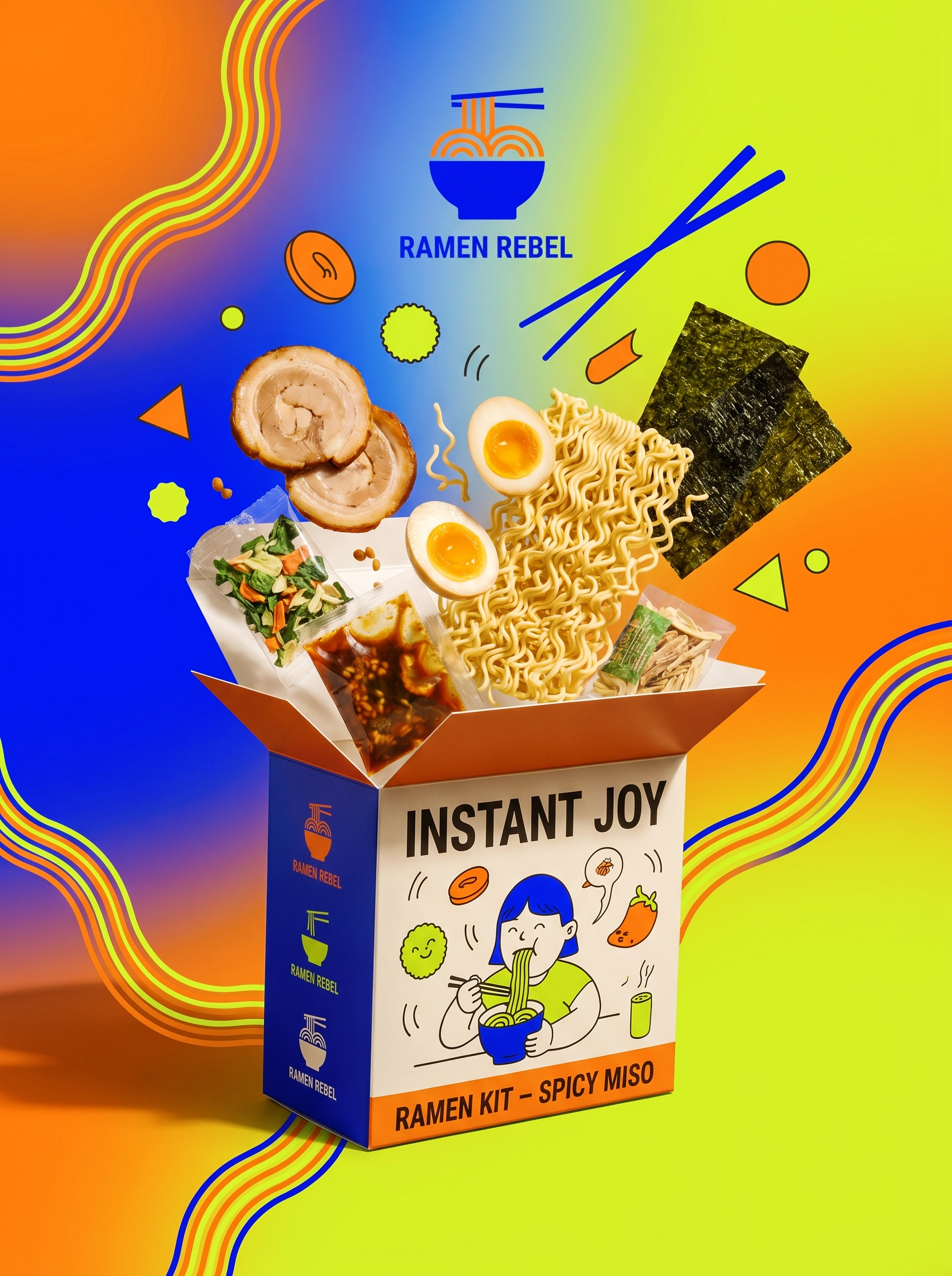
The visual system starts with a geometric emblem: a cobalt blue bowl drawn in single-weight lines, with thick orange curves for noodles and one horizontal stroke for chopsticks. Clean enough to stamp on anything. The packaging moves that emblem into full illustration. The INSTANT JOY spicy miso box features a comic character, a blue-haired girl with her eyes closed mid-slurp, surrounded by deconstructed spring onion and chilli shapes. Her expression isn’t a stock enjoying-food smile. It’s private, absorbed happiness. Against the solid orange side panel, the box reads more like a collectible blind box than a packet of instant noodles.
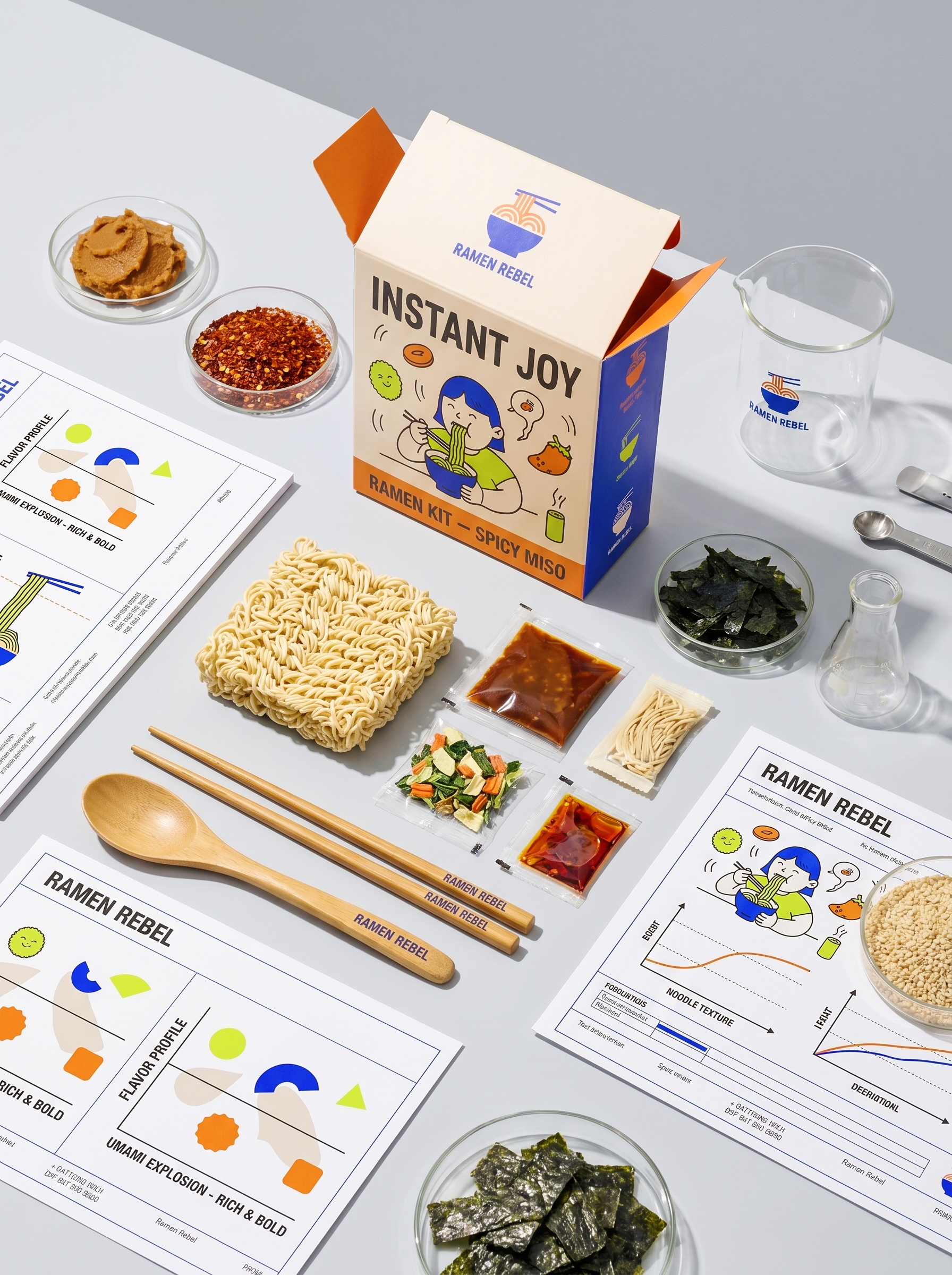
The flavour system is treated as information design rather than appetite appeal. Each kit includes a diagnostic card mapping the flavour profile using primitive shapes: neon lime circles, cobalt semi-circles, and bright orange square markers. The phrase UMAMI EXPLOSION, RICH AND BOLD is set as a clinical index rather than a marketing claim.
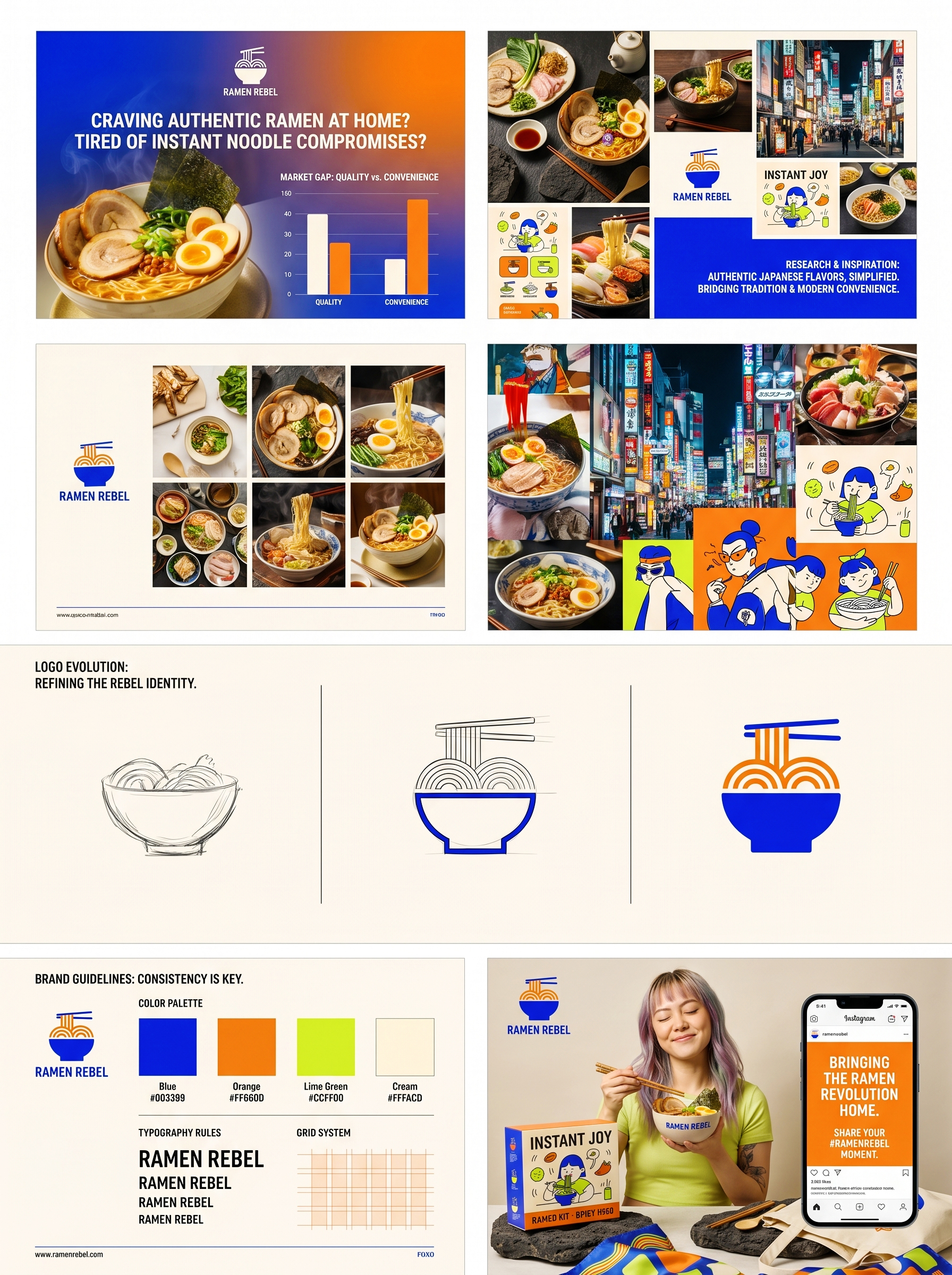
Four colours hold the whole system together: rebel orange for appetite, geek cobalt for the high-street edge, acid lime to cut through the noise, and washi ivory to give everything room to breathe. The result is packaging that treats instant ramen as a design object, not a commodity.
Designed by Up-Brands Design Agency, based in the Greater Bay Area, China.
 monther al omari
 Shustova p
 mutta
 @Allenarts13
 Sirka Agency
 Atiq Alam
 Dozen Agency
 j.substance
 SCD
 Cristian Lepore | crilep Copia
 Chris Creative Works
 Aligned Design Co.
 CreativeWise
 Agence des Coteaux
 Ramyromeo2024
 Grain of Design ®
 Ebbi
 BFS Studio
 butterflyhunters
 Asprey Creative
 About House of Ta
 KJS CRAFT
 hello ocean
 PG Branding
 CF Napa Brand Design