
- THE CHALLENGE –
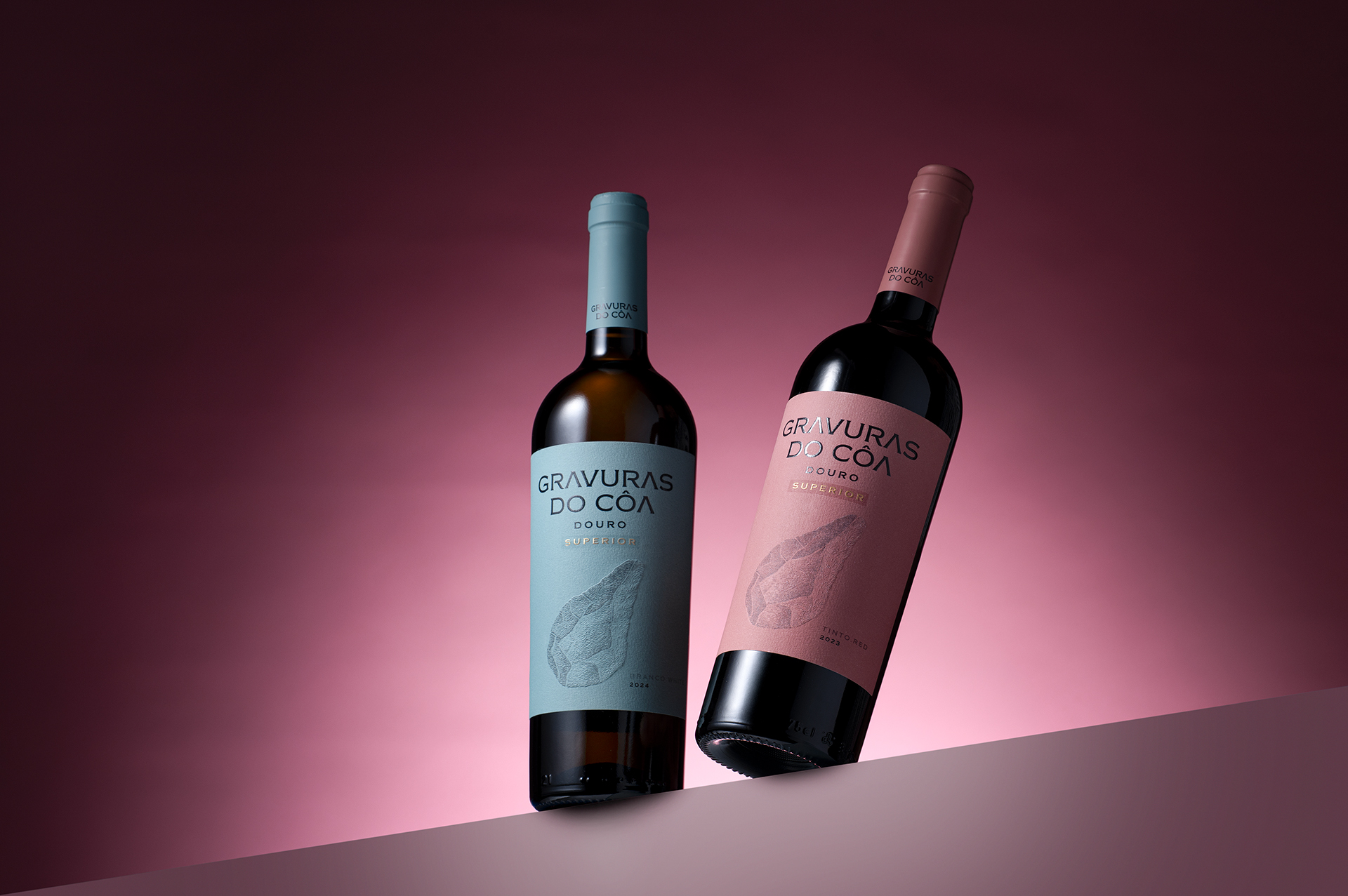
Gravuras do Côa is a wine brand deeply connected to one of Portugal’s most extraordinary cultural landscapes — the Côa Valley and its prehistoric rock engravings. Over the years, we have developed a distinctive visual universe for the brand, building strong recognition and contributing to its commercial success. The challenge was therefore not to redesign what was already working, but to evolve it without losing its identity.
To create a new generation of packaging capable of feeling more contemporary, premium and visually distinctive, while preserving the codes that consumers already associate with Gravuras do Côa.
- THE CREATIVE IDEA –
A story carved in time.
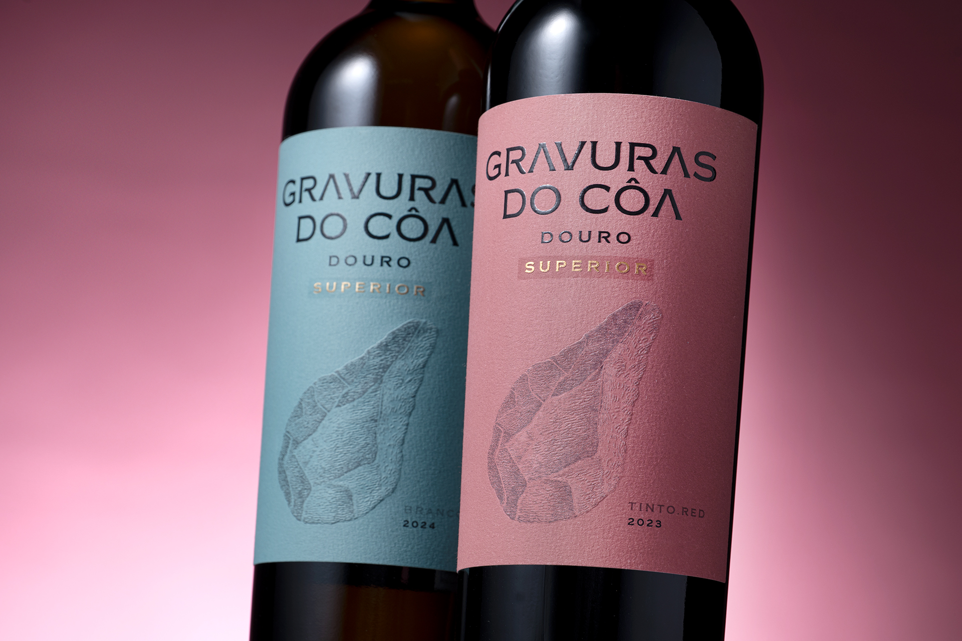
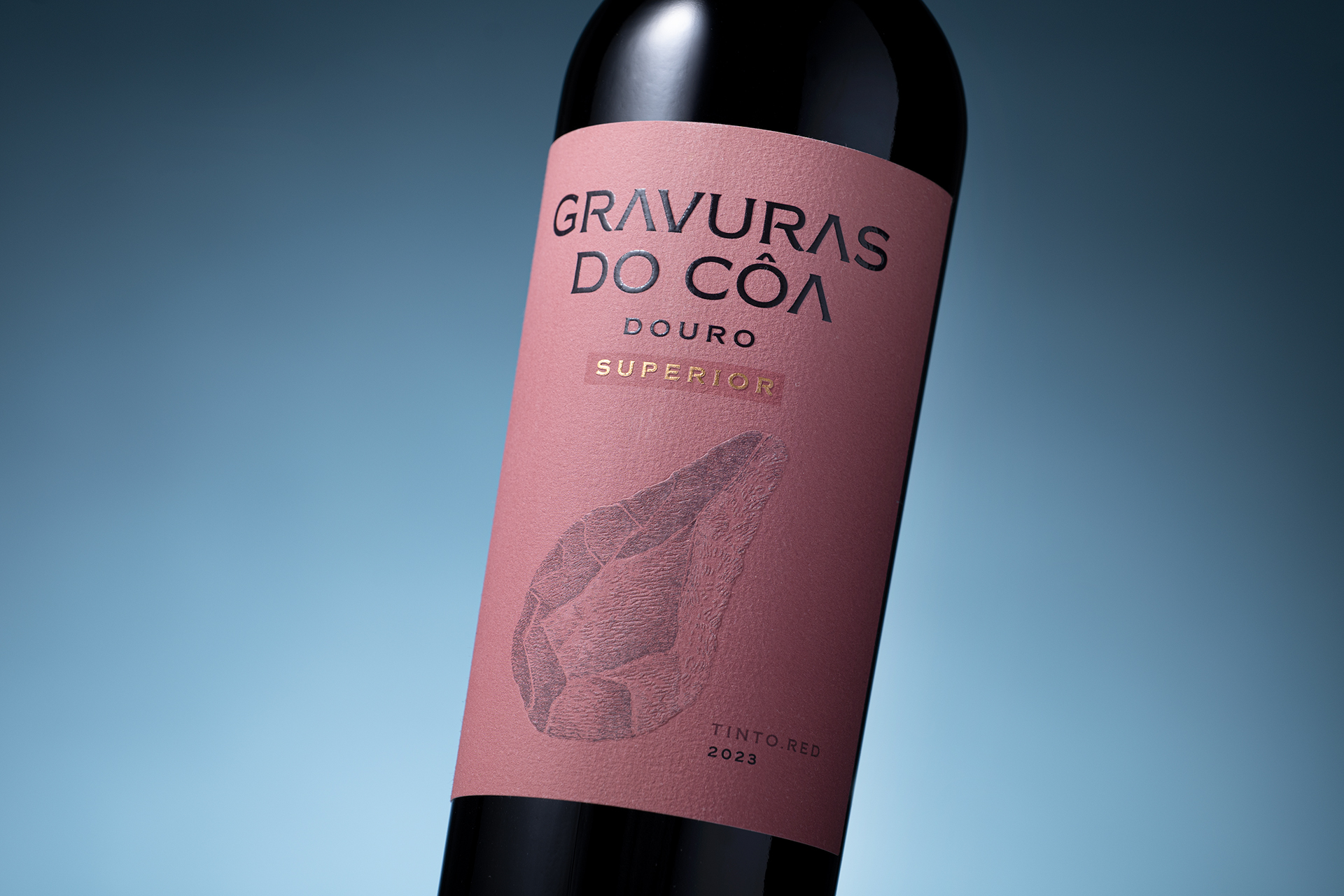
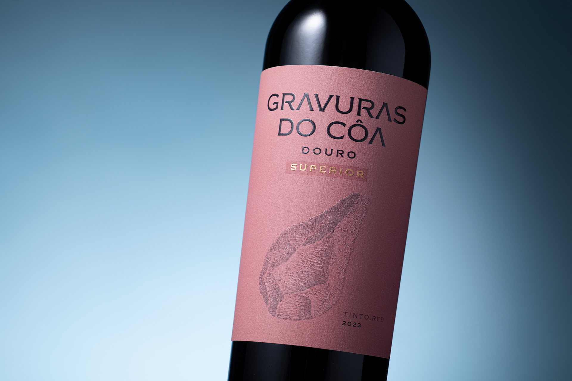
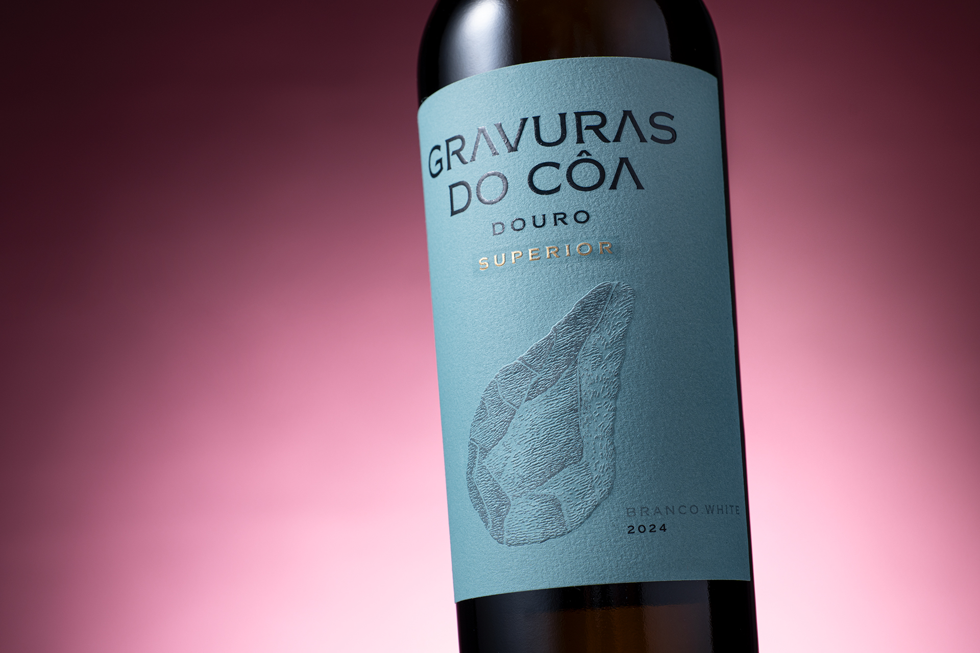
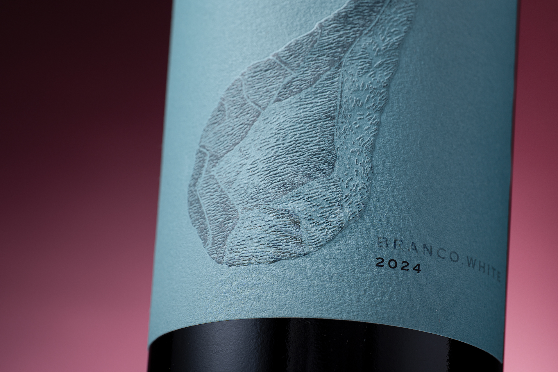
The archaeological artefact becomes the central visual element, treated almost as an imprint emerging from the surface of the label.
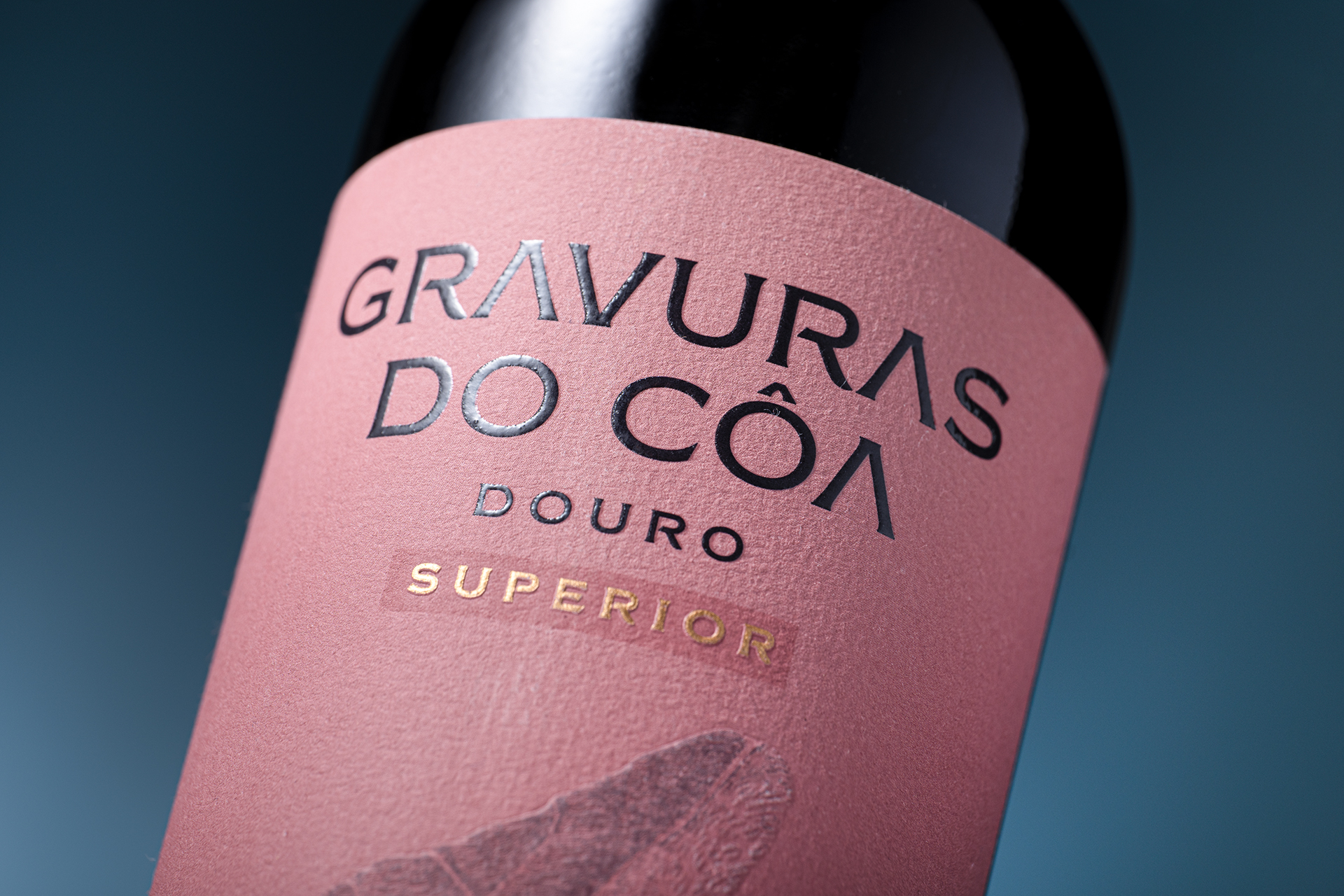
Through relief, texture and subtle tonal contrasts, the paper takes on a tactile dimension that evokes stone and the physical act of engraving.
The design creates a dialogue between two very different moments in time:
prehistoric human expression and contemporary visual culture.
- DESIGN –
The new identity retains the essential DNA of Gravuras do Côa while introducing a more refined and contemporary design language.
A deliberately restrained composition gives prominence to typography, material and texture.
The archaeological element occupies the centre of the label, creating an immediate connection with the brand’s origin, while carefully selected colours differentiate each wine and give the range a distinctive personality.Embossing, tactile papers and subtle finishing details reinforce the physical character of the concept, encouraging the consumer not only to look at the packaging, but also to experience it through touch.
Every element has been reduced to what is essential. Nothing is decorative without purpose.
The result is not a break with the past, but an evolution of a visual identity that has already demonstrated strong market recognition.A more sophisticated and contemporary packaging system that strengthens shelf presence, improves range differentiation and preserves the cultural authenticity at the heart of Gravuras do Côa. It is a design built around permanence, connecting territory, archaeology, wine and contemporary design within one coherent visual language.
Client: Mateus e Sequeira Vinhos
Brand: Gravuras do Côa
Category: Packaging
Services: Concept · Illustration. Packaging Design · Printing Direction. Photography
Region: Douro Valley
Country: Portugal
Sector: Wine
(R)2026. ALL RIGHTS RESERVED – M&A CREATIVEAGENCY
 lunapanda
 Tridimage
 Analoguecreative
 lettera7
 alchimistestudioParis
 Lana B
 Colossal
 Pivot Studio
 monther al omari
 Anastasia Cherepanova | xtramez
 Hollóka Grafikai Műhely / Graphic Design Studio
 BOLD branding
 Antonia Skaraki
 Pâmella Lorrany
 Z9BKAdsgn
 Francesco Paternoster
 b1studio.ro
 Chris Creative Works
 Boordon
 Dmitriy Kuzovlev
 Brand Society
 yasharpic
 Lisa Pokrovskaya
 Simple Studio
 Studio Unbound