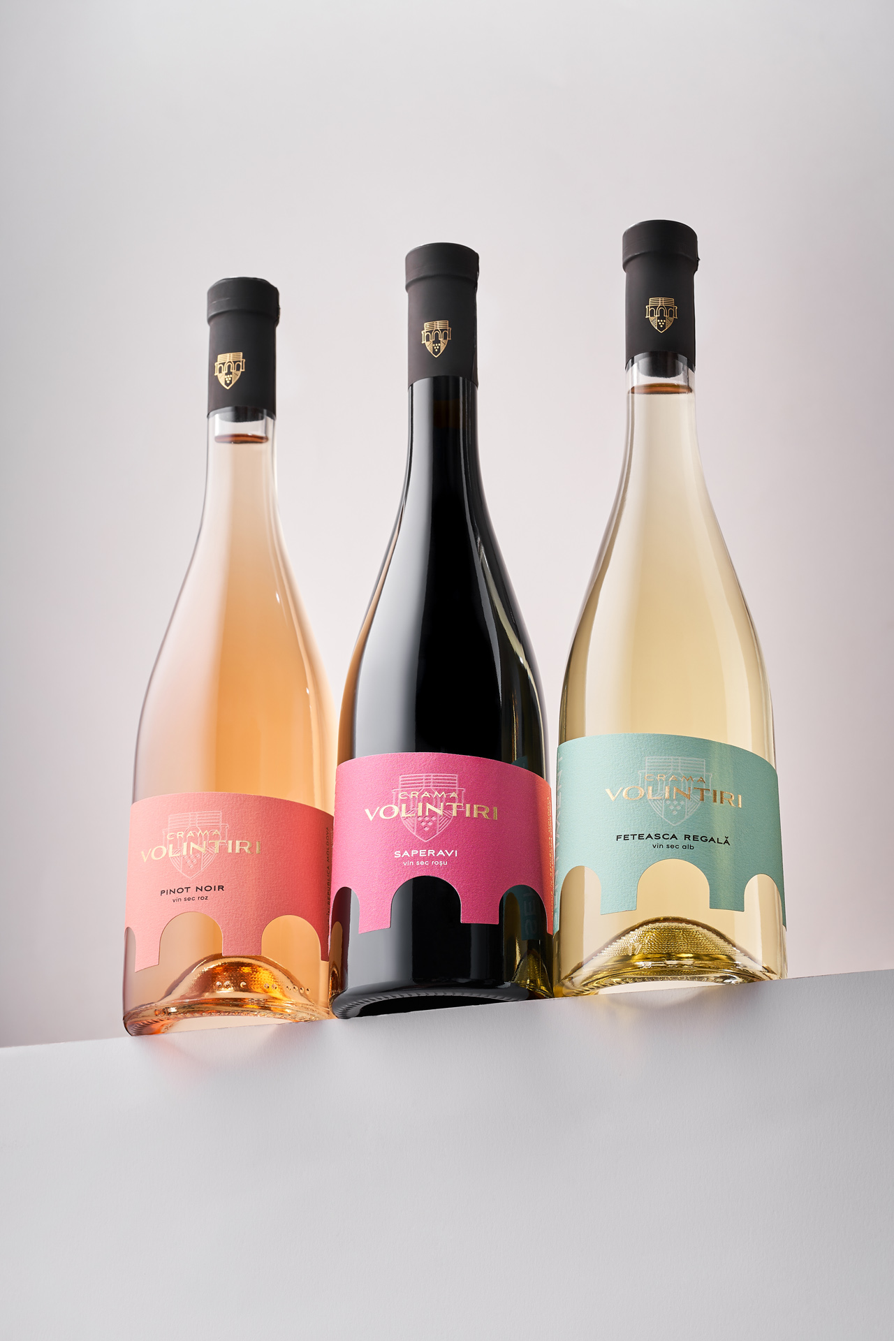
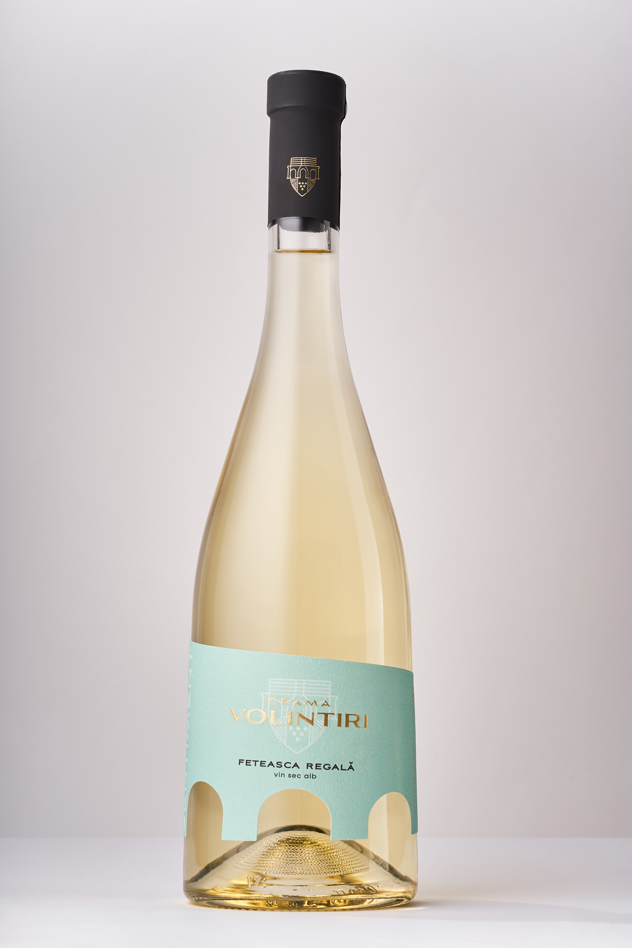
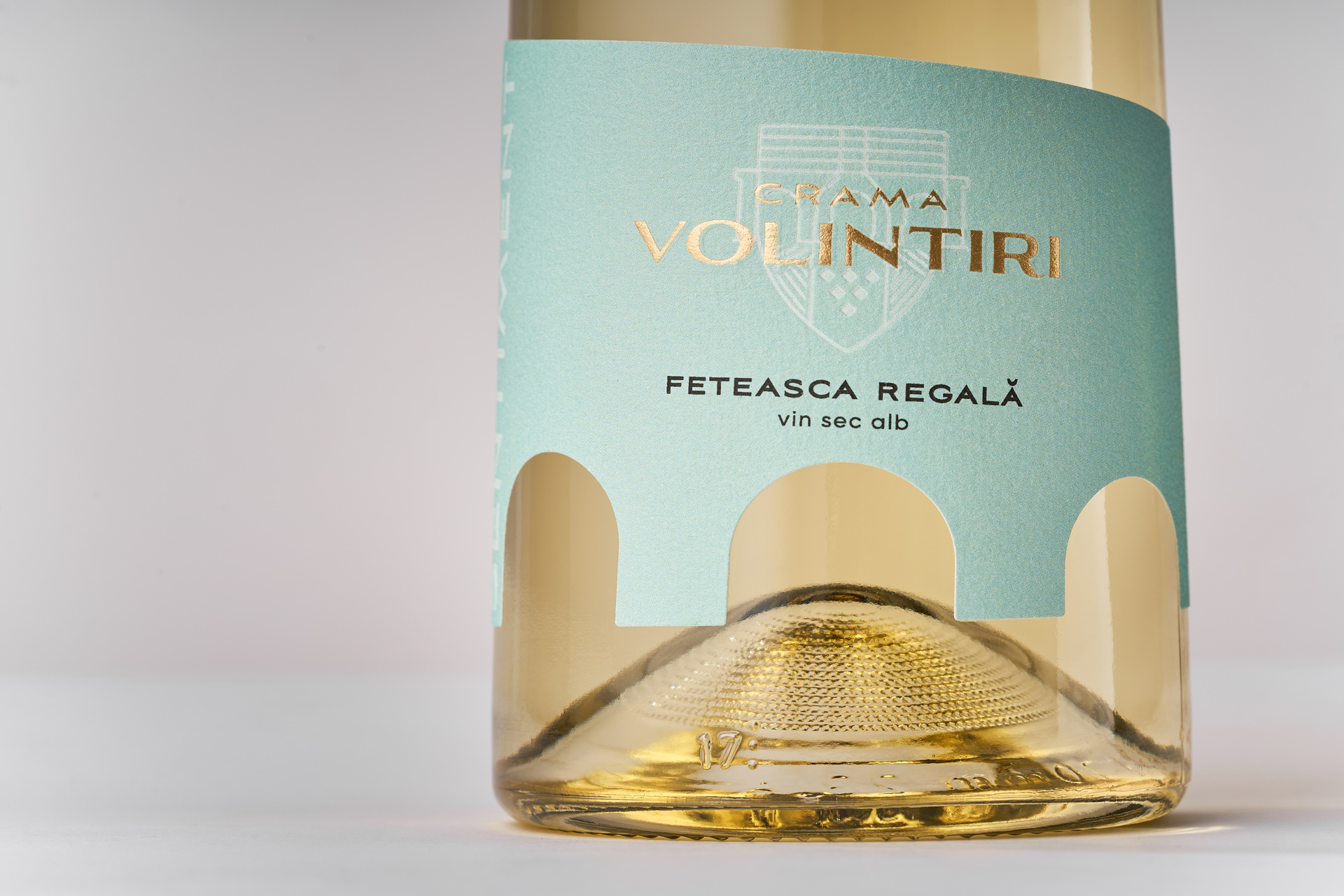
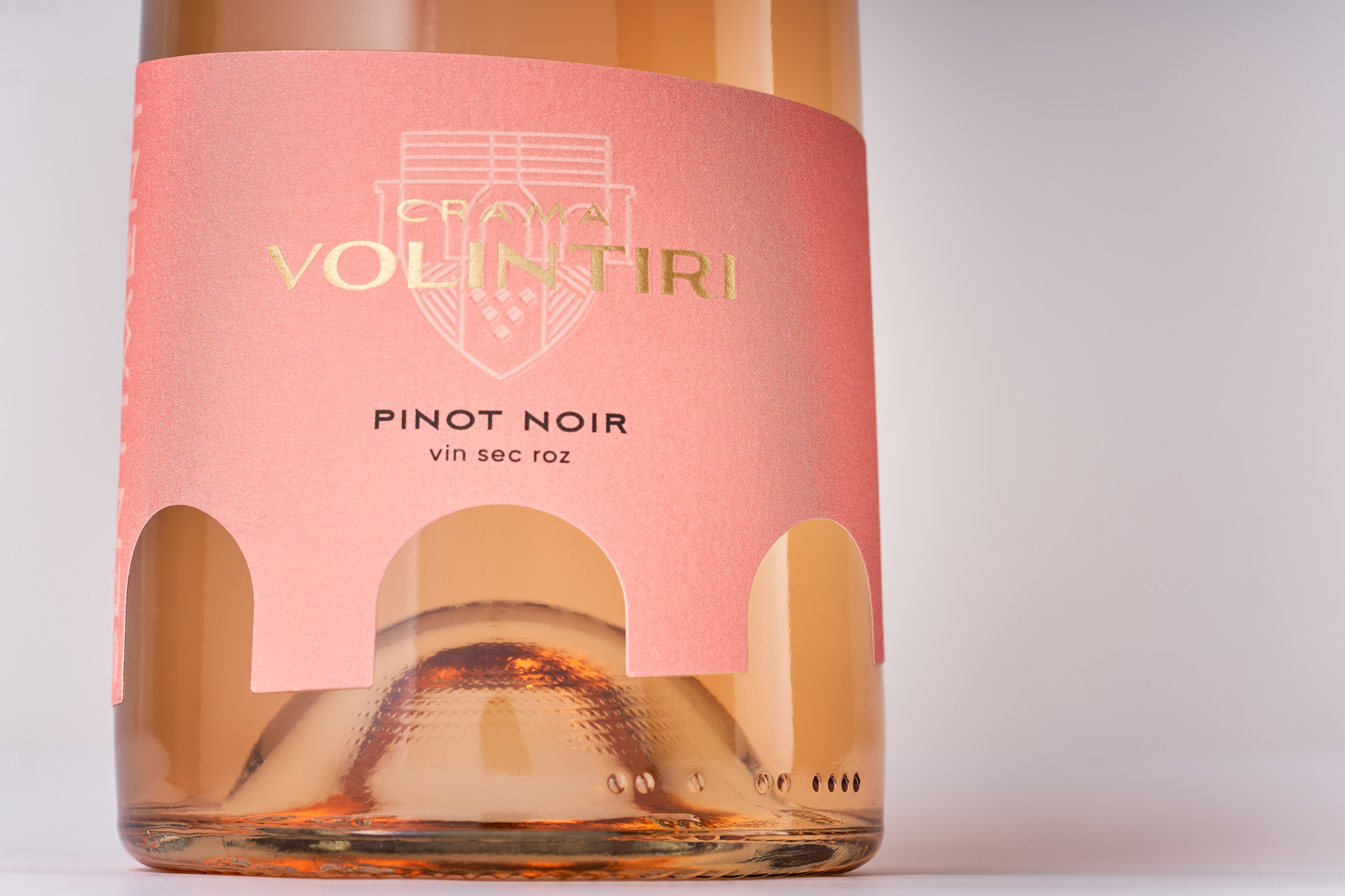
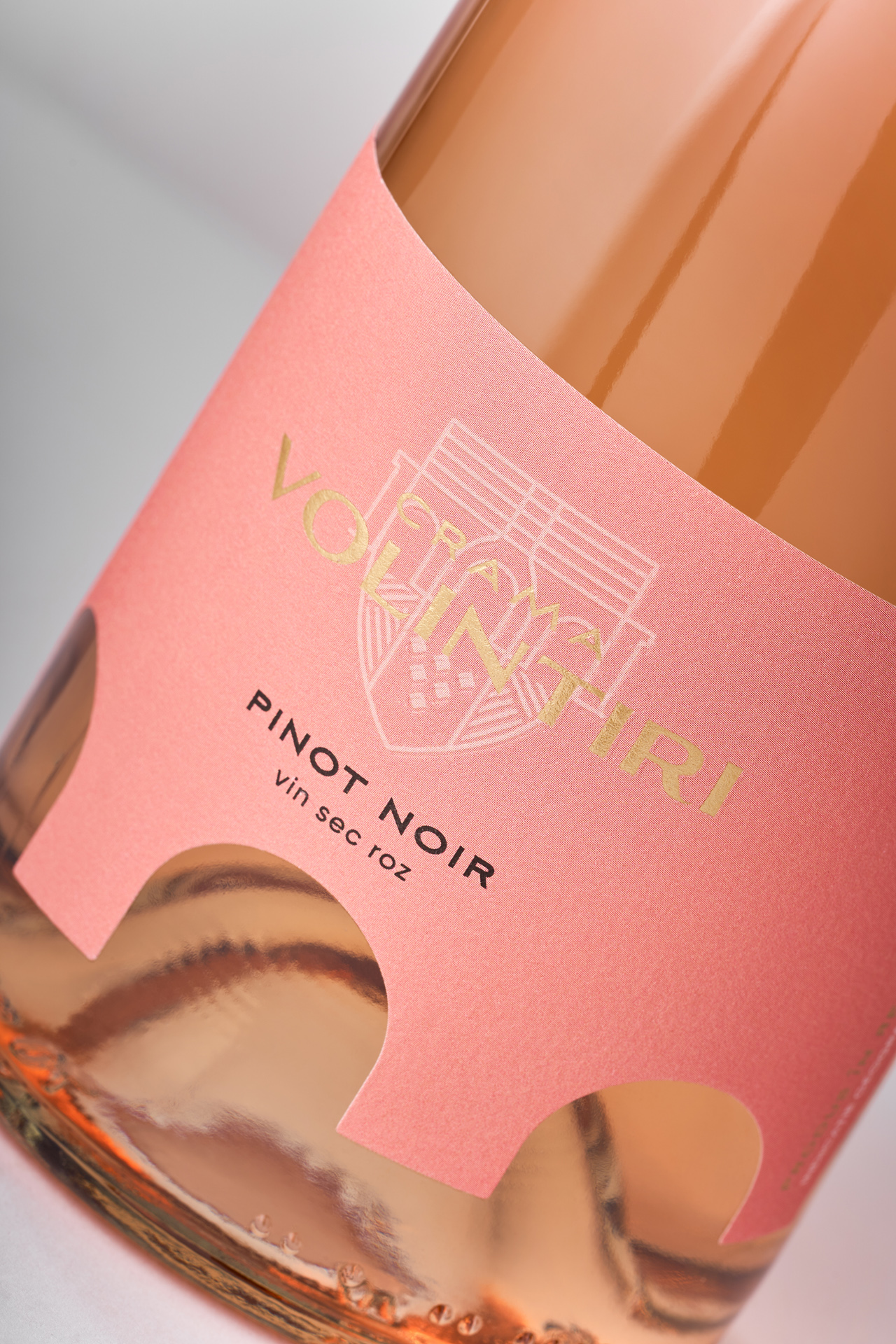
Crama Volintiri partnered with our studio to redefine its visual identity in line with a shift to a new bottle shape. This transition offered the perfect moment to revisit the brand’s positioning and craft a solution that would both preserve continuity and introduce a fresh visual narrative. The goal was to develop an identity that could reflect the winery’s authenticity while elevating its presence on the shelf.
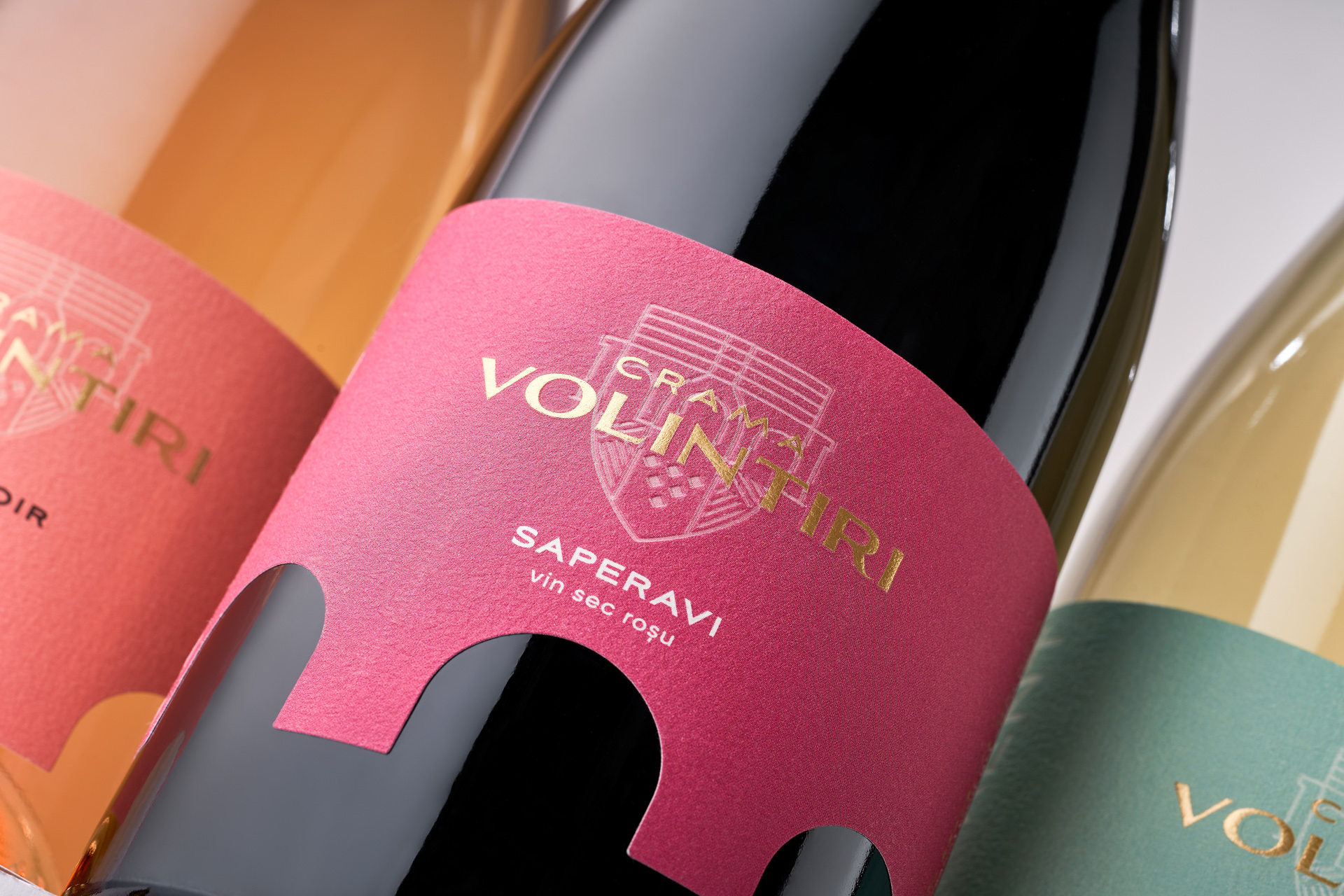
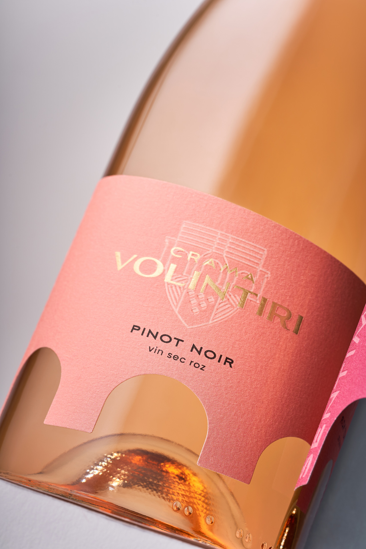
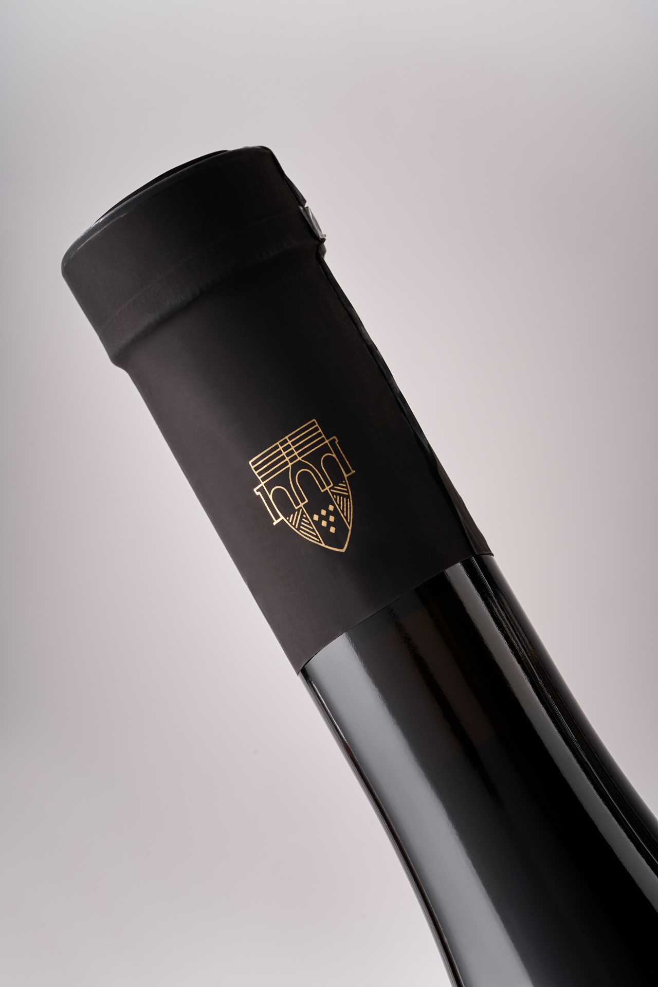
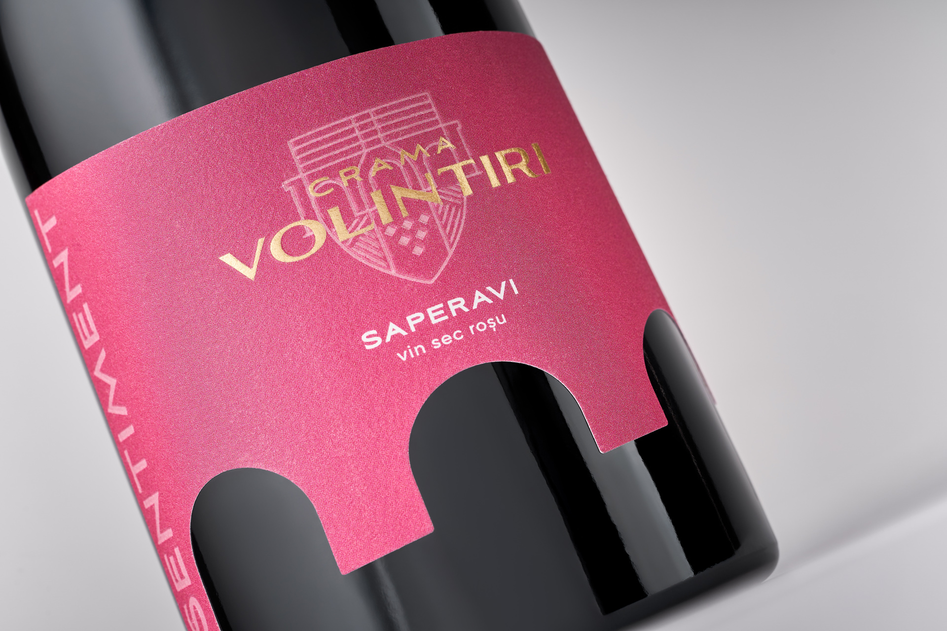
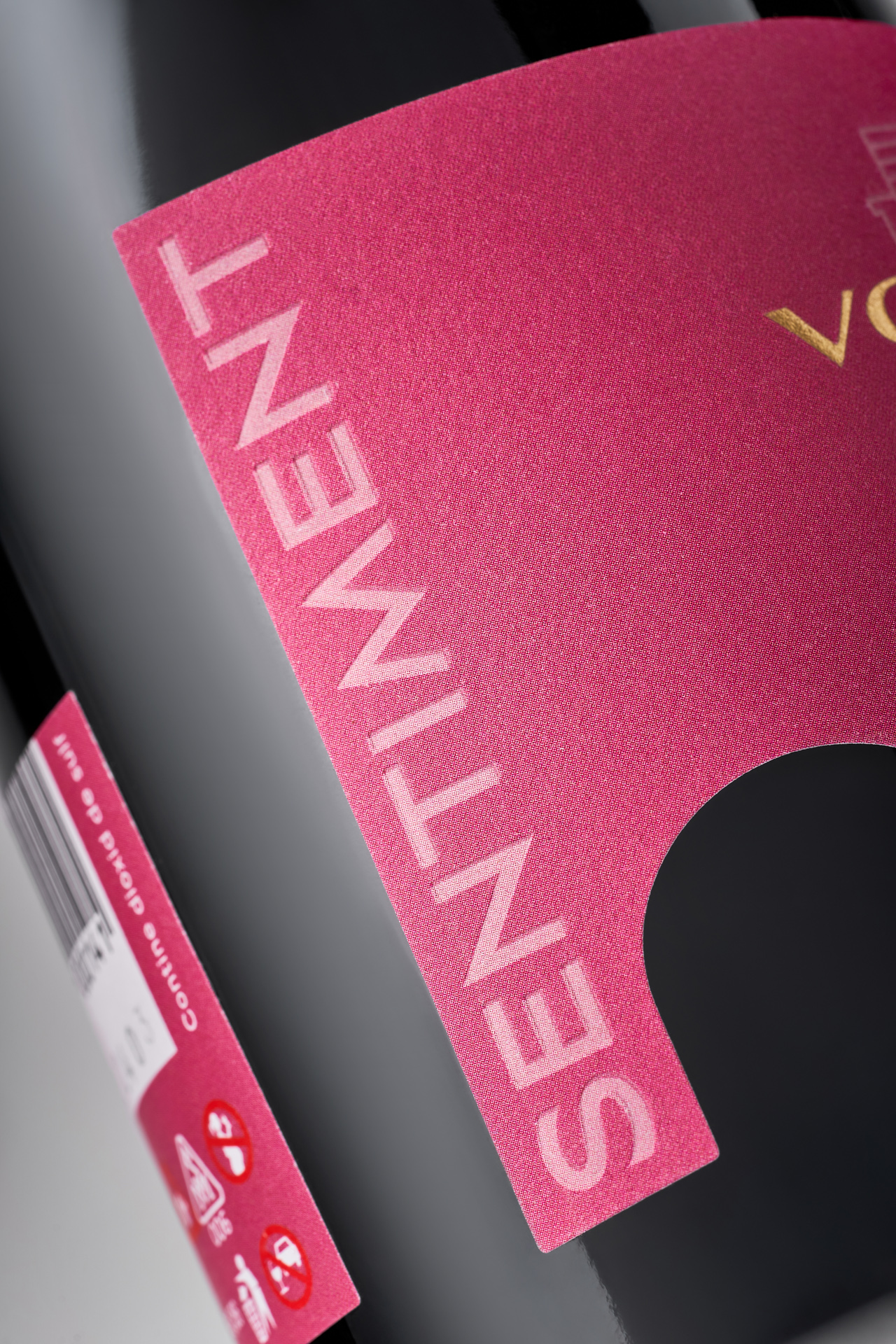
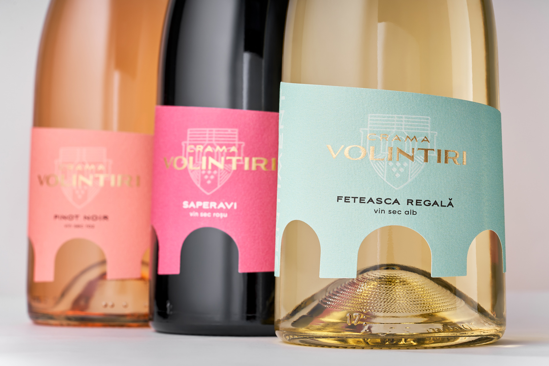
The creative direction took inspiration from a local landmark – the old bridge of Volintiri village. This bridge, a symbol of enduring connection, became the central metaphor of the redesign. Its silhouette was translated into a distinctive label cutout, instantly recognizable and resonant with the winery’s sense of place. The color palette was carefully structured to differentiate wine types: gentle pastels for white and rosé, contrasted with deeper, bolder tones for red wines. A refreshed logo integrates seamlessly into the composition, ensuring brand recognition while aligning with a modern minimalistic style.
Through this redesign, Crama Volintiri embraces both its regional roots and a contemporary vision, creating an identity that is authentic, elegant, and adaptable across its portfolio.