specialty coffee packaging
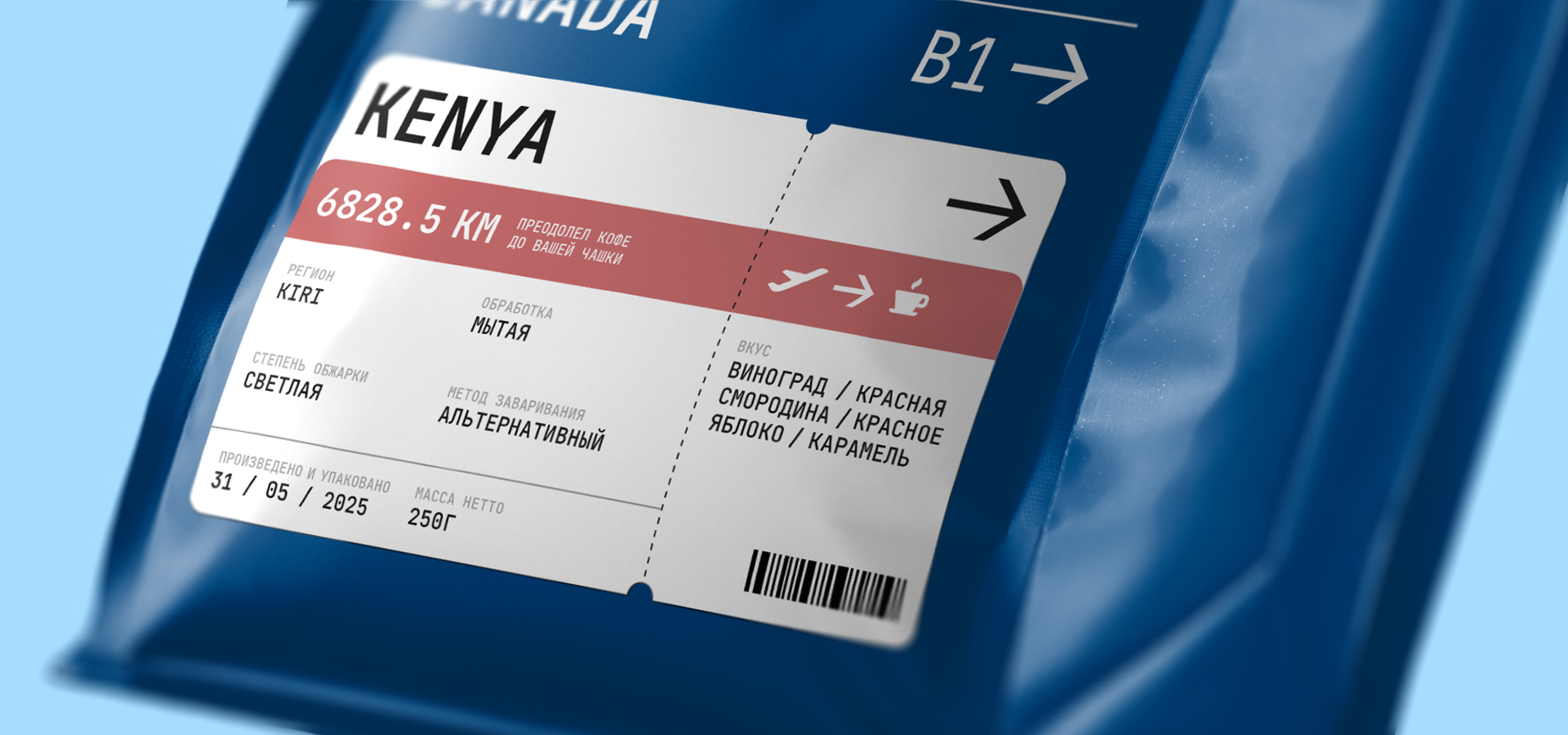
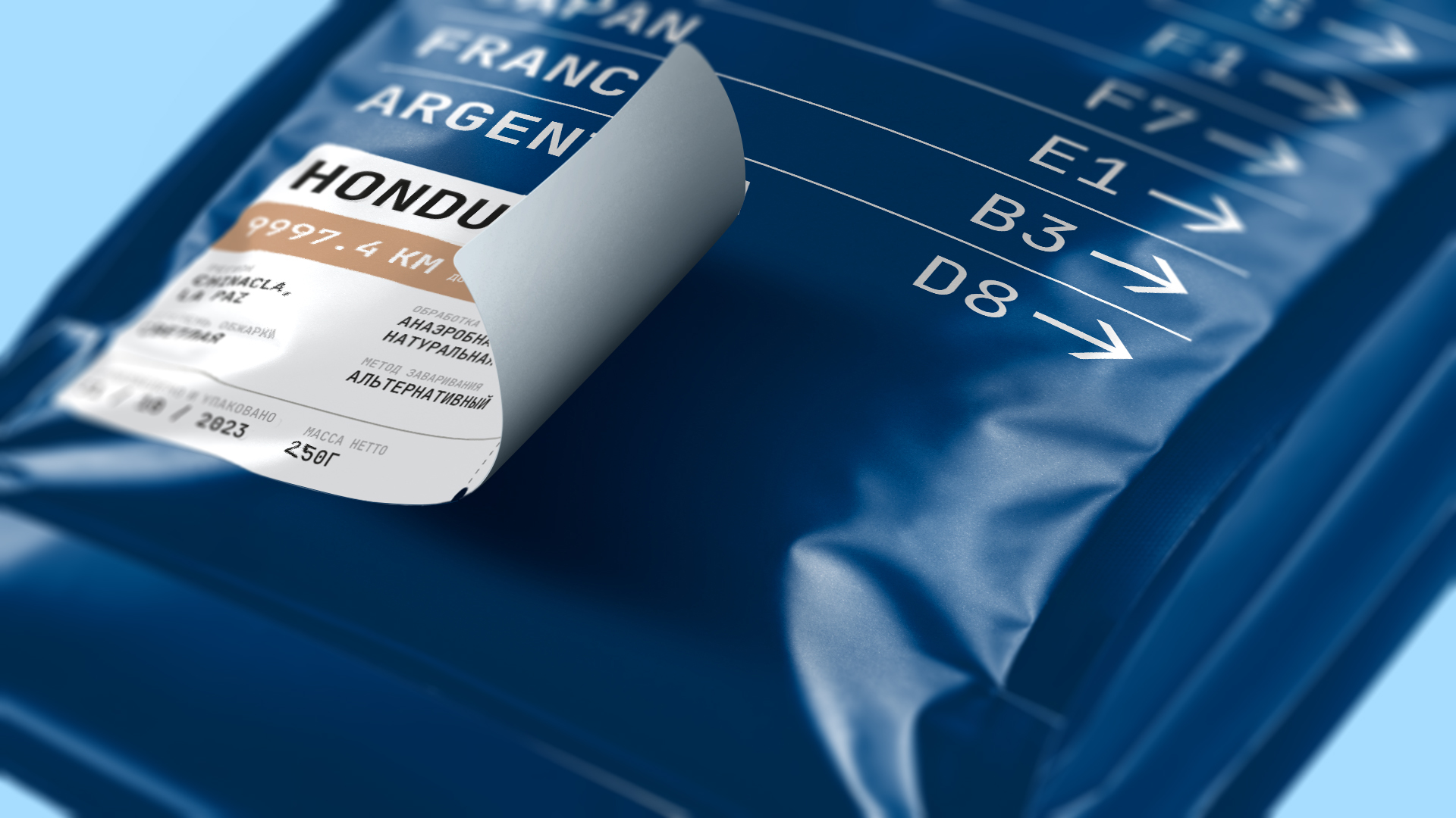
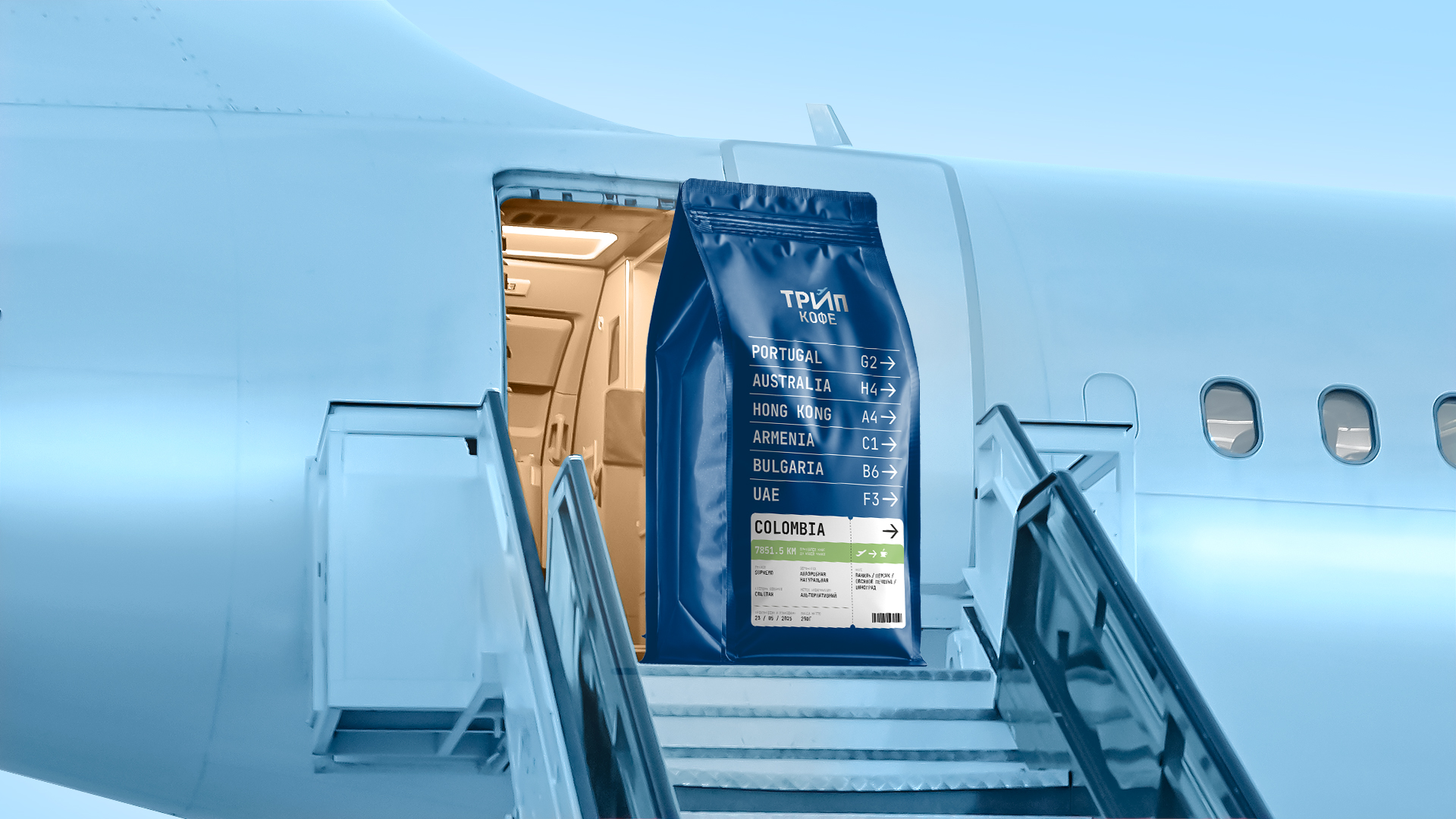
TRIP is a new brand of the coffee manufacturer Aurora Coffee. A client came to us with a request to update their main product line. At the stage of demonstrating the concepts, he liked several options, one of which inspired the launch of a new sub-brand. This is how “TRIP” appeared — specialty coffee (the highest category in the coffee segment), where the exoticism of each variety literally immerses connoisseurs in a full-fledged coffee journey. The main objective of the project was to create a design that the client can independently scale to suit different tastes with further expansion of the product range.
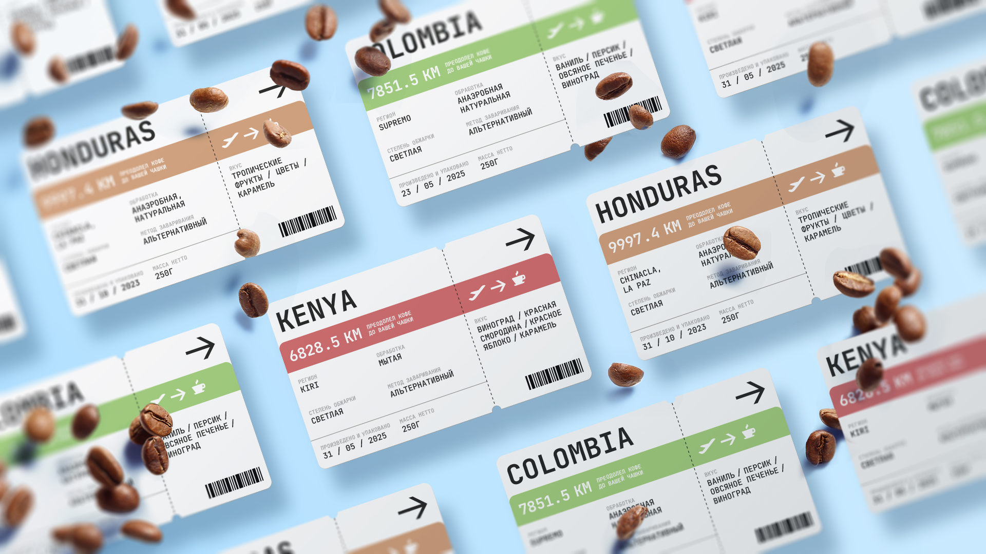
creative solution
Having initially taken the idea of travel as a basis, we were faced with the question of choosing a visual metaphor for such a popular topic in the coffee category. As a result, we identified the brand as an airport where coffee drinkers receive tickets for a personal trip based on tastes and aromas. The graphics are based on the aesthetics of the flight display, where there is always a suitable one for us among the many options. And to solve the problem with easy scaling, we made branded stickers on the packaging in the form of airline tickets. It’s like we’re sending customers on a flight for new experiences, and at the same time we’re helping customers adapt every taste into a single sticker template.