It was a great challenge for us to create a new design and logo for Baron Hildprandt. It is the flagship of the traditional Czech Blatná distillery.
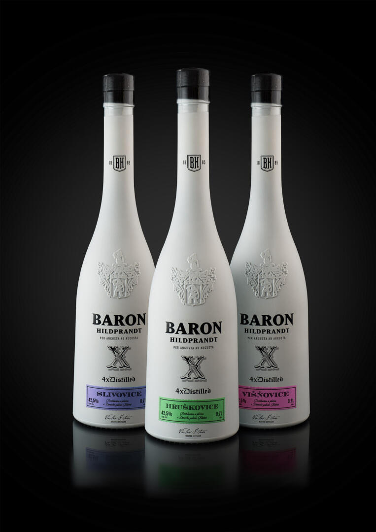
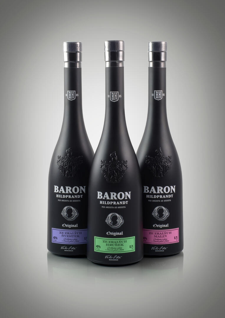
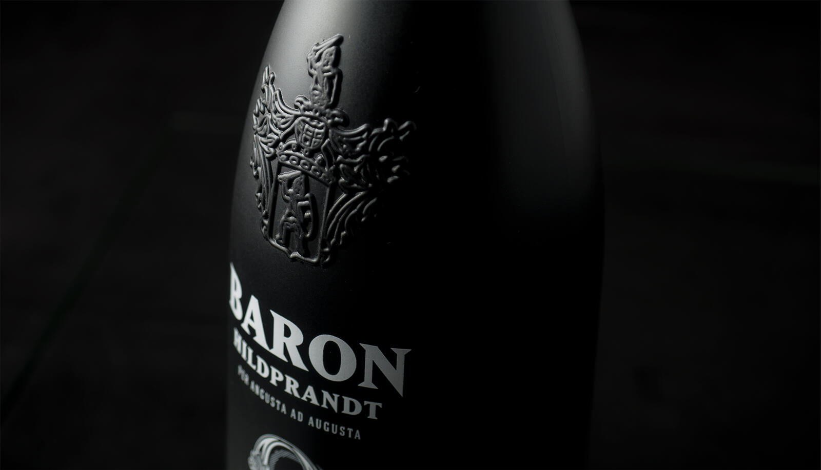
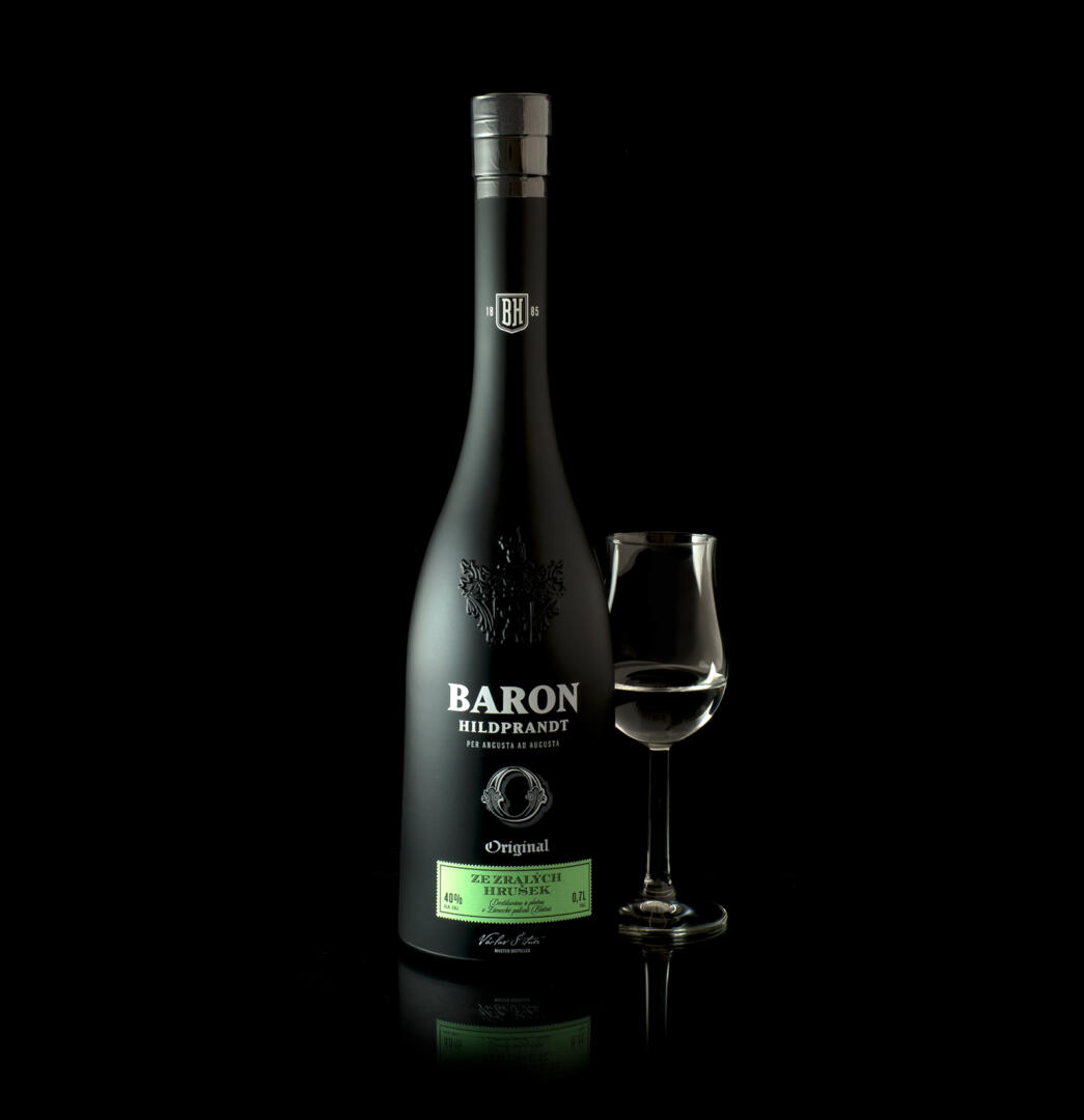
Baron Hildprandt are premium distillates divided into several categories, and, as the name suggests, the distillery was founded by a noble family in 1885. The design is based on this tradition. The client had only one condition: to preserve the shape of the bottle with embossed coat of arms of the Hildprandts family. The original bottle had classic dark green glass. We decided for full-colour bottles. To distinguish different kinds, we chose a black variant and a white variant. The black bottle is for the Originál fruit spirit, which matured for 12 months in oak barrels. The white line labelled “X” stands for a 4-time distillation, which gives extremely fine and pure distillate. The basic signatures of the brand, such as the logo and the line label, were designed as a one-colour inverse print to the bottle colour. The design is rounded off with a one-colour label in a striking contrasting colour, which is used to identify the taste variant easily. It is important for us that the new design expresses the right emotion of premium quality and noble character, which the product deserves given its origin.