Wow, How’s Coffee designed by SenseDesign is bursting with creative energy! It’s like the designers took a big sip of a super flavorful coffee and let their minds run wild.
-
Life as a Container: This is a super unique way to think about packaging! It goes beyond just holding coffee and dives into the emotions a good cup can bring. It makes you think about the experiences you might have while enjoying this coffee – like making up with a friend or finally meeting someone special.
-
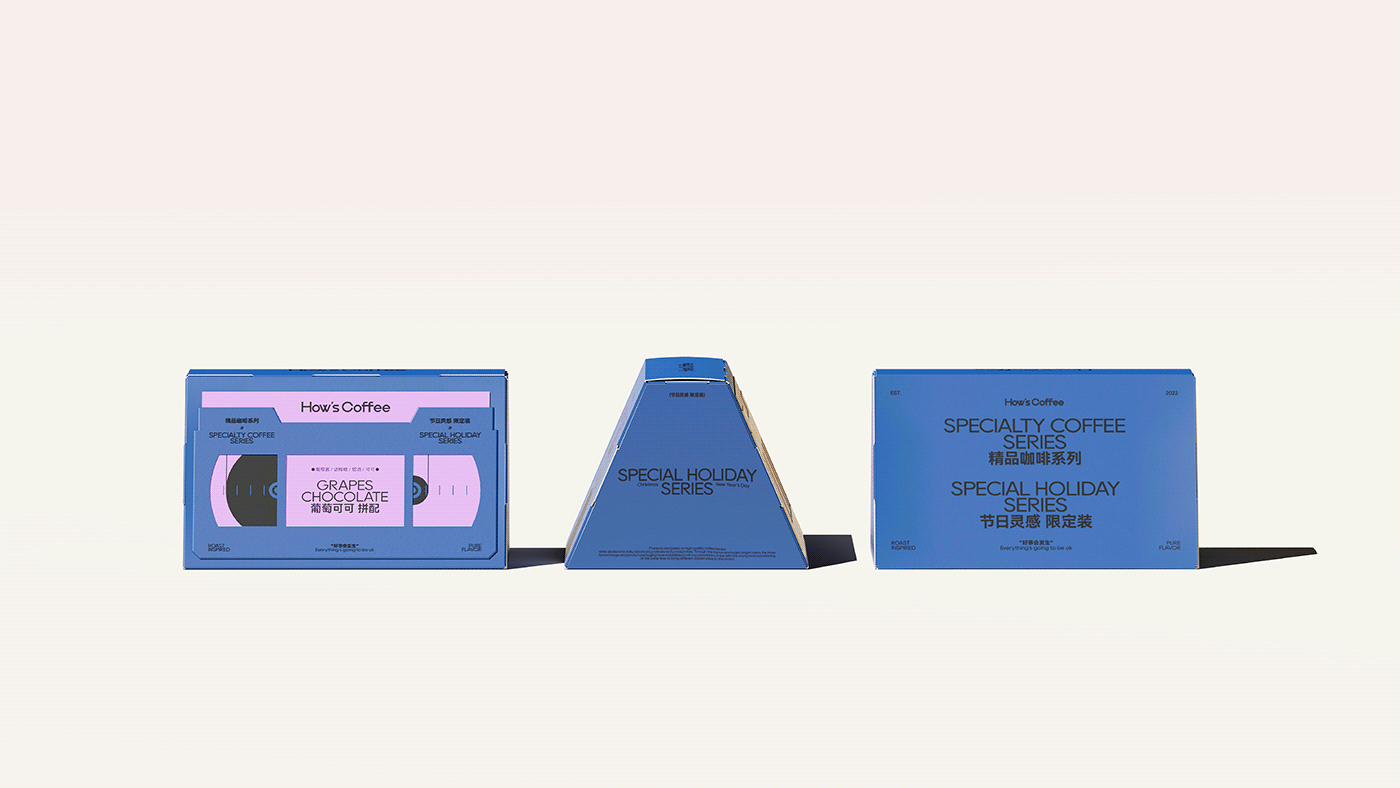
The Tape Visualization: This is a clever twist! Instead of just a plain label, they’re using the “tape” concept to represent the music that complements the coffee. It adds a playful element and makes you curious about what kind of music they’ve paired with it.
-
A Symphony of Colors: Forget boring brown bags! This design promises a rich collision of colors, just like the variety of flavors from coffee beans around the world. It sounds like a feast for the eyes and the taste buds!
Here are some additional thoughts from a coffee enthusiast:
-
Matching the Colors to Flavors: It would be amazing if the bold colors on the packaging actually represent the flavor profile of the coffee inside. For example, a bright yellow could indicate a citrusy bean, while a deep purple could hint at a rich, dark roast.
-
Interactive Packaging: The mention of cards interacting is intriguing. Maybe unfolding the “tape” reveals a music recommendation or a story about the coffee’s origin? A little interactivity goes a long way in engaging the customer.
-
The Holiday Connection: While the container concept is strong, the holiday season connection feels a bit loose. Maybe they could tie it back to the emotions of the season – like “gifting cherished moments” or “brewing up joyful connections.”
Overall, this design has the potential to be truly innovative and memorable! It speaks to the heart of a coffee lover and promises an experience that goes beyond just a cup of joe. Find more amazing packaging designs in our curator’s insight!