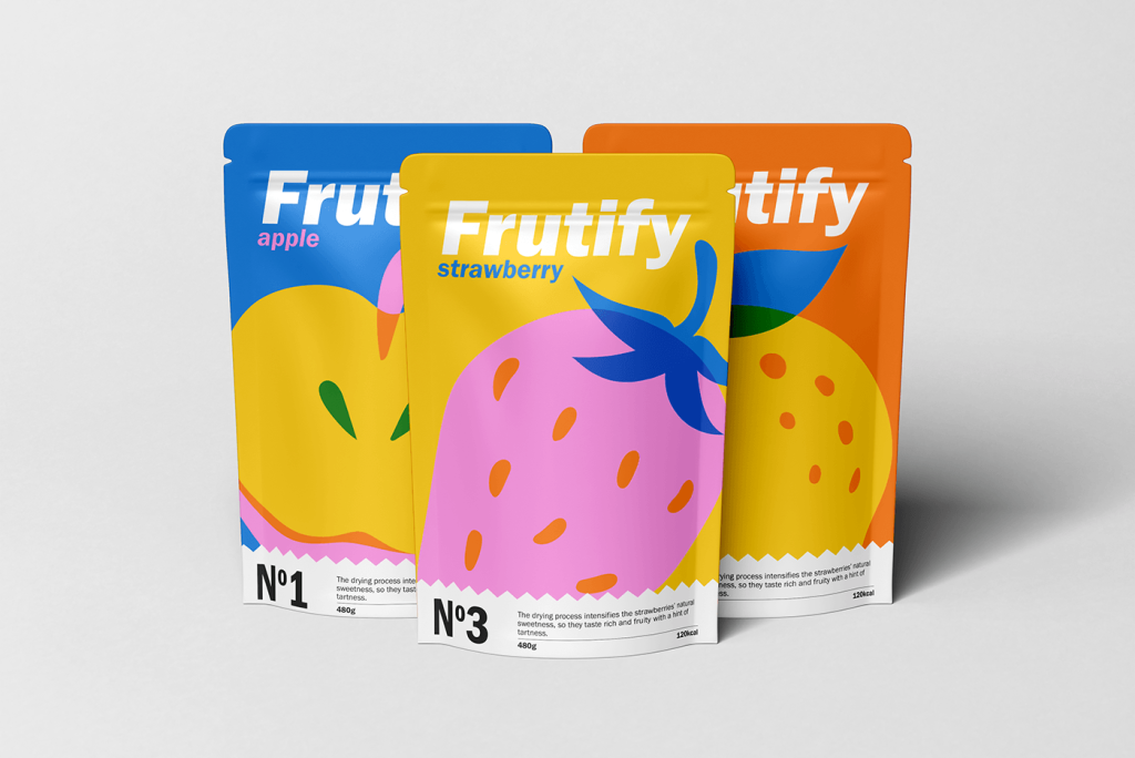
These Frutify Fruit Chips designs by Karlen Avetisyan and Henrik Nikoghosyan make me smile. They have an undeniable charm, like they’re inviting you to “join the fruit party.” Let’s dive into the details in this Curator’s Insight.
The minimalist, flat illustration style is beautifully balanced with vibrant colors. The design doesn’t try to do too much—it’s clean yet energetic. The focus on large fruit graphics gives the packaging an approachable, cheerful vibe while maintaining sophistication.
The brand name “Frutify” is in bold, white sans-serif, which pops against the colorful background. The use of lowercase for “lemon” and “banana” adds a casual, friendly tone. It feels approachable and very much in line with the natural, healthy essence of the brand.
The lemon pouch, for example, pairs a bright orange background with yellow, green, and blue. This unexpected palette makes it feel fresh and stands out from typical fruit-based packaging, which often sticks to safe, muted tones.
Including a product number (“No. 4” and “No. 2”) is an intriguing touch. It makes each flavor feel like part of a collectible series. It also appeals to the organized, health-conscious consumer who likes categorization and variety.
The white zigzag divider at the bottom is such a clever detail! It’s playful and adds movement to the design. It also doubles as a visual cue to guide your eyes toward the nutritional and product details, ensuring the design is functional as well as fun.
The bold use of color and quirky details feels refreshing and unexpected in the dried fruit category, where many brands lean toward neutral tones. If I saw this on a shelf, I’d want to grab it, even just to admire it closer.


