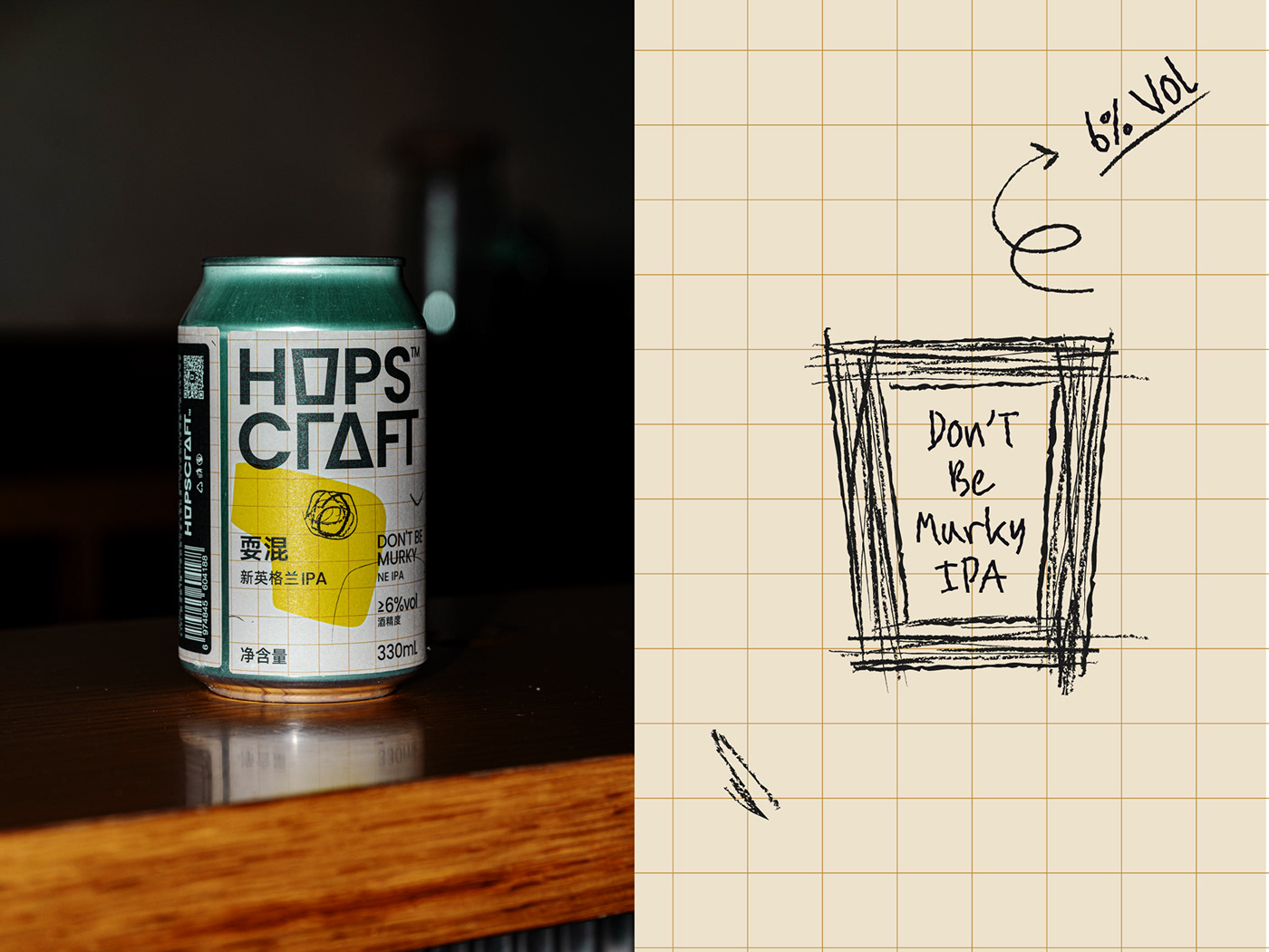
Oh wow, this packaging design by PigeonStudio has so much personality and charm! Let’s break it down in this Curator’s Insight.
The casual handwriting and rough, loose brushstrokes give the packaging a human, raw, and playful energy. It feels like a creative doodle on a grid-paper background—something you might find in a notebook of a daydreaming artist. This approach captures the “muddiness” in both theme and spirit. The imperfections are intentional and reflect the carefree attitude of craft beer culture.
The faint graph-paper-style pattern is such an understated yet clever touch. It adds structure to the otherwise chaotic design elements, giving it balance without taking away from the carefree vibe. This also subtly nods to experimentation, perhaps reflecting the craftsmanship behind the beer itself. The quirky, abstract green shapes overlaid with black line art feel spontaneous, almost like the designer was having fun and channeling that “naughty, muddy” vibe. These elements mirror the unfiltered and fruity character of the IPA—wild but harmonious.
The “HOPSCRAFT” logo combines boldness with subtle playfulness. It strikes a great balance between contemporary craft beer branding and originality. The pairing of fonts elsewhere on the can maintains a casual, easygoing feel without losing legibility. The reference to local dialects like “playing muddy” grounds the branding in its Sichuan and Chongqing roots. This is a great way to celebrate regional pride while telling a story that resonates emotionally with locals and intrigues outsiders.
The design looks unstructured at first, but the details show thoughtful layering. This reflects the idea of being messy (like a hazy IPA) but still intentional. It’s bold without being overwhelming—perfect for a beer called “Don’t Be Murky.” The design evokes a bohemian, carefree vibe that matches the “free and easy” attitude described in the dialect explanation. It almost feels like a piece of modern art you’d want to display, not just drink from. The design’s juicy green hues and abstract, fruity shapes evoke the taste of the beer itself. You can almost feel the zing of the citrusy hops through the visuals, creating a multi-sensory connection.
This design feels like a mini art project with a story—perfect for a craft beer. It invites drinkers to feel like they’re not just consuming a product but becoming part of an attitude, a culture, and a celebration of playfulness.


