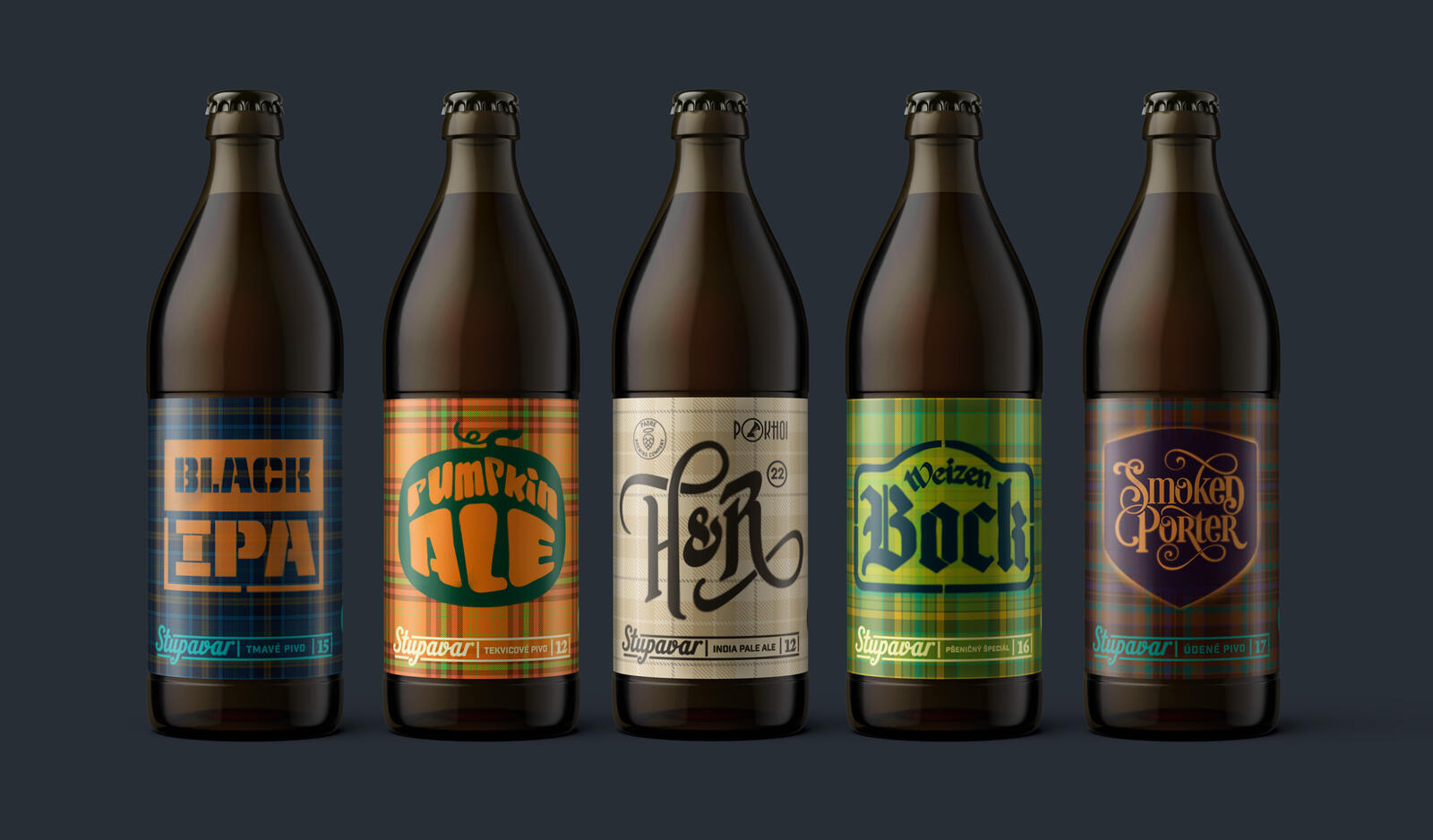
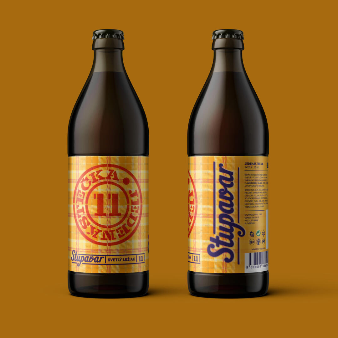
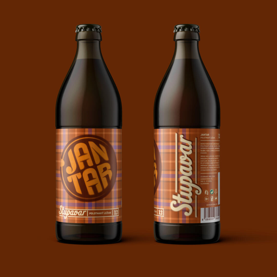
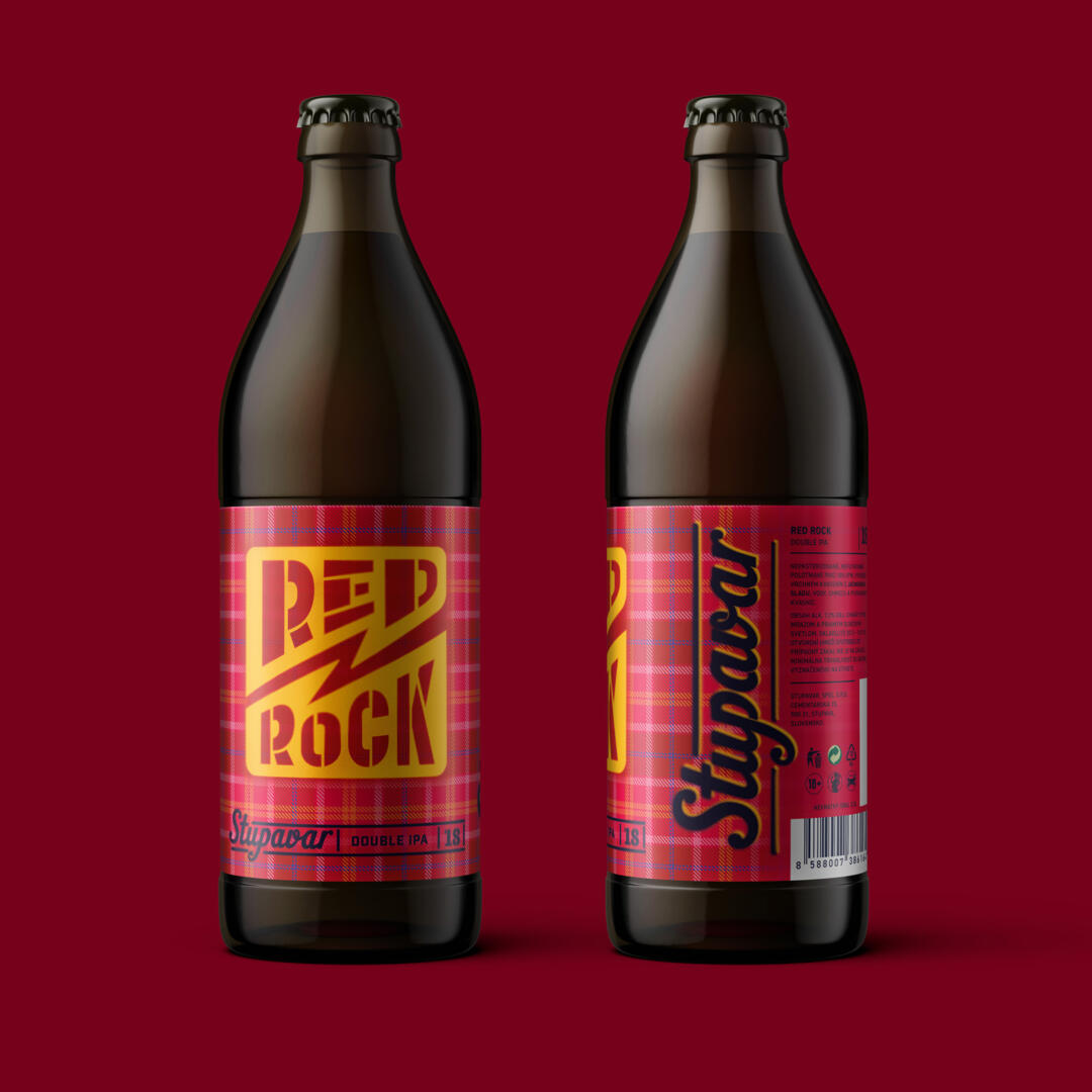
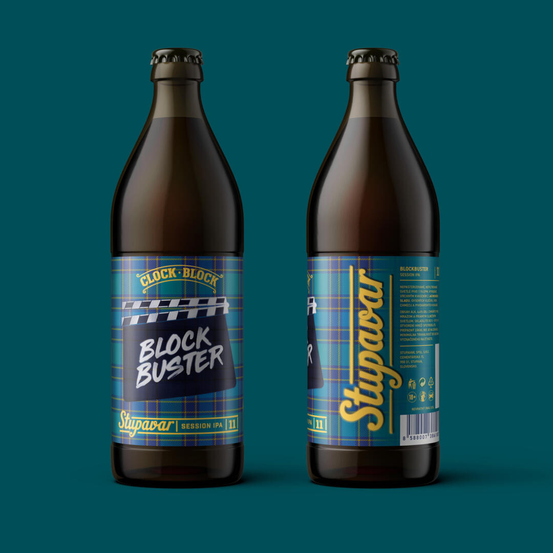
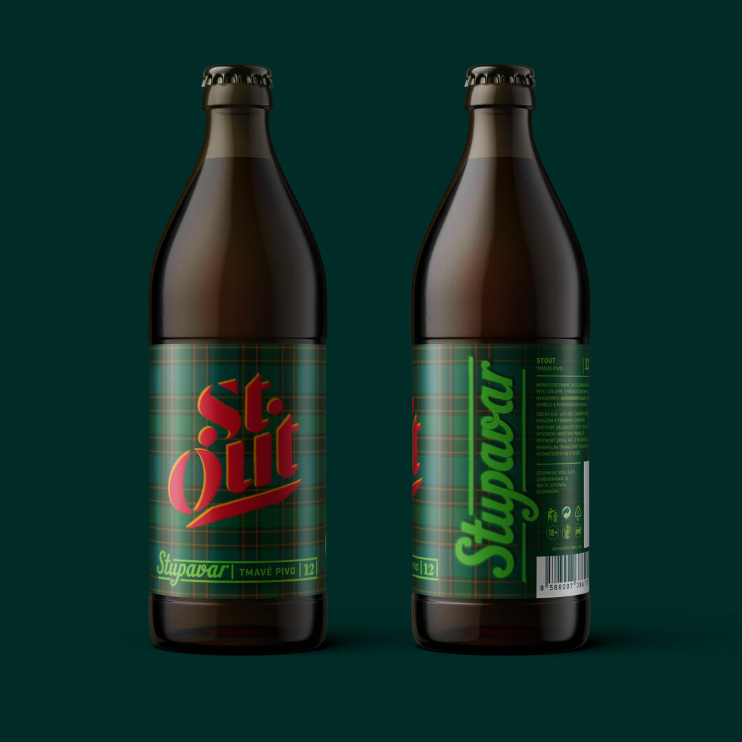
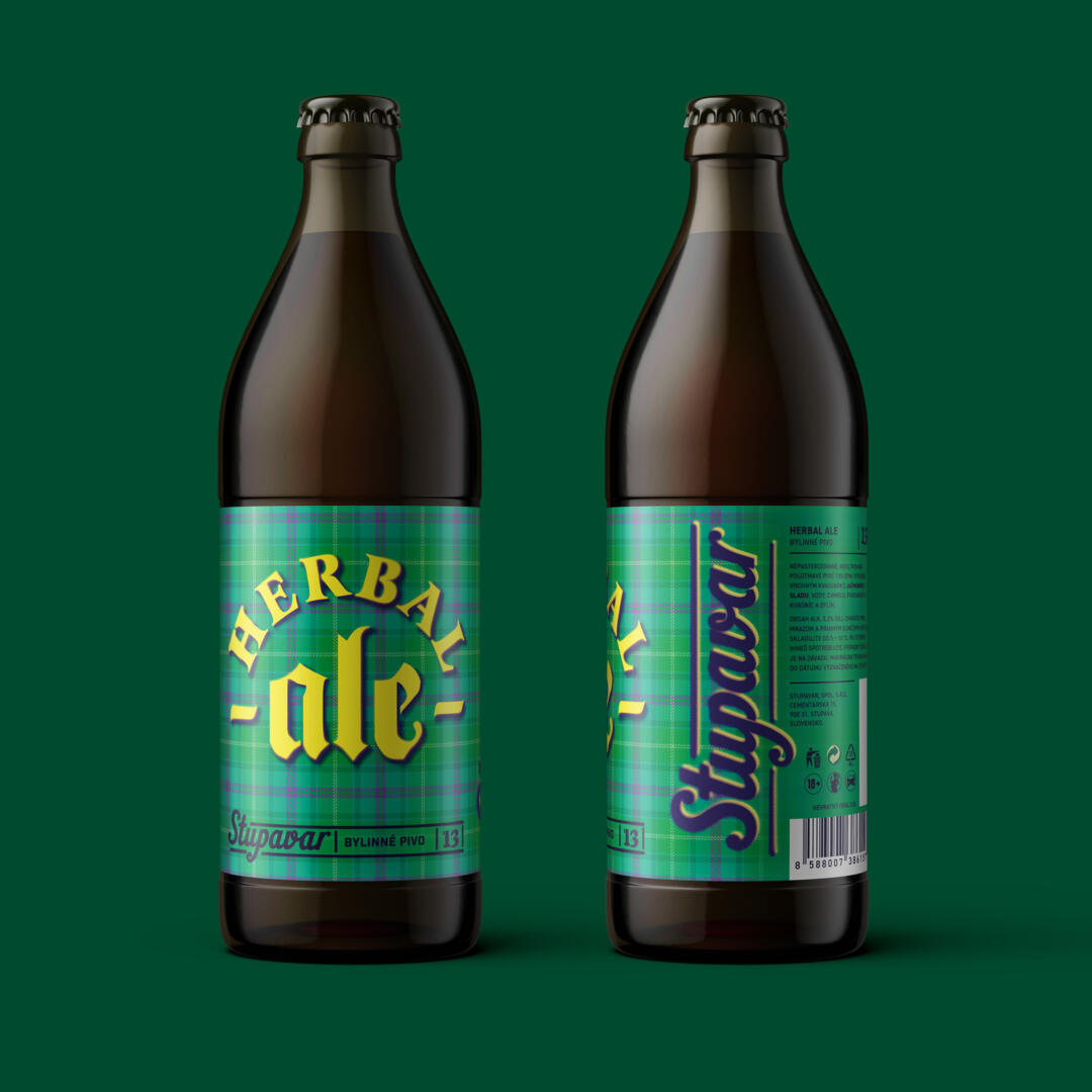
This is a new bottle design for the Stupavar craft brewery, which I have been working on intensively with the guys from Stupavar lately. I’m looking forward because those many hours of work were really worth it. 20 beers will continue to wear a checkered pattern, which remains as a reference to the original label design.
The checkered pattern simply belongs to Stupavar and we didn’t want to change anything about it. The checkered pattern carries a certain relaxation, free thinking and especially a reference to classic craftsmanship and skill, e.g. in the form of a classic checkered shirt. More colors have been added to the design, because beer is also about fun and entertainment. At the same time, each beer received its new logo, which we sprayed on the labels as if through templates made somewhere in the garage, just like the first beers from Stupavar. We wanted the design to carry simplicity with a reference to old honest craftsmanship, breathing a bit of retro, and at the same time to have the signature of the free punk rock philosophy of life from which the honest craft brewery Stupavar was born.