For the Domkaiser brand and the designer, it was important to create a basic foundation as a future umbrella brand when designing the brand and packaging. This means that other drinks from the house, such as liqueurs, vodka and schnapps, should be and are even already adapted with this design and thus visually fit together wonderfully. And throughout in different bottle shapes and sizes.
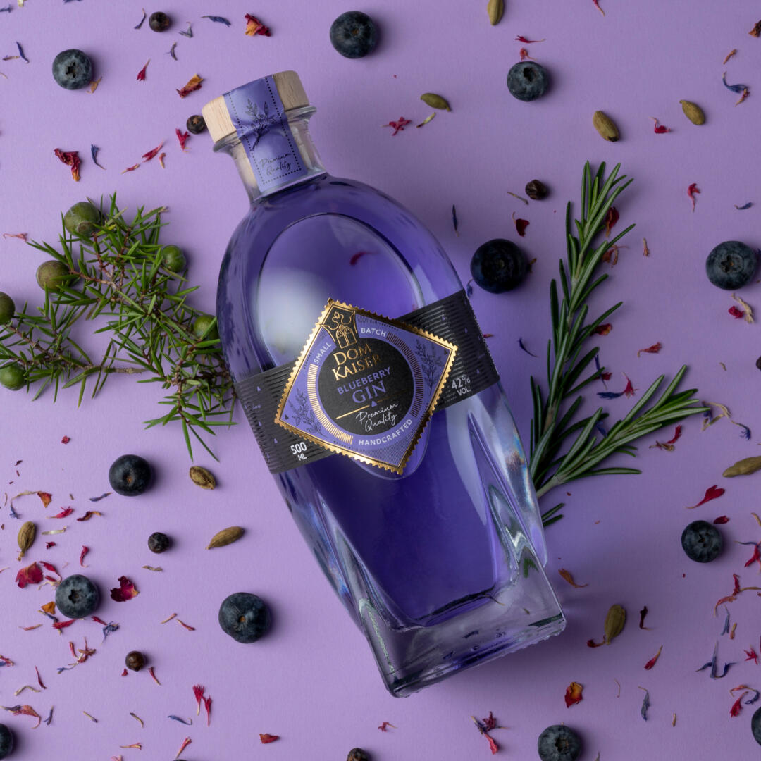
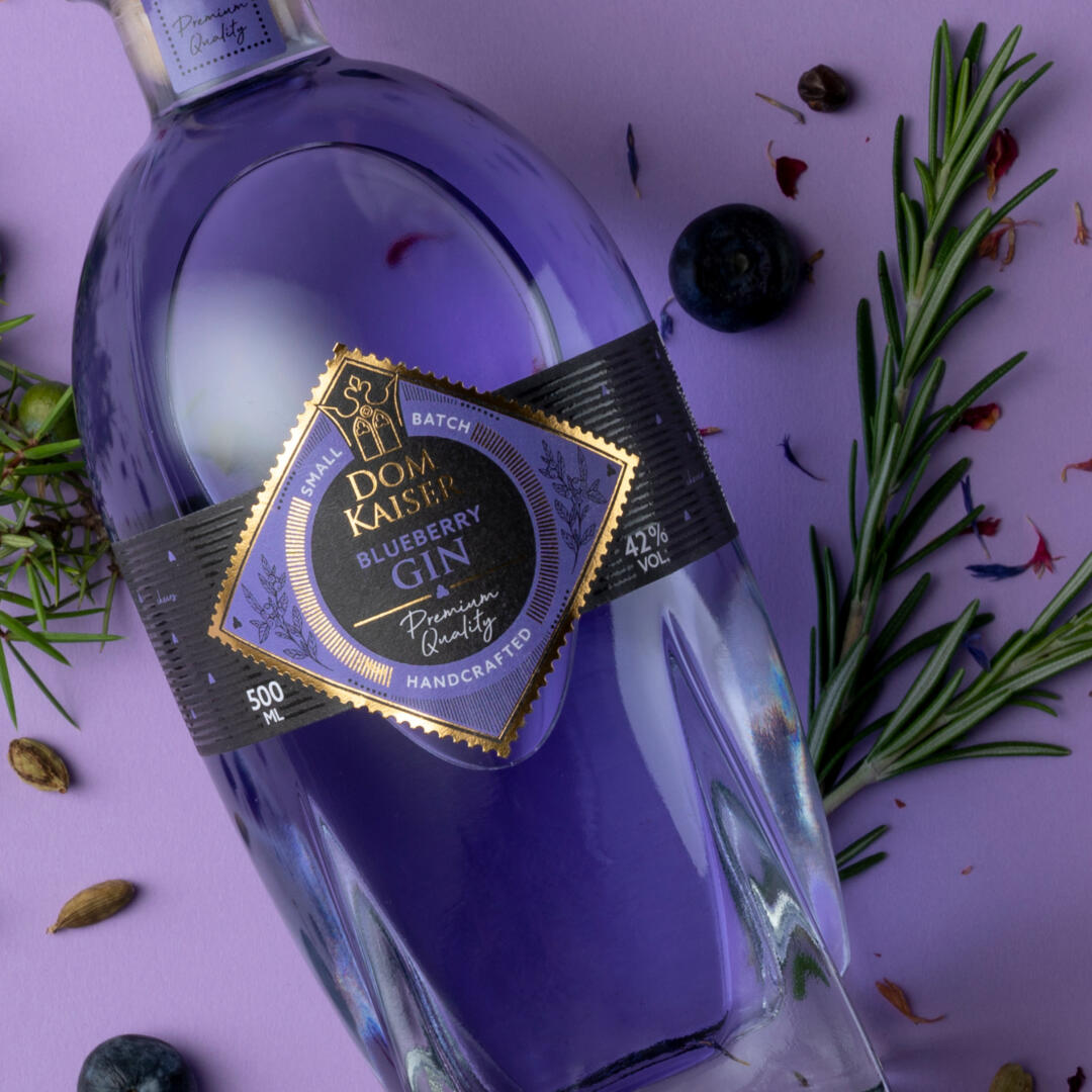
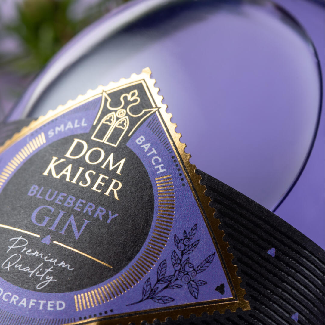
The focus of the design elements, some of which consist of the logo itself, such as the outer shape of the twisted square, the crown or the „spade“ element, can be found everywhere as a recognizable detail. The same applies to the basic colors black and gold. The additional colored variety coding, the secondary color, is thematically coordinated with the beverage and thus not only stimulates the taste, but also gives room for emotionality.
Overall, the entire product range stands out well on the shelf, forming an eye-catcher and thus standing out from the competition. Overall, it was important to the company and the designer to create a visually modern interpretation of traditional craftsmanship. Regional manufacturing is also an important criterion that had to be taken into account.
Values such as quality, know-how and genuine, honest manufacturing work are perfectly embodied in these three bottles. This is also reflected in the choice of the exciting font, the high-contrast color scheme and the emblematic design. Let‘s look forward to many more drinks from this series and say cheers to this small edition as a tasting size! A wonderful gift idea – don‘t you think?!