

Design: Getbrand
Location: Russia
Project Type: Produced
Product Launch Location: Russia
Packaging Contents: Beer
Packaging Substrate / Materials: Aluminium
About the project
XP Brew is a craft brewery from the homeland of the first cosmonaut of the Earth, which invariably follows its values: to consistently produce high-quality and interesting beer.Task
The XP Brew Brewery is appreciated for its high-quality assortment, the brewer’s craftsmanship, and the original taste.But as the manufacturer noted, the packaging was called not attractive enough and not original. The XP Brew brand lacked a well-formed image and charisma.
We were commissioned to create an attractive, understandable and informative design that will provide the brand with a loud restart and distinct market positioning, assortment navigation and at the same time be memorable and relevant for a long time.
Decision
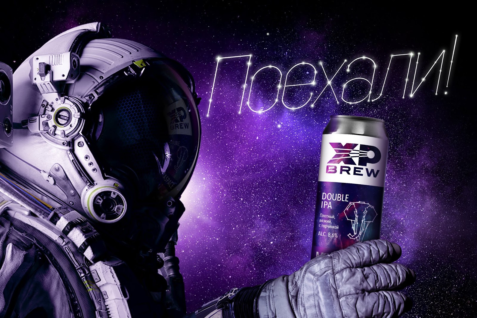
Wanting to emphasize the “residence permit” of the XP Brew brand in the city of Gagarin, Smolensk Region, the birthplace of the first cosmonaut of the Earth, the Getbrand team created a new logo for the brewery with the silhouette of the first Earth satellite piercing with capital letters.On all packages, the logo area now occupies at least 2/3 of the label, which allows you to distinguish and remember the brand name among competitors in such a complex category as craft beer. For each taste on the front of the package there is also a separate place for a description of the main organoleptic sensations that the buyer will receive from the drink, as well as the level of strength. Continuing the space theme, the design of the classic line of more traditional XP Brew varieties is a space firmament, each time changing its shade to match the richness of taste and beer. Moreover, each SKU has been assigned its own personal constellation-animal. Such solutions helped to differentiate as much as possible all positions of the craft line of traditional varieties in order to avoid confusion.

In the XP experimental beer line, the designers, retaining the overall architecture, brought more freedom and detachment to the concept through the use of interesting color combinations, a glitch effect, and typography unusual for the usual beer category. The overall visual solution thus underlines the brand’s commitment to the original approach in craft brewing and new experiments.
The design was developed using our methodology “3 layers of efficiency”.

The packaging became catchy and noticeable with a clear differentiation inside the lines (visual layer). It contains all the necessary information: density, strength, grade, IBU (context layer). Through the packaging we transmit the image of an experienced, high-quality, professional and at the same time the time of a modern, open to interesting and tasty experiments, craft manufacturer (conversion layer).
XP Brew is an “unmistakable choice” for connoisseurs and lovers of craft beer looking for new experiences and an original taste.

