The Yasno Solnyshko brand has existed since 1998 and is represented in several categories of breakfast cereals.
The range of products under the Yasno Solnyshko brand includes such categories as oat flakes, multi-grain flakes, oat flakes with fruits, instant oat porridges, side-dish buckwheat porridges.
Task
Update the image of the Yasno Solnyshko brand in all current product categories and develop a brand design strategy in new categories.
Solution
The Yasno Solnyshko brand has been the leader in the Russian Federation in the Oat Flakes category for several years, according to Nielsen, and ranks first.
The breakfast market is quite conservative, but recently significant redesigns have begun to appear that change the shelf and the perception of the buyer.
After an audit using our “Three Layers of Efficiency” methodology, the key advantages of such strong players as Uvelka, Nordic, Russian Product became clear and it became clear what growth points the Yasno Solnyshko brand has.
At the same time, the design must remain consistent with the current one, since the 25-year history of the brand cannot be ignored. It is necessary to preserve the brand’s DNA and its distinctive features, while modernizing it. Feedback from consumers indicated that the design was perceived as outdated, unstylish, and overloaded with various elements. The logo was perceived as simple and angular. The brand’s USPs were poorly expressed.
“We solved the problem that often arises before any marketer – to make the perception of the brand more relevant, modern, and at the same time not to lose the recognition accumulated over the years.
The brand has been on the market for more than 25 years, several generations of families grew up eating breakfast with Yasno Solnyshko, and during this time the brand has become very close to its consumers.
In this case, we had no right to act as revolutionaries. We acted on the principle of “cutting off the unnecessary” of one famous Italian, only instead of stone we took packaging and removed all unnecessary details and elements from it, preserving and improving what was done before us.”
Sergey Golubtsov, head of marketing department
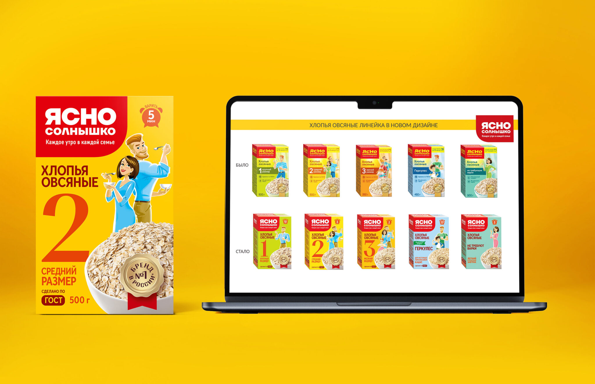
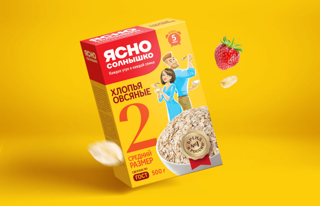
It was decided to maintain the core brand architecture, emphasizing the logo with more prominent lettering and a bold font, making it clear and direct. We removed the yellow color and changed it to white, which added contrast to the packaging. We kept the slogan “Every morning in every family”, as it really clearly reflects the positioning of the brand.
It was important to indicate the category and size of the flakes in the context layer. In the conversion layer, they focused on the fact that this is the number 1 brand in Russia in this category. The food zone remained the same, but we redrawn the characters beloved by consumers, making them more modern. This is a married couple who looks stylish and modern, both take care of their health and choose a healthy breakfast for themselves and their children.
Due to fontographic changes, stylish illustrations and accents in the right places, the packaging began to look much more advantageous and more noticeable on the shelf.
“Working on the project was truly exciting!
When a brand has such a strong market position and recognition, it requires special precision and meticulousness in its work. While maintaining the current architecture and packaging elements, we wanted to create a more modern and clean brand image.
The improvement of the logo deserves special attention: now it has become the dominant feature on the packaging, standing out due to the tonal contrast of the style to the background, a calmer and easier to read font. At the same time, it has become softer, more comfortable and classy, due to the fact that we abandoned the sharp angle in the die.
A lot of work was done with the brand characters. The hairstyles, clothes, and poses of our heroes were worked out in detail. During our work with the project, we practically became close to the Ovsyankin family – a modern and happy family, where the daughter is like her father, and the son is like her mother, where everyone lives in joy, harmony and love. Each story is filled with humor and warmth.
We look forward to the updated product on the shelves!”
Elizaveta Katanskaya, art director of Getbrand


