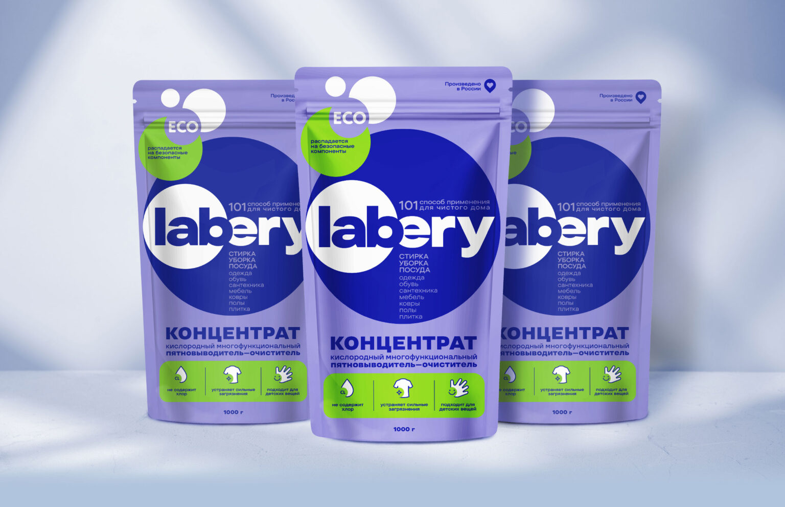
Labery is an effective and versatile cleanser that has a wide spectrum of action and will help in solving many household problems. The brand’s main sales channel are marketplaces, which are crowded with a large number of competitors.
The main advantage is that with the help of a hypoallergenic product you can clean any dirt, including difficult stains.
In addition to its effective properties, Labery is environmentally friendly, as it does not contain chlorine and is completely safe for use when washing children’s clothes.
Task
Despite the obvious advantages of Labery as a universal household product, overall sales figures were not strong. It was necessary to fix this, develop an effective design, and also stand out from the large number of competitors on marketplaces. It is also important to convey to the consumer all the properties and benefits of the product using visual communications. It is important to take into account the specifics of the e-commerce sales channel.
Solution
The client commissioned us after being introduced to our Getbrand Method tools. mainly, due to the audit of the effectiveness of packaging design using our agency’s proprietary tool © “Three Layers of Efficiency”.
In the case of the Labery brand, it was necessary to highlight the strengths and identify the next growth points.
After a qualitative analysis of the packaging on three layers – visual, contextual and conversion, it became obvious that the contextual and conversion layers should be actively worked out – to convey the benefits of the product, explain the methods of use, take a fresh look at communication with the consumer, and also place color accents.
Previous designs did not communicate with the consumer, it was not clear to them what the benefits of this product were, and what problem it could help solve. In addition, the old packaging did not catch the eye, which is a big disadvantage on marketplaces.
To solve the set tasks, we chose the EXPRESS DESIGN service, which allows us to implement an effective option that will work successfully in the market in a short time and for an acceptable amount. As a result, you get one effective design option developed by the leading designers of our agency. An excellent example of the implementation of this service was the design for the Labery brand.
Result
First of all, we changed the logo, maintaining the concept of the image of bubbles, which acted as an association with oxygen.
Then we applied the modern trend for geometric shapes – placed a circle inside another, thereby emphasizing the name of the product. Using a geometric shape – a circle in design – is one of the most effective ways to attract attention. This technique gives the packaging a modern and structural look, and also enhances the visual effect, making it memorable and attractive to the consumer.
It was important for us to evoke an association with a reliable and technological brand that can make solving everyday problems easier. To do this, we have worked on an effective arrangement of product properties, trying not to burden the buyer with “heavy” concepts. In order to improve the performance of the contextual layer, which is responsible for how the audience understands the product category, we placed the word “concentrate” in large font at the bottom. The inscription “101 ways to use for a clean home” helps you immediately understand the purpose of the product and understand what problem the product can solve for the consumer.
The “Eco” badge helps reach a growing target audience that cares about using eco-friendly products that do not leave a carbon footprint.
The parameters of the conversion layer, which evaluate the transmission of brand values, also changed in positive dynamics, thanks to the effective placement of product properties. We placed them at the bottom of the logo and highlighted the background of the text in a pleasant green color. The reverse side of the packaging was used as much as possible to provide a more detailed introduction to the product.
Labery now looks stylish, stands out from competitors, attracts consumers, and most importantly, conveys all its properties and advantages. Our proprietary “Three Layers of Efficiency” technique helped maximize the effectiveness of packaging design.


