Agency: Tribox Design
Brand Strategy: Inusentes Catapusan
Corporate Strategy: Regine Ylaya
Creative Direction: Inusentes Catapusan
Art Direction: Regine Ylaya
Typeface Design: Inusentes Catapusan
Research: Regine Ylaya
Project Copywriter: Faye Penetrante
Location: Philippines
Project Type: Produced
Client: Anacco
Product Launch Location: Global
Packaging Contents: Baby Essentials
Packaging Substrate / Materials: Plastic
Printing Process: Screen printing
Anacco is a baby essentials retail startup founded in 2020 and newly registered in Hawaii. They will soon be launching their fresh brand identity and new products to the market. Their products include toys, garments, clothing accessories, cosmetics and toiletries, baby food and nutrition, baby safety and convenience, and after-birth or motherhood essentials.
The baby product industry is wracked by various challenges such as products made from toxic materials and poor craftsmanship. Targeted at first-time moms, Anacco offers a solution that addresses these concerns. They also promise to deliver innovative, premium-quality products at competitive prices with added features compared to what’s currently available in the market. Added to that is their dedication to excellent customer experience.
While the company is still in its infancy stage, their goal is to become a well-known brand in the baby essentials industry, particularly in the United States of America. Expanding to the e-commerce sector, from retail to social media, is one of the company’s targets. They also aim to have their products made available at big retail companies’ brick-and-mortar stores such as Walmart, Target, Macy’s, and the e-commerce giant, Amazon.
The CEO and owner of Anacco, who has a background in arts, reached out to Tribox Design to help her design a logo, gather her thoughts, and select the best color scheme for her business. Tribox Design worked closely with the client to help them with the brand development so they stand out in the market. To address the challenges of this new business, part of the Brand Strategy was to go through a Brand Discovery Workshop which involved Anacco’s founder. The Brand Discovery Workshop involved studying the baby industries’ problems and challenges, defining their mission-vision and goals, gathering customer data, understanding consumers’ demographic and psychographic profiles, identifying their market competitors, identifying their value propositions, establishing the only-ness and uniqueness of their products and services, defining their new voice and culture, identifying their marketing channels, and creating effective brand identity.
In addition to the Brand Strategy, two of the top challenges were (1) to create an identity that will bridge the gap between product centricity and customer centricity and (2) to establish a strong brand identity through visual language. Before we jumped into the process of crafting the new logo, we revisited the business’ identity history. The idea itself was to convey to the targeted market that Anacco is producing and providing baby essential products.
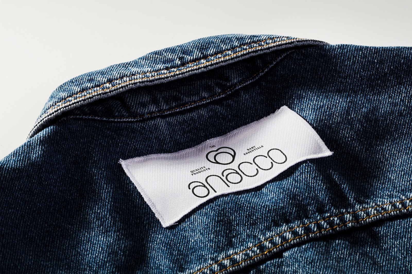
For the final logo, as also requested by the management, we created a custom typeface intended only for Anacco. We retained the stroke of the typeface and refined it to become clearer and more authentic. Tribox Design made sure to retain the friendly look and feel of the design. To be distinctive, the team considered the social and emotional development of babies. The designers crafted the letter A to become functional by creating emojis that represent the different basic emotions and facial expressions of babies. As for the brand mark or icon, we’ve applied the golden ratio in designing and combining the two letters A to form a heart shape to symbolize the special bond between mothers and babies. The letter A also has the flexibility to function as a lock (as shown on the packaging label information) which represents how the company values child’s safety and protection. As for the official color palette, we chose warm bright colors as it is developmentally appropriate and encourages a child’s development.
The new brand identity of Anacco is playful, modern, engaging, gender neutral, inclusive, flexible, and functional for a variety of contexts including marketing initiatives.
What’s Unique?
The baby product industry is wracked by various challenges such as products made from toxic materials and poor craftsmanship. Targeted at first-time moms, Anacco offers a solution that addresses these concerns. They also promise to deliver innovative, premium-quality products at competitive prices with added features compared to what’s currently available in the market. Added to that is their dedication to excellent customer experience.