Design: SoreThumbStudio
Location: United Kingdom
Project Type: Produced
Client: Happy J’s
Product Launch Location: United Kingdom
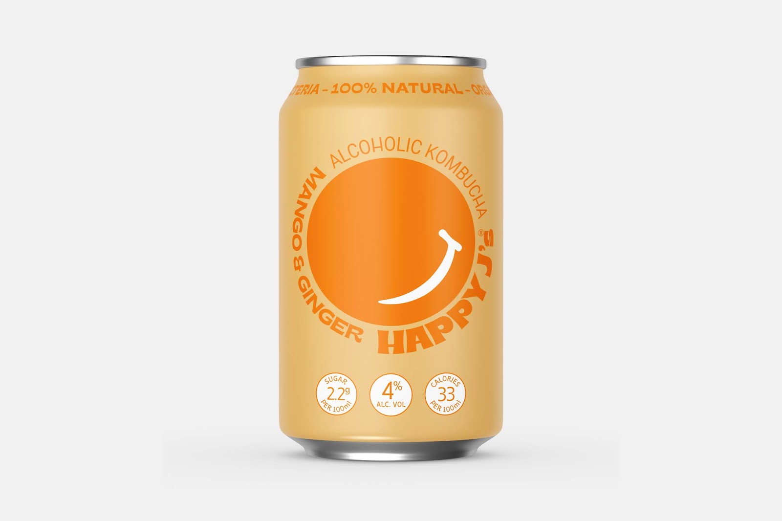
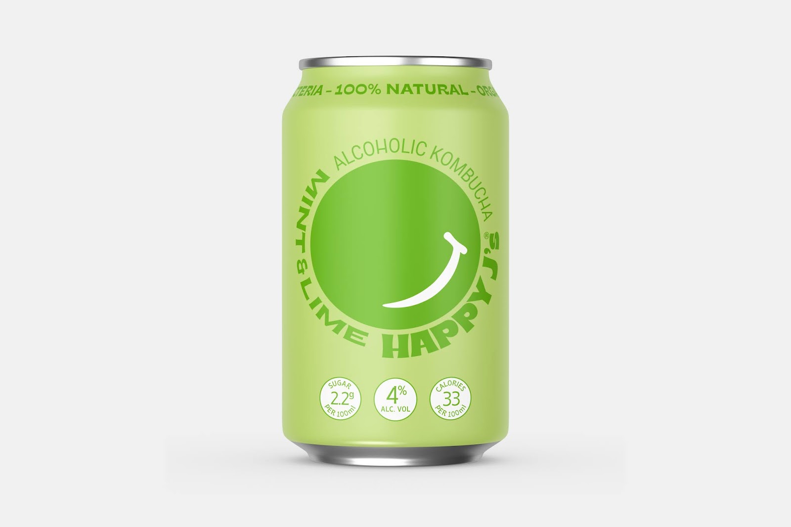
Packaging Contents: Alcoholic Kombucha
Packaging Substrate / Materials: Steel can
Printing Process: Digital
SoreThumbStudio has worked with Happy J’s in creating the category defining brand and packaging for their Hard Kombucha launch in the UK market.
First there was Kombucha. Now there is Hard Kombucha which offers a happy balance of probiotic goodness along with a little kick from the hard stuff, and in Happy J’s case this is quadruple distilled Vodka.
Hard Kombucha is already developing as a category in the US and is riding on the wake of Hard Seltzer. In the UK and Europe it is newly emerging and set to follow a similar path to its opposite number the other side of the pond.
SoreThumbStudio pride themselves on creating brands that are fresh and stand out from the crowd. So rather than follow the usual path they shook off the tie die, flower power and sandal shackles that would normally be associated with Kombucha and took their inspiration from the ‘second summer of love’ embarking them on a journey in creating a brand and its packaging that is informative, fun, irreverent and perfectly timed for the resurgence of late 80s and early 90s, baggy jeans and bucket hats, cool.
As a design brief goes, Happy J’s founder Jake Filson’s “Give me a brand that looks shit hot on a t-shirt” would have to top almost all designer’s wish list. It gave SoreThumbStudio enough insight into the mind of the founder and the creative freedom to go wild and create something outstanding.
Happy J’s Hard Kombucha is launching with two cocktail inspired flavours, Mango & Ginger, and Mint & Lime in bars in and around the UK’s London and Manchester metro areas.