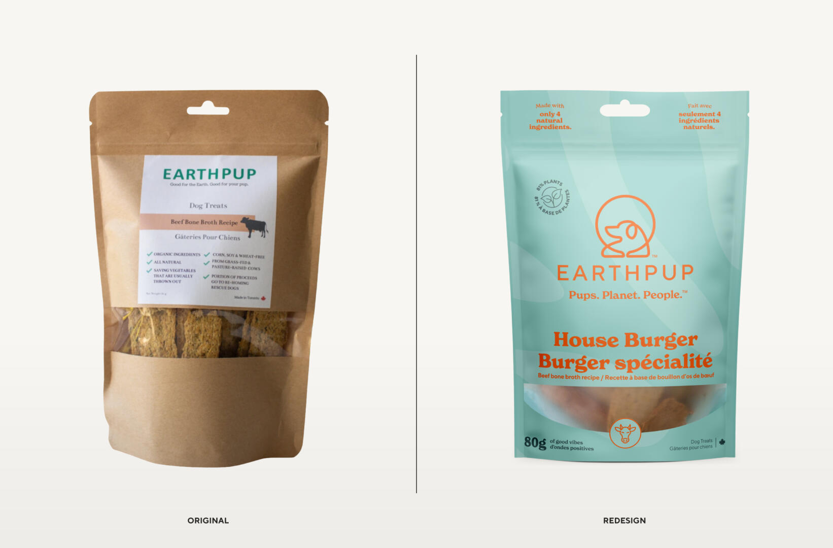
EarthPup was already selling their eco-conscious dog treats in several retail locations and online, but needed to take their entry-level packaging to the next level to scale their business. The founder Lucy is an award-winning environmentalist and sustainability expert, and her partner Adam is an acclaimed Toronto chef. It was clear they had the expertise to make this work!
We kicked off the project with a strategy and positioning session to nail down their brand direction, focus the messaging, establish their tone, develop customer personas, and more. The copywriting for the packaging was crafted, unique differentiation points were highlighted, and everything was topped with some humour and personality.
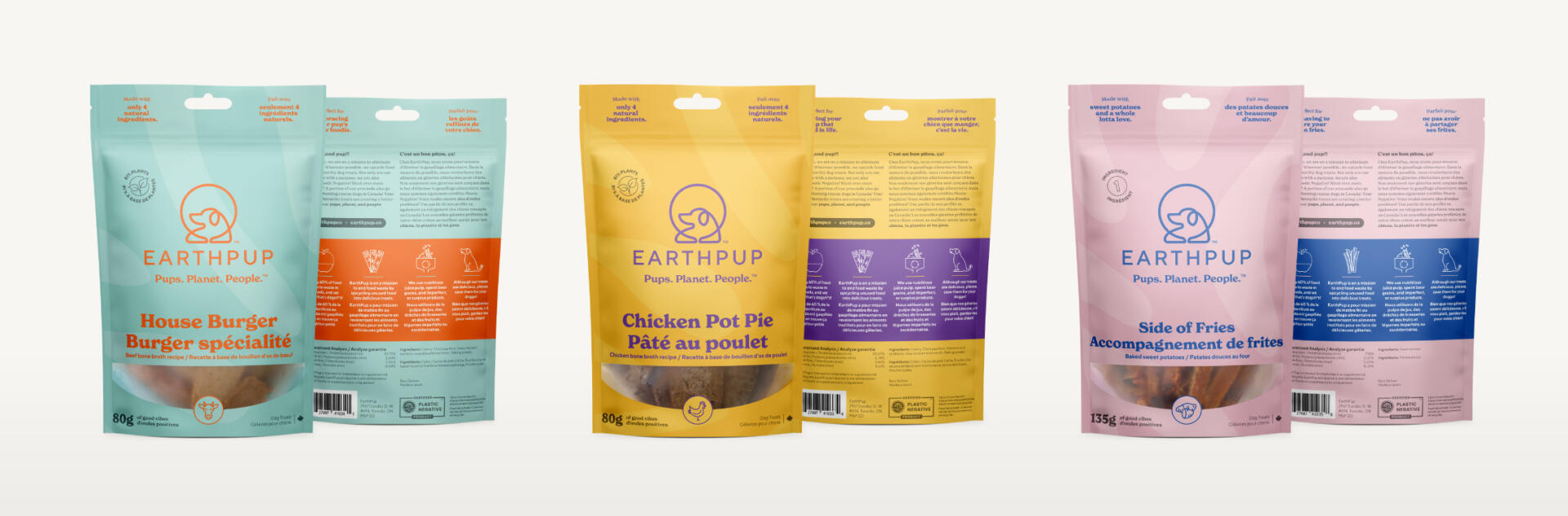
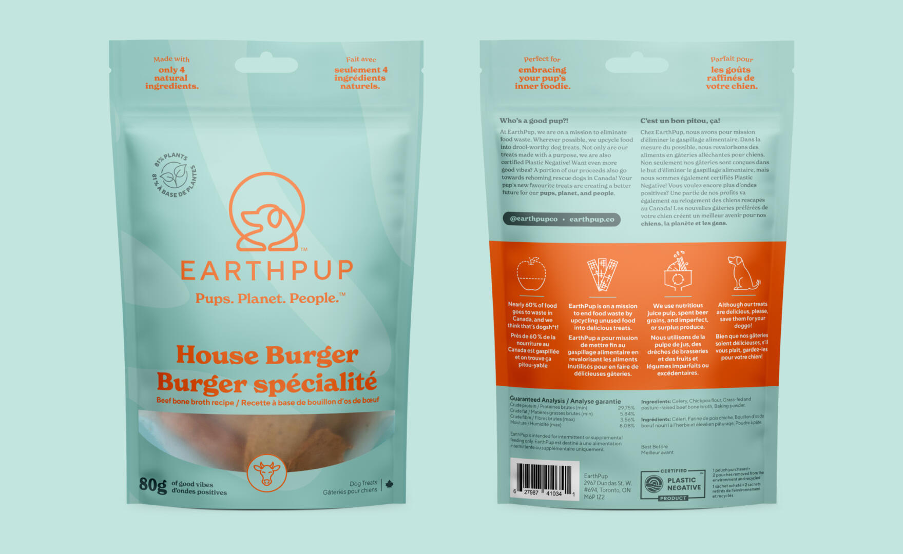
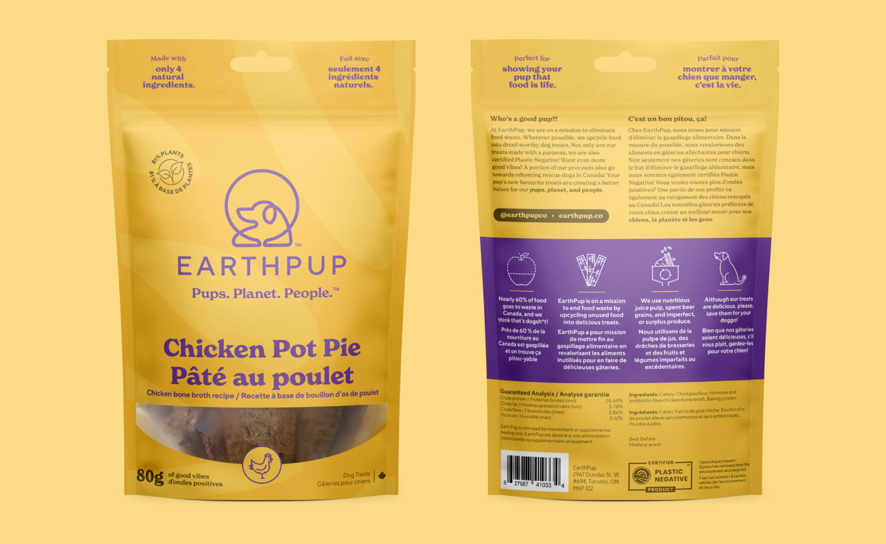
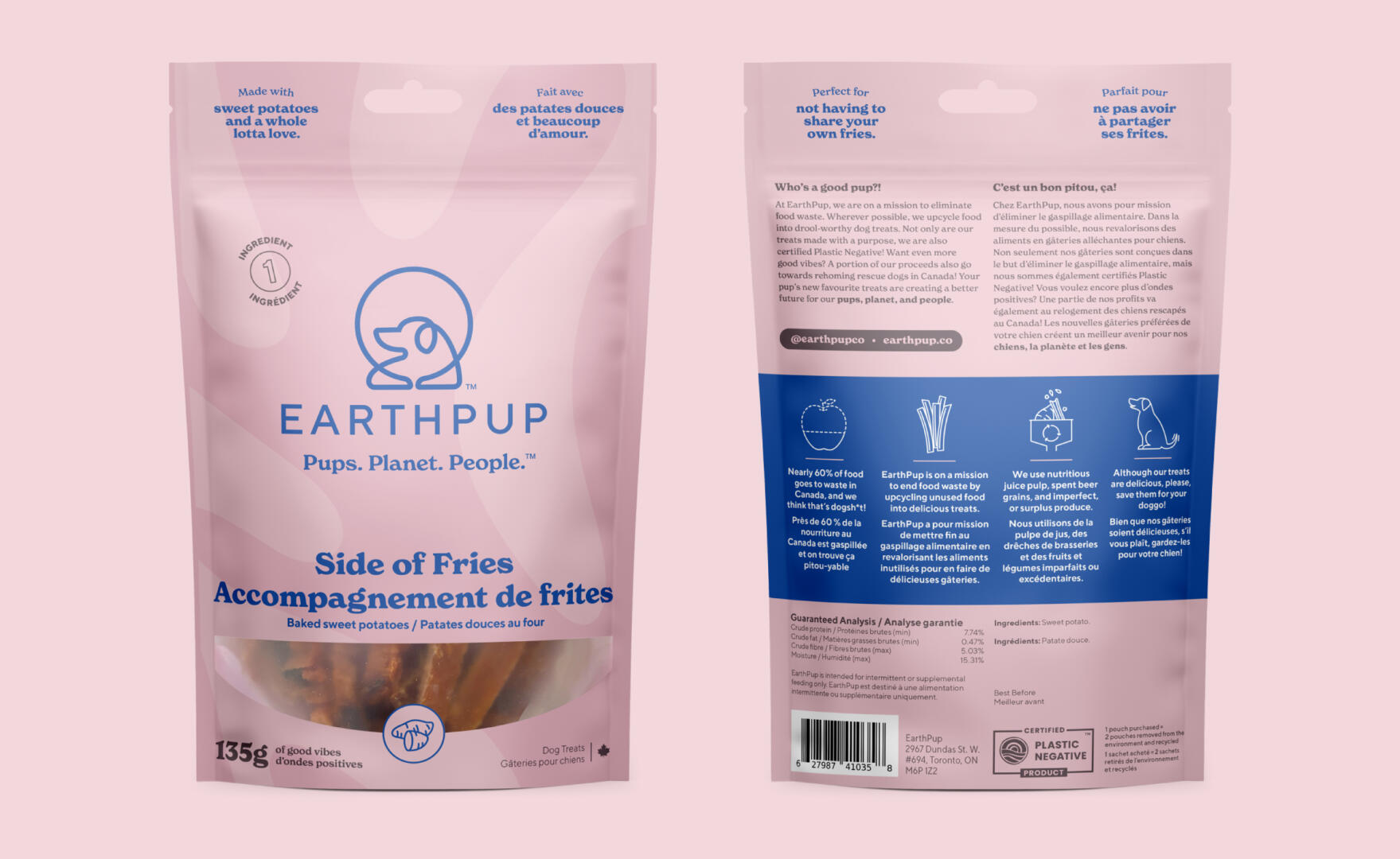
The packaging was designed around the brand’s personality which is eco-focused, playful, and laid back. Each of the flavours is named like a menu item, which creates a fun way for customers to pair treats like “House Burger” with “Side of Fries”. This also serves as a nod to the founders’ time spent in the restaurant industry together.
The pouch colours combine a slightly vintage, muted quality which is offset with a bold, bright accent colour. The accent colours are used to pull focus to specific details on the front, and offers separation and a space to feature the brand’s story on the back of the pouch.
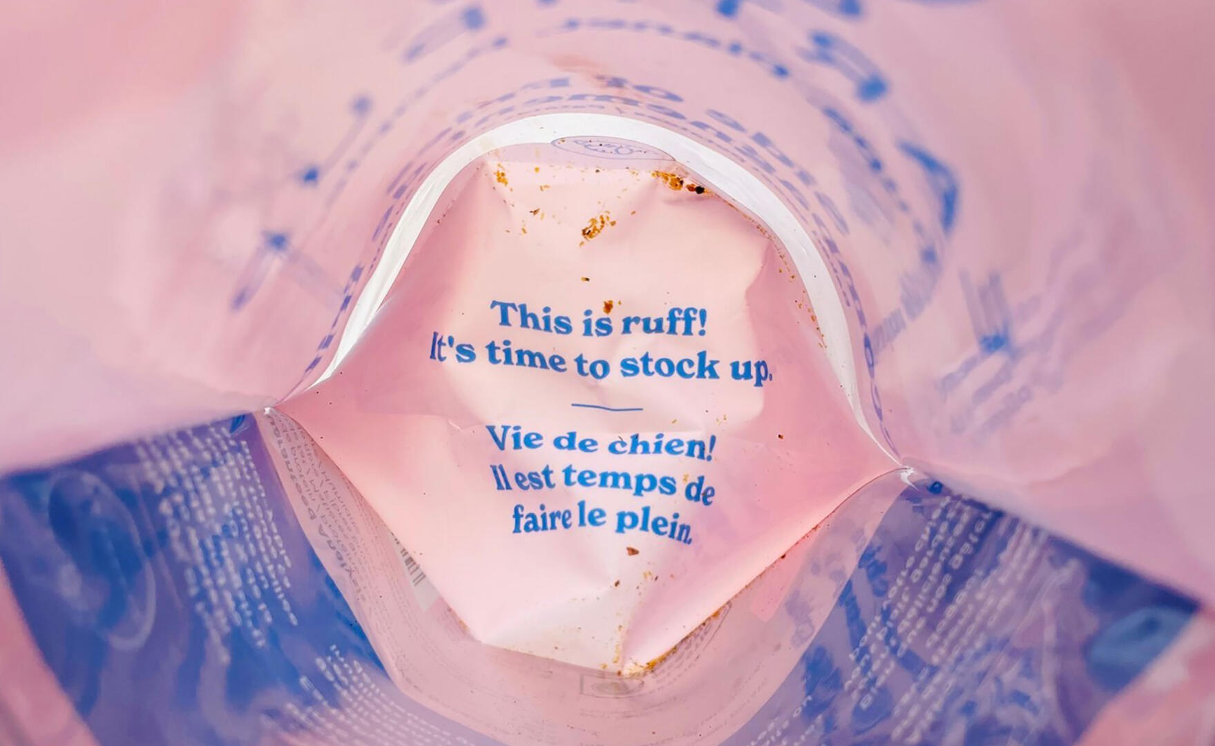
Various elements were thoughtfully added to inject personality. Icons were used to help highlight important details while clever copywriting is used throughout like “Perfect for showing your pup that food is life.” as a way to tell the customer why they should consider purchasing this treat for their pup, or the message you can only see from inside when the pouch is empty, “This is ruff! It’s time to stock up.”. Even the window to show the product is shaped to mimic a big, wide smile!