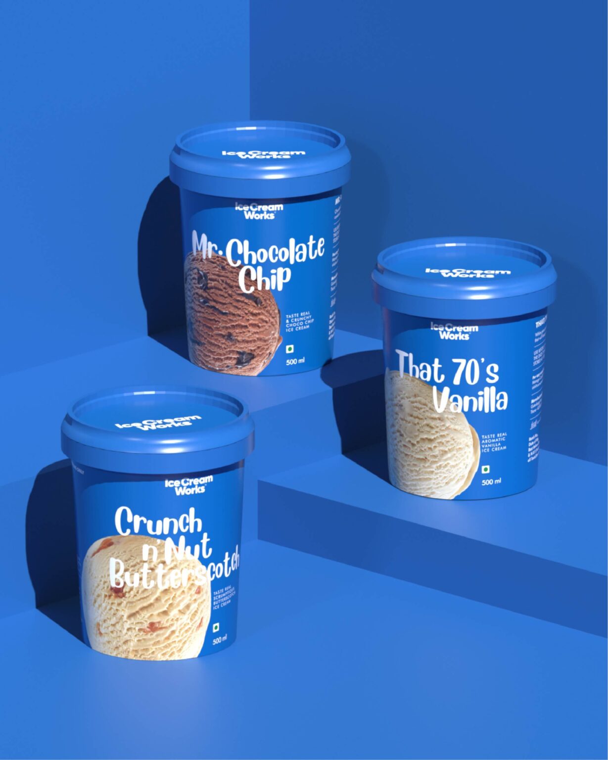
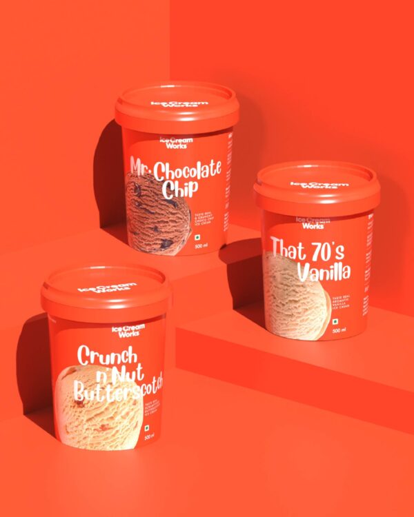
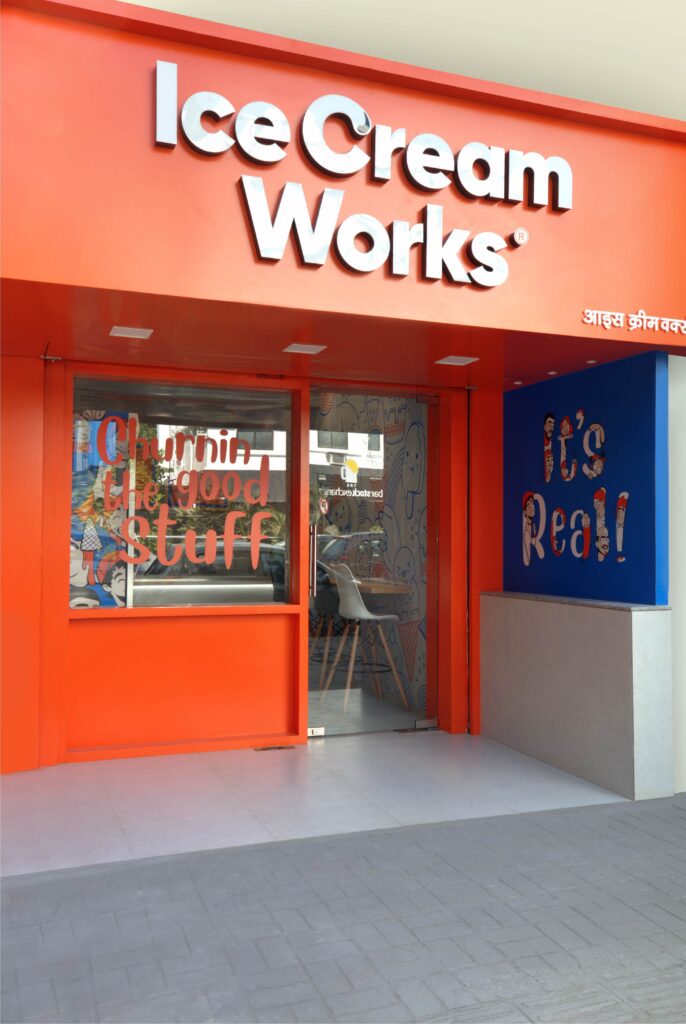
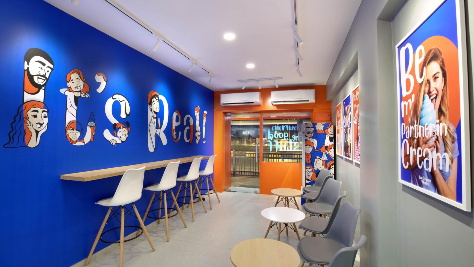
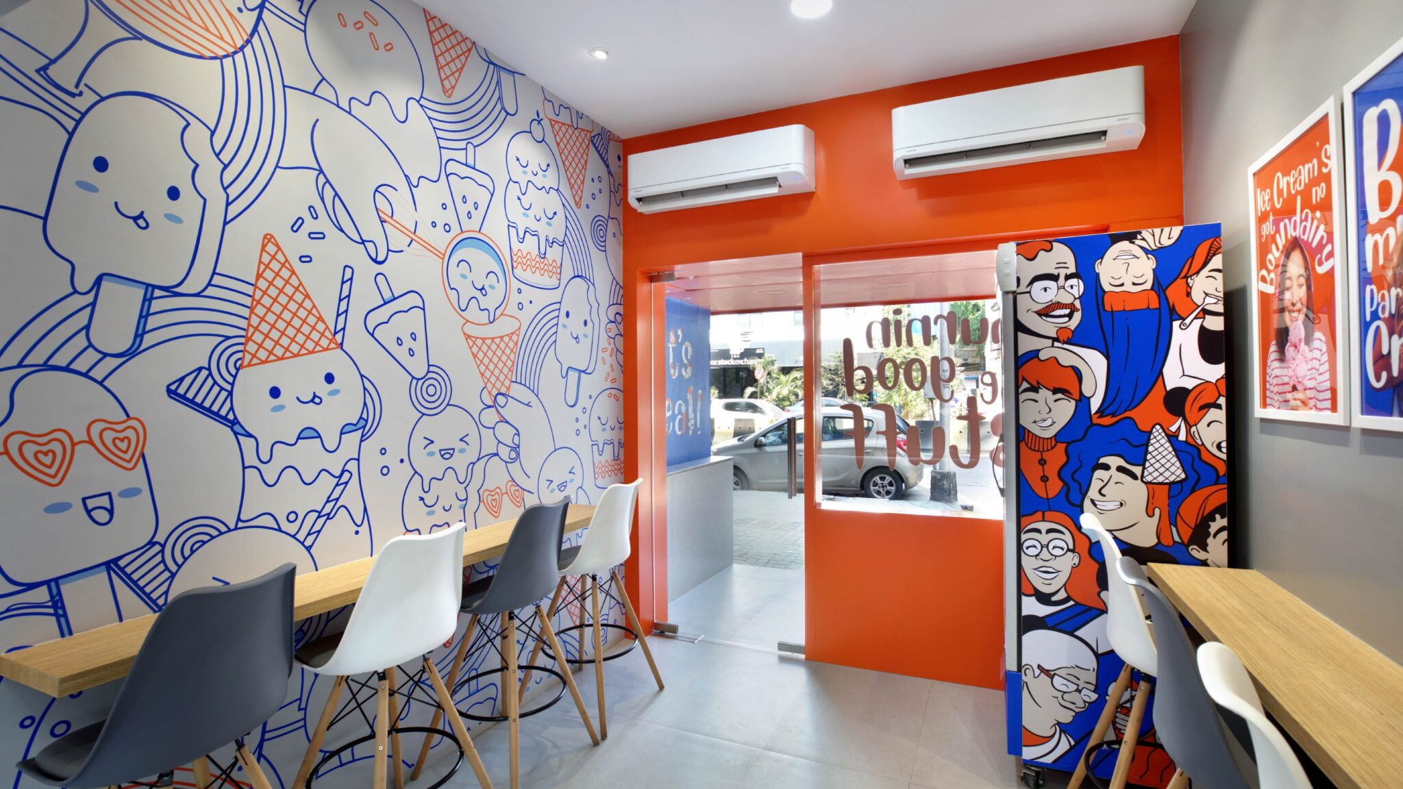
Ice Cream Works is an ice cream brand for people who love to indulge in a little bit of everything and want to take a break from the mundane. They have a curated range of the best flavors from around the world that hug your taste buds with the sweetness it desires. We built a distinctive identity for Ice Cream Works and differentiate it in this cut-throat market through packaging, campaigns, and space designing, and also position it as people’s go-to ice cream brand. Keeping the overall theme cool and groovy, we infused eye-catching colors and quirky typography into the brand identity while giving emphasis on playfulness and colorfulness to foster a wholesome ice cream experience for customers.
This was done to make people feel what real indulgence of joy looks like and how Ice Cream Works gives you a cheerful and exotic moment to rejoice with each spoonful. We were able to catch the eyes of the market and strike a strong cheerful connection with people through the distinctive use of colors and fonts used in curating the brand identity. With a blend of creativity and brevity, we also cultivated an identity that makes people perceive Ice Cream Works as a brand that offers tubs of comfort and self-care, and is the perfect match for your sweet tooth.
Ice Cream to us means an instant celebration, an expression of love, a moment to surprise your taste buds, a break from the mundane, an indulgence for the frivolous, sugar adrenaline, a simple detour to happiness, a cure to the human condition, an excuse to pamper ourselves, a brain freeze that makes you grin, the edible version of self-love and luxury, the simple passage of sweet time as it melts, the delicious side of summer, the smoothest serve that it beats Roger and our all-giving bestie.