THE PROJECT
Seventh Pathy is an upcoming novel brand of proprietary herbal tinctures, gummies and chewies that focuses on using nature to rebuild the pathway to a radiant heart, relaxed mind, and a vibrant spirit by deep cleansing the toxins in the body.
Founded by Paul Dang from over 60 years of experience, Seventh Pathy (or 7thPathy in its pre-rebrand avatar) was now looking to launch itself in the US market after having a successful experience with consumers in India.
After consulting with Brand Strategist, Justin Tilia they repositioned themselves with a mission to take their ancient traditions into the modern age and pave the way to optimium health.
They concluded that a re-brand was definitely needed before they could launch.
I was commissioned to conceptualise, re-design and develop the brand visual logo and identity and package design concepts* for the US based holistic health and wellness brand.
THE DESIGN SOLUTION
During the discovery calls and briefings, we covered various crucial aspects of the brand that included the brand vision, its positioning, consumer market, competitor analysis and visual design analysis.
The client was clear that the branding needed to look clean yet natural, assertive yet compassionate and not look like another earthy, rustic product line.
Inspired in India. Made in U.S.A
Aptly named Seventh Pathy, to stand alongside other well known treatments like Naturopathy, Homeopathy, Allopathy, Osteopathy, Hydropathy and Naphrapathy, Justin framed it best,
‘A 60 year journey has led Paul to understand the deep nuances of each and every herb that he has hand selected from the farm to go into his remedies. Each plant has its own energy signature or elixir that Paul has studied and created his own novel ways to extract each one’s essence. The essence of each medicinal herb is then combined with others that he has curated in a synergistic manner leading to a holistic remedy with the perfect potency and targeted toward an entire body system, not just a symptom.’
It’s Herbal Energy Optimised. As is its new tag line.
Centered around this core idea, the new brand logo is a combination of three elements; a herb leaf symbolising nature, the energy signature or elixir sourced from it and sunlight for its life force; that together form the number 7 thereby creating its own unique brand logomark.
The serif logo typeface was inspired from the golden era of typography styles used on bottle labels prescribing natural remedies and further customised for Seventh Pathy. Since 7 was incorporated as part of the logo mark, I decided to rewrite the brand name from 7th Pathy to Seventh Pathy adding the elixir droplet icon between the letters ‘n’ and ‘h’ to unite both words and visually connect them as a cohesive brand logo while still maintaining their individuality.
The tagline, Herbal Energy Optimised was designed to be used in two forms. One as a circle to represent the sun; adaptable on both the logomark as well as the logotype or as a line below Seventh Pathy when space was limited.
The purpose of the design was to enhance the core philosophy of the brand and create a compelling visual language that can be adapted across brand collaterals such as the brand packaging as well.
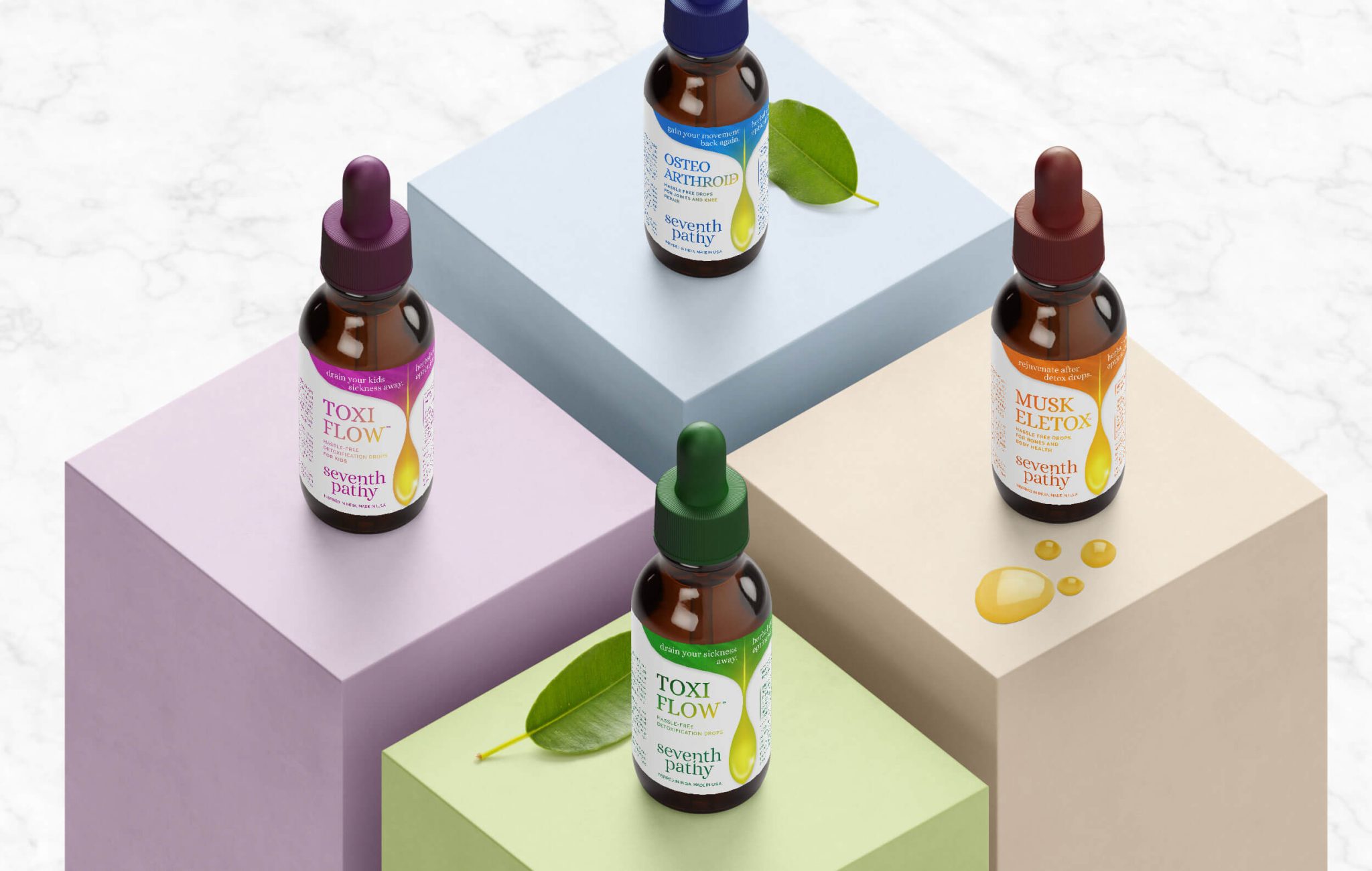
Having plants and its elixir in the brand logo as the visual foundation, I designed them as the main feature on the packaging labels and boxes of their four main products. It served the dual purpose of not only showcasing the essence of the brand but also connecting it to the logo even if the brand logomark couldnt be added on smaller label sizes.
Taking inspiration from the beautiful colors of plants, flowers and herbs within nature, Seventh Pathy’s vibrant colour palette were used against a predominantly white background to symbolise the synergy between the sun and nature. It also helped to differentiate between products while maintaining the brand theme and brief.
THE RESULT
Seventh Pathy’s new rebrand clearly communicates Paul’s vision and brings its value offerings to the forefront. It encapsulates the uniqueness of Seventh Pathy, and stands out among its counterparts, just like the saying, ‘Little drops can truly make a mighty ocean of well-being.’
- Due to the pandemic, the packaging aspect of the project has been placed on hold. I conceptualised and designed the Seventh Pathy packaging to showcase the cohesive visual design language of the approved re-branding that symbolizes its philosophy and connection with the essence of the brand.