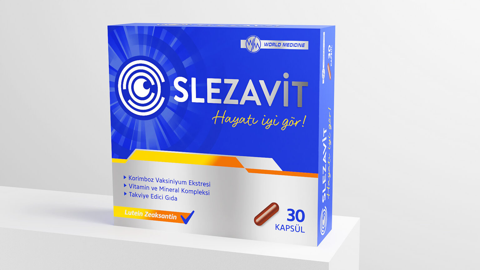
The packaging design renewal we made for the Slezavit product developed by the World Medicine brand for eye health in the health sector.
The different colors and dominant white areas used in the logo did not highlight the corporate identity of the brand. In our renewed design, we used metal to make the logo stronger. Instead of using a single color on the packaging, we have applied the colors that we distinguish between variants more clearly throughout the design.
