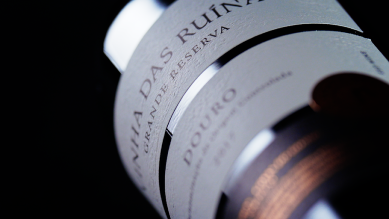
Quinta da Formigosa is located in Chanceleiros do Douro, on the right bank of the Douro River and uniquely framed in the UNESCO classified landscape. Among its references is the Vinha das Ruínas. These wines were developed with the enological consulting of Duplo PR.
The name of the Vinha das Ruínas comes from the ruin of three ancient wine presses that exists in the quinta, next to the river. This geometry inspires the label and its texture; the outline of the ruin of three lagares becomes three rectangles.
The parent brand is Quinta da Formigosa, so a symbol dedicated to the Ruins Vineyard (with an “R”) was created, inspired by the Quinta da Formigosa logo. This symbol is used on the seal and helps us establish a link to the main brand while having its own personality. This seal creates a connection between the mills, which helps to understand the label as a single figure. It is an apparent stamp because it is part of the label, it is a whole label, although the gold finish makes it look like an added element on top.
The rectangles help organize the information on the label, allowing the name of the wine to breathe, and they work with the color of the glass to create a pattern of dark horizontal lines. In addition, the rectangles allow variations to be achieved by the range of the wine, thus distinguishing the Reserva from the Grande Reserva.
Another choice was to include the rough texture of the granite stones, which are part of the ruins, to bring that tactility to the label and contrast with the soft paper.
We kept the color palette minimalist to emphasize the premium quality of the wine and let the texture and readability come to the fore.
The label was produced by VOX Artes Gráficas (Canelas, Porto).
The photos are by Lino Silva and the videos and stills are by André Macedo.


