Colour as Identity: Bisarro Studio for Casa dos Migueis
For Casa dos Migueis, Bisarro Studio designed a label that stands out – not by following Douro conventions, but by breaking away from them.
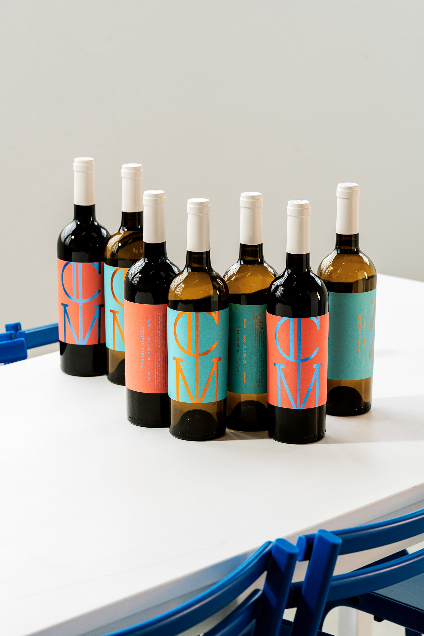
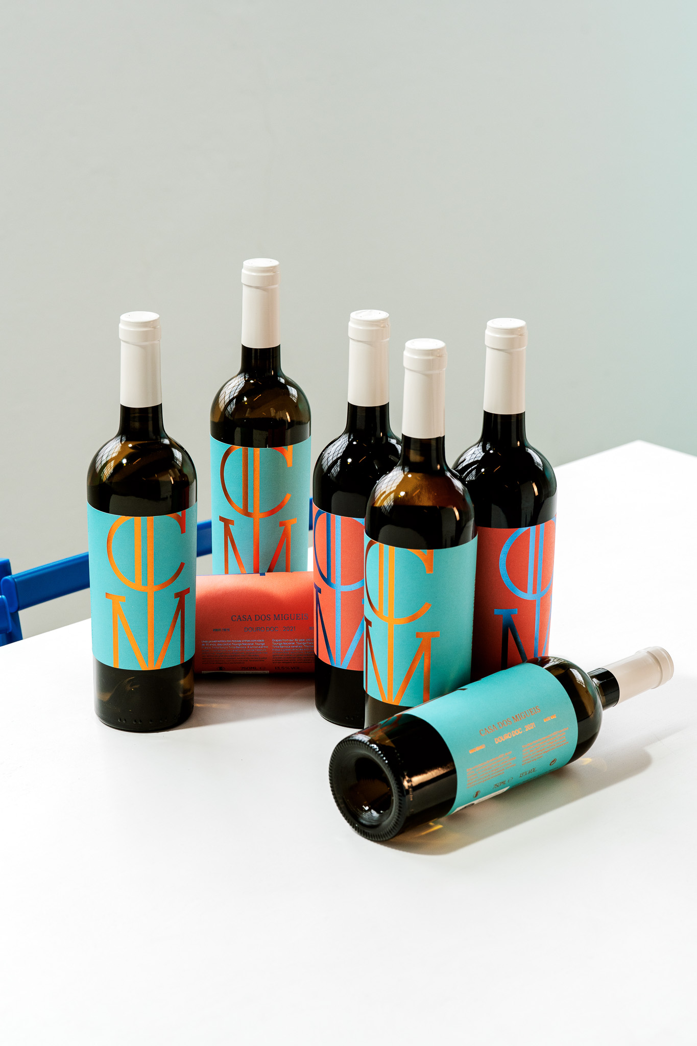
The design uses strong colour blocks and bold typography to create high impact. Coral, turquoise, orange, and blue define the range, giving each bottle a distinct and memorable presence. The brand’s existing CM logo is the central graphic element – oversized, cropped, and placed front and centre.
The materials are simple: matte paper with metallic stamping as the finishing touch. The focus is on clarity and contrast, with metallic stamping adding a modern edge to the design. It’s a youthful take on an existing language, with a fresh, contemporary twist. This is not a nostalgic take on wine design. It’s direct, modern, and built to be seen – reflecting a simple and innovative approach to wine, aligned with a brand that’s always thinking outside the box.