Designing the identity for two 80-year-old Port wines is not a graphic exercise. It is the responsibility of giving form to something that already carries its own historical weight. For Bisarro Studio, the challenge was to translate time into visual language – without noise, without excess, with the restraint that rare objects demand.
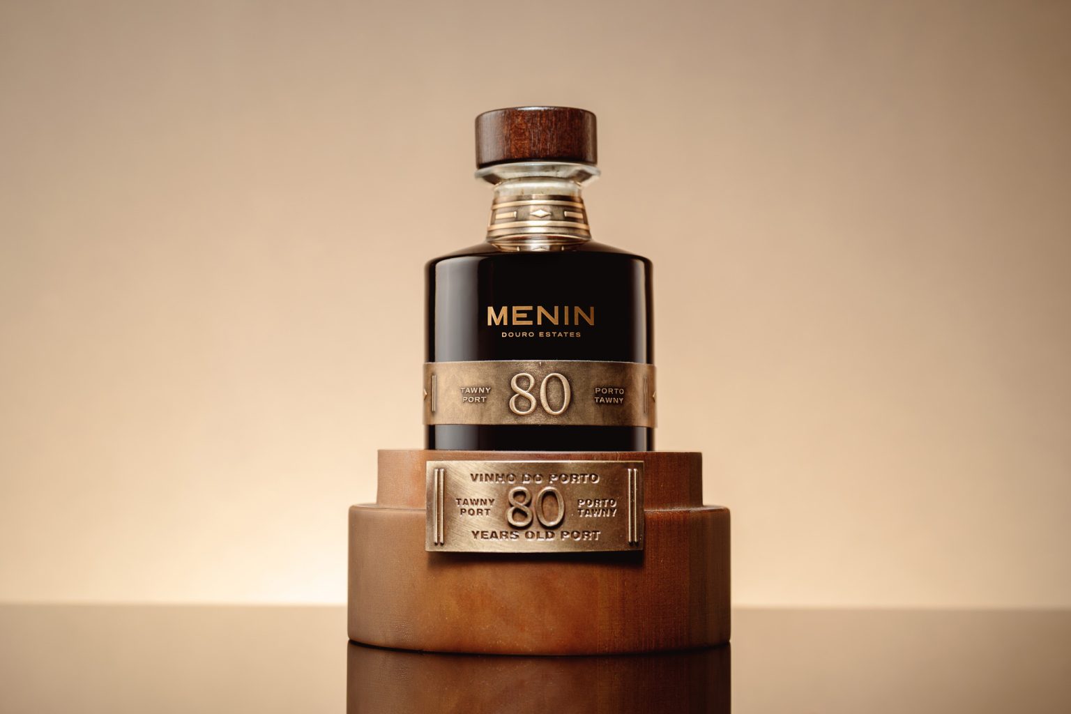
The project’s robustness begins with color. Gold for the Tawny and silver for the White are more than chromatic decisions; they are material metaphors. Gold conveys depth, age and warmth, while silver expresses freshness, clarity and a certain ethereal character. Both finishes are applied with durability in mind, giving the bottles a sense of permanence worthy of their age.
The label, sealed as if protecting a secret, adopts a classic, timeless structure. The typography is assertive and precise, free from unnecessary embellishment. The subtle yet essential embossing adds physical presence – not as decoration, but as a tactile signal of exclusivity. It invites touch before sight, reinforcing the rarity of what it protects.
The visual system was built with the discipline of watchmaking. Balanced lines, careful spacing, and decisions driven by a single question: how do you express eight decades in a graphic object? The answer lies in restraint. In respect for material. In elegance shaped by what is left out rather than added.
The winemaking context strengthens the design’s purpose. Menin Douro Estates selected lots over eight decades old, creating a Tawny and a White that are pieces of Douro heritage. Design’s role is not to overshadow this story, but to elevate it. The metal-clad, sealed bottle and wooden case become contemplative objects, while the label crafted by Bisarro Studio connects tradition, longevity and contemporary precision.
This project is about giving visual identity to time – with the same patience, rigor and intention that age a wine for 80 years.


