Gorun Reserve is the newest addition to the growing portfolio of Gorun Winery.
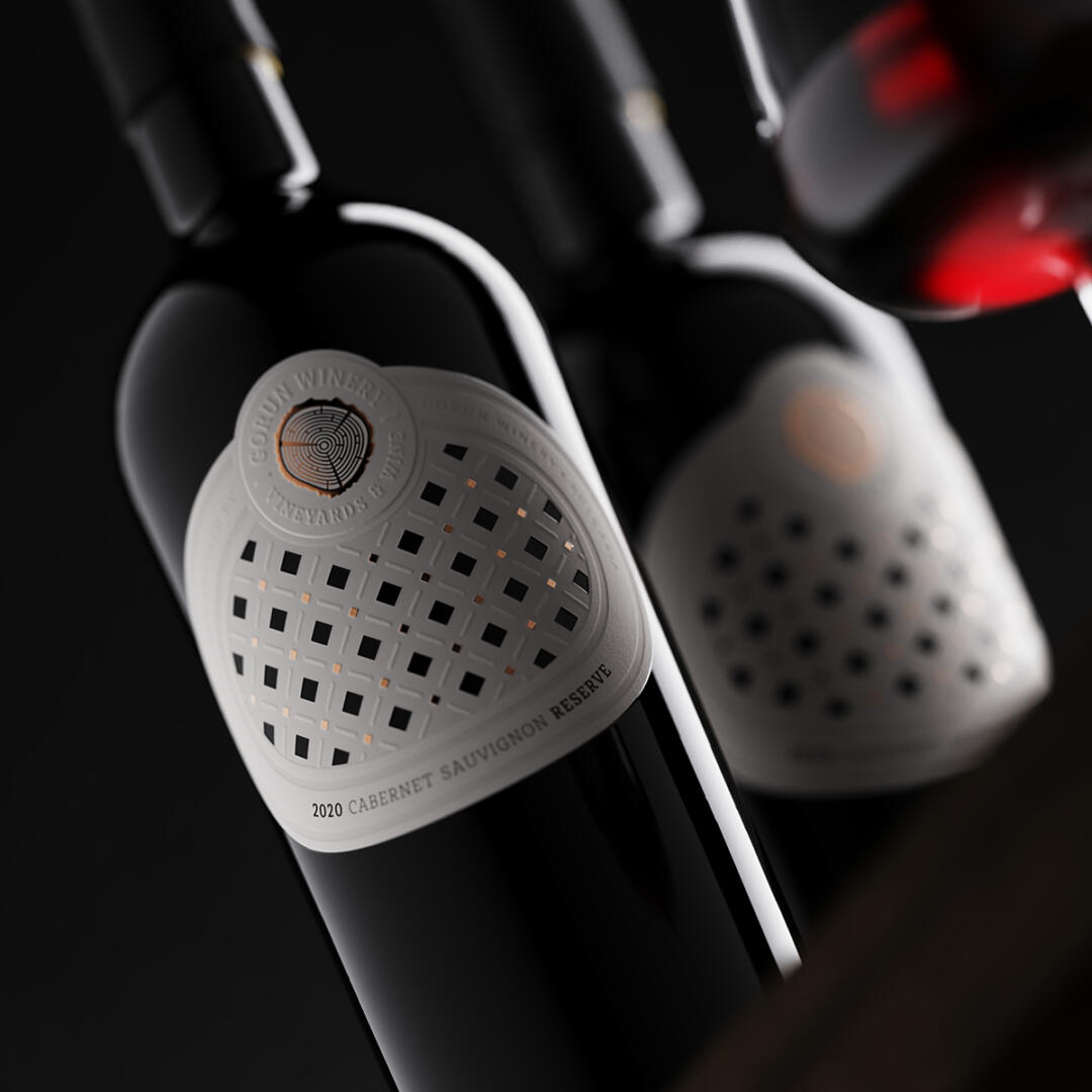
This is a very special design that is a successor to the previous ones I made for the estate wine tier of the winery. What is new here is that I have tried to upgrade the existing vision to a higher and more complex level that reflects the class of these wines. As with the previous Gorun wines, the leading theme is the playful pattern of square holes, which represent my modern vision of Bulgarian traditional embroidery. This pattern is so memorable that I decided to continue using it for these premium wines as well.
What is different in this new design is the shape of the label – I picked a soft oval shape because I wanted to have a more classic and even conservative look to the whole design. At the same time, my choice of paper helped me a lot to show the embroidery theme in a new different way. Larger part of the label surface is debossed so it appears on two different levels. In addition my colleagues at Dagaprint applied an additional smaller round label with the winery logo on top of the main label. This is how we got label over label – a technology that gives a lot of volume inside the structure of the paper.
The text part on this label is heavily embossed, while the logo itself is stamped with domed copper foil. We used a heavier conical Bordeaux style bottle. The tip is finished with a black matte wax that aims to enhance the premium brand feel. The design of the Gorun Reserve is a natural upgrade of their existing vision, which was received extremely well by the audience.
In this design, I used new technologies and carefully selected materials in order to achieve a more serious, more unique and luxurious appearance – one that reflects the class of the wines in the bottle.