“Design is a process for making things right, for shaping what people need.” -Ralph Caplan, American Designer
As American designer Ralph Caplan once suggested, Paper Tube Co. Senior Graphic Designer Ricardo Gomez works to make things right—listening to, interpreting, and shaping our customers’ visions into the perfect expression of their brand. According to Ricardo, “When a new client comes to Paper Tube Co, our job is to assess their needs and offer professional experience and support to develop package design they love. It’s an intuitive process and we know we have done our job when the customer feels confident that their packaging is just right.”
The Back Story
Gina Payne came to us with a deeply spiritual vision. Her Bathtisma line of essential oil-infused bath soaks was created to inspire, guide, and motivate people to incorporate ritual bathing and water meditation into their daily lives.
After years of battling chronic anxiety and depression, Gina found solace in the meditative bathing ritual she developed to heal. “My ritual unfolded as I learned to combine my daily meditation practice with the peace and calm I found in the tub,” she explains. “I would energetically cleanse my space, prepare my bath, immerse myself, and meditate, soaking in the positive, healing energy of the oils, water, and Divine presence. It became my own sacred baptism, (or Bathtism, if you will) a place to wash away negativity and emerge spiritually, emotionally, and physically regenerated.”
“Bathtisma was birthed out of my own journey toward self-healing and the desire to help wash away the world’s negative energies; one person at a time.” – Gina Payne, Founder of Bathtisma
The Challenge
Gina knew her customers would expect her product to be packaged sustainably, but she didn’t want to compromise on the elegant aesthetic of the brand. “As a direct-to-consumer online retailer, it was also important for the packaging to be sturdy, but light enough to keep shipping costs in check,” she explained. “Early on, I wanted to go with dark glass, to give more of an apothecary look, but it occurred to me that it wasn’t exactly easy to ship. As soon as I began researching lighter, more eco-friendly options, I landed on The Paper Tube Co.”
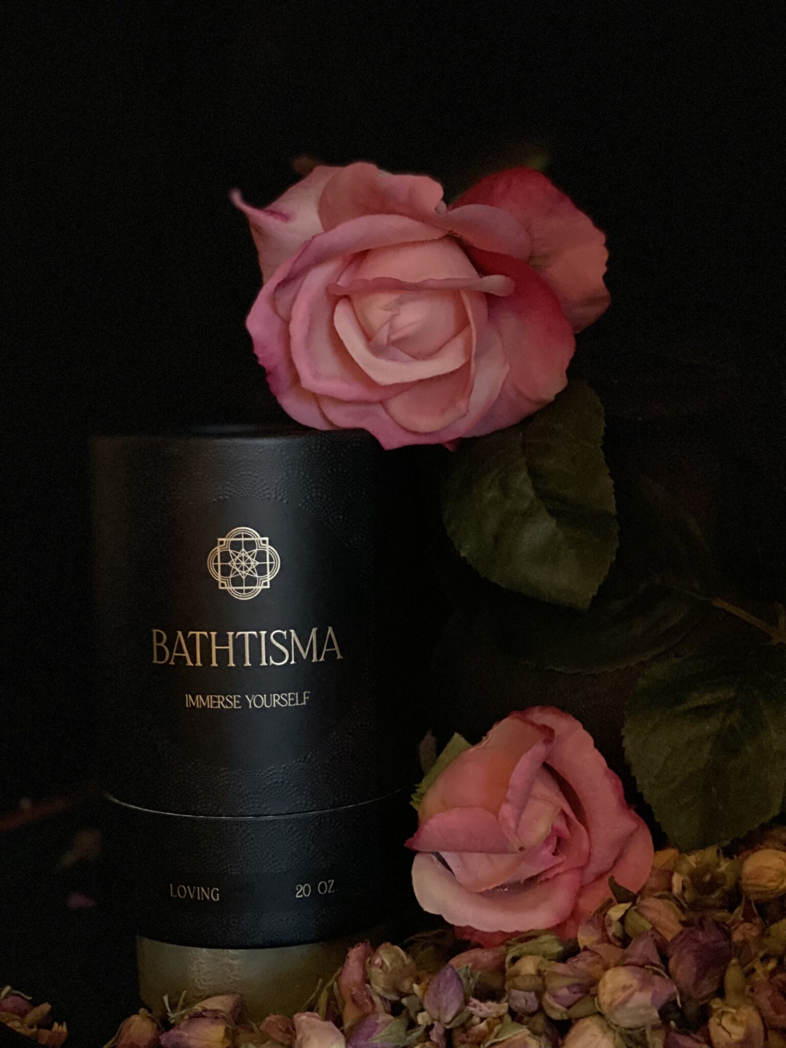
With such a deeply personal origin story, Ricardo’s challenge was to create a package design that honored the spiritual nature of the brand without confusing or overwhelming customers. As a lifestyle brand marketing to spiritual seekers who embrace alternative and holistic healing modalities, the final design needed to resonate on a metaphysical level. Gina explains, “Our branding is mysterious, ethereal, captivating, and moody, reminiscent of sacred geometry. An overlap in the water drop shape in the logo creates a faceted eye, referring to the idea of awakening, and the outer edge creates a reference to ripples in the water.”
The sincerity of the brand meant it would be essential that the design feel accessible and not at all overpowering. “The biggest challenge with this project was finding a way to express the serious tone Gina was looking for in a way that wouldn’t hinder curiosity,” says Ricardo. “The sacred symbolism of the logo is intense, so we lightened it up a bit with the repeating shell pattern which is simpler and more inviting.”
The design process allowed us to work Gina’s initial ideas in a direction that would ensure the final design was just right. At each stage, she was presented with concepts and her feedback was integrated until it was clear the true expression of the brand was achieved. “It was so important that we didn’t overdo it, we wanted to keep the tone ethereal and mysterious without being intimidating,” says Ricardo. In addition to the branding on the exterior, the whole unboxing experience would also need to land with the customer. “Simple, inviting, and unexpected are what we were shooting for,” Ricardo recalls. With great attention to detail, the final result was just what Gina had in mind.
The Solution
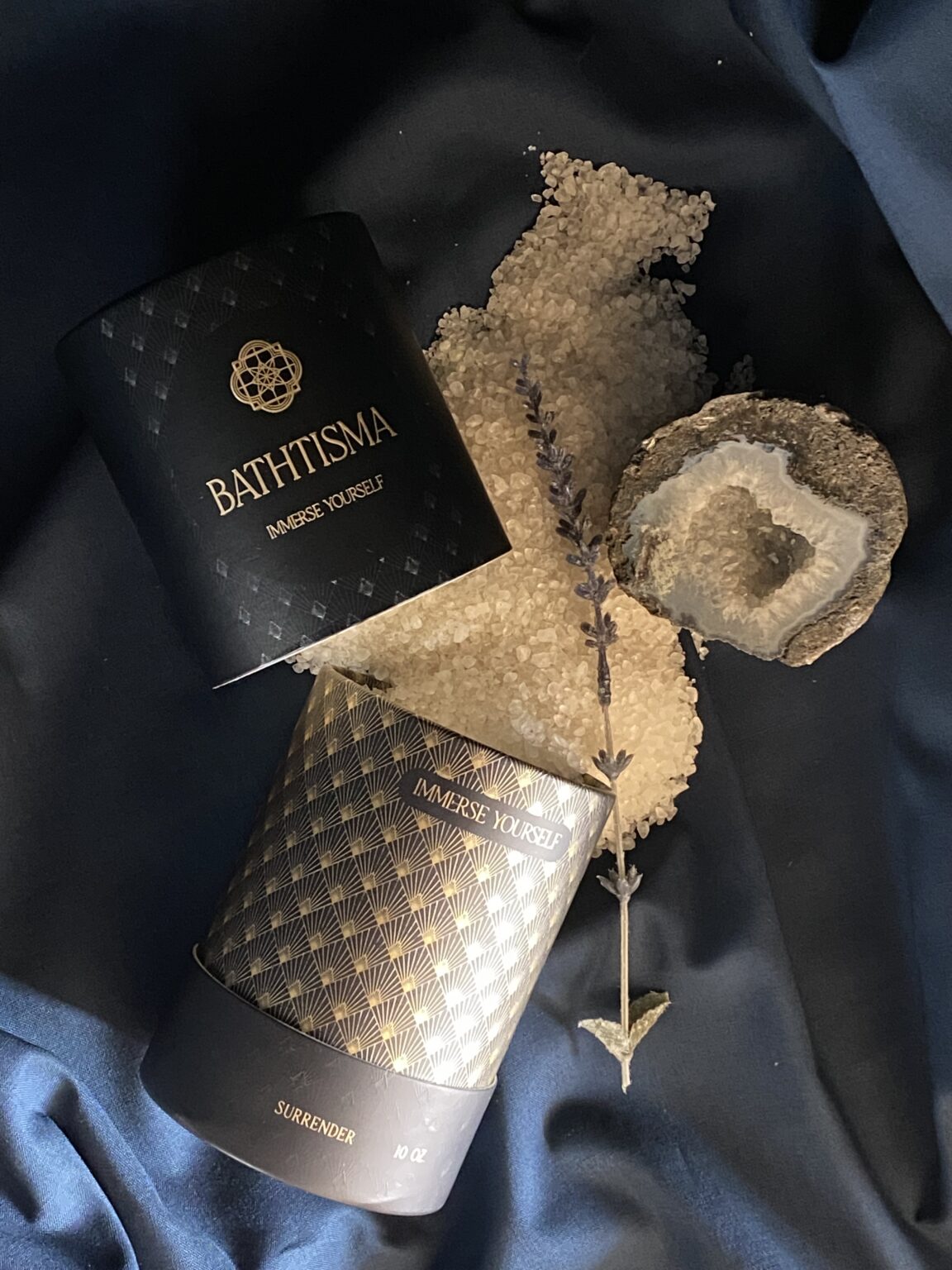
Bathtisma tubes are indeed unexpected. Using a long cap and a short tube makes the whole package an experience. The cap doesn’t just pop off, it’s drawn out—slow, anticipatory, almost sensual, which is right on brand according to Gina. “The foil and tagline printed on the interior of the tube are quite unexpected. The whole thing is just delightful.”
“Ultimately I chose Paper Tube Co. because of the sustainability, design options, and in-house branding services,” says Gina with a smile. “The genuine care and service I received from Packaging Consultant Nicole and Ricardo really made all the difference. In my opinion, people and relationships matter so much when choosing who to do business with.”
More than Paper Tubes
At The Paper Tube Co., we’re thinking beyond the tube. Although many customers come to us with branding firmly in place and mood boards and style guides to back them up, we also offer complete design services that go far beyond packaging. Our new Print Kit makes it easy to bring concepts to the table with the goal of developing a visual brand in tandem with custom packaging that is the true expression of your business identity.
“From the first conversation, Nicole was great and continues to be. She is professional, responsive, and helpful. She also seems genuinely interested in what I am doing. Nicole has remained involved in every aspect of the design process, which is appreciated. Ricardo is a talented designer who truly listened to what I wanted to achieve and delivered beautiful solutions. He answered my questions and explored the options that I requested. Both Nicole and Ricardo explained the processes, managed my expectations, and followed up on all my comments and questions which made the process enjoyable.” –Gina Payne, Founder of Bathtisma