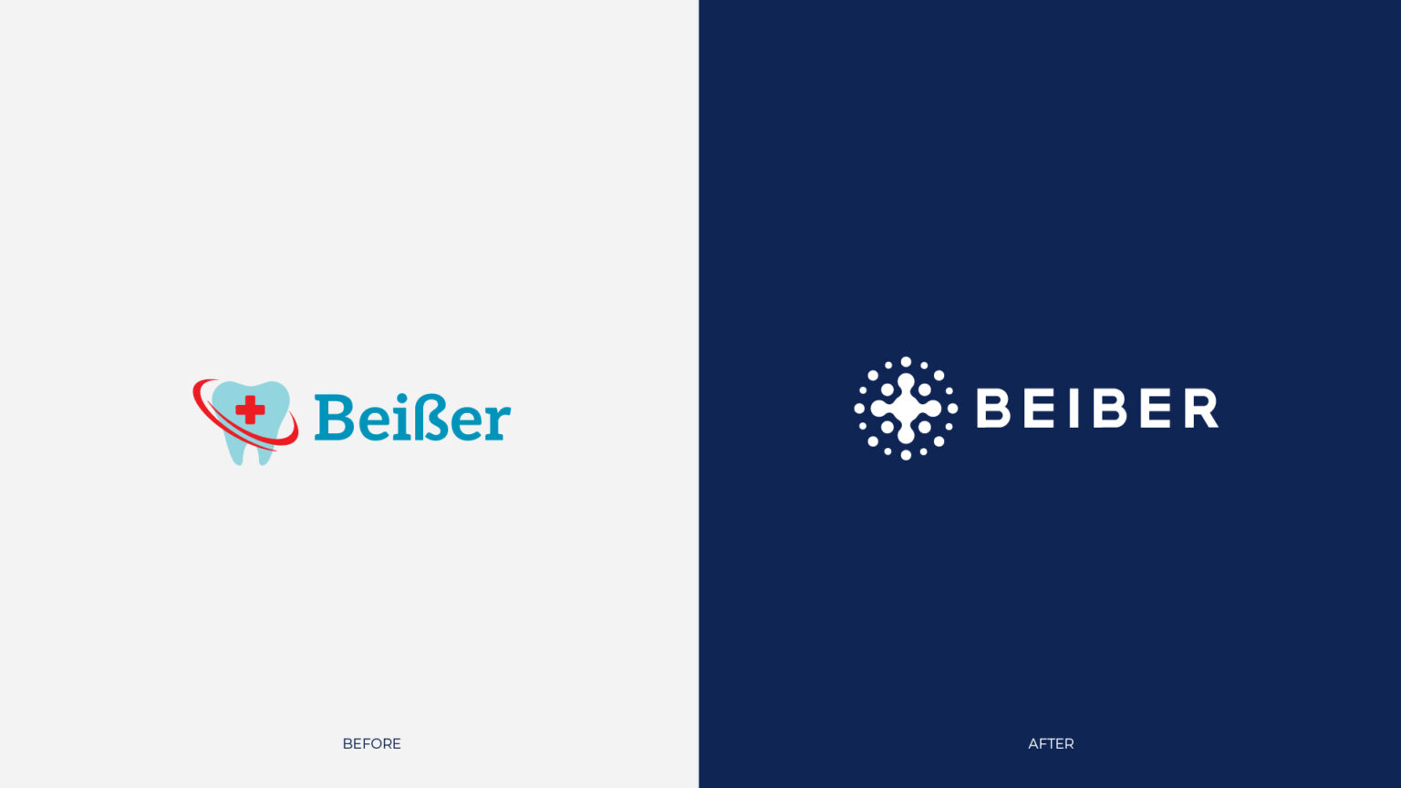
The brand was originally called Beißer, and was pitched as a product of “German” manufacture.
After some research, we found out that most of the audience does not read the double German letter S, and the name looks exactly like Beiber to them.
Since the brand had already been sold relatively successfully for several months and was gaining a relatively loyal audience due to the quality of its products, we suggested leaving the perceived name instead of the one originally broadcast.
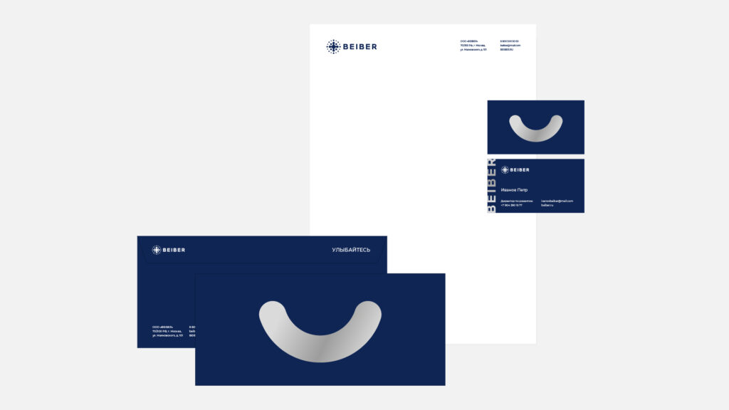
In terms of visual perception, our goal was to create a sense of a company that was technologically and professionally developed, yet very friendly. The logo now symbolically depicts the company’s first product, a top view of the toothbrush bristles.
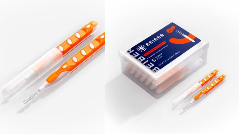
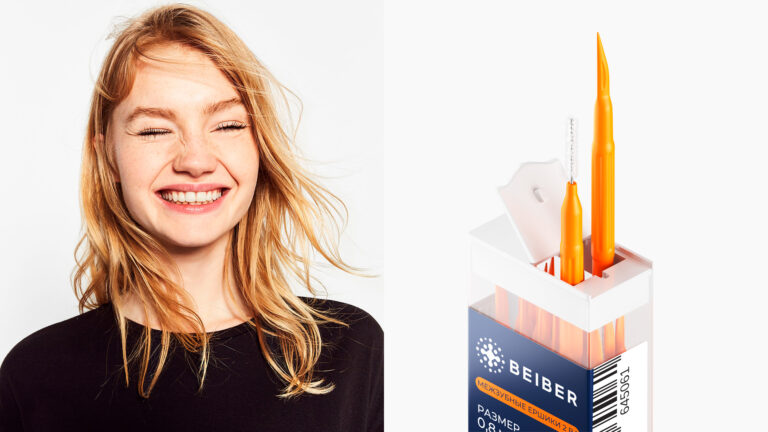
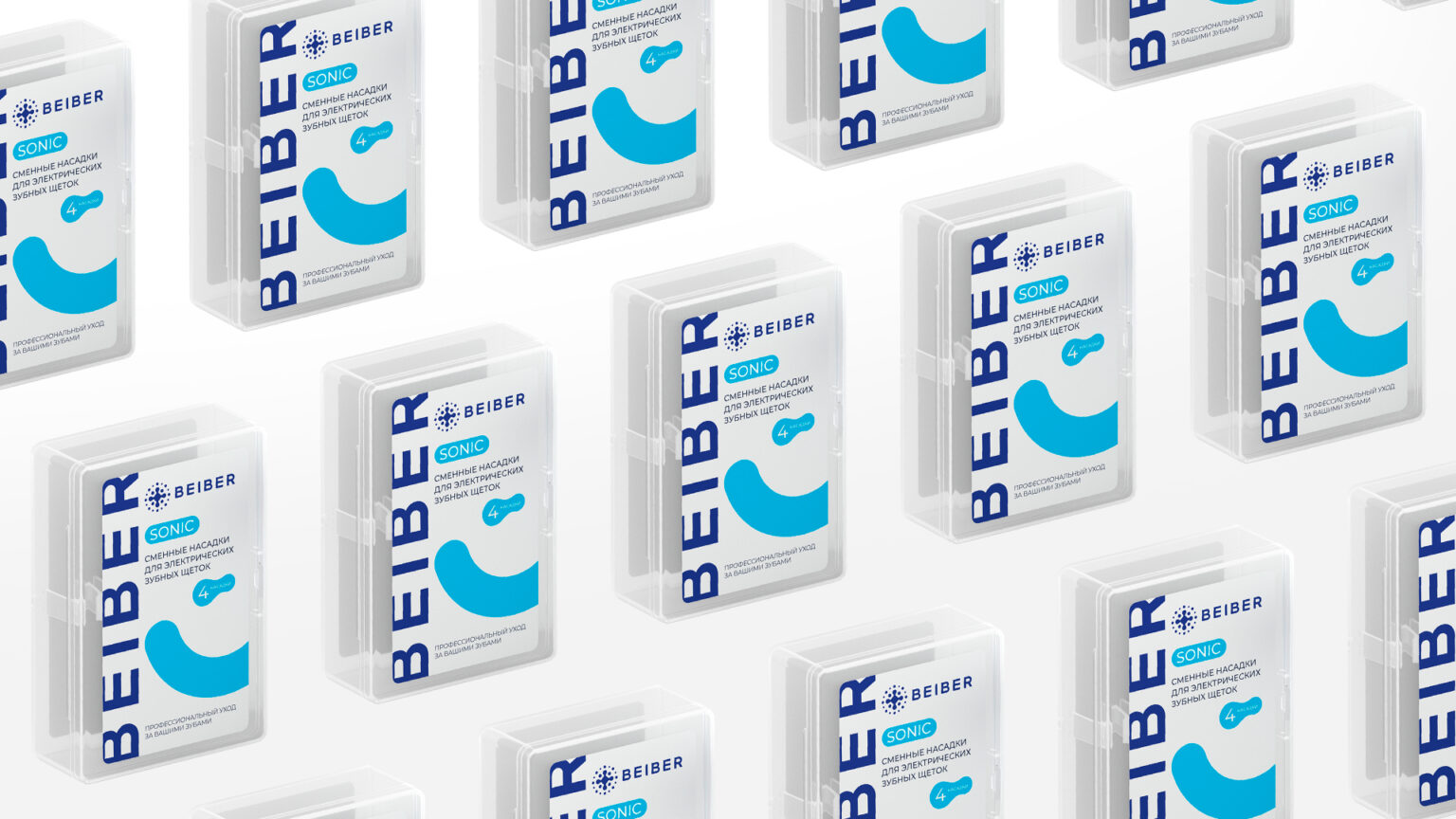
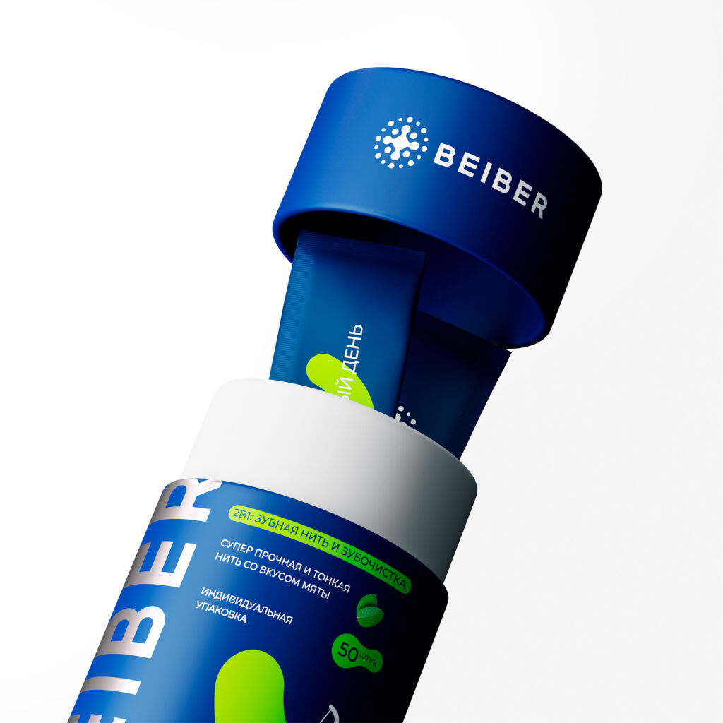
We also prepared content for the marketplace, centered on medically sterile prototypes of the products themselves, surrounded by friendly branded graphics.