Wistery: A Bold Identity for a New Beauty Brand
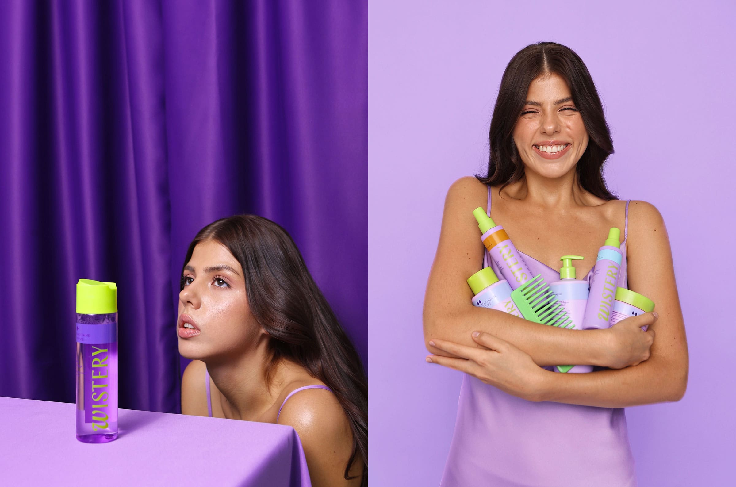
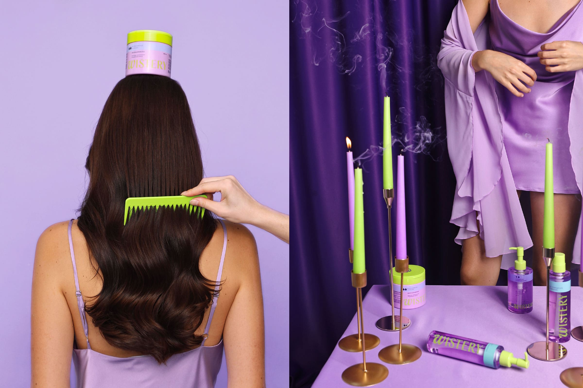
Wistery is not just another skincare brand. It’s a carefully crafted identity that fuses mystery, self-expression, and modern femininity. The name itself combines woman and mystery, reflecting the brand’s ethos of empowerment through self-care.
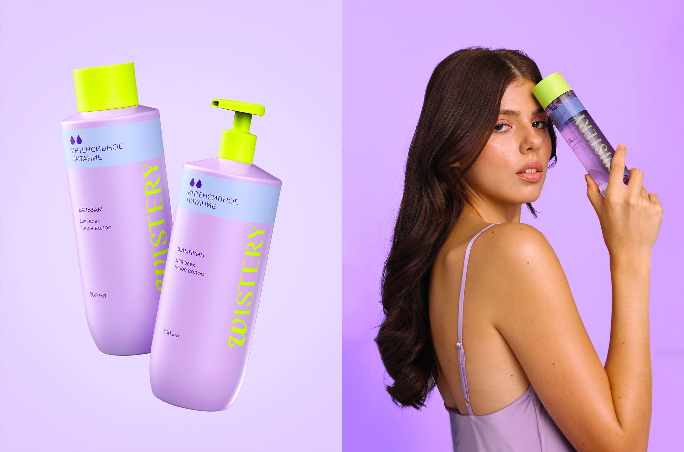
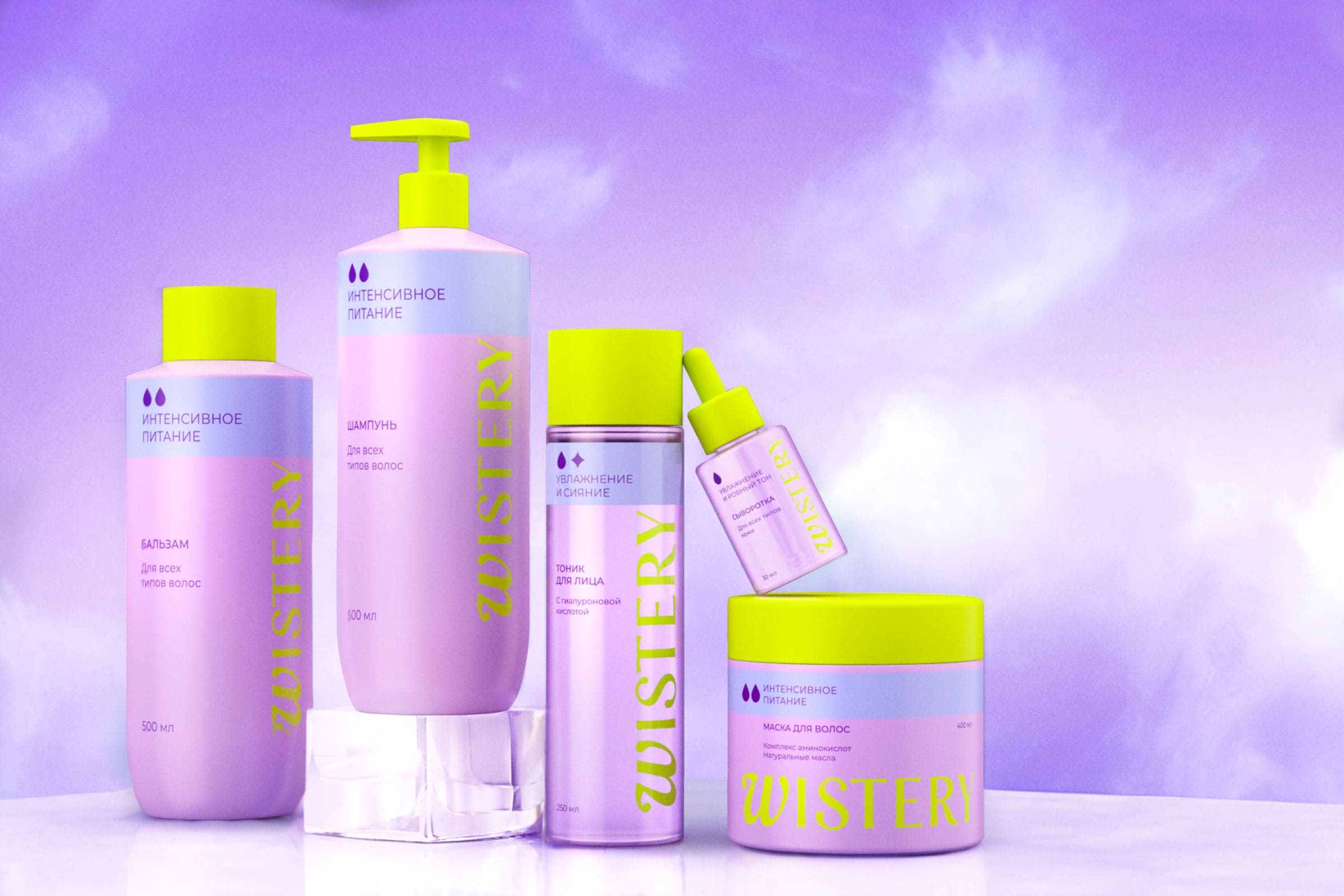
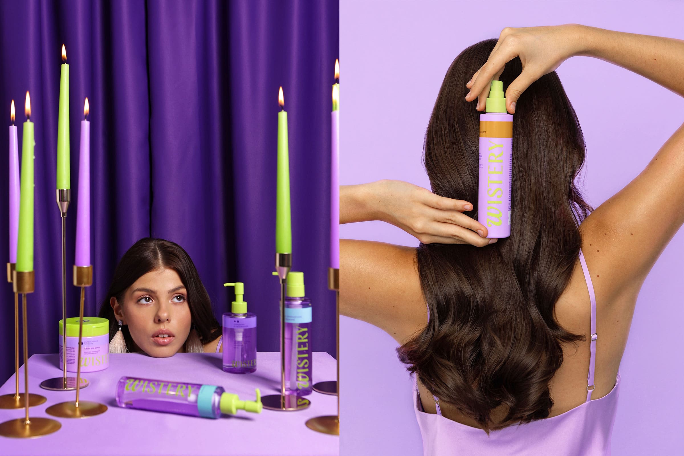
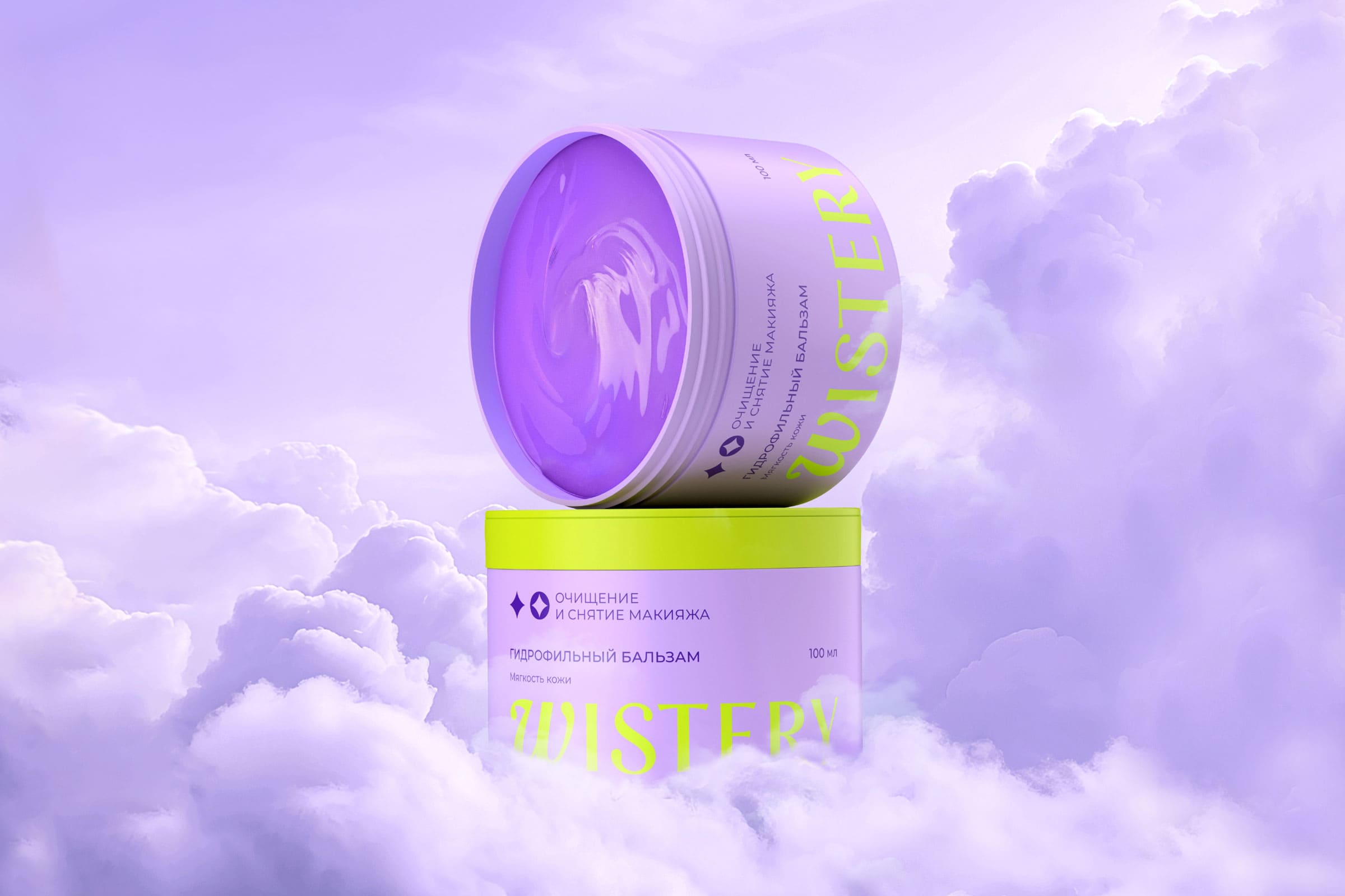
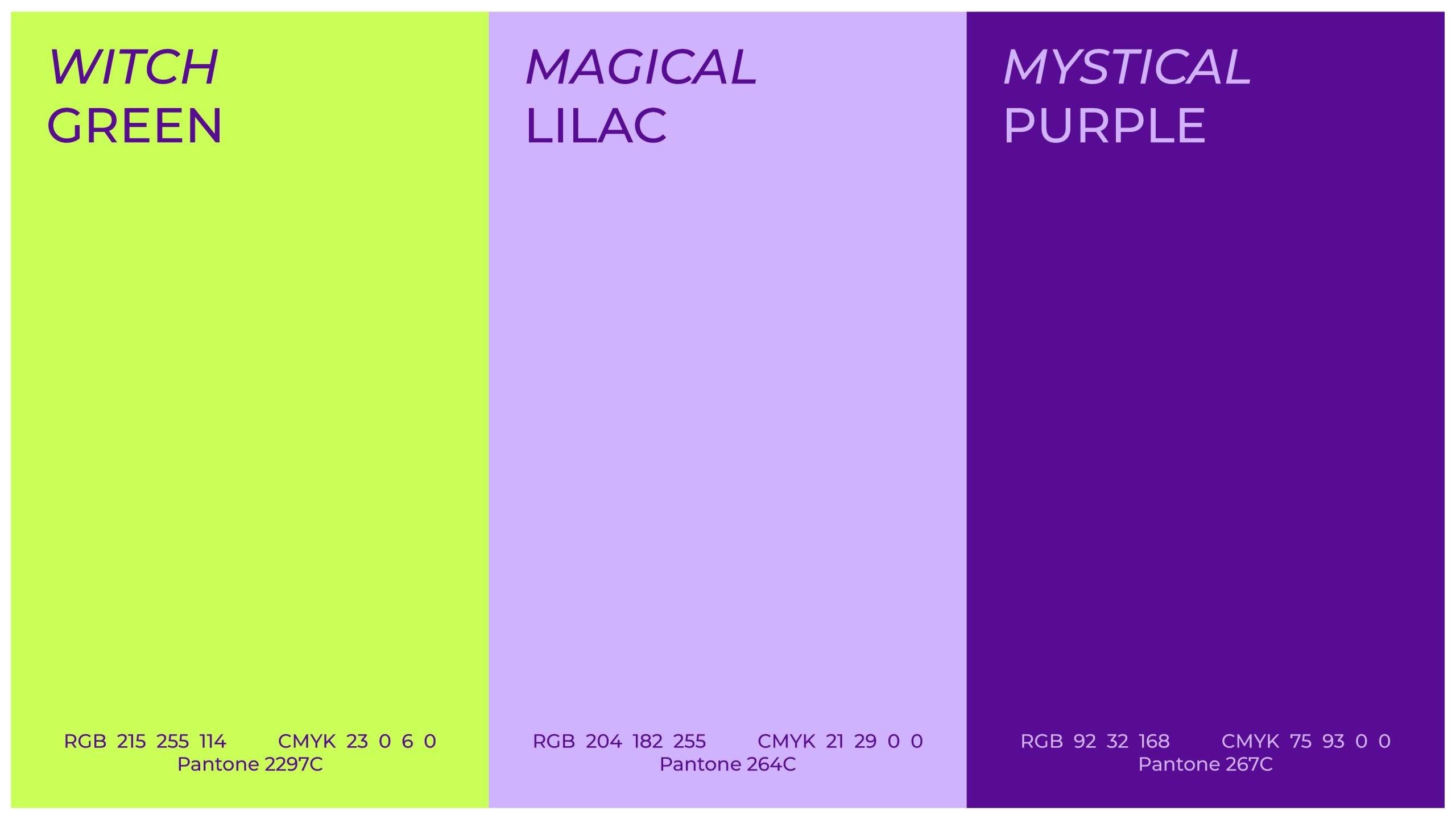
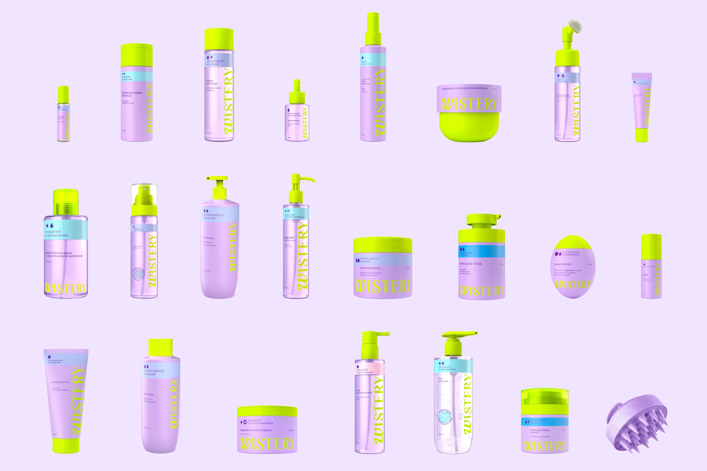
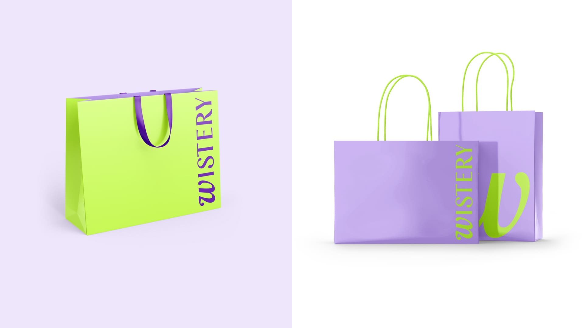
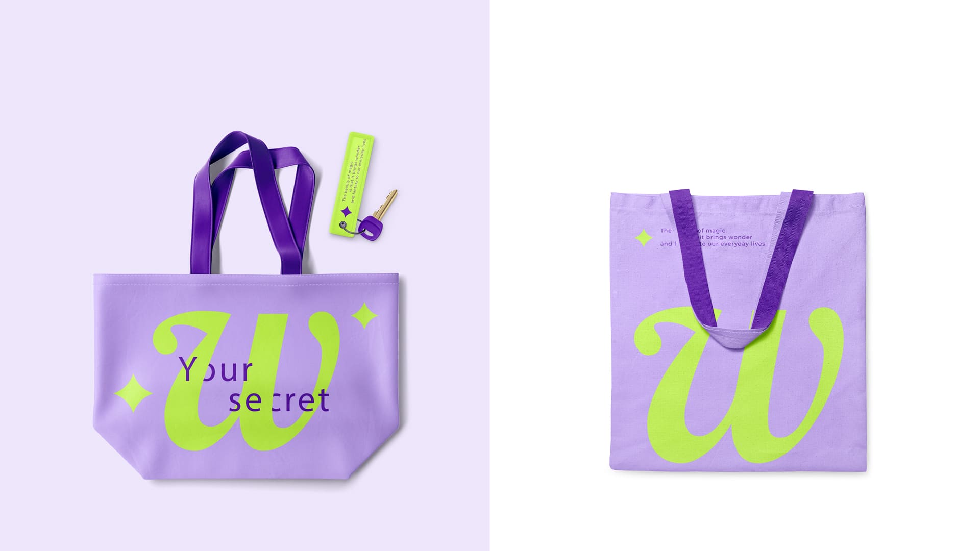
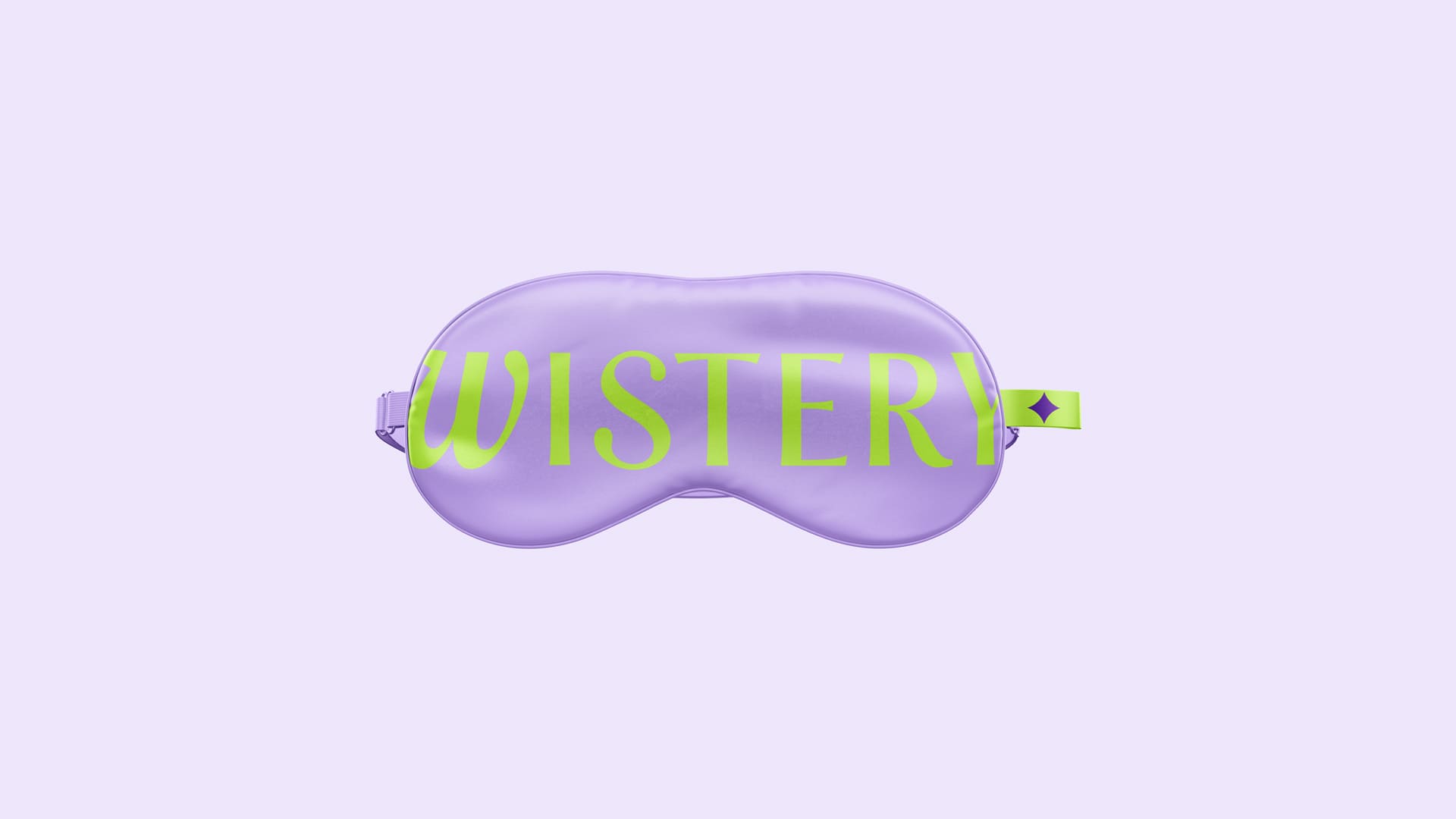
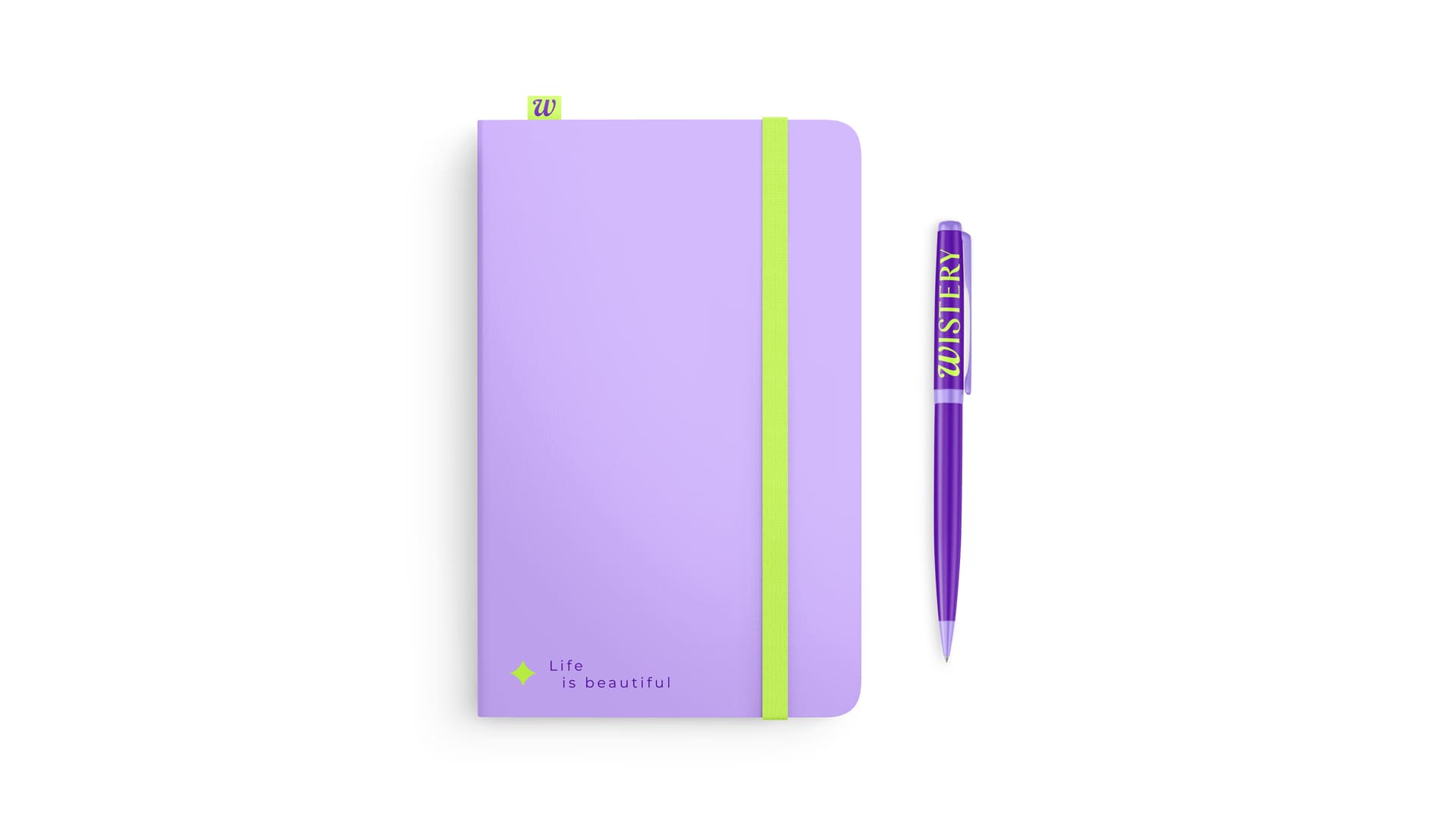
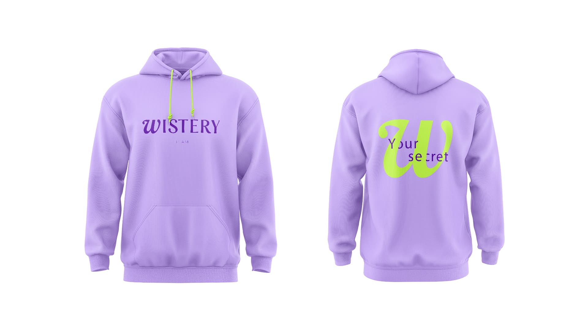
The packaging system is built on a modular grid, creating seamless visual consistency across a large SKU range. The color palette plays a crucial role in establishing Wistery’s presence. A mix of soft lavender & striking neon accents creates a high-contrast look that pops both online and in-store. This combination not only enhances shelf impact but also resonates with the brand’s core audience – those who seek unique, aesthetic-driven self-care products.
With over 30+ products launching simultaneously, maintaining a clear & recognizable identity was a top priority.
Beyond visuals, Wistery is built on a comprehensive branding platform, covering everything from strategic positioning to art direction & marketing assets. The goal? A beauty brand that not only looks striking but also resonates deeply with its consumers.
Already live on major marketplaces, Wistery is entering L’Etoile & Golden Apple, two of the country’s leading beauty chains. The perfect blend of strategy & design!
#branding #beautybranding #packagingdesign #graphicdesign #skincare #modularidentity #retailready