ABOUT
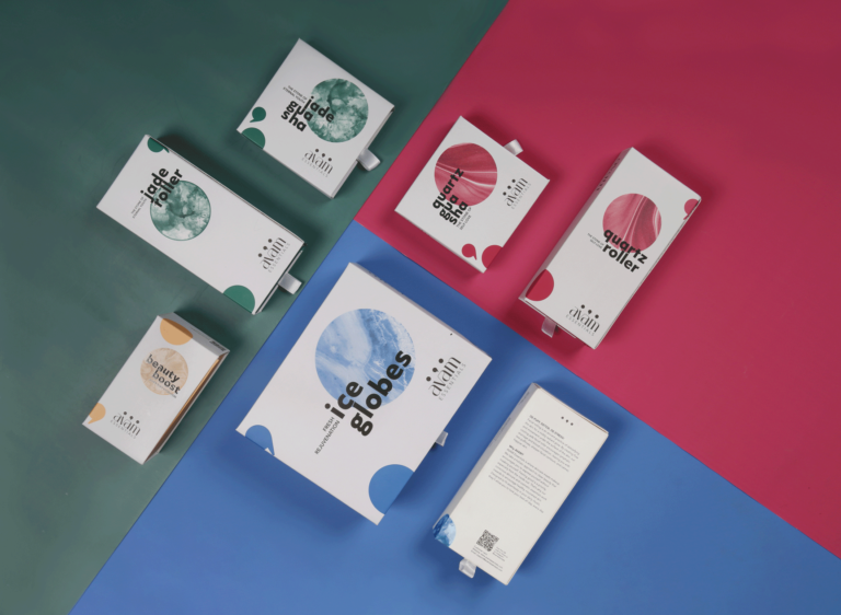
Avam Essentials is a beauty and skincare brand focusing on bridging the gap between Indian skincare and makeup. Split into three ranges, we worked on modifying their brand, and building their overall visual identity. The range we focus on here contains the pre makeup products – Rollers, Gua Shas, Ice Globes and Serums. Amidst a market full of illustrated packaging, our aim was to evoke more than one sense at the outermost layer.
SOLUTION
The brand had 3 product ranges – pre makeup care, makeup and post make up care. We associated each range with a full stop, comma and full stop respectively. The full stop denoted the pause, the comma denoted the applause! This idea trickled into the visual identity overall, and circles became the main element around which we built the brand extensions.
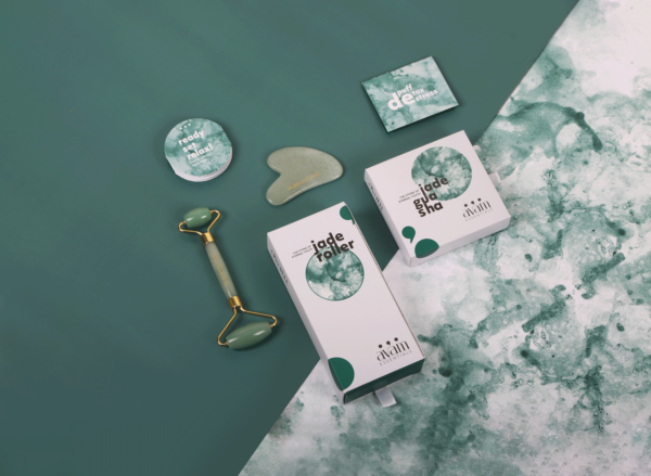
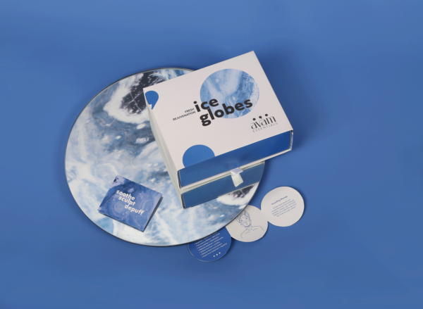
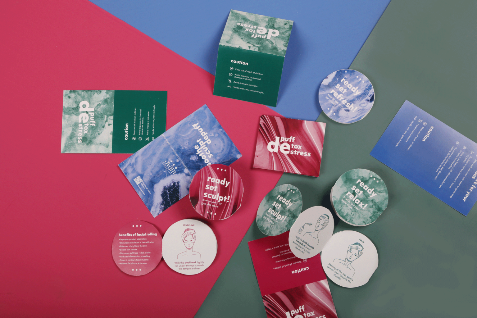
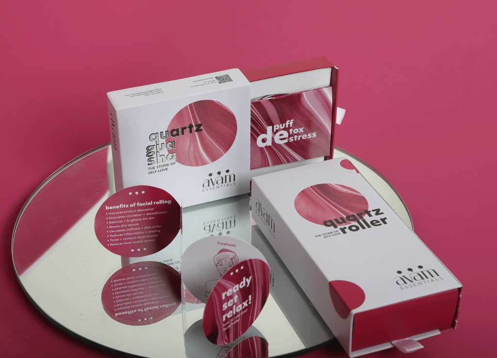
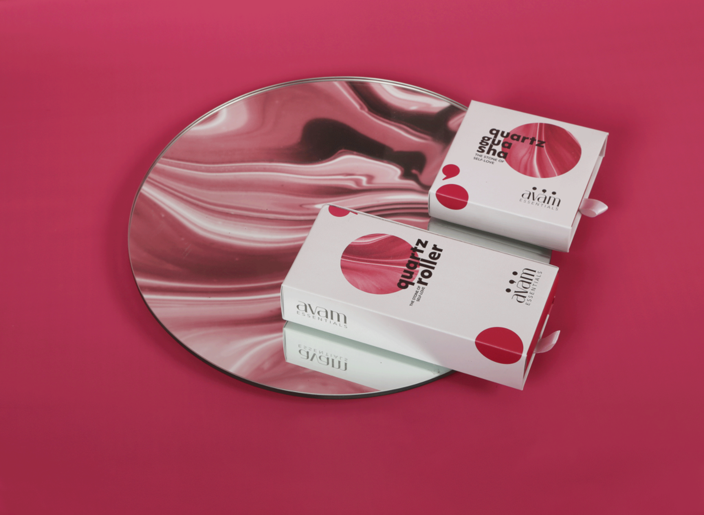
The circle became the main focal point on the packaging: instruction booklets were made circular, circle mirrors were used for reflections and photoshoots, and circular shapes were used as a packaging element.
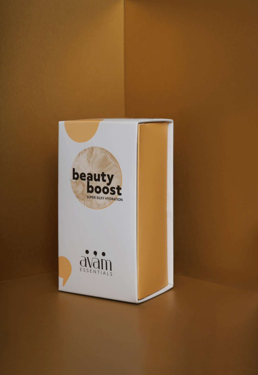
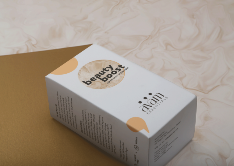
One of the recurring aspects of the Avam Pre-makeup range were the semi-precious stones used for each product. Stones are very tactile materials, and we wanted to show this tactility in a visual way. Our idea behind textures? Once you look at them, you should get a sense of how the stone will feel – in your hand, on your skin without actually touching it.
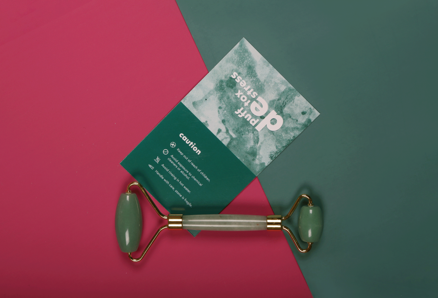
Taking this idea of visual tactility, we expanded the textures into all aspects of the brand: to the packaging, user manual, care card and kept the identity of each stone intact across all products that were made from it.
RESULT
All of this resulted in packaging that conveys the tactility of the product without using product images. Further emphasising the point of tactile surfaces, we added print effects that give the consumer a further heightened packaging experience. Embossed product names with texture UV coating for textured elements of the branding tied the packaging together.
