CONCEPT
“What do we hope for in the days before Tet, after such a tragic year?”
This is the main concern Navigator has after receiving a brief “2023 Gift box” from the Do Gia Lacquer brand. At such special occasions, “luck” includes not only wealth and status, but also the beauty of reunion. When there are too many losses, there is nothing “luckier” than being beside our loved ones, seeing them safe and healthy, sharing and having the opportunity to better understand them.Do Gia is a lacquer brand that has been passed down through three generations: grandparents, parents, and now Thao, the heir – a youngster who hopes to bring traditional values in Vietnamese culture to younger generations in a friendlier and more modern way. As a result, “Reunion dream” is the answer to the preceding question. Navigator hopes that Do Gia Tet Gift Box evokes a journey of inheritance and continuity through graphic, color, material, and structure factors.
PATTERN & COLOR
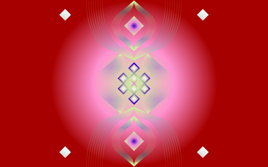
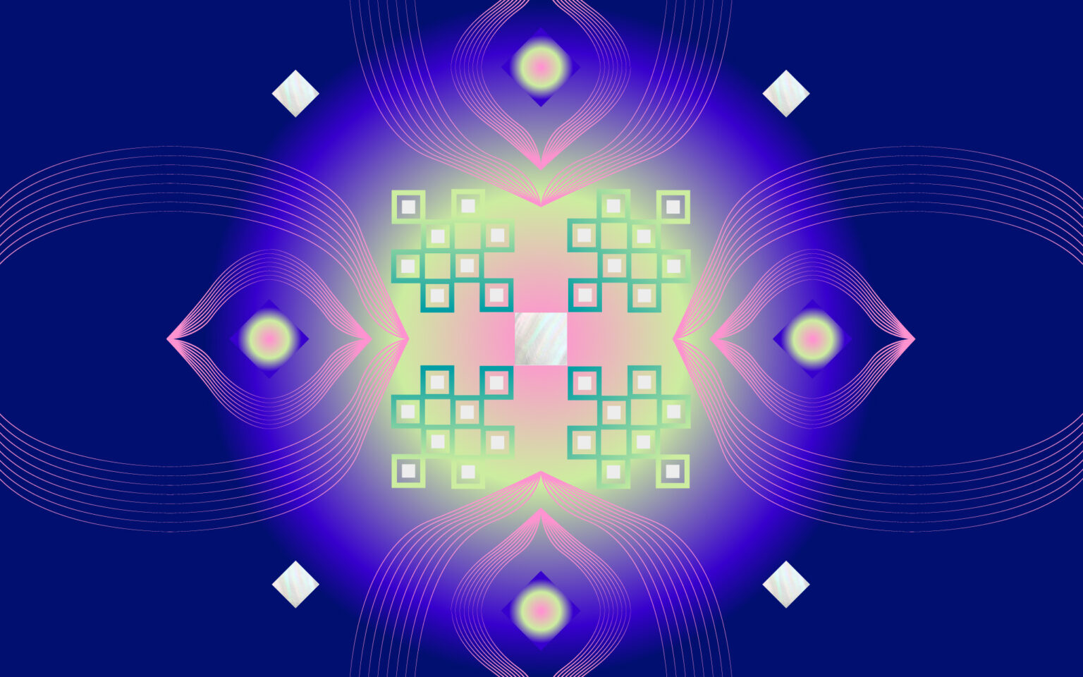
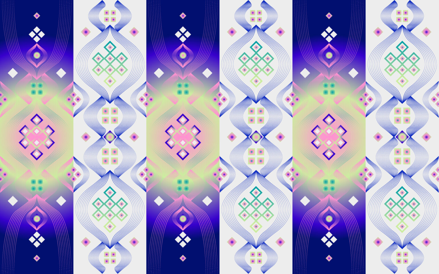
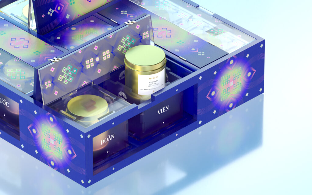
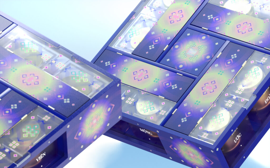
Concentric patterns are usually associated with reunion and good fortune in East Asian culture. We put “concentric” in a younger context to create a new sense of traditional patterns, which is built from geometric elements, a gradient method, and a neon pallet covered in lacquer. Overall, we have a path that makes it easier and more exciting for young people to approach traditional values.
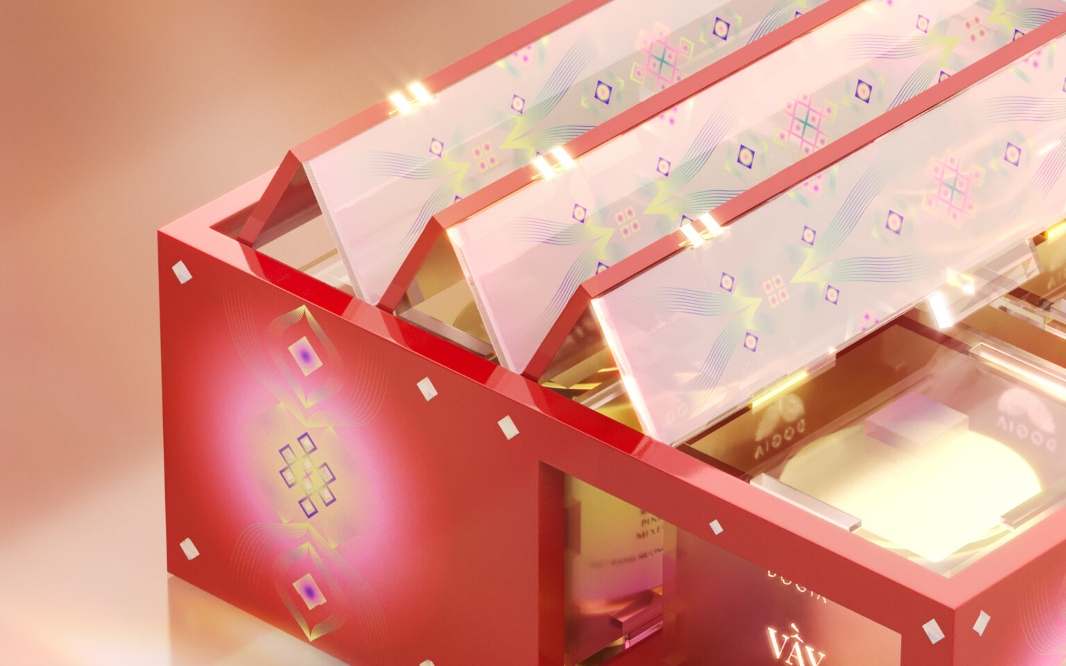
STRUCTURE & MATERIAL
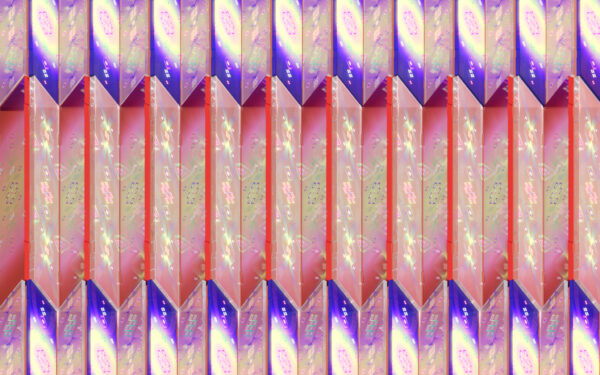
“Dream” in “Reunion dream” is approached by a vibrant palette with smooth and foggy gradient treatment, similar to “spring dream,” and “dream” can be understood as Kanawa Tsugi joint when it comes to structure. This is a wood-joining method based on Yin-Yang space for directly transferring from one wood bar to another without the use of intermediaries. In design, Yin-Yang properties represent condense-hollow details in packaging as well as two materials, lacquer and mica.The cover’s structure is based on the structure of a folding screen – a room divider in Asian culture. Lacquer with traditional values blends with youthful and open-minded mica material in this section. Because of the stark contrast between the two materials, when the pieces are arranged as if opening the box, details on opposing sides will reflect reciprocally and intertwine, implying one’s willingness to open up and share feelings with their partners.