Project information
Ben Khufu is a new brand of non-alcoholic beer from Alexandria, Egypt. I have always had a passion for getting into packaging design, as a correct strategy and a specific theme characterize it. It also requires several skills and reflects the designer’s vision and tools. This project is considered a case study for developing my skills in packaging design.
Challenge
Barley market in Egypt Most products cannot balance the taste of barley with added flavors, while competitors rely on flavors and lower quality barley as main ingredients. Regarding design, businessmen in Egypt pay less attention to a brand identity built on the right strategy. However, this is a challenge in itself on the part of the brand strategy as a key to differentiating the value from the competition.
Solution
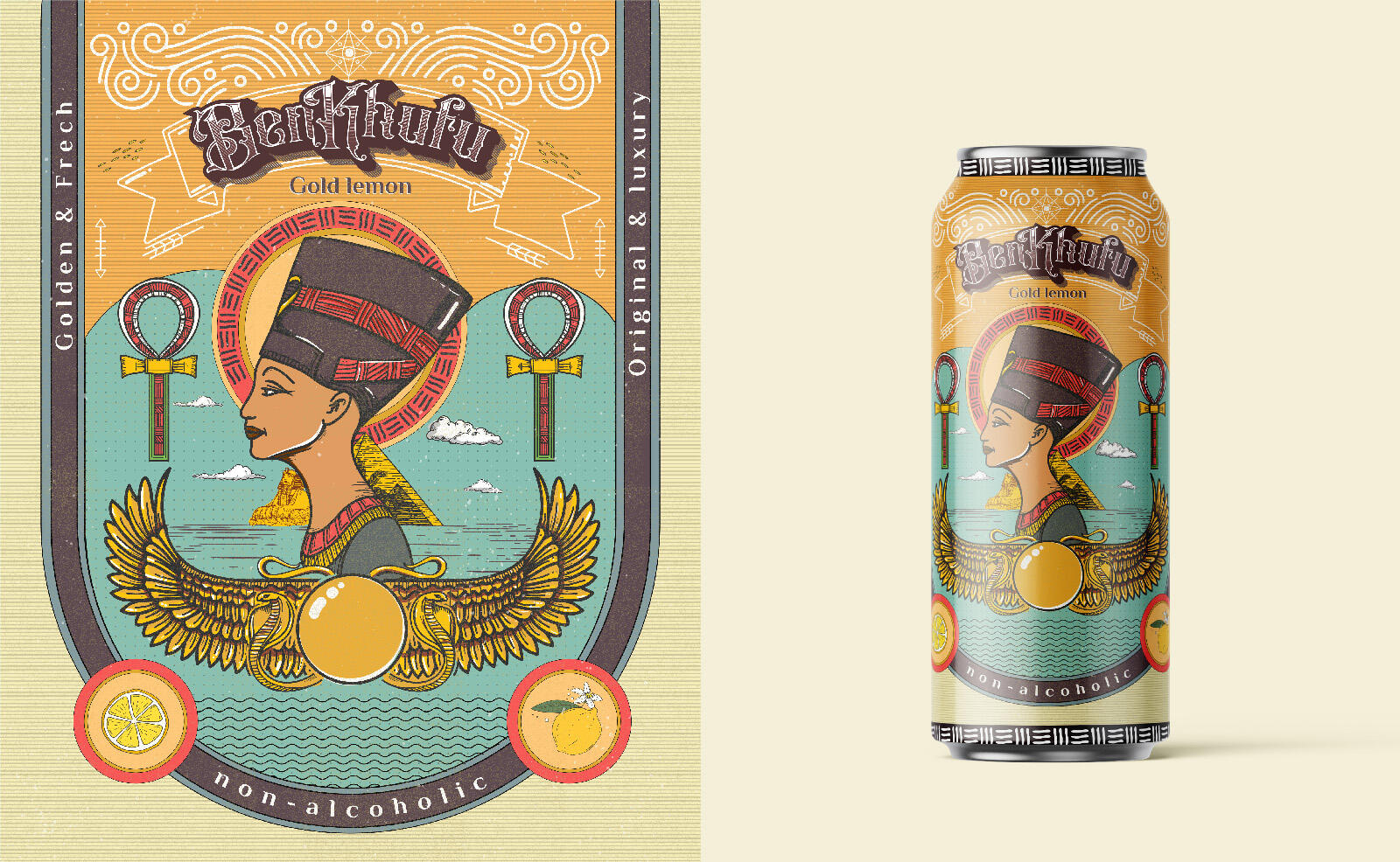
This brand needed a name that was simple, concise, and easy to remember. we created the brand name Ben Khufu, one of the ancient Pharaonic kings who built the Great Pyramid. Of course, Shimmer needs a visual identity as proof of his existence.
We chose the text tag as the Ben Khufu logo. Since it signifies the barley’s strength, majesty, and authenticity, there is no need to give fake codes and hide Ben Khufu’s identity. We chose bold heritage as the font for Ben Khufu, this script sign is unique with bold, subtle angles on each of the letters.
In packaging design, we try to step aside from the malt as the basis for packaging design ideas. Unlike most competitors’ barley designs, we design an illustration of characters from ancient pharaonic cultures who can try new things without excluding the original. Apart from being an identity and design on the packaging, this illustration is also a symbol associated with the brand. It is out of the ordinary, unique, and eye-catching.