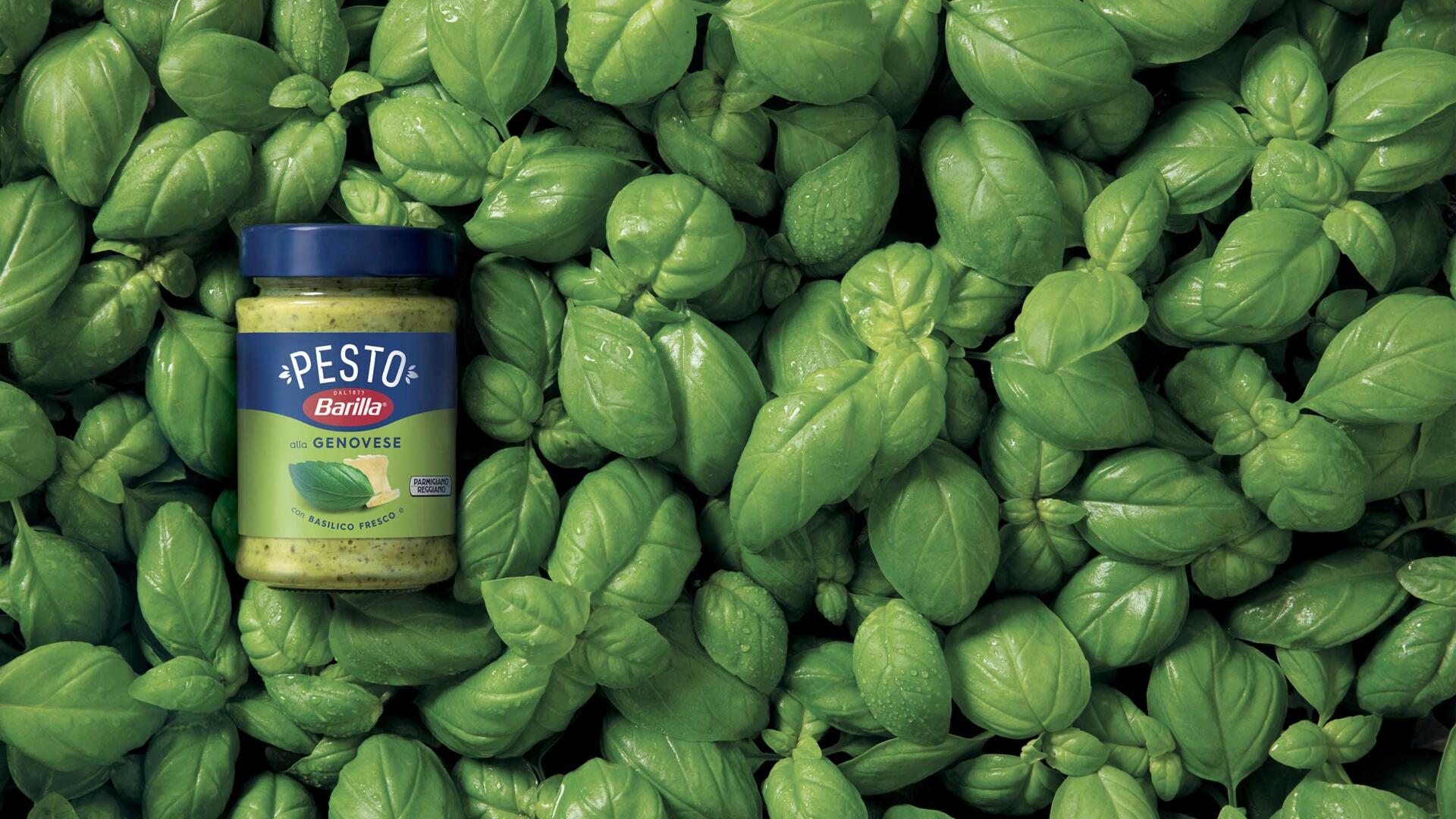
The new global identity for the Barilla pesto range was designed with the ambition of creating a striking, timeless icon that embodies the Italian identity. A proprietary visual identity, 14 variants, a range destined to become a perennial favourite.
This grand ambition began to take shape with the new logo, carrying forward the brand goal of becoming synonymous with this growing category. The sans serif font, minimalist and exceptionally clear, has been embellished with a number of cuts near the joins of the letters. Basil leaves on the sides of the logo enrich the design adding value and elegance whilst helping to create balance.
The new visual system was conceived to make the most of the ingredients and to cast the entire pesto range in a new light. One design, myriad flavors. The result is a contemporary, proprietary visual identity designed to blend in with the Barilla logo.
Barilla’s new Pesto is an embodiment of ever-increasing value: how to showcase such a valuable product to senior managers and other key players? By designing a special edition couvette and presenting it as a priceless artwork. To this end, artist Johnny Pixel has been involved to create 25 unique art pieces inspired by the product.


