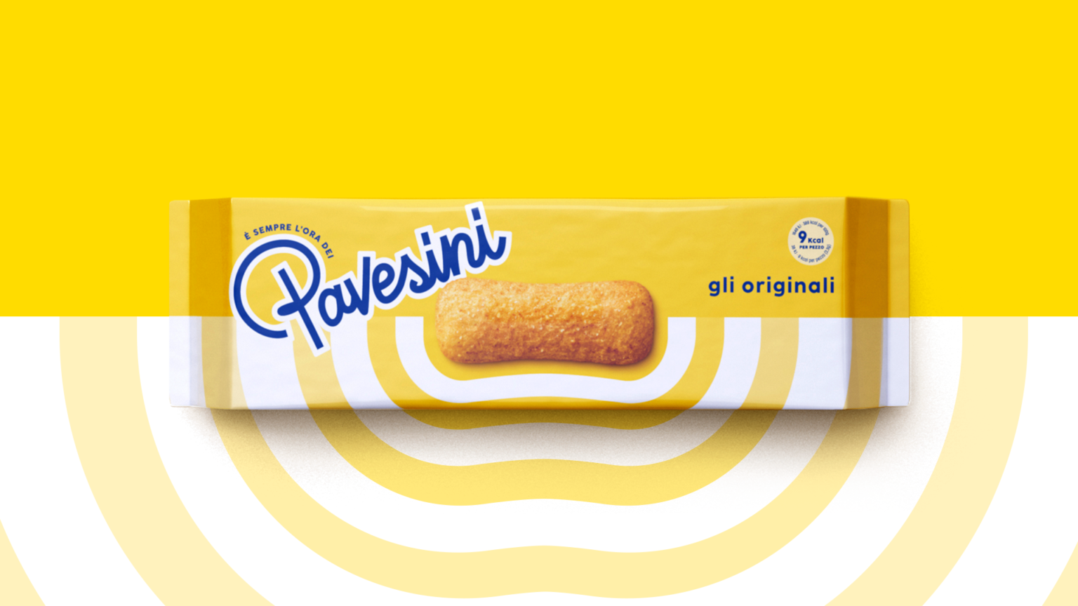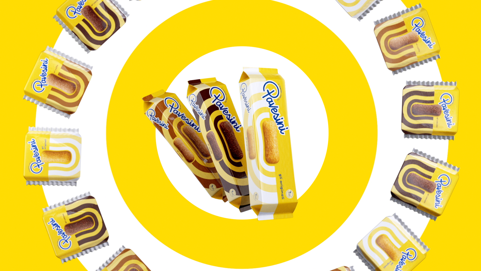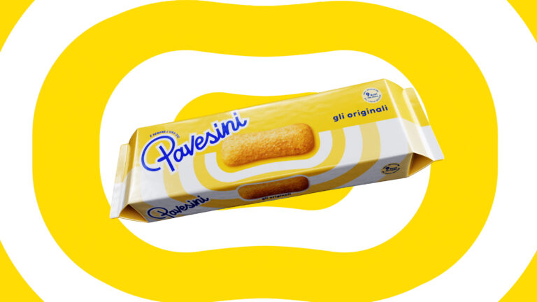
The new visual identity of the time-honoured Pavesini brand, conceived by the independent Marimo agency, revamps the image of the brand, highlighting its iconic nature.
The rebranding, which accompanies the brand from the retail environment to the digital world, has been a tough challenge that the Rome-based agency has grasped with passion and enthusiasm, starting from the new positioning: “The light side of life”.
The visual system is intended to express the values of light-heartedness, joy and conscious carefreeness: from the logo designed with a custom font to the sunny brightness of yellow, with good vibes evinced by the symbol of soundwaves that spread out and put everyone in a good mood, the Pavesini biscuit takes centre stage.