Client: Kraken
Creative Agency: ModiFox
Project: Sushi Restaurant (Branding – Packaging)
Location: Viet Nam
ABOUT PROJECT
We met the owner of the Sushi shop, he said that there are now many sushi shops near his restaurant. He wanted to create a sushi shop that was completely different and had a compelling story to go with it. Regarding the color, he said to let the story convey the color, and about the packaging and brand identity, he wanted them to follow the story we created and some requirements like he wanted to have a few details. Japanese class, with illustrations of sushi pieces… Well, this is a difficult topic for us.
SOLUTION
It’s hard to think about the story that comes with a sushi shop. We asked about the store’s scale and products and I learned that he strictly controls the seafood section, even some specialties. Especially to create wonderful cuisine, I arrived and saw a big squid lying in the warehouse, I immediately thought of the Norse myth about the monster Kraken.
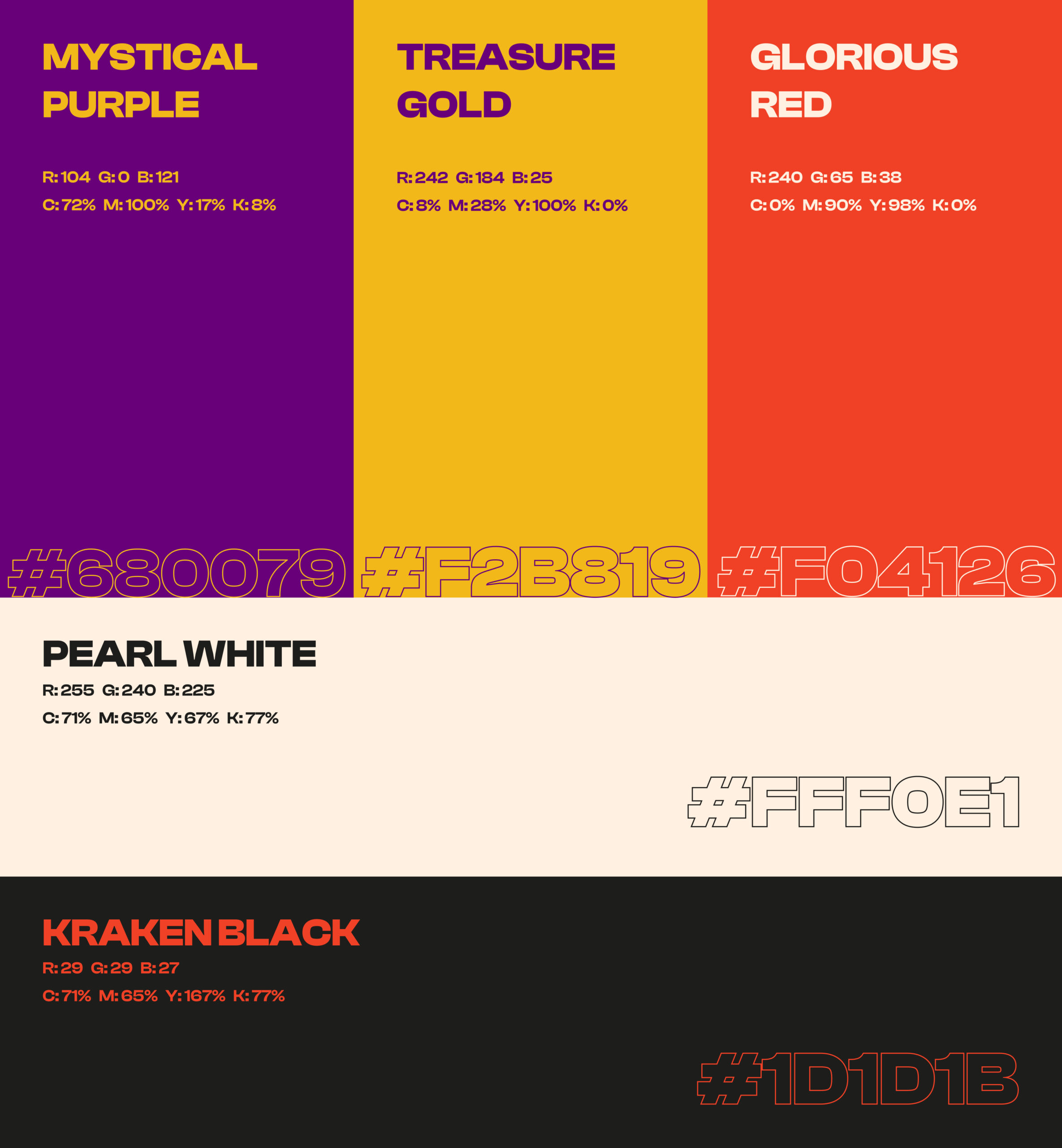
I immediately discussed it with him and received a positive response. Then I learned about this story and from that story, I created colors that carry mystery in them, the colors gold, mystical purple, pearls, and red glory… but with a cartoonish feel, bringing a closer, lively look to make it easier to approach customers. Creating a new sushi brand with great appeal, customers will enjoy the wonderful atmosphere right at the sushi shop. In addition, for those who buy sushi to enjoy at home, their packaging will also convey tradition. Get an insight into the unique personality of the Kraken sushi brand.
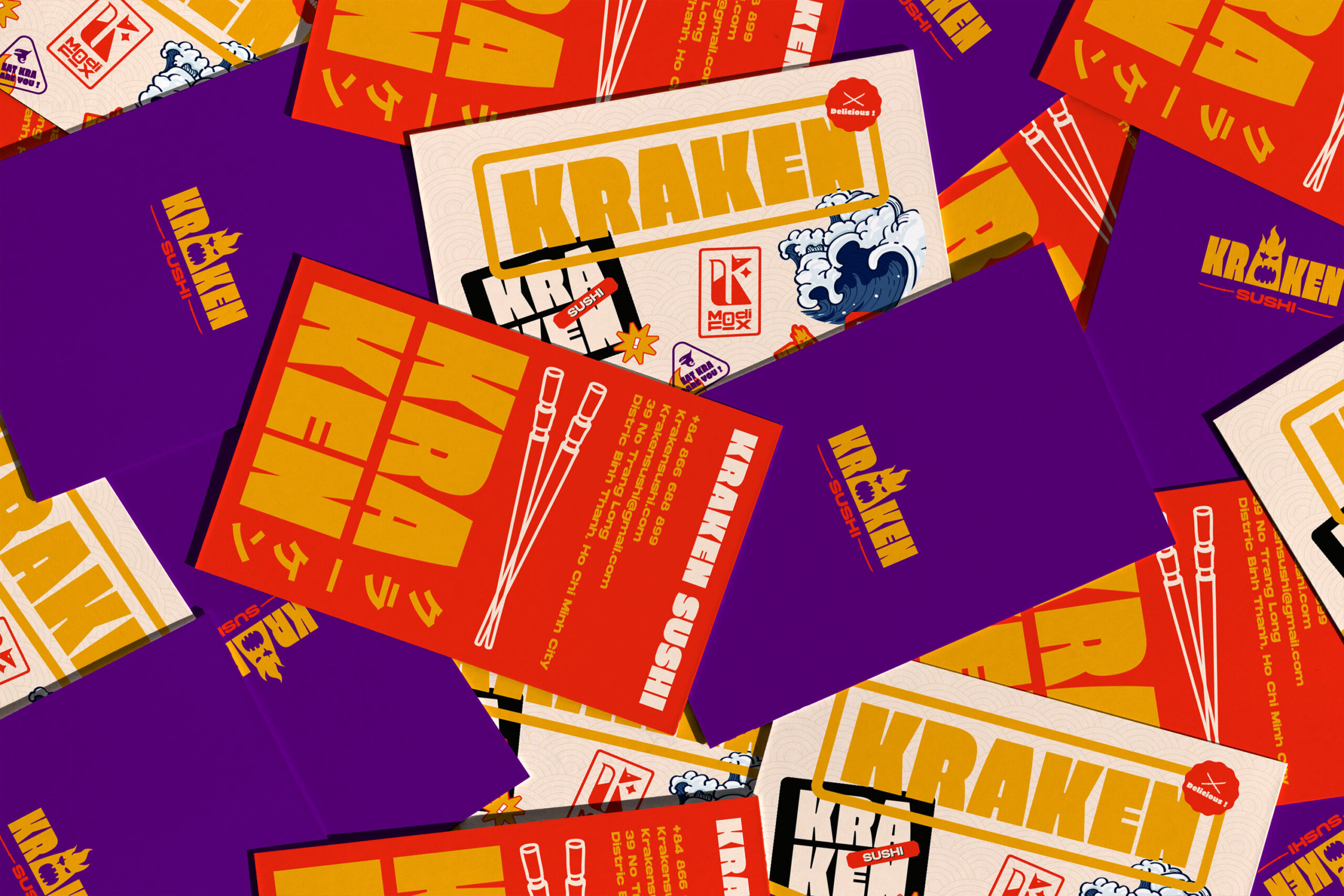
As for the logo, I said why not use the name Kraken for your restaurant name and create an illustration for this mysterious monster. After many changes, the restaurant owner also made a decision and We created several other logo styles to use for many purposes. In addition, we create additional slogans, restaurant messages, stickers, sushi illustrations… And in the brand identity part, we have also reused the most core parts of Kraken to arrange decoration for media publications, as well as decorative items, accompanying the brand.
About packaging with a focus on increasing attention compared to other brands. Central location with a brand name, slogan, and some sushi illustrations. This ensures that our brand stands out among our competitors. On the side are a few stickers that convey a sense of fun and give a bit of Kraken’s personality, along with a little information about the dish. In addition, some other packaging such as chopstick bags, and canned goods… also have a similar direction.
RESULT
After a long time with those changes, we have also perfected a brand sushi dish with a truly unique new perspective that comes with Norse mythology. We have received feedback from the homeowner and we are quite excited when everything is completed. Next, we are preparing a communication plan for our effectiveness.