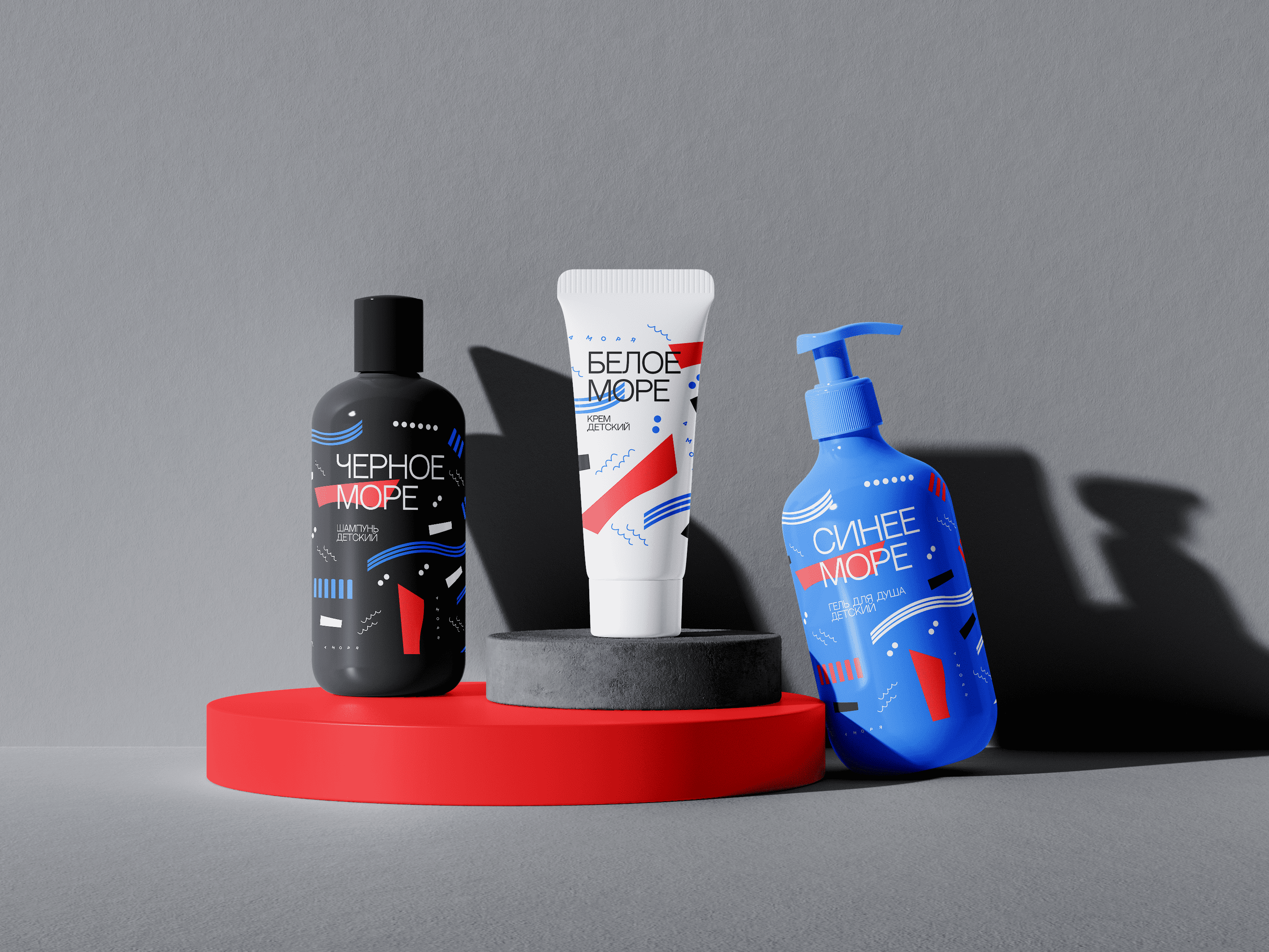
The packaging design of children’s cosmetics “4 seas” is a bright, playful and attractive style designed specifically to attract the attention and admiration of children.
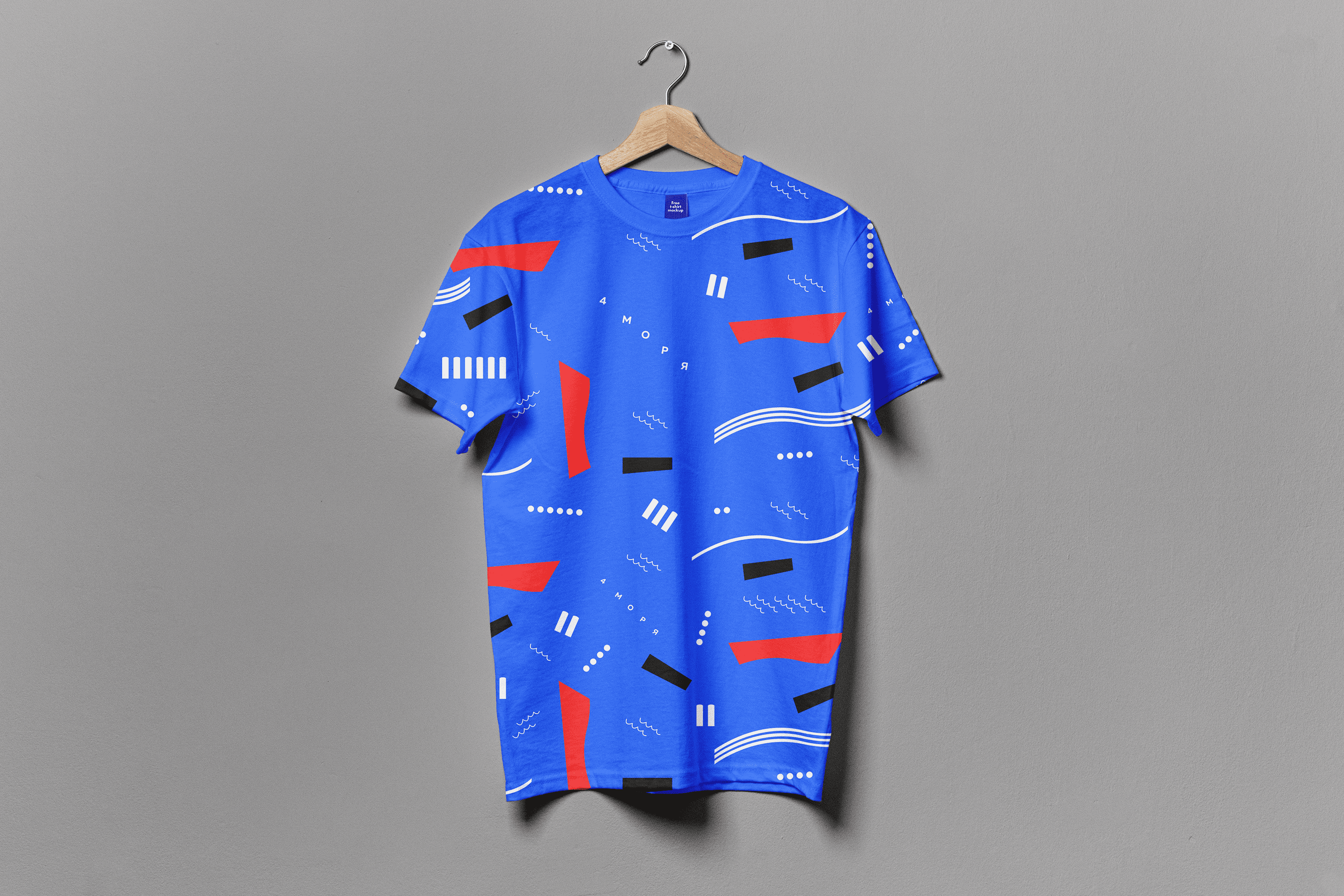
The dominant feature of the design is saturated colors such as blue, red, white and black. These bright colors create impressions of fun, joy and pleasure. Moreover, they link to the names of four seas.
Also, the decomposition of a children’s toy boat become the base of packaging design.
The design of the packaging “4 seas” for children’s cosmetics strives to create an attractive and childish image that will delight and attract the attention of young consumers. It combines bright colors, game elements, marine themes, creating an interesting and safe visual perception of products for children.
Mockup templates and font belong to their copyright holders.This project was completed as part of my art direction course at HSE Art and Design School. Special thanks should be given to my tutor, Tatyana Dunaeva, whose expertise and support help in realization of this project.