Palone Ziarno is a small, family coffee roastery that uses a craft method of roasting the highest quality beans from all continents where coffee is grown. They do not use any chemical additives as flavor enhancers; they manufacture genuine and exceptional products.
We had the pleasure of designing identity and packaging for the whole range of their products.
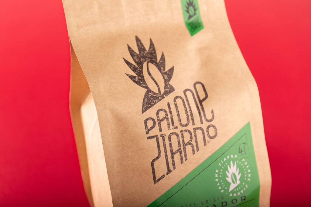
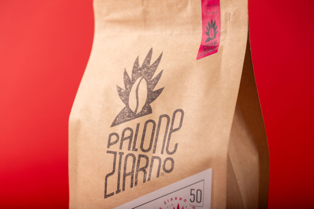
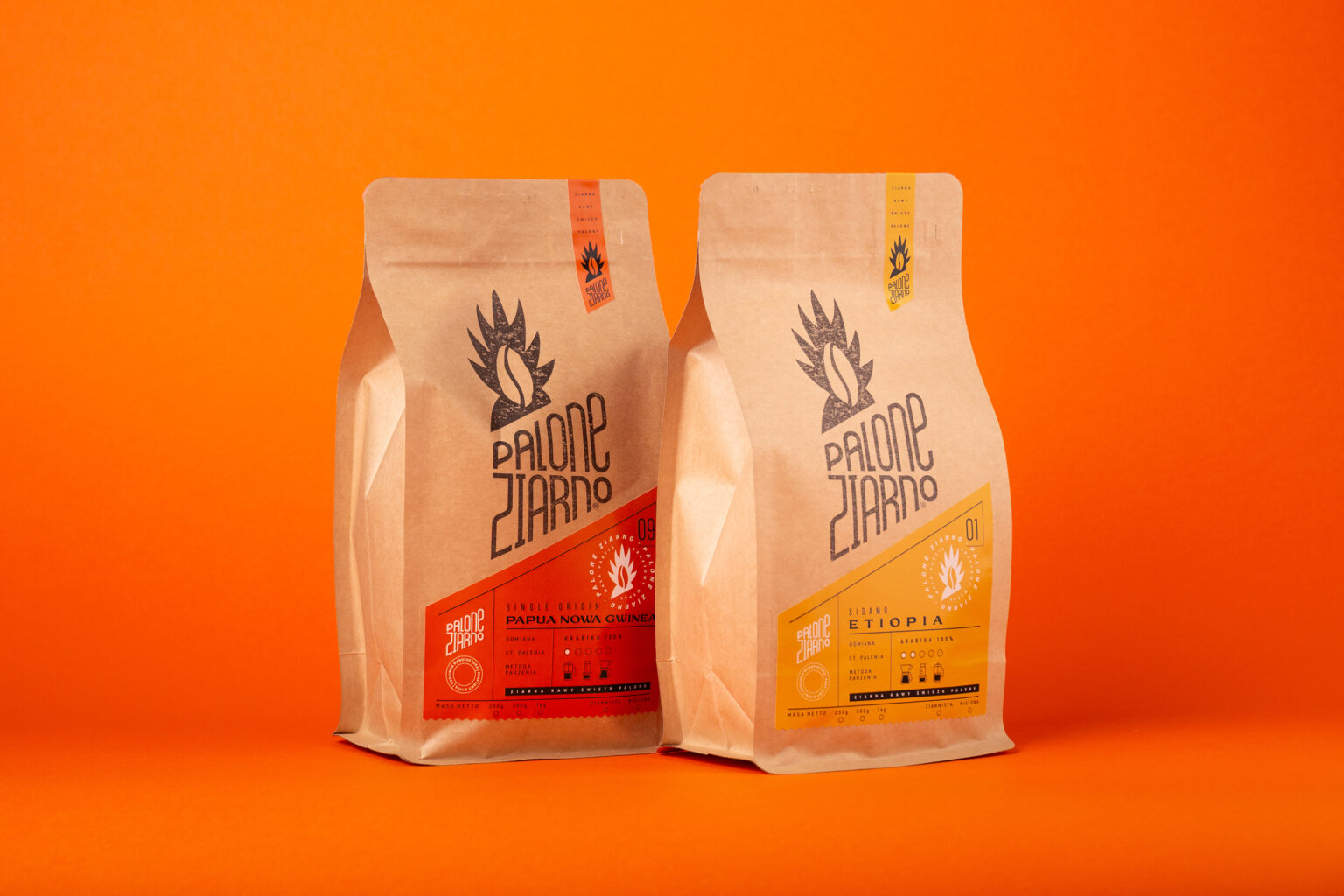
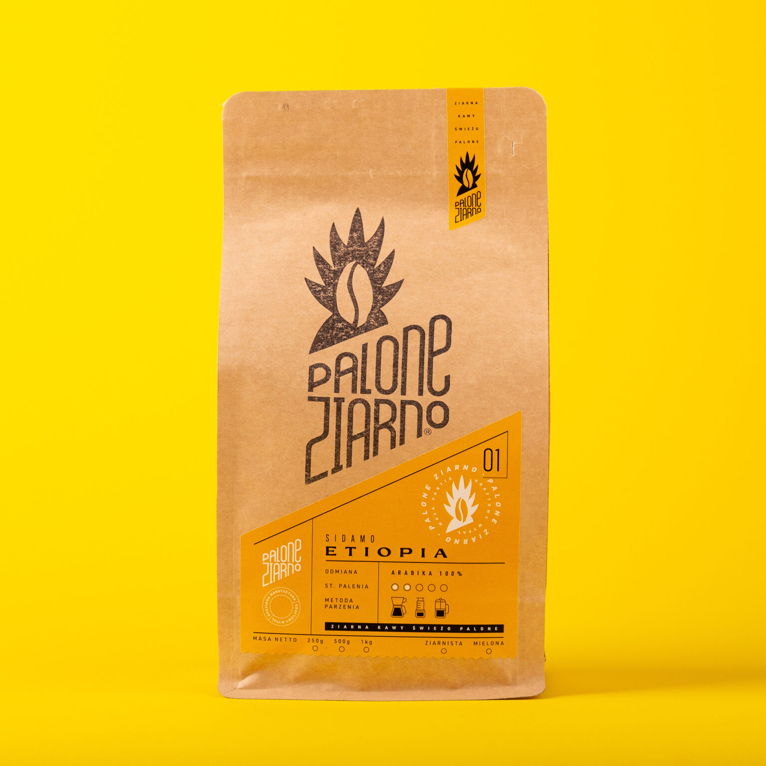
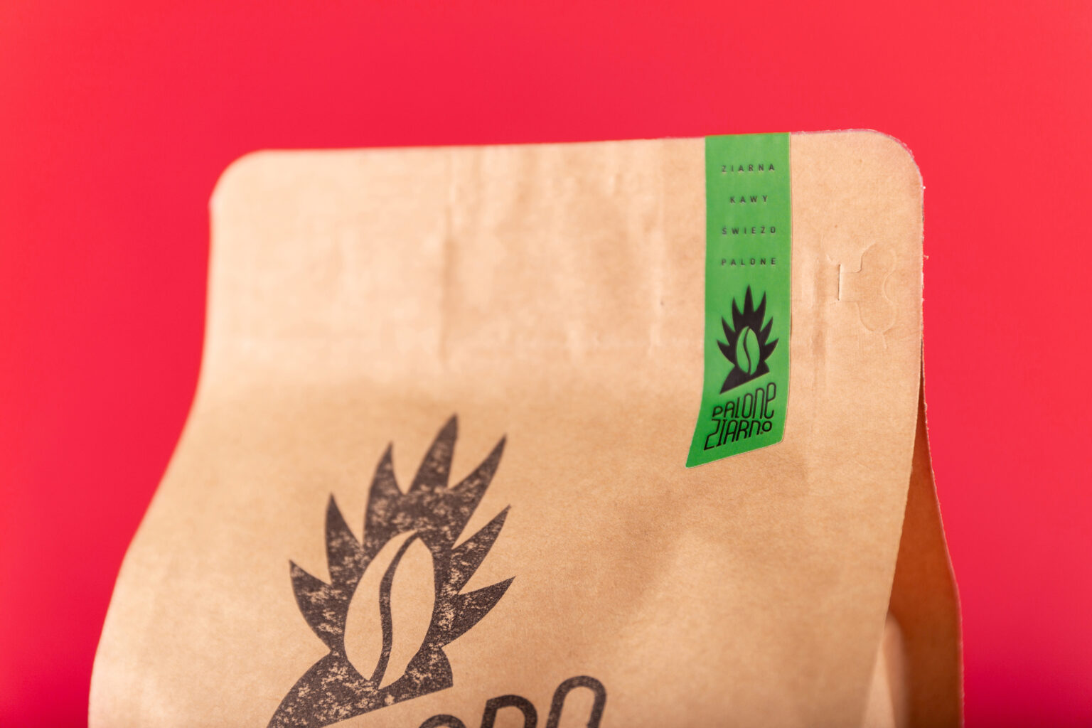
The main foundation for the style was to keep that rough, eco-friendly, handmade feel with a bright and contrasting label.
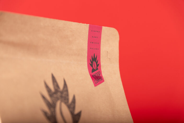
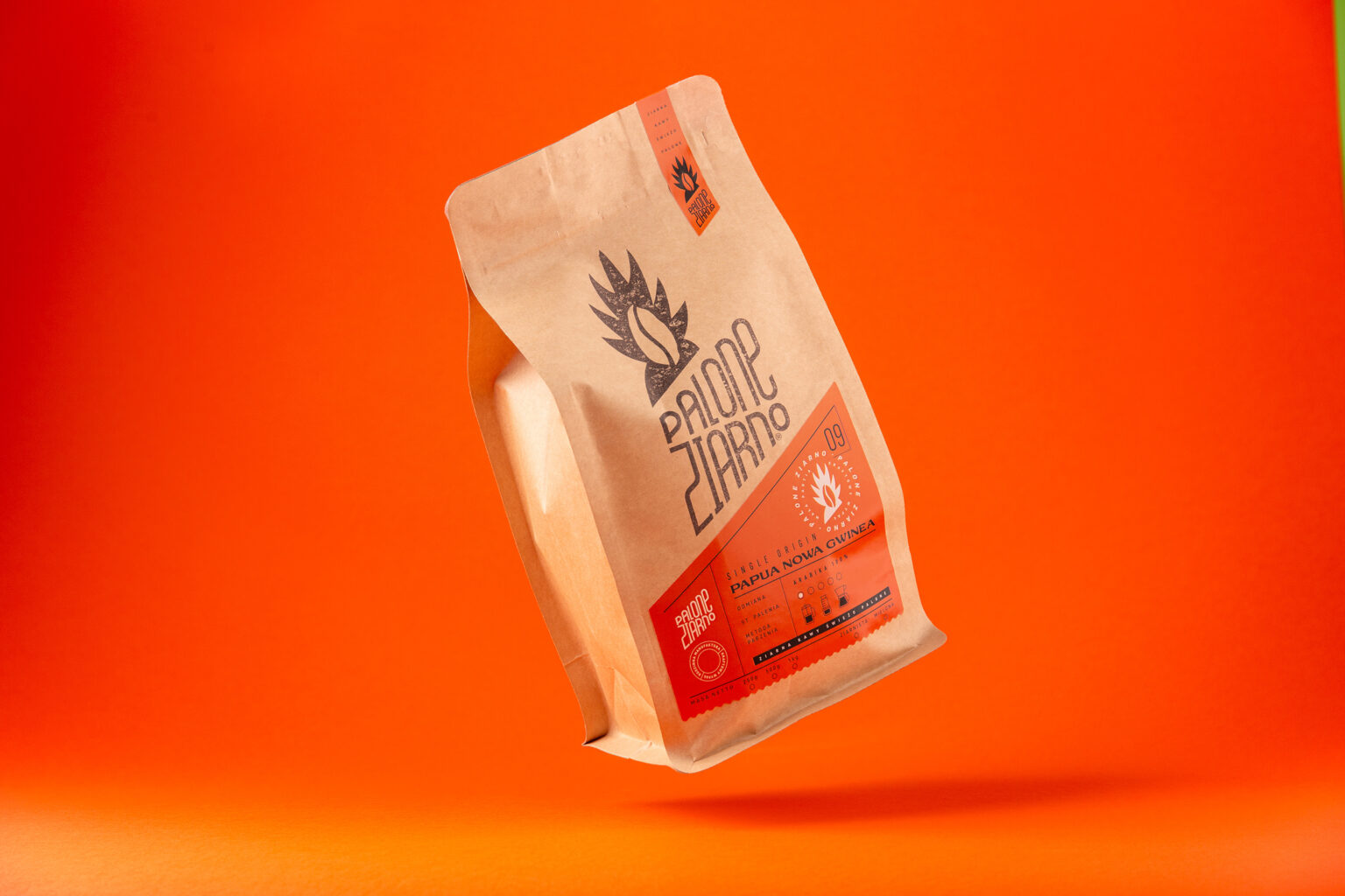
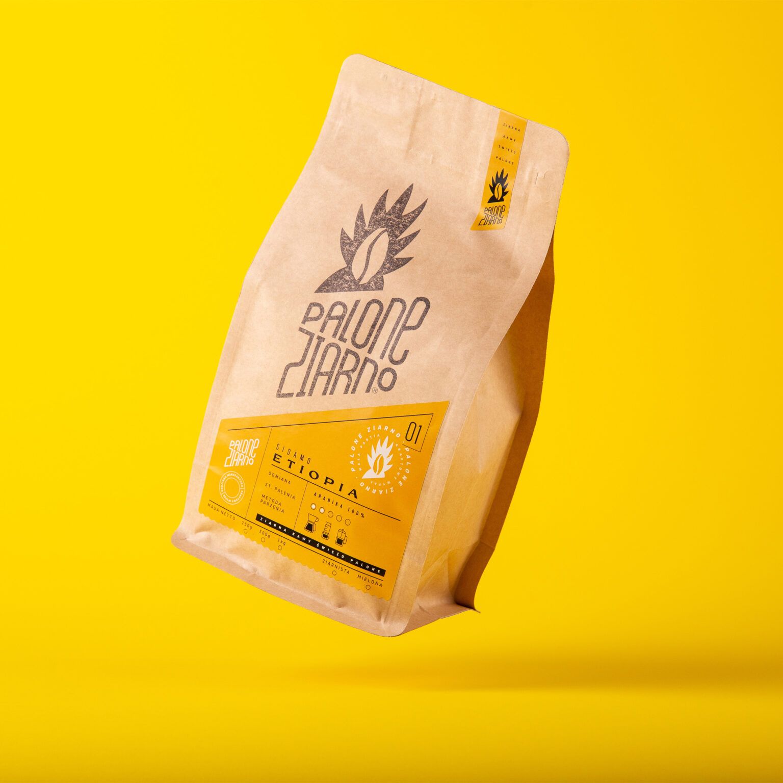
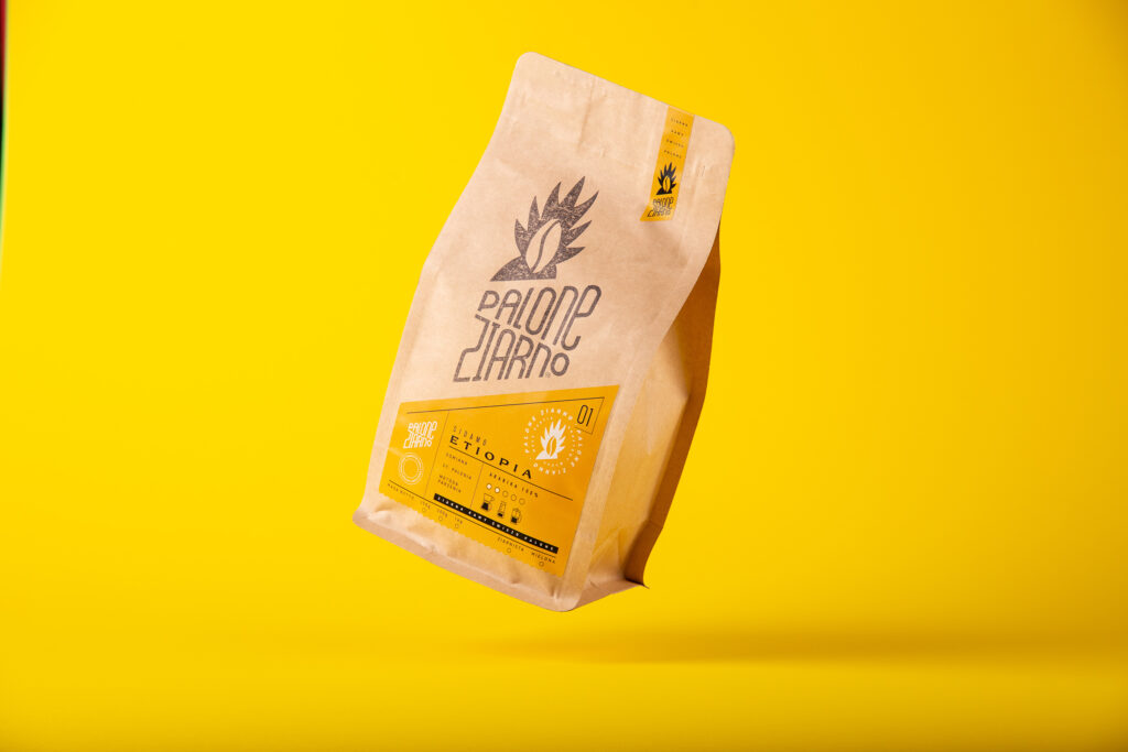
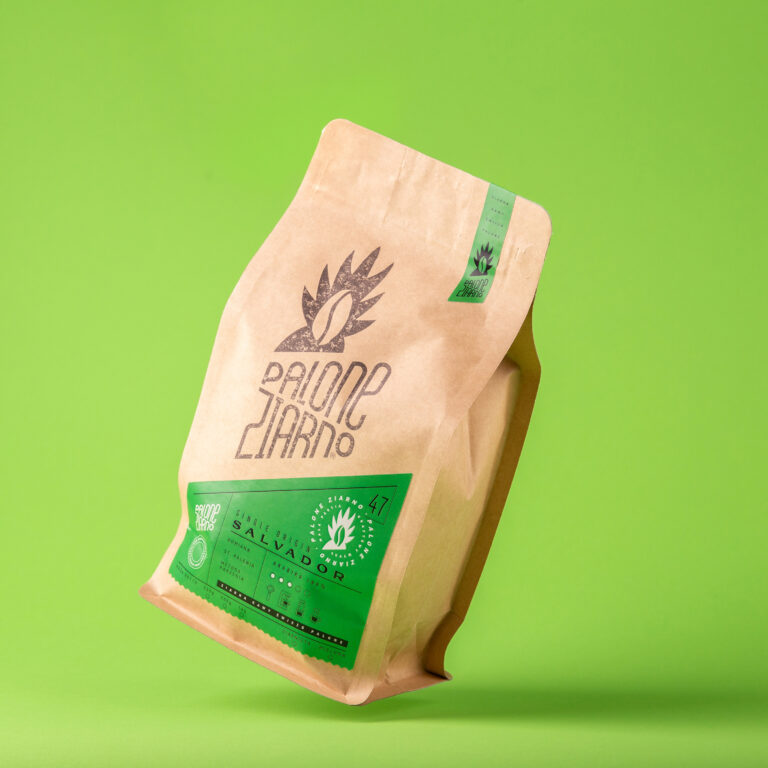
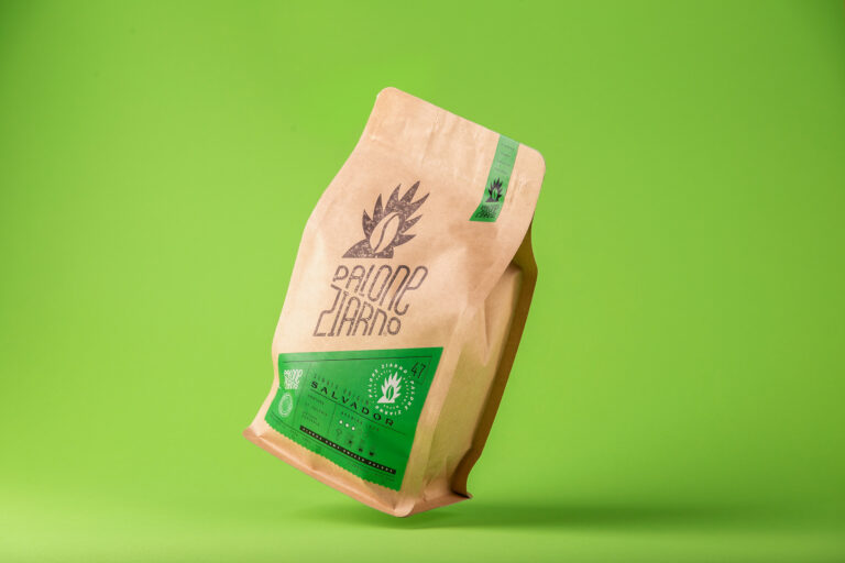
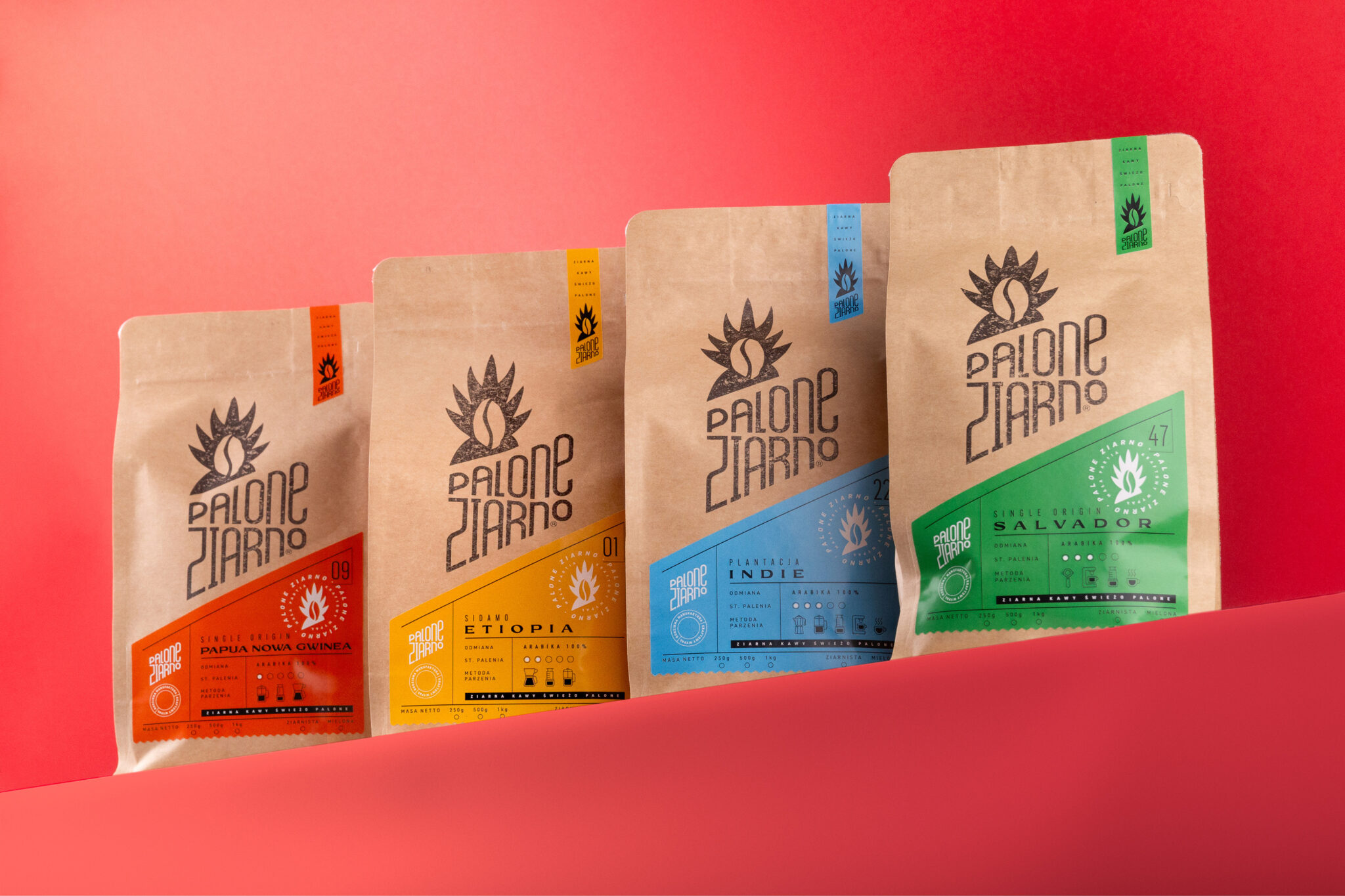
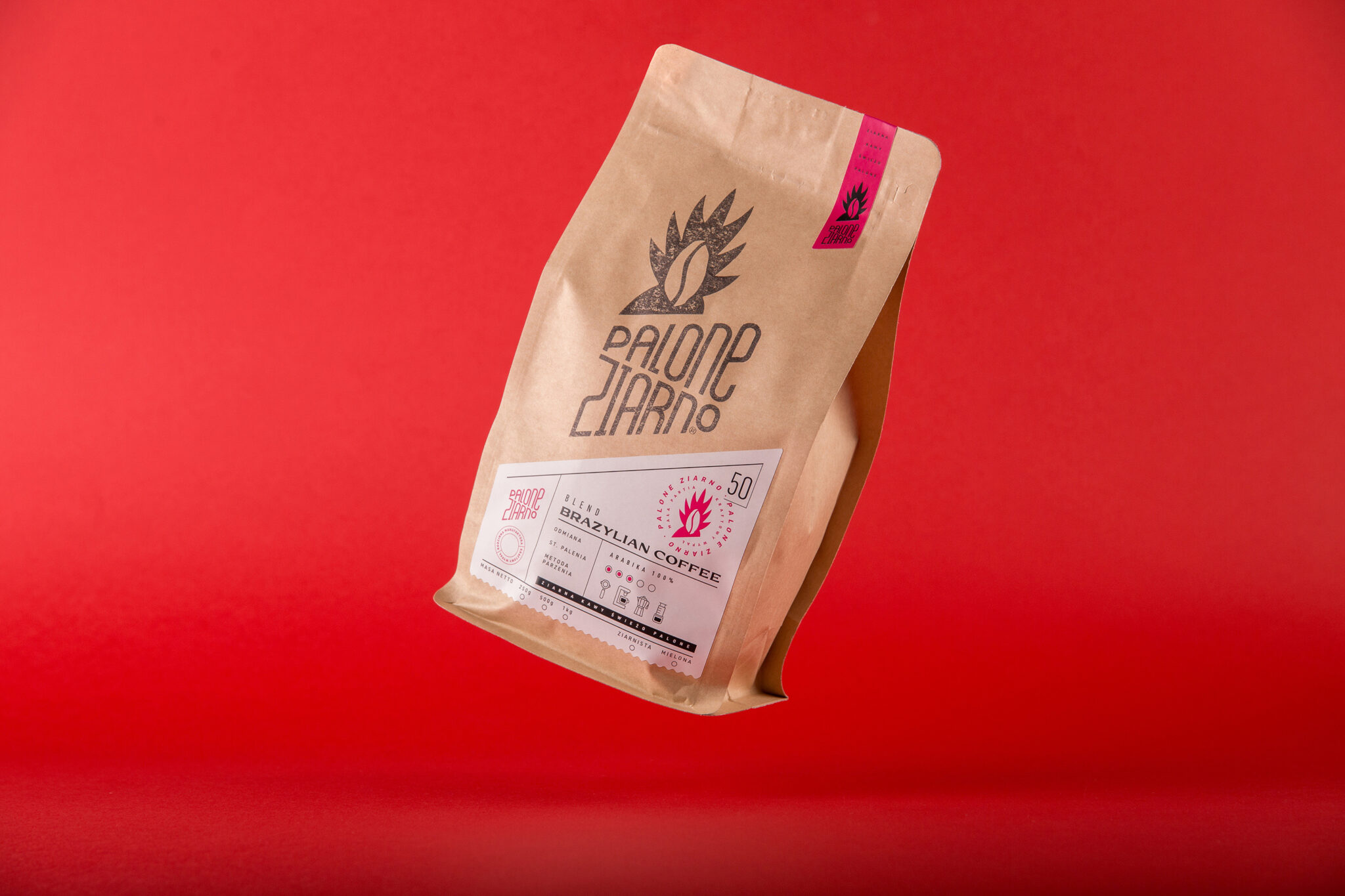
With the many different blends we have, we went for a bright and vibrant color for each of them. Since coffee bags are quite large, we could allow for prominent branding. Each of the bags was stamped with a unique stamp with the company logo, dipped in paint, and came out to be unrepeatable for every piece of packaging, keeping the rugged and irregular finish. Apart from that, every bag also has a tiny piece of paper with the logo on top, which seals the packaging.
Contrasting with recycled bag and stamp materials, we’ve added very colorful labels to every product.
Each color defines the different coffee blends, ensures that all important information and distinctness about each product is well presented for the consumers, and helps them understand subtle details.
This way, the packaging system is evocative and well-balanced, with clear information on each of the flavors, giving the consumer a friendly and playful message about what the product is about.
