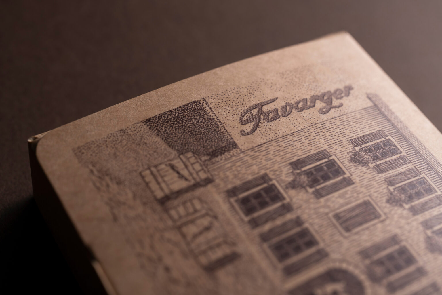
The artisanal production of the Favarger chocolate brand began with a family love story of a young watchmaker by the name of Favarger who fell in love with the daughter of a Genevan chocolatier back in 1826. Shortly thereafter, he learned the trade from his father-in-law and embarked on a journey that continued for almost two hundred years.
Bruketa&Žinić&Grey agency was tasked with the packaging redesign for Switzerland’s oldest chocolate manufacturer. The aim of this assignment was to highlight the brand’s longevity and its chocolate making history dating back to 1826. Another redesign goal was to put forward the brand’s traditional production processes and the family culture at work nurtured by all stakeholders who give their contributions to the product, brand, customer relations, and business. The underlying idea of the new packaging was to build up a powerful artisanal image in sync with the values fostered by the Favarger brand.
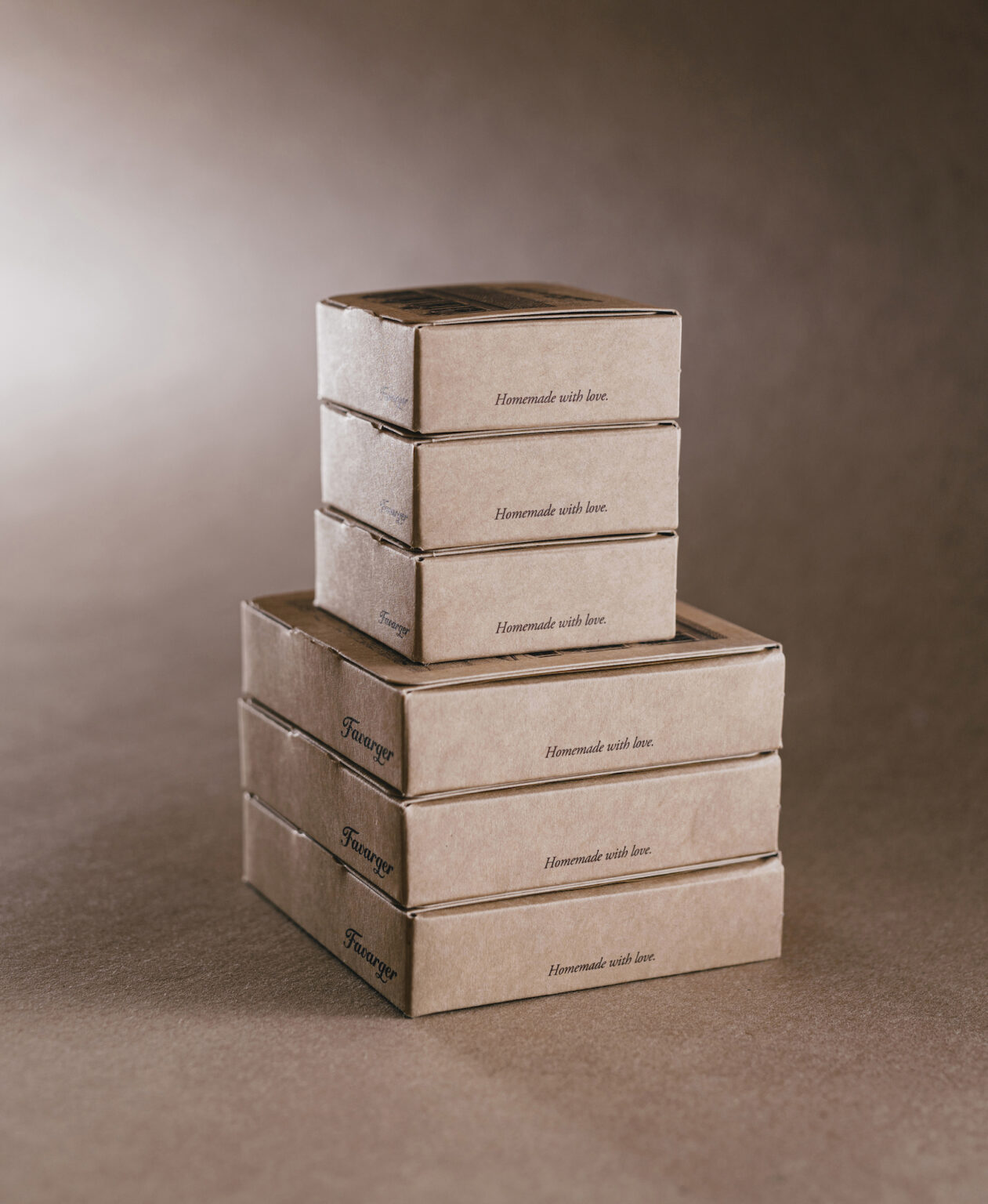
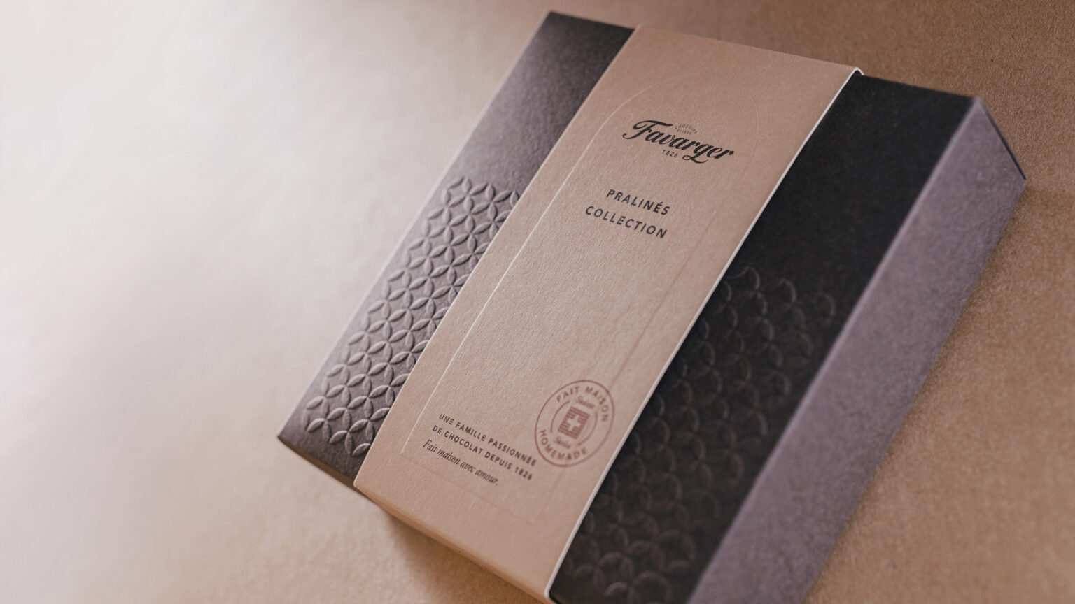
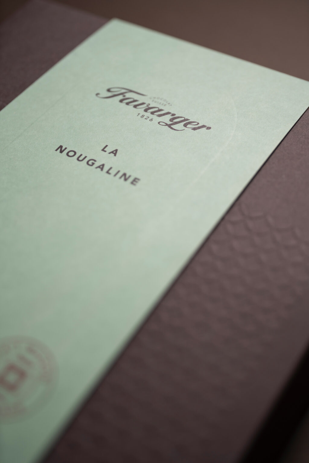
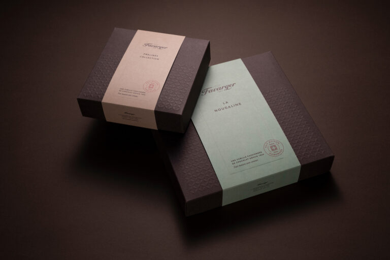
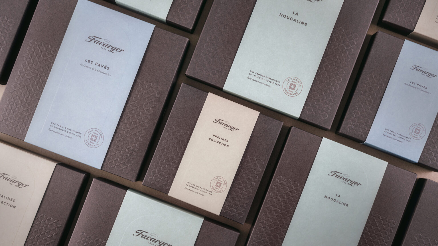
The Favarger brand espouses a “passionate chocolate family,” emulated by the brand’s signature and seal impressions on every single piece of packaging, including unassuming cellophane bags as well as luxury praline boxes.
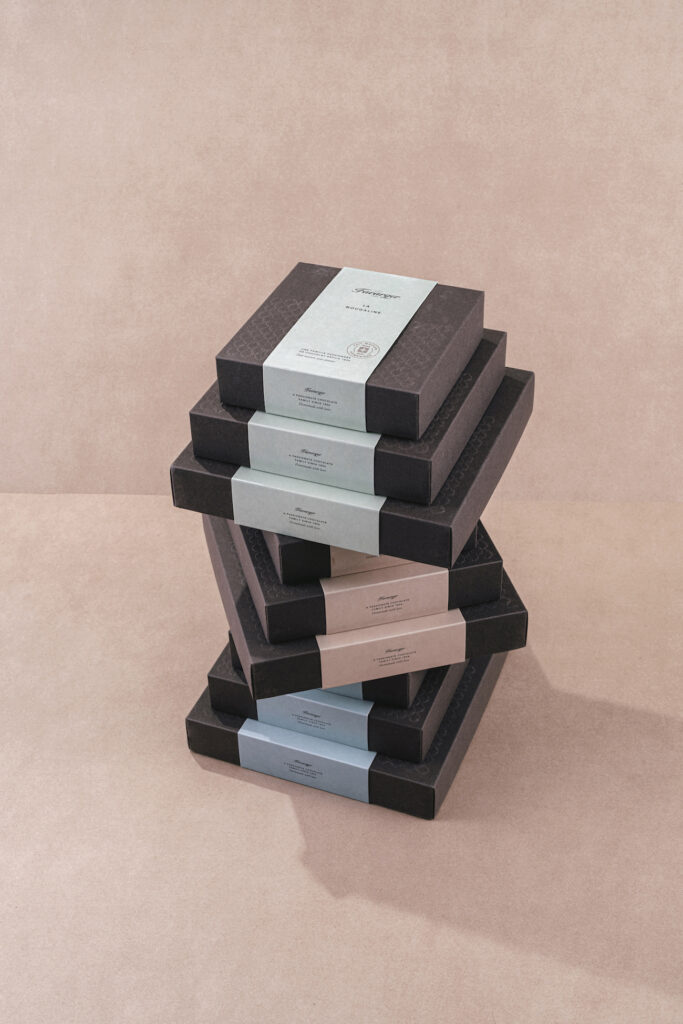
The packaging redesign was guided by the classical approach to packaging in the chocolatier’s industry. The packaging usually consists of multiple components, creating a memorable unboxing experience and highlighting the uniqueness of the packaging content. This is especially applicable to chocolate gift boxes and packages. However, chocolate lovers often have sudden chocolate or praline cravings, and Favarger has various packages in its portfolio to instantly meet their needs, e.g. hand-held cone boxes and especially sweet small ball-shaped boxes with an assortment of 4, 8, or 16 favourite pralines. The brand also offers a special cellophane bag with paper reinforcement on the bottom for broken chocolate to keep it from melting.
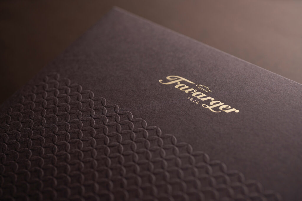
The design is characterized by simplicity and warmth felt in home kitchens, which is particularly evoked by the pattern featured as the centrepiece of the brand’s visual identity – a connecting link between the shop tile pattern and the pattern integrated in the packaging to evoke the actual memories of the brand’s shop.
The redesign included around fifty individual pieces of packaging, along with different adds-on, such as product labels for the shop, posters, wrapping paper, chocolate moulds, a variety of ribbons, message gift cards, etc.
