When Sustainability Meets Aesthetics And Functionality.
Which came first: the chicken or the egg? The history of the gourmet oil mill for SOSOFactory. SOSO Factory, a company specialized in gourmet products for food (with a very special format), decides to expand its range of products and introduce gourmet oil into its catalog.
The challenge is defined by the short term of action and the objective of SOSO Factory: to launch a product that generates an impact on the target audience and that coexists with the brand’s star product, an egg-shaped salt shaker. IDEA has worked to create an industrializable solution fully contextualized with the language of the client’s catalog.
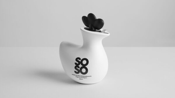
As we have said, one of the red lines of the project was that the oiler coexisted with the egg-shaped salt shaker. With this in mind during the creation process, the phrase crept in: “Which came first, the chicken or the egg?” In this way, we bet on merging the shape of the egg with a traditional boiler to generate the iconic shape of a hen.
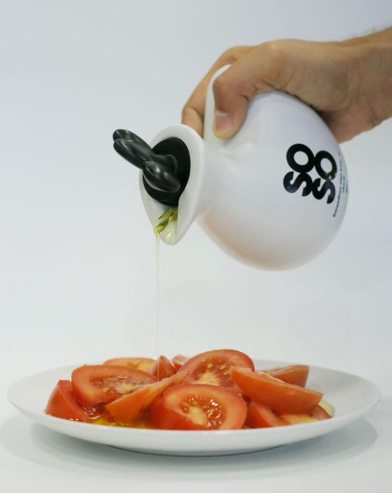
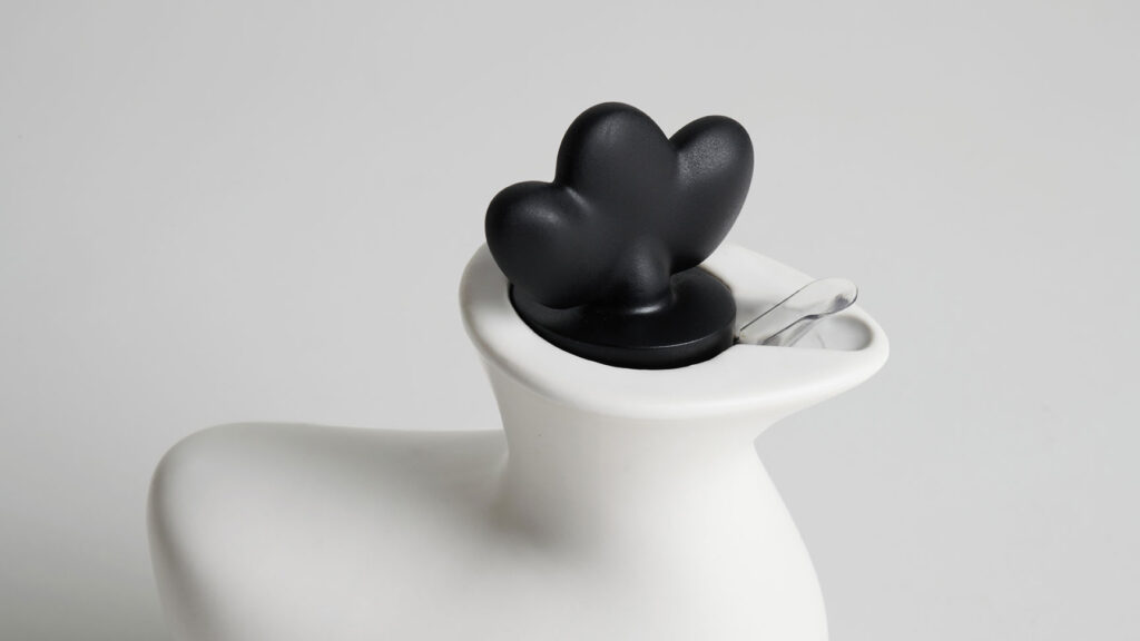
To understand this product well, we must differentiate between 2 parts: body and crest. We have worked on AD-HOC solutions to maintain the set and not break the aesthetics of the oiler when used. How did we do it? We have designed and developed a fully customized cap that is not only functional(with three positions that allow actions: hermetic closure, pouring and filling) but also includes a return and anti-drip system, all this is integrated into the crest of the hen. For the body, the shape and finishes have been worked taking into account that we had to achieve an iconic, attractive and functional product, where the touch and ergonomics of this would have all the prominence at the user experience level.
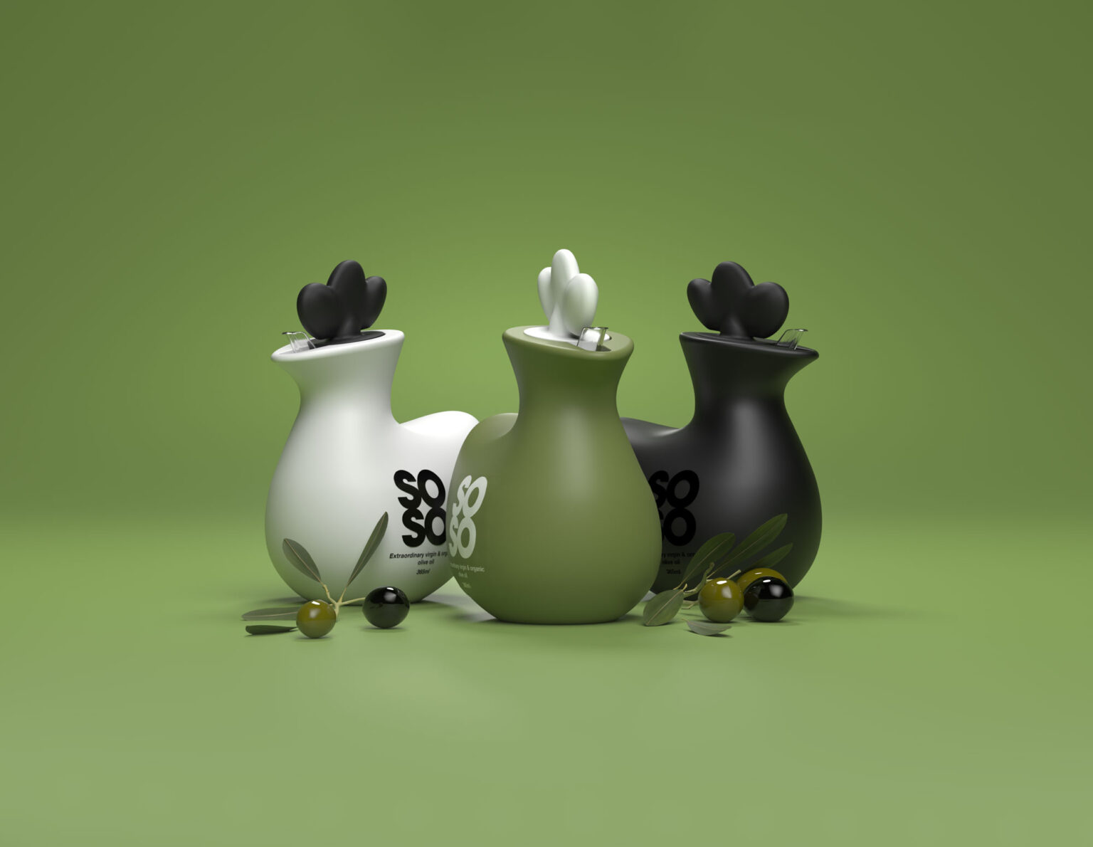
When we say that it is a product full of intention, we mean that every choice, from the chicken shape to the materials chosen, has a reason. In this case, we decided to make the body of the hen in ceramic because it allowed us: (1)Preserve the properties and quality of the oil; (2) Offer a differential proposal in the world of packaging, where plastic and glass are positioned as the first and only options; (3) Reuse the oil mill and (4) Revalue a local material that reminds us of our roots, which is strongly linked to the culture of the oil.
This choice of material has been a great challenge at the industrialization level, the ceramic sector presents many restrictions for the mass production of complex shapes (as in our case). In this way, only one supplier (of the 30 we contacted nationwide) joined the project.
In the rest of the oil mill, the following materials have been chosen: plastic for the crest and cork as an adjustment between the stopper and the body. Both are conscious proposals made to last over time.
Curator’s Insight
Forget boring bottles! This design hatches a charming hen shape, playfully merging the brand’s signature egg shaker with a classic oil cruet. It’s not just cute, it’s cleverly contextual, connecting with the brand identity while standing out on the shelf. Plus, the “chicken or the egg?” question adds a whimsical touch, sparking conversation and memorability.