The brand L’Ortie is a young online brand of women’s classic clothing, aimed at modern women who appreciate elegance and retro style.
The challenge was to convey through visual language the elegance, grace, and tranquility that characterize the L’Ortie brand. The main idea was to show that every woman shines with her unique beauty and style.
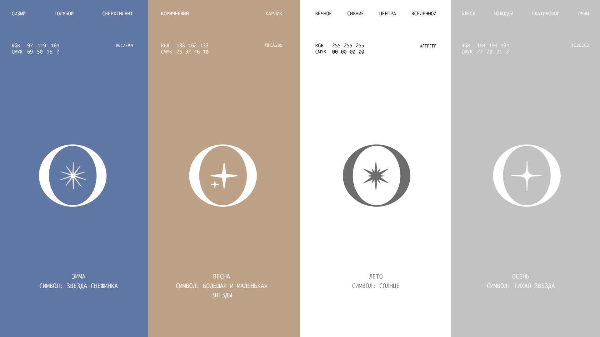
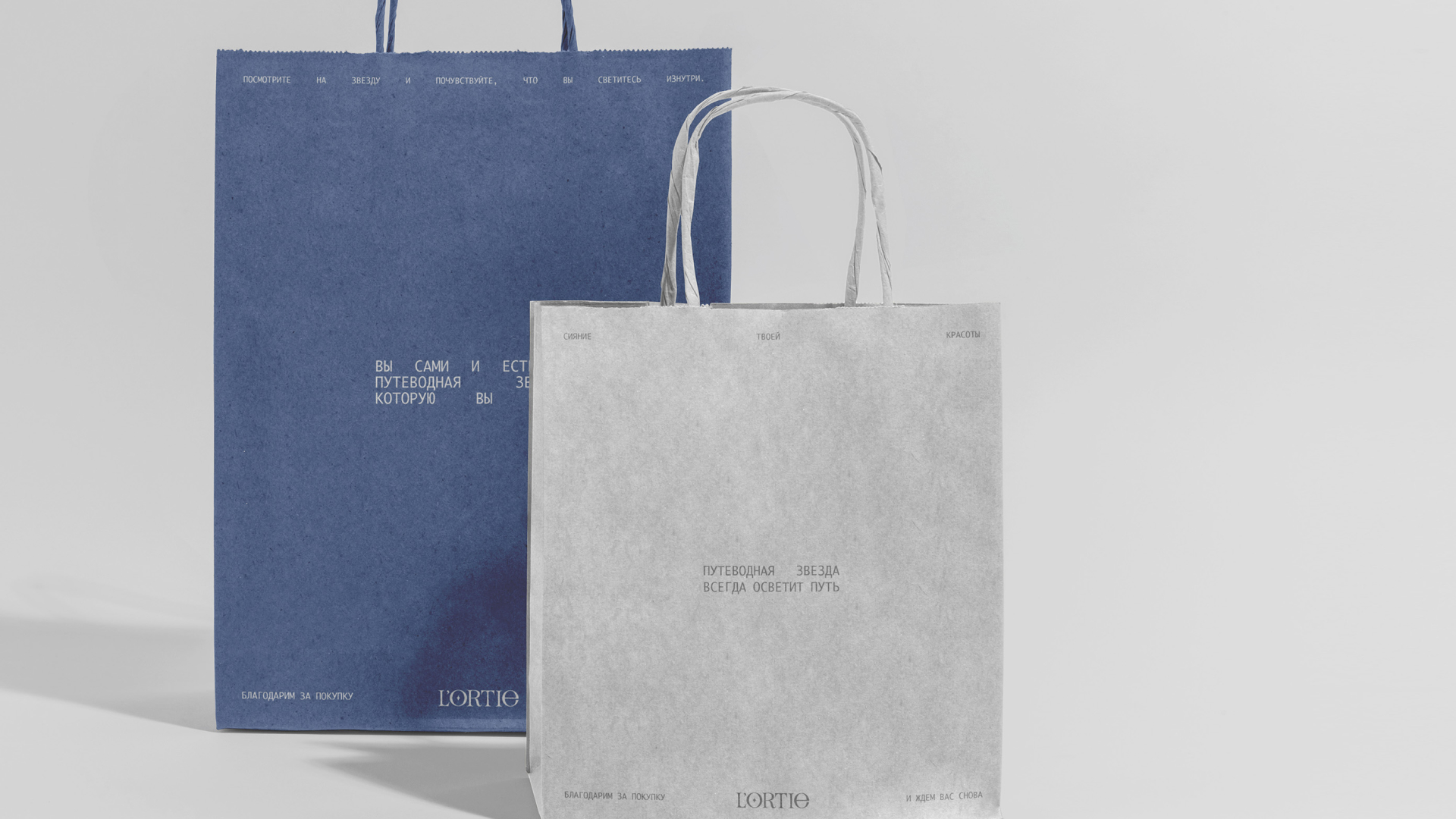
To achieve this goal, we used muted, shimmering color palettes and delicate typography. In this way, we created a brand identity that reflects the concept of quiet luxury where the main focus is on the beauty and grace of women. The result was a stylish and refined image of the L’Ortie brand, emphasizing the individuality and elegance of every woman.
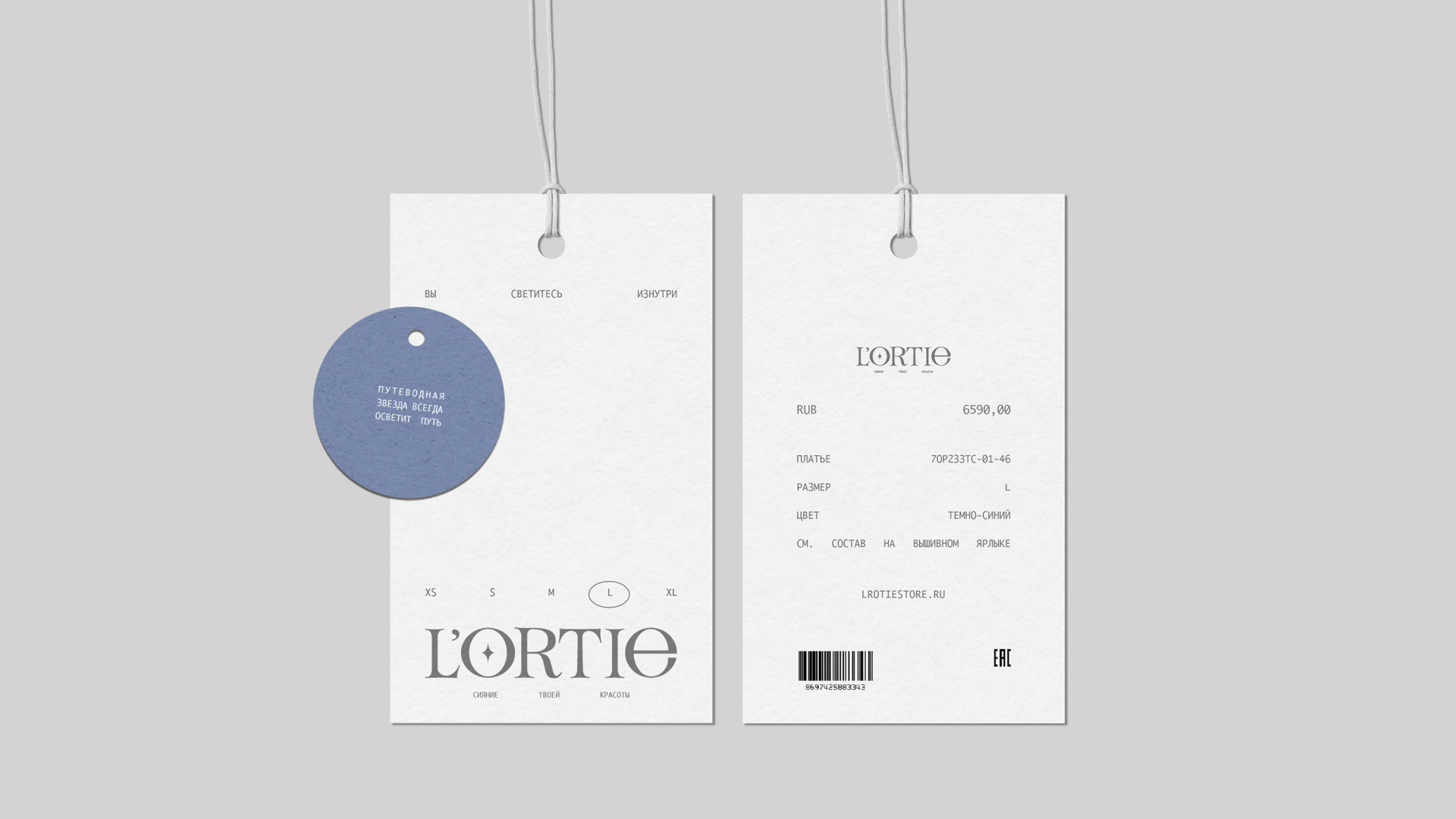
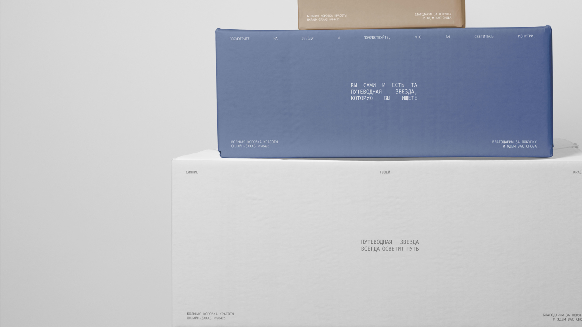
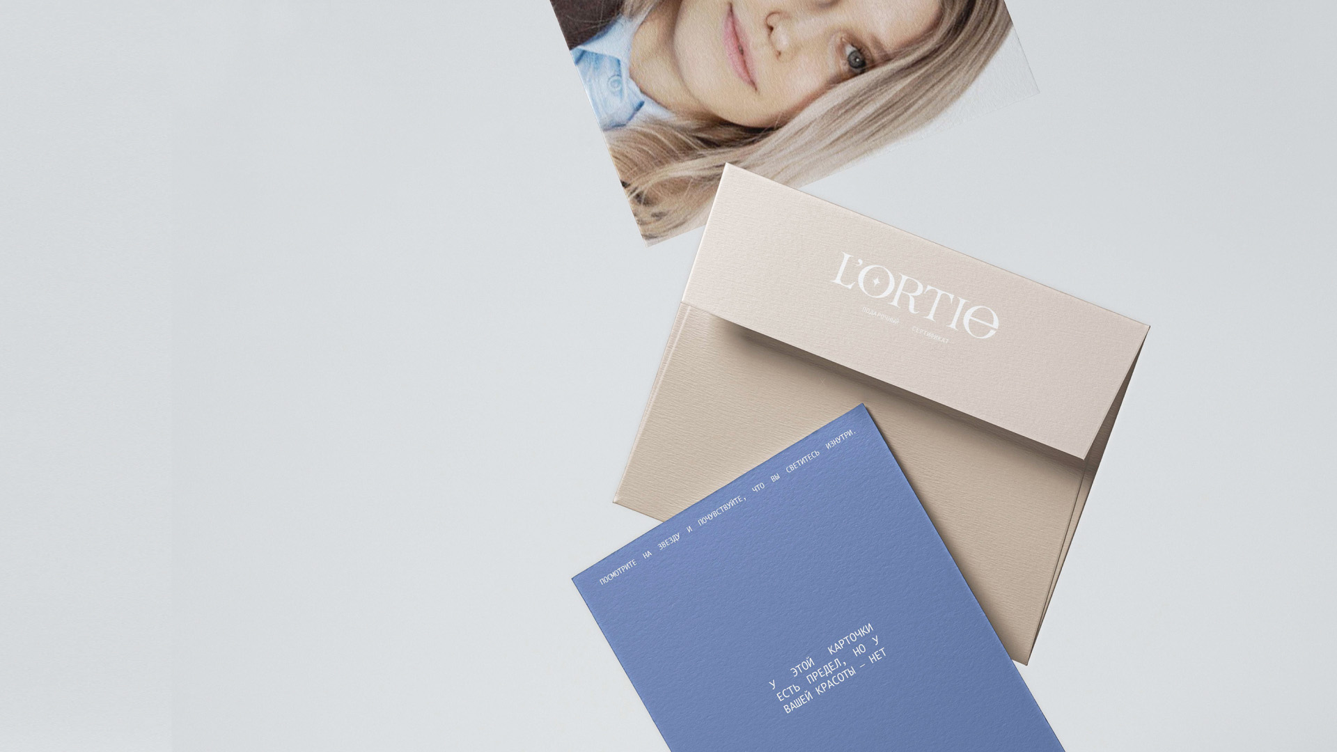
As far as L’Ortie clothing brand associated with classic clothing, we paid special attention to typography, colors, and illustrations. We chose the Ayuthaya font to create accents in the design. This font resembles the characters of a typewriter, giving the image a classic elegance and style. It complements the concept of the L’Ortie brand, enhancing its connection to classic values.
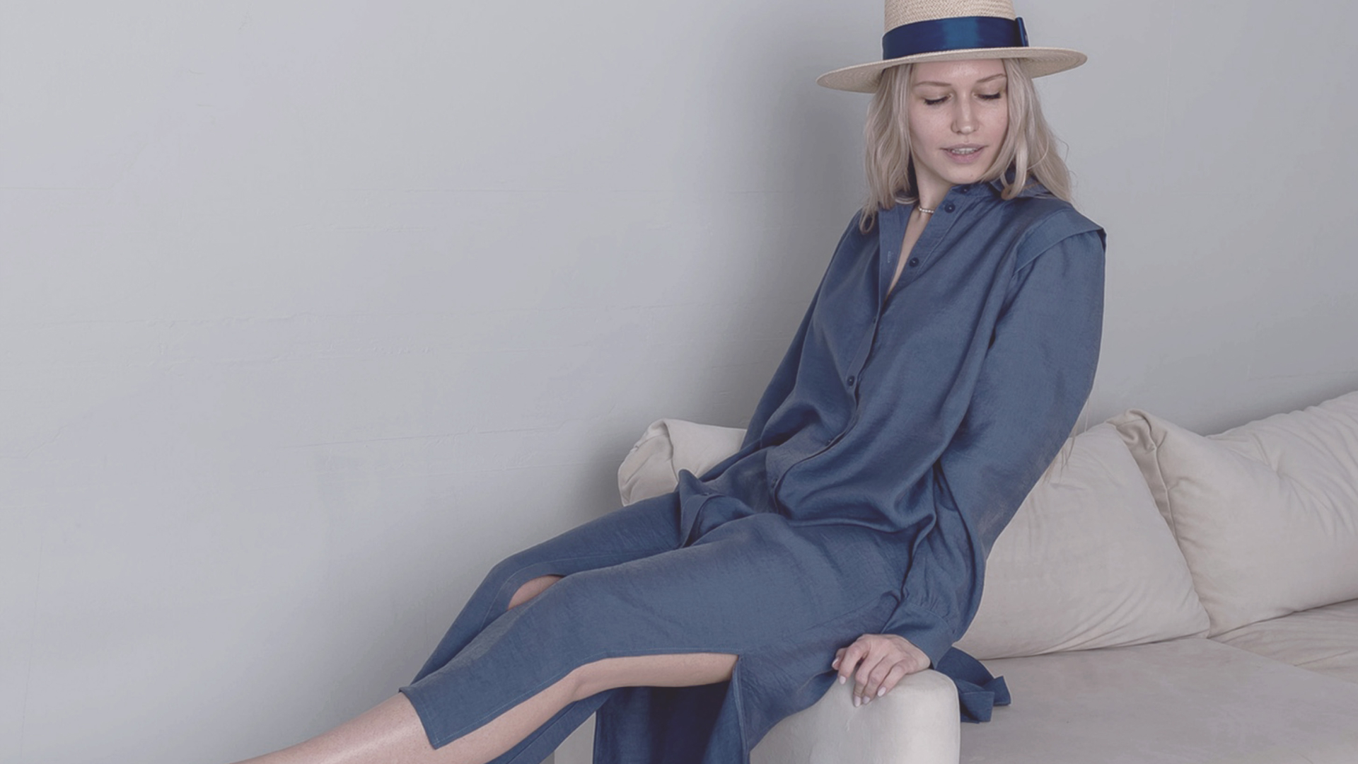
In an atmosphere of tranquility and luxury, muted colors were chosen that remind of well-known luxury brands. These colors add sophistication and style to the overall image of the L’Ortie brand, highlighting its attractiveness and elegance. To illustrate the grace of female models we used beautiful photographs that help convey the atmosphere of classic clothing. The photos serve as an important element of visual content that complements the overall brand image and helps convey its values and style.
Through the combination of typography, colors, and illustrations, we created a harmonious and stylish image of the L’Ortie brand, reflecting its unique concept and attractiveness.
Special thanks should be given to the Russian Higher School of Economics (HSE Art and Design School) and to the tutor Tanya Dunaeva.