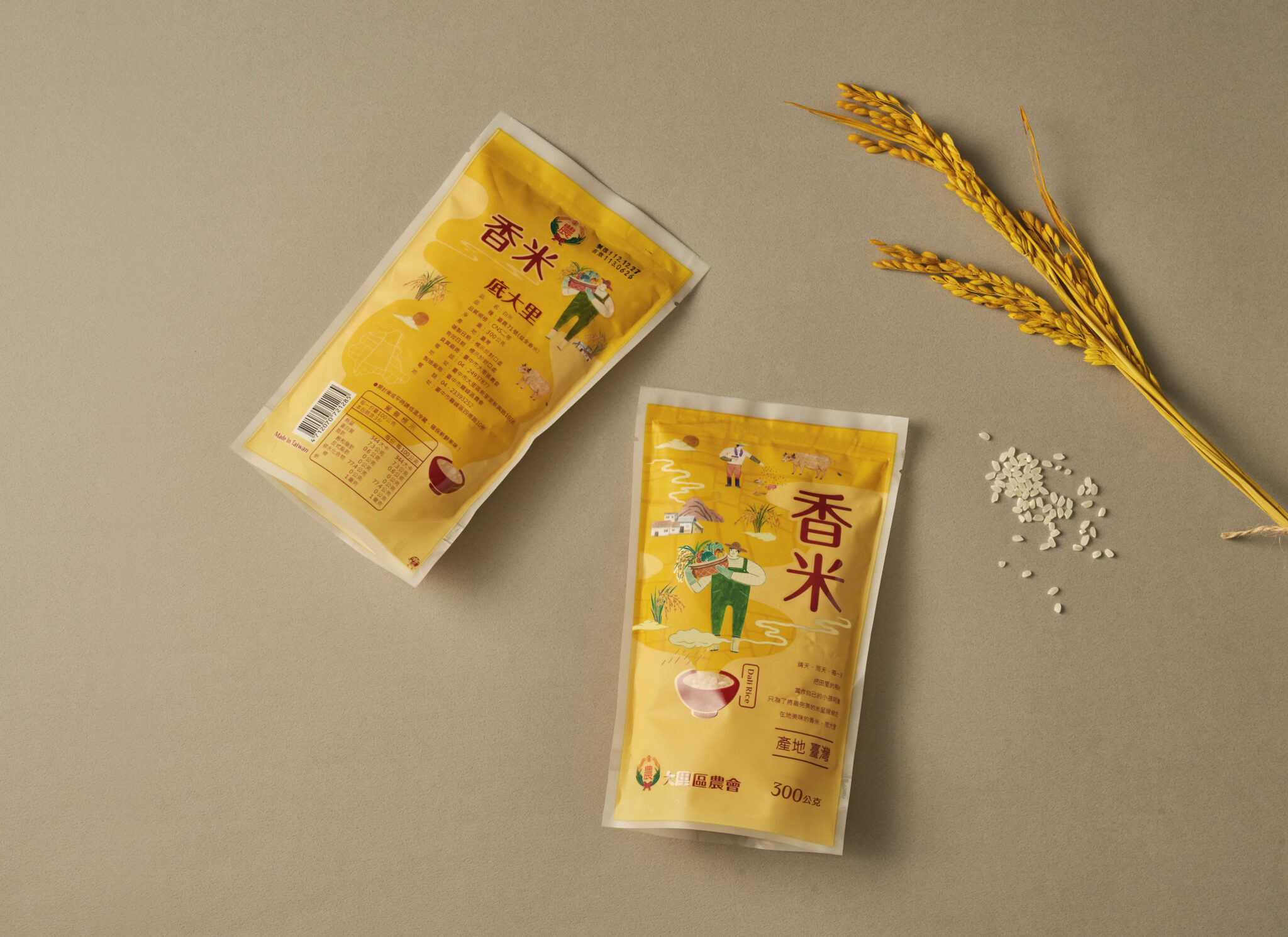
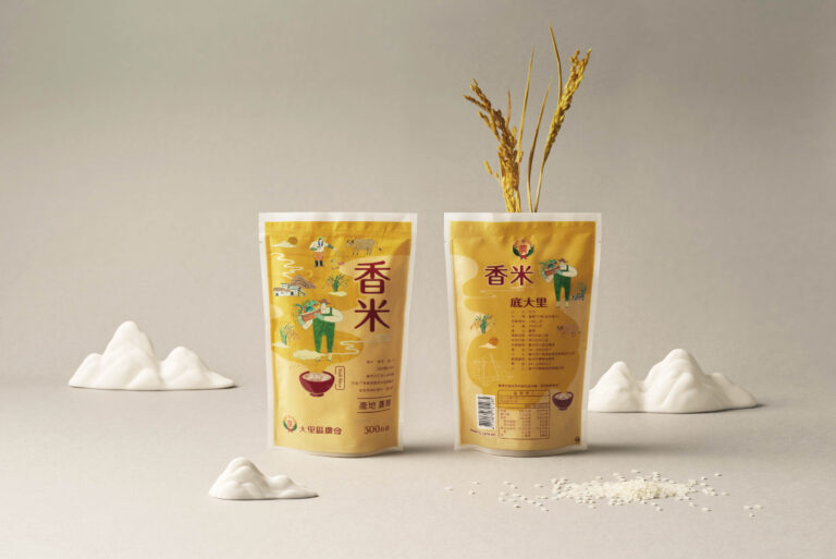
onebookdesign created a fresh, informative, and down-to-earth design for Dali Farmers Association’s rice packaging.
Key Features:
- Immersive Aroma: The packaging uses a unique “rice grain aroma” display to entice consumers and highlight the quality of the rice.
- Four Seasons Farming: Charming farm illustrations depict the agricultural cycle across all four seasons, giving consumers a glimpse into the care and dedication behind the product.
- Storytelling Through Design: Subtle connections between the front and back of the packaging create a cohesive narrative, further engaging the customer.
- Friendly & Local: The overall aesthetic is warm and inviting, reflecting the friendly spirit of Dali’s local farmers.
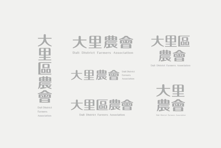
- Bold New Brand Identity: We’ve developed a new brand standard character for the packaging. This character is rounded and bold, conveying a sense of inclusivity, trust, and approachability. This is a departure from traditional rice packaging and aims to create a more modern and relatable brand image.
Overall, this design aims to change the public’s perception of Dali rice, showcasing its quality, the dedication of the farmers, and the friendly local spirit behind the brand.


