WHO 3LANCE IS:
People often become so preoccupied with making a living that they forget the importance of their health. We skip meals and take time to keep working instead of recharging our energy. However, in reality, our eating habits significantly impact both the quality of our lives and our work performance. Understanding that 3LANCE was established as a healthy food brand. We aim to accompany you on your journey to nurture both your physical and mental health.
LOGO CONCEPT:
The 3LANCE logo is inspired by the rounded but solid shape of a brown rice grain, incorporating an ‘=’ sign to symbolize balance and the unity of mind, body, and spirit. ‘Live and eat balanced as a way to love yourself’ – this is the message 3LANCE aims to convey.
VISUAL:
3LANCE’s brand identity incorporates the ‘=’ sign, brown rice, and variations of brown rice as key visual elements across all communication campaigns.Additionally, the brand leverages the phonetic similarity between English and Vietnamese, with the English phrase “3Lance,” which is pronounced /ˈbæləns/ (meaning 3 times) in Vietnamese. This makes it easier to convey messages and calls to action and more approachable and friendly to customers.
PACKAGING:
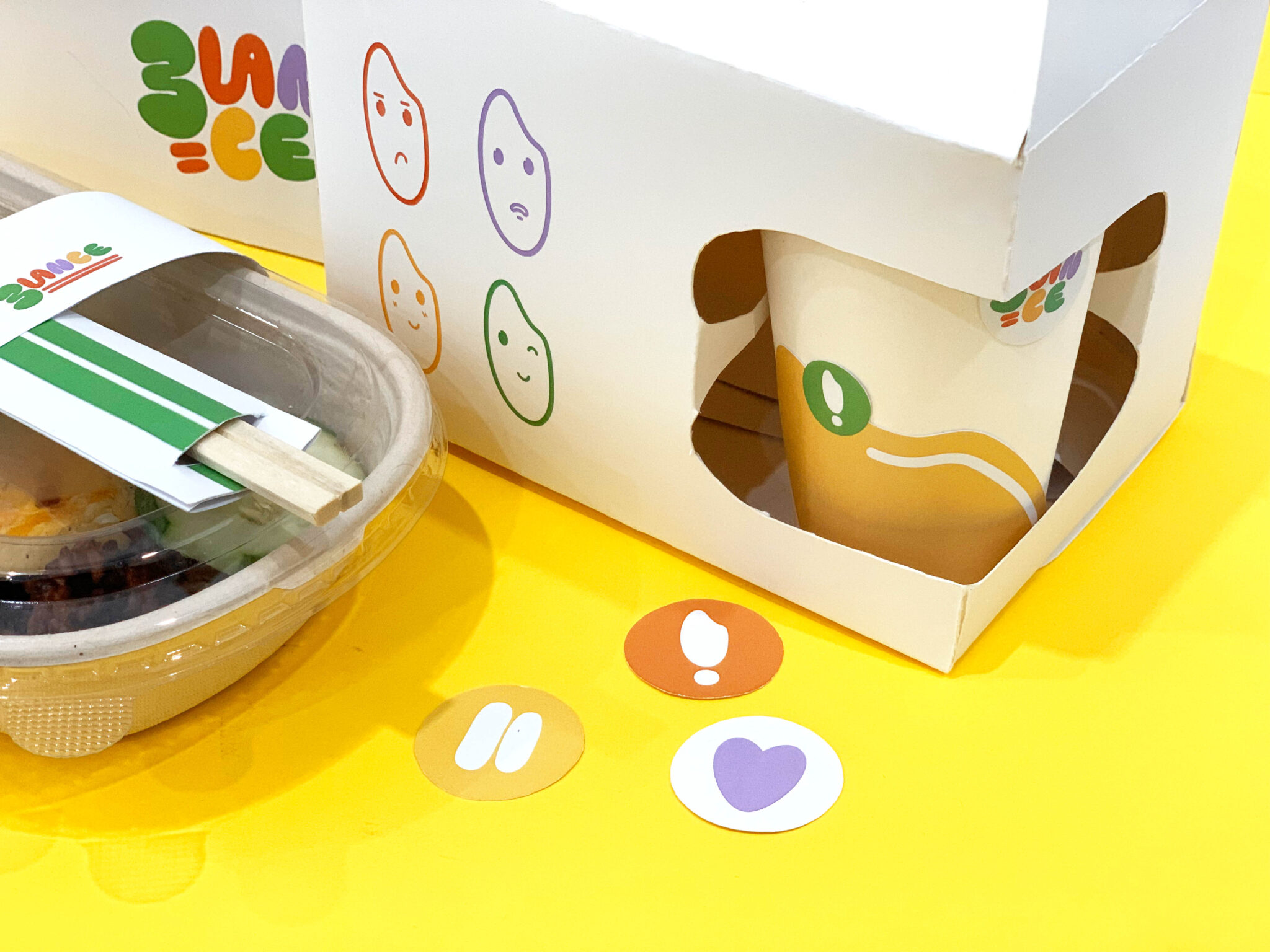
The shape of the box is part of 3LANCE’s brand identity system. By using a paper cutout technique in one corner of the box to create an ‘=’ shape, it can be divided into two compartments for water and food. This design also piques the curiosity and interest of customers when they look at the box from the outside.