THE TASK
The reason for the redesign of the packaging was the client’s desire to overcome consumer fatigue and to position a quality product with a vision that is competitive with European analogues.
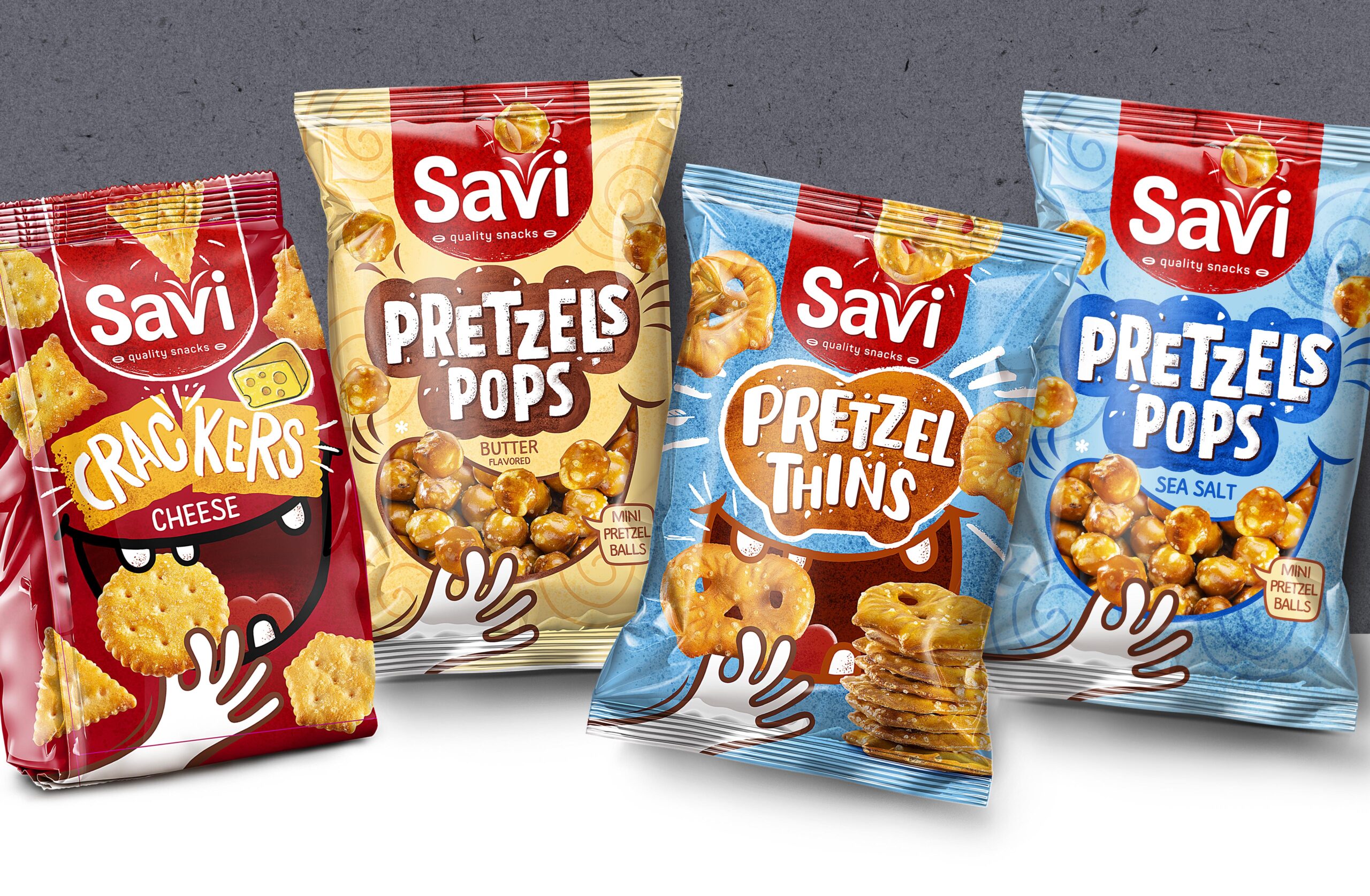
With the new design, the Savi brand stands out strongly on retailers’ shelves, while maintaining the recognizability of a well-loved and well-loved product. As part of the redesign, our team abandoned the traditional color range and opted for bolder solutions. As a result, we achieved a completely new design, keeping a small part of the old one.
Our team decided to add a playful element to the new packaging because consumers love emotional packaging so much. We drew a happy mouth that eats the product and a hand with the product. We photographed the products themselves and retouched them well.
The result is a very successful project that sells well in supermarkets in Bulgaria and attracts the attention of consumers.