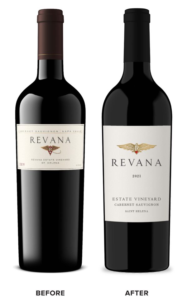
Revana Family Vineyard came to CF Napa to refresh their luxury Napa Valley Revana brand. The goal of the redesign was to take a holistic look at the wines, establish tiers that were visually identifiable, and premiumize the design to match the pedigree of the brand. It had been 20 years since the packaging was designed for a single SKU, single vineyard wine. The main equity element of the original packaging was the icon which featured a heart and simplified staff of Hermes as a nod to the brand owner’s tenure as a cardiologist.
CF Napa reimagined the icon as a high-end crest inspired by luxury car logos such as Bentley and Aston Martin. The tiers were differentiated by color with the Napa Valley & Estate tiers utilizing neutrals of gray and cream. The Single Vineyard wines displayed rich, jewel-toned colors and an elegant script for the vineyard names. The Icon Series wines took on a bold black label and red wax dip for a finishing touch.


