Task:
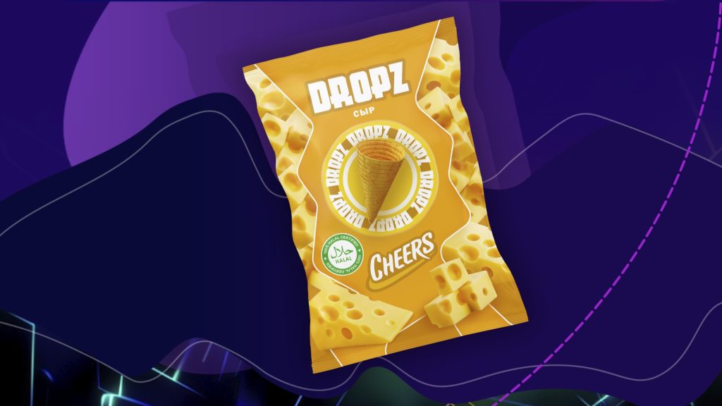
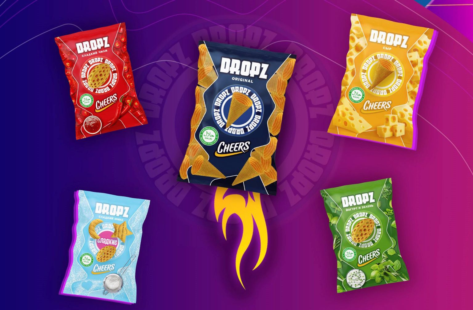
Our task was to create a snack packaging design for the new subline from Cheers — Dropz, which stands out with its unique shape for the entire Uzbek market.
Challenge:
To highlight the shape of the snack, making it the main eye-stopper, while vividly conveying the spicy flavors of the chips within the food zone.
Idea:
To derive inspiration from the geometric shapes of the snacks and find the same geometry in the packaging architecture, which would not “blind” but rather complement the appetizing food zone.
Process
Step №1
We brought the uniqueness of the chips to the forefront by placing their shape at the center of the composition.
Step №2
We started exploring options for building the food zone in an interesting and unusual way.
Step №3
We transformed the package into a solid ingredient that “screamed” about the flavor. However, this option seemed like a canvas with many small details that visually appeared unappealing.
Step №4
Then we realized that we needed a panel that would become part of a complex architecture, balancing the center of the composition and the zone where all RTBs would be placed. The shape of the panel was inspired by the geometry of the snack shapes.
Step №5
We created an arbitrary wavy panel and combined all the components into one.
Result
As a result, we have a multi-layered architecture of packages in different flavors, with a food zone executed in the best out-of-box style, and the central eye-stopper being the unique shape of the snacks. Well done.
Conclusion
This was a great case that once again proved that “impossible” simply does not exist for us.
P.S: Order your best packaging only from us!


