Apito, a newly launched food and beverages brand, has made waves with its unique and refreshing approach. As their strategic partner, Thirteen Ideation (TI) played a crucial role in their journey, using every strategy to add a zing of freshness and exclusivity to the brand.
Starting from scratch, TI’s brainstorming sessions led to the name ‘Apito,’ derived from ‘Appetite,’ capturing the brand’s essence in a catchy, memorable way. This was the first step in establishing a strong brand foundation.
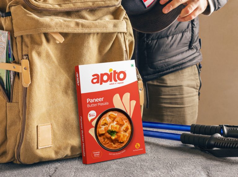
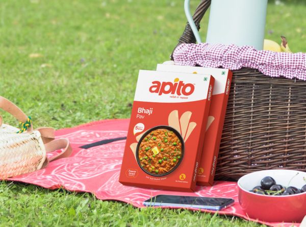
What sets Apito apart is their innovative freeze-drying technology, making ready-to-eat packs that only need boiling water for consumers to enjoy delectable meals anytime, anywhere. Our vision was clear: to encapsulate Apito’s unique selling point of being “all about deliciousness” in its logo. TI crafted custom fonts that convey the brand’s sensory delight, infusing taste and texture into the design. To further symbolize the brand’s essence, we incorporated two distinct drops—one representing water, the only ingredient customers need to add, and the other representing the mouth-watering sensation evoked by the delicious food. This thoughtful design captures Apito’s promise and creates a memorable visual identity.
With the brand identity taking shape, TI introduced the brand position line to succinctly capture Apito’s essence. The phrase “Relish n’ Repeat” perfectly encapsulates the brand’s promise of delightful flavors that keep customers coming back for more.
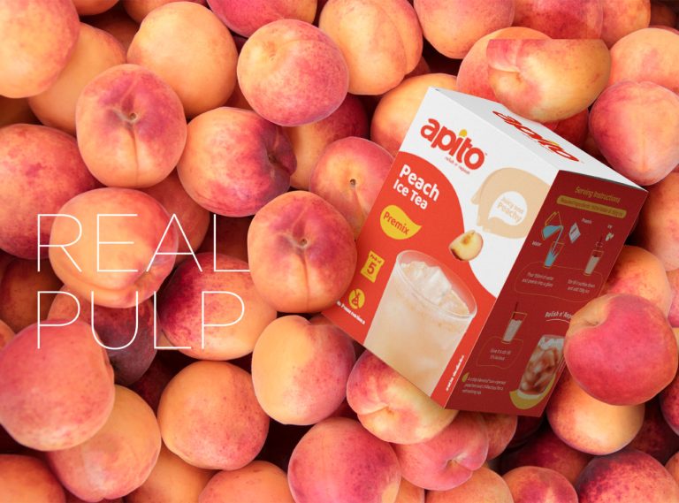
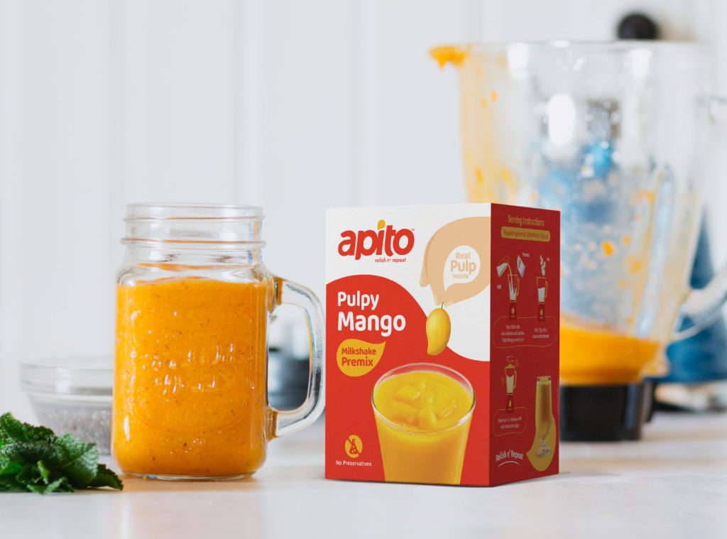
Packaging is a direct reflection of the brand, and TI ensured that Apito’s packaging is as delightful as its products. By using consistent brand colors, we maintained a cohesive look across both food and beverage categories, each with a unique twist. Food packs convey awesomeness, while beverage packs highlight the use of real ingredients, making the brand’s promises tangible and enticing.


