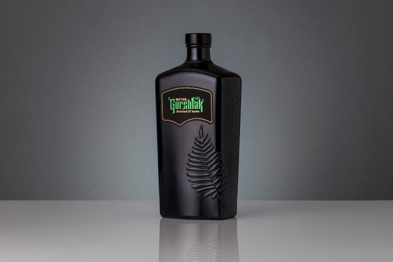
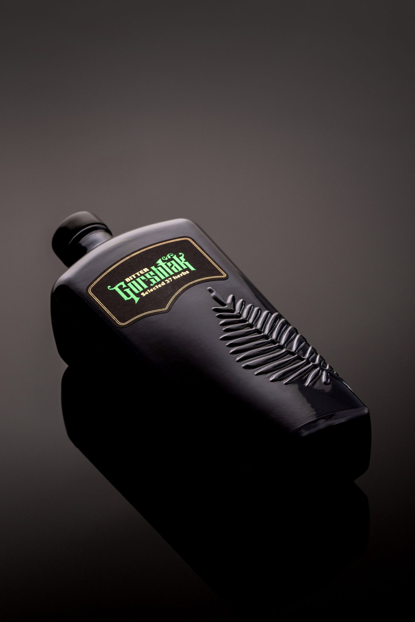
A few months back, our team was thrilled to be invited to rebrand Gorshtak Bitter from Podrum Palic 1896. We’re passionate about label design, but when faced with two major non-negotiables (bottle and logotype) we knew we were in for a challenge!
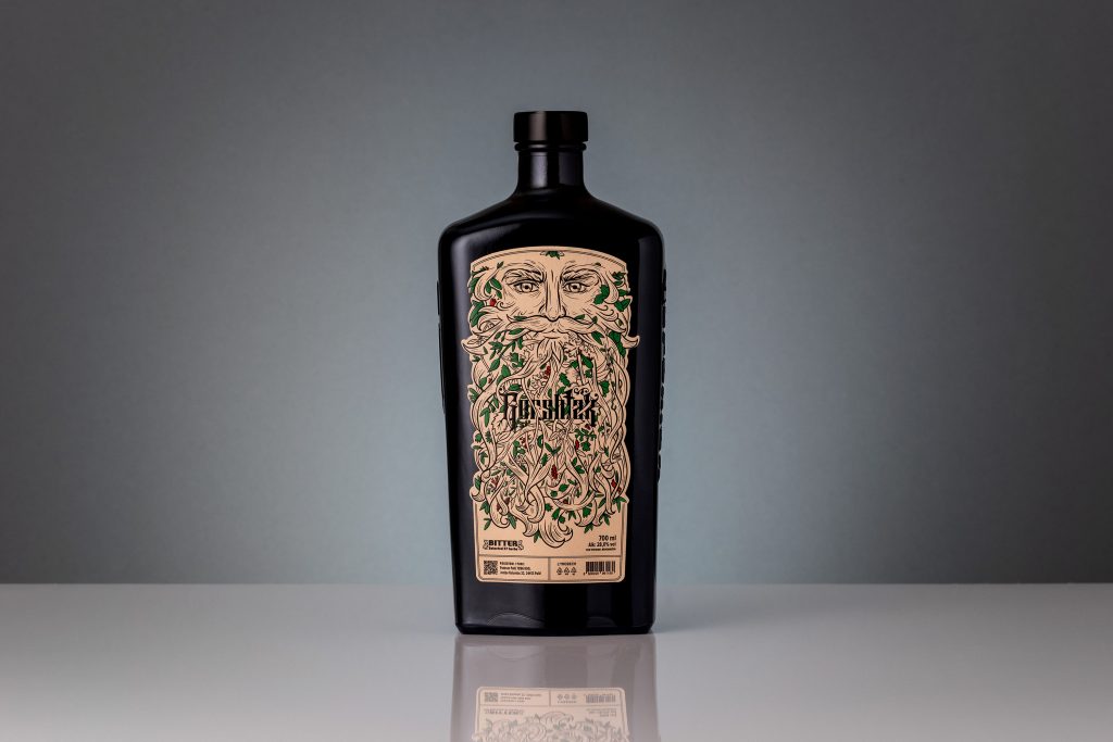
To bridge the gap between the name and the essence of the bottle, we crafted a captivating illustration of a mythical mountaineer—a wise old man whose beard is intertwined with branches, leaves, and fruits from the forest where the medicinal plants for this renowned bitter liqueur grow.
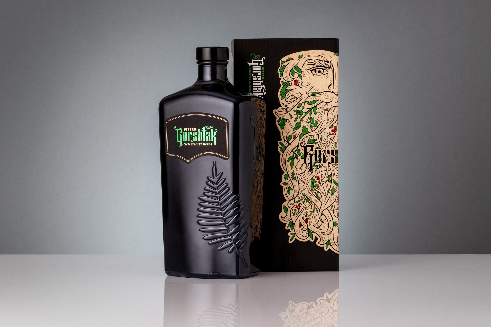
His eyes conceal the secret of the bittersweet recipe, made from 37 unique plants. The new logo, in vibrant green foil with elegant gold details, complements a refined front label that enhances legibility while maintaining elegance.
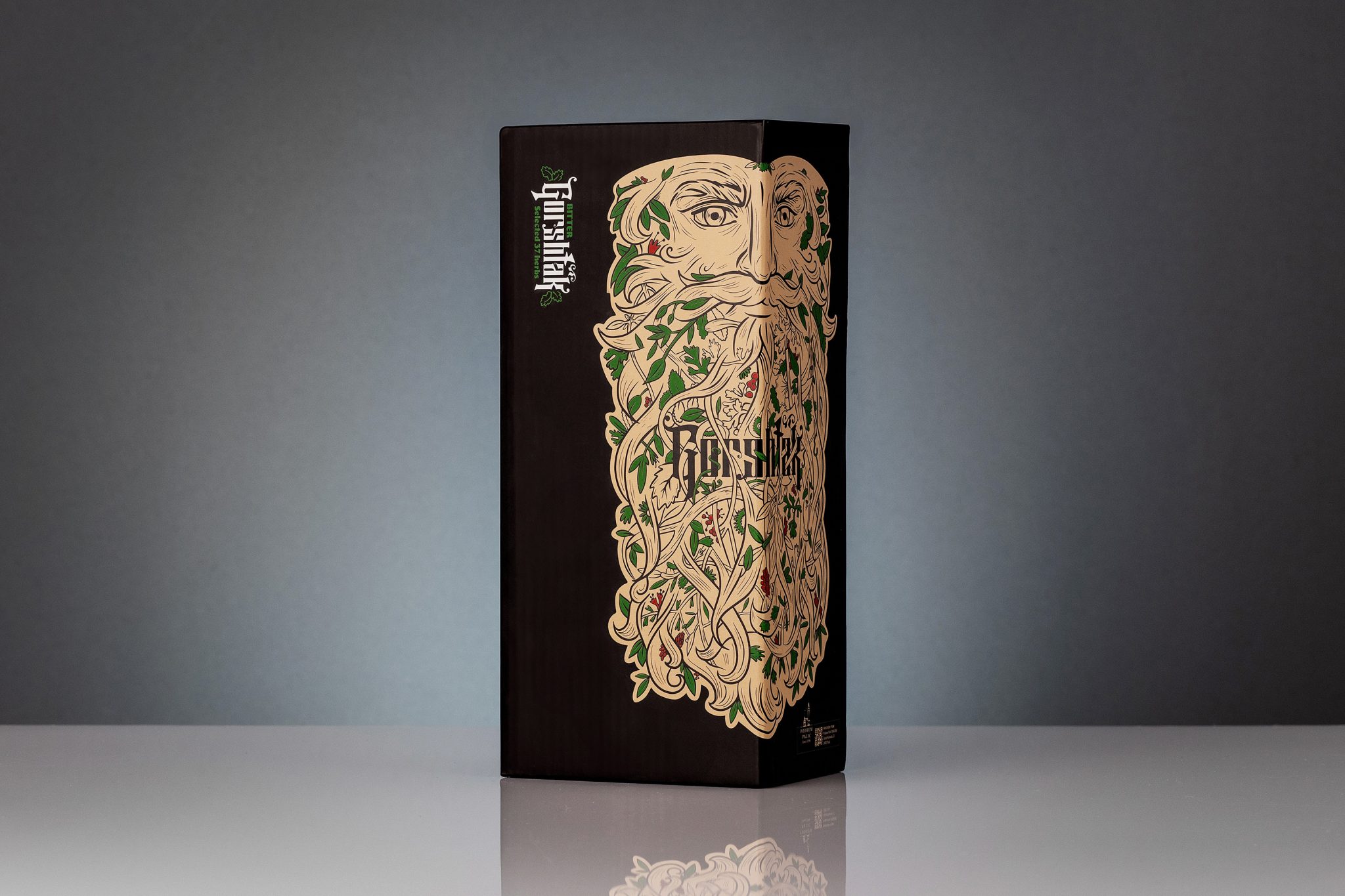
But the real magic happens on the back label, which now tells the intriguing story of this liqueur, making it just as compelling as the front. We also reimagined the gift packaging—positioning the illustration creatively to spark curiosity and invite exploration. When viewed from the side, the half-visible face adds a mystical touch, enticing people to discover more.
We’re proud of this project and can’t wait to see how it resonates with the community.
Find out more at Metod Brands
