NATURAL GLOWMULA* Delicious Gummies for Wellness and Elevation | Chídr Design Studio
In today’s market, brands must delve deeper into understanding consumer needs and experiences to create communication and product development that truly resonate with their audience. In the NATURAL GLOWMULA project, Chídr reimagined the strategic brand identity and packaging design for a new generation of nutrition gummies that centred on the customisation driven by customer purposes. Our approach allows consumers to better understand the brand’s value and product benefits in a tangible, relatable way, fostering a stronger personal connection.
Positioning and Defining the Identity
Many competing brands communicate in an abstract, formal manner, making them feel like generic pharmaceuticals—cold, distant, and hard to connect with emotionally. Our approach positions the brand as caring, uplifting, and playful, focusing on using scientific solutions to trigger inner health improvement and better wellness, making consumers glow and shine. This approach makes this brand relatable and approachable, and helps portray how this brand deeply understands the consumer’s needs and presents targeted products in a way that feels approachable and enjoyable.
The visual and linguistic identity is built on communicating: offering a “fun and effortless experience,” using “natural, safe, and scientifically proven methods,” and delivering “perceptible wellness improvements.” These values align with consumers’ desires for a health improvement, vibrant energy, and a more elevated sense of well-being. The overall style is fresh, engaging, and distinct, while also reflecting the brand’s scientific credibility and proven effectiveness.
Trademark and Naming
We named the brand NATURAL GLOWMULA to tap into the core desire of consumers: to “make me glow.” It also communicates the scientific, well-reasoned approach, careful design, and natural ingredients behind the products.
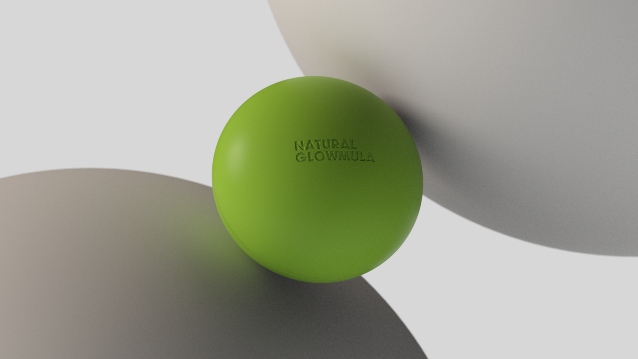
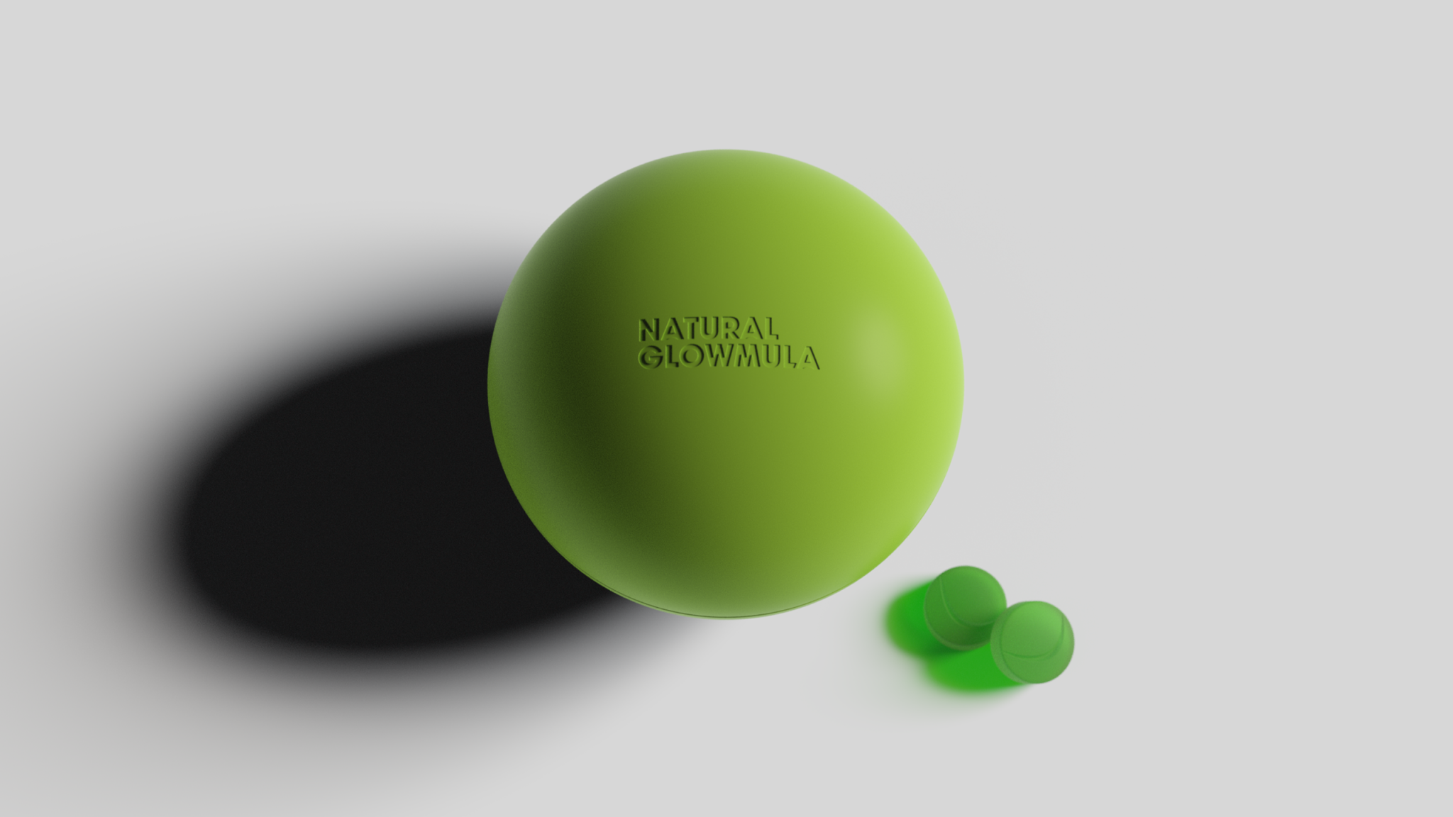
What’s the best way to express “glow”? We believe it’s through a radiant, confident smile. This idea is at the heart of the logo, which incorporates various circular elements throughout the visual system and packaging. It also beams out a smile before the consumer takes the gummy.
Packaging
The product container is designed as an adorable, flat sphere with a wide opening, reminiscent of vintage candy tins. Consumers open it with a gentle palm twist, creating a tactile, memorable experience that stands out from typical product designs. It’s both visually unique and leaves a lasting impression.
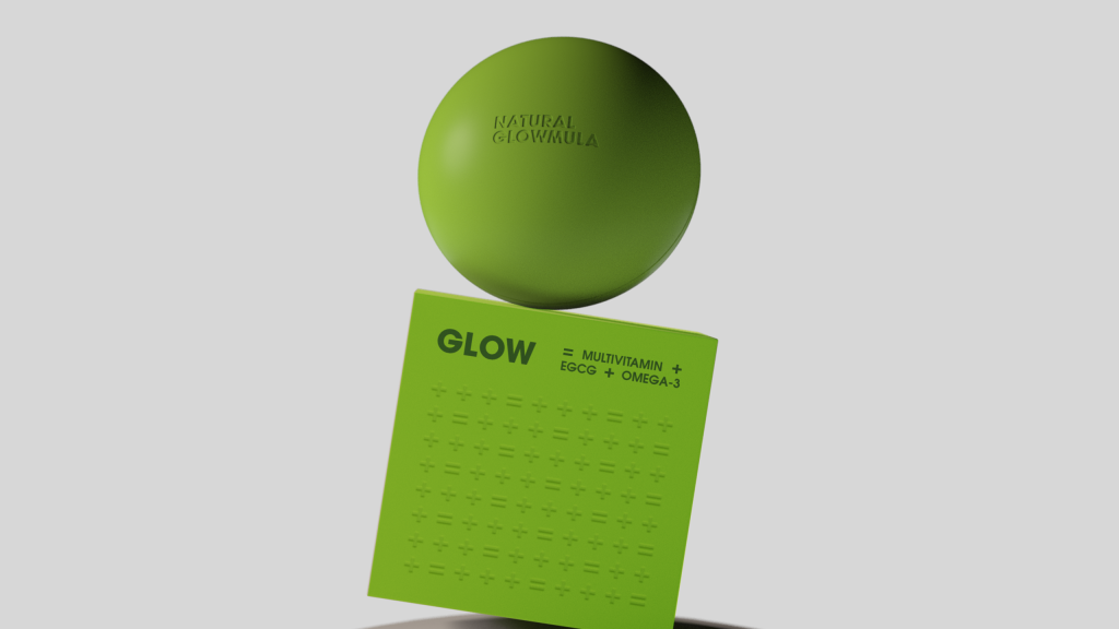
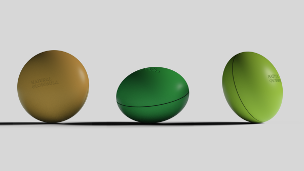
The container and box packaging feature a series of colour schemes that correspond to each product’s function. The ‘GLOW’ formula, designed for skin improvement and multivitamin support, shines in a bright yellow-green. ‘RISE,’ for energy, uses a vibrant morning blue. The calming ‘RELAX’ is a soothing teal, while ‘HAPPY’ pops in orange, and ‘SLEEP’ is wrapped in a tranquil deep green. These bold, functional colours dominate the packaging, with minimal distractions, enhancing the product’s purpose-driven message.
Key benefits and ingredients are cleverly communicated using chemical equation-inspired designs—an inventive, playful approach that highlights the product’s scientific integrity while clearly showcasing its purpose and benefits. These equations also appear as decorative motifs, reinforcing the brand’s scientific roots. The entire packaging series feels vibrant and cohesive, and makes it easy for consumers to pick the product that suits their needs.
The brand experience is designed to be authentic, fun, engaging, and inspiring. It helps consumers easily understand how the products can deliver improvements to their health and well-being—whether that’s glowing skin, renewed energy, or enhanced mood and physical performance. Through this journey, consumers will form emotional connections with the brand, encouraging them to fall in love with it.