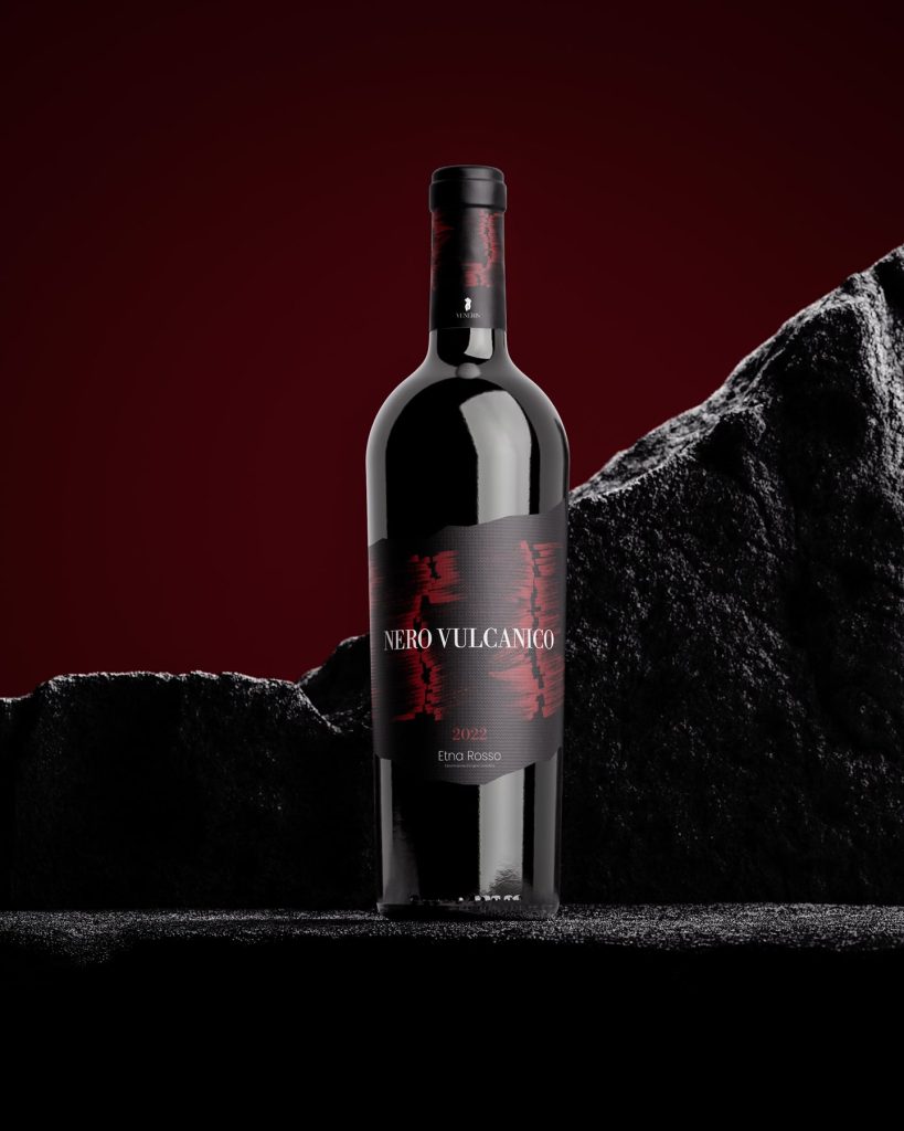
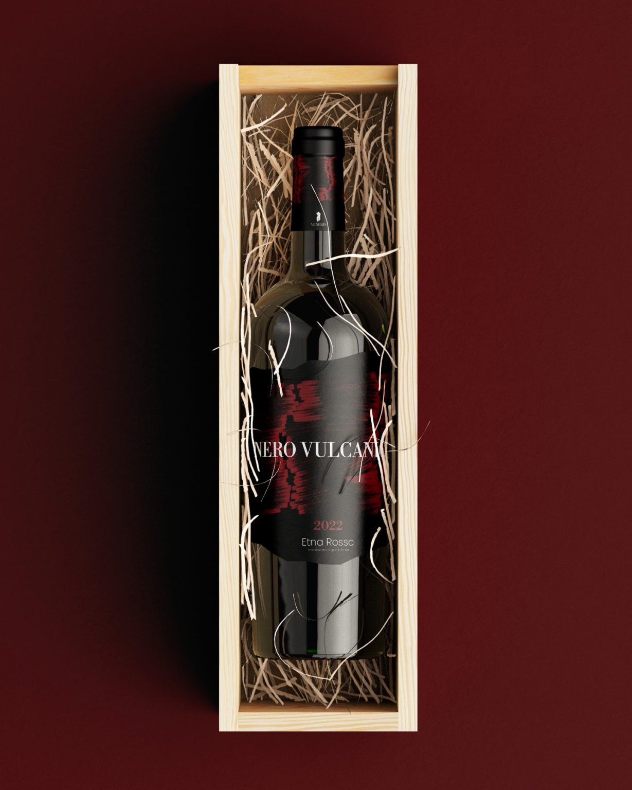
The wine label design for “Veneris Nero Vulcanico” is an ode to the raw power and beauty of Mount Etna, brought to life through the expert craftsmanship of Andrea Curto. This project blends geography, history, and contemporary design sensibilities to create a visual identity as bold and refined as the wine itself.
The concept begins with the geographical roots of the product. “Nero Vulcanico” is inspired by the volcanic soils of Etna, which nurture the autochthonous vines that produce this unique wine. The design seeks to translate this dynamic terroir into a visual language that embodies strength, elegance, and authenticity. The jagged edges of the label are deliberately crafted to evoke the rugged, unpredictable profile of Mount Etna or a fragment of volcanic rock, drawing a direct connection between the wine and its birthplace.
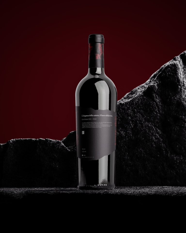
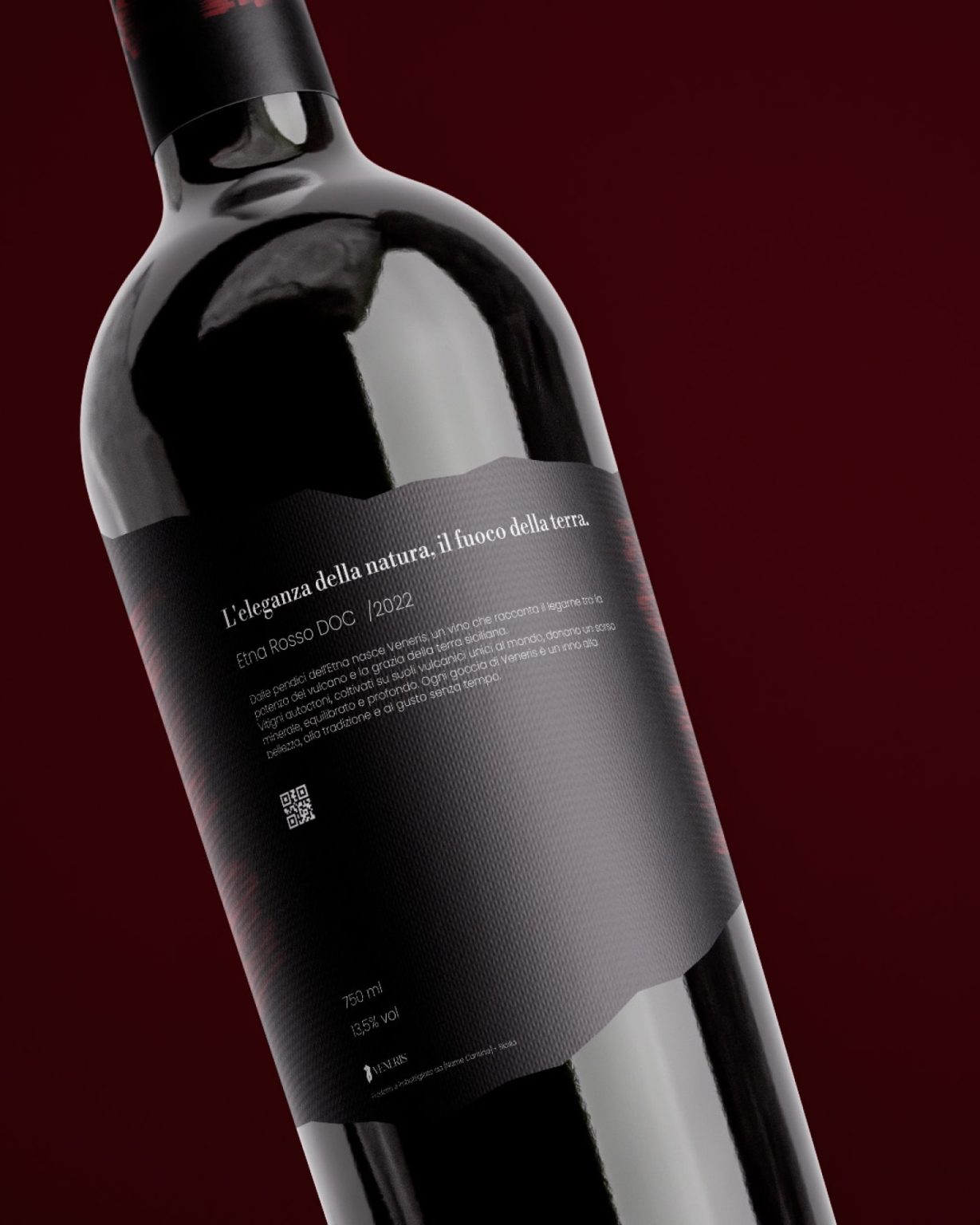
The color palette plays a significant role in storytelling. The base of the label is an intense black, symbolizing volcanic ash and the depths of the fertile soil. Contrasting this are bold red brushstrokes that sweep across the label, mimicking the fiery eruptions and molten lava flows of the volcano. These strokes add a dynamic, almost painterly quality, which not only captures the essence of Etna’s fiery temperament but also introduces a sense of handcrafted artistry that mirrors the winemaking process.
Typography is another cornerstone of the design, carefully chosen to balance tradition and modernity. The classic elegance of Libre Bodoni speaks to the heritage and sophistication of the wine, while the clean, approachable lines of Poppins introduce a contemporary edge. Together, they create a harmonious dialogue that reflects the wine’s dual identity: rooted in history yet designed for the modern connoisseur. The type is rendered in a crisp white, ensuring maximum legibility and a striking contrast against the dark background, further emphasizing the bold personality of the label.
From a technical perspective, the label’s form and materials were chosen with precision. The frayed silhouette not only serves as a visual metaphor but also adds a tactile element that engages the sense of touch, making the experience of holding the bottle as memorable as tasting its contents. The combination of a matte finish with glossy accents on the red brushstrokes enhances the depth and interplay of textures, inviting consumers to explore the label both visually and physically.
The branding of “Veneris” ties the entire project together. Representing Venus, the Roman goddess of love and beauty, the name alludes to the alluring and sensual qualities of the wine. The accompanying logo, featuring a minimalist yet striking silhouette, reinforces this theme while adding an air of timeless elegance.
Andrea Antonio Curto’s design for “Veneris Nero Vulcanico” transcends the boundaries of traditional wine label aesthetics. By intertwining the geographical essence of Etna, a bold visual language, and refined typographic choices, the project delivers a sensory experience that resonates with authenticity and sophistication. It’s a celebration of Sicily’s volcanic heritage, transformed into a work of art that elevates the wine’s identity on an international stage.