Vitame’s brand identity is rooted in the principles of simplicity, authenticity, and natural beauty. Our approach to design focuses on creating a visual language that feels fresh, modern, and effortlessly aligned with the brand’s core values of health and sustainability.
At the heart of the brand’s identity is a custom wordmark, carefully crafted to embody elegance and clarity. The letter “V” is uniquely shaped within the logo, serving as a subtle yet powerful visual cue that enhances brand recognition and ensures a strong shelf presence. This design choice not only distinguishes Vitame from competitors but also reinforces its minimal and contemporary aesthetic.
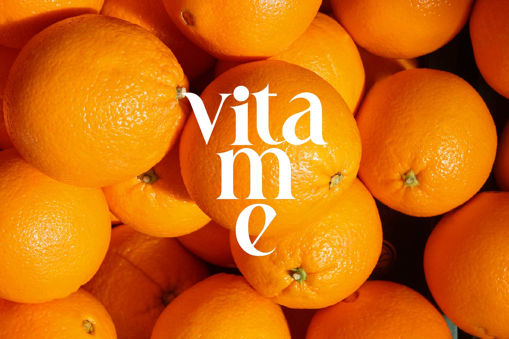
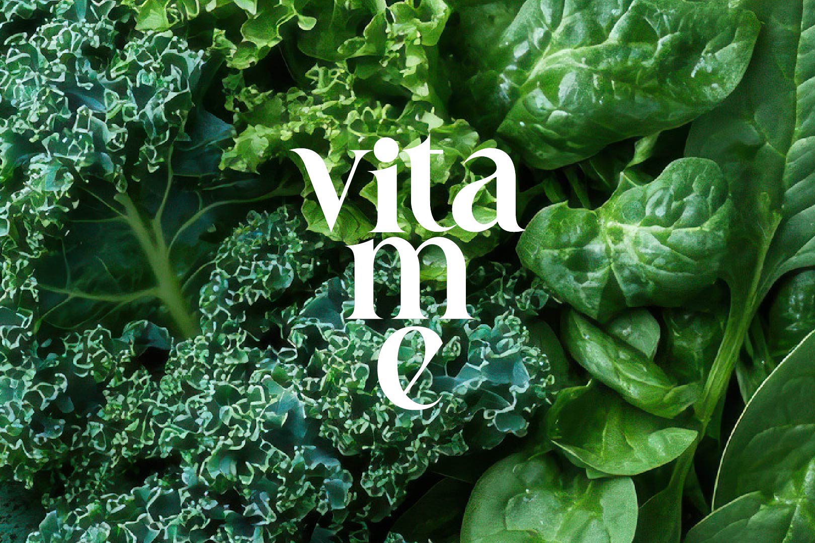
The packaging design embraces transparency—both literally and figuratively. By allowing the rich, vibrant hues of the cold-pressed juices to take center stage, we highlight the purity of the ingredients while evoking a sense of freshness and vitality. A crisp white logo and flavor name overlay the bottles, maintaining a clean and sophisticated look that lets the product speak for itself.
Inspired by nature’s raw beauty, the design draws from elements such as sunlight filtering through leaves, the rich textures of fresh produce, and the organic shapes found in nature. This connection to the natural world is more than just visual; it extends into Vitame’s sustainability efforts. To minimize environmental impact, the brand opts for reusable glass bottles and eco-friendly cloth bags—offering customers a refined yet responsible packaging solution that aligns with modern sustainability practices.
Through this thoughtful design approach, Vitame seamlessly blends aesthetics with purpose, ensuring that every touchpoint of the brand resonates with its mission of delivering pure, nourishing, and environmentally conscious products.