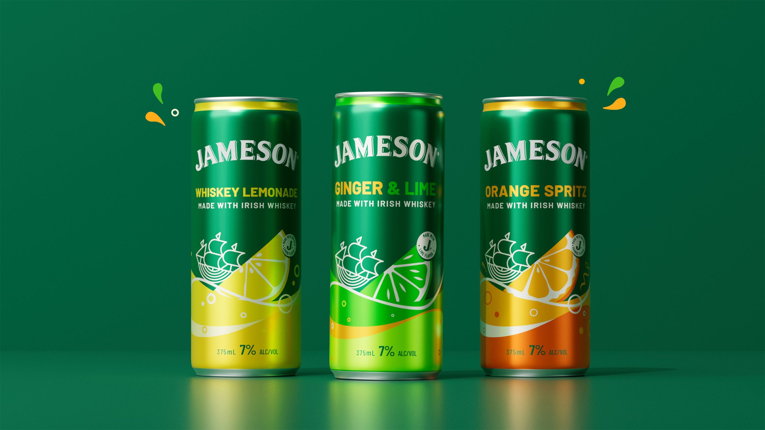
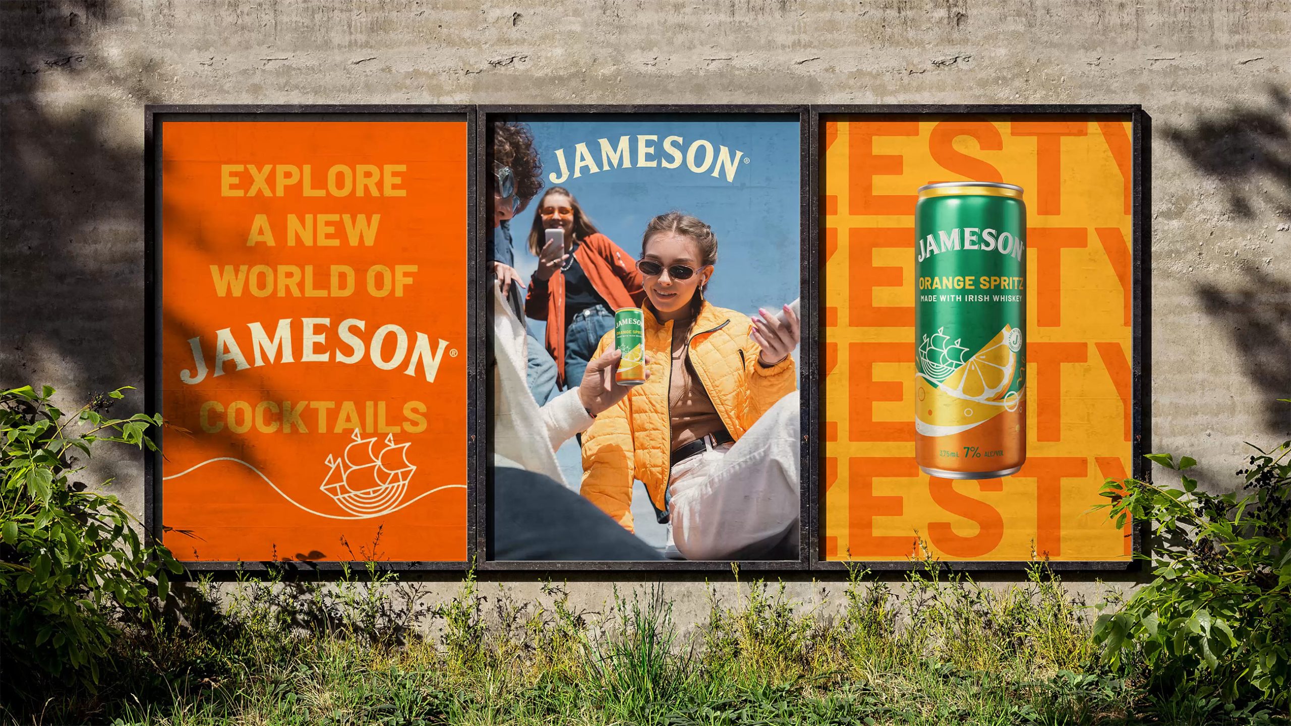
Jameson partnered up with JDO to create one global and cohesive design bringing Jameson personality to life, strengthening shelf presence, and brand recognition in a premium and distinctive way.
“The perception of the RTD category has evolved significantly in recent years, driven by higher-quality propositions from premium brands – a shift that has created an ideal landscape for a brand like Jameson to thrive,” comments Ben Ridley, Associate Creative Director at JDO. “We saw an opportunity not only to unify and strengthen the equity of Jameson ready-to-drink cocktails but also to inject a playful personality into its visual identity, making it more fun.”
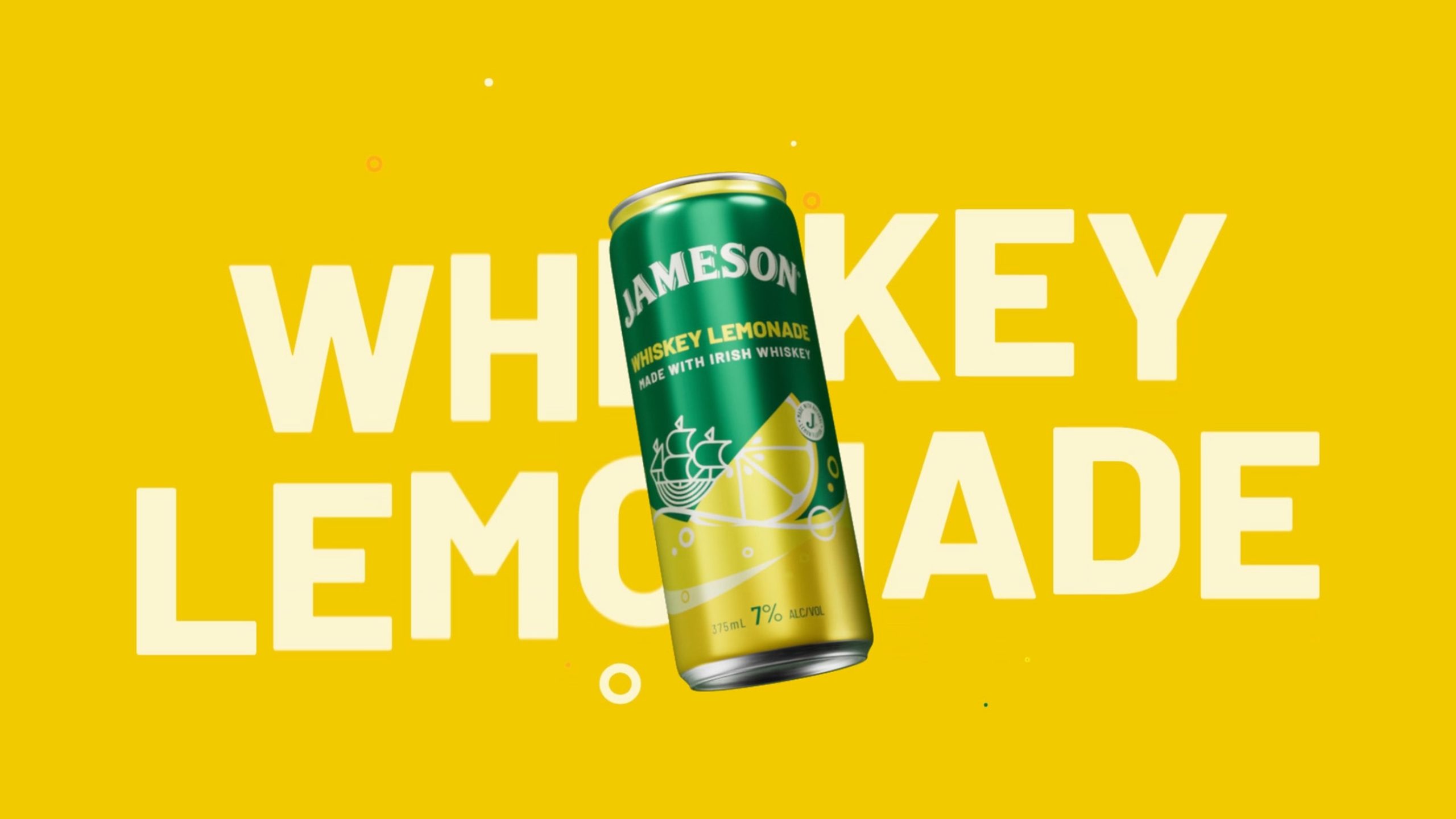
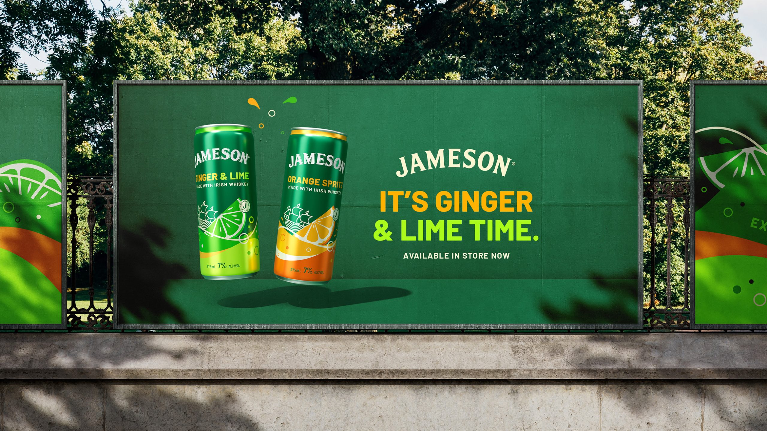
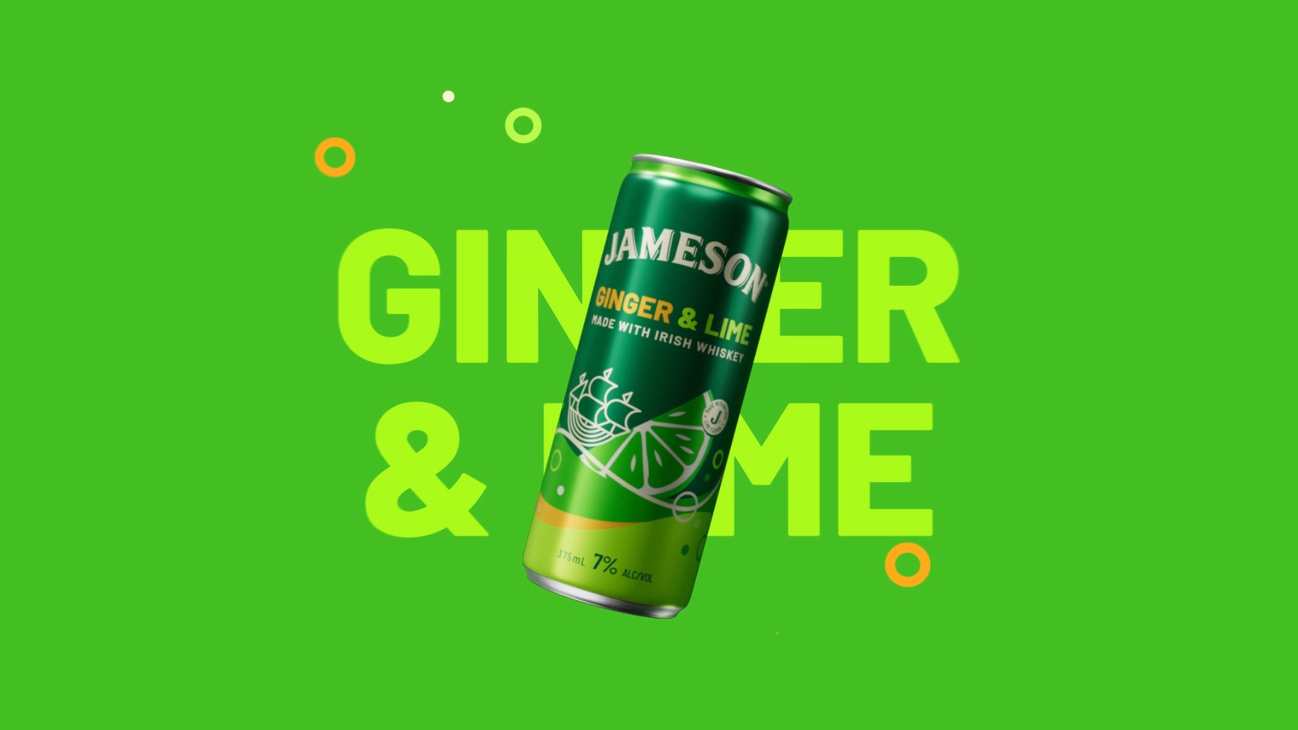
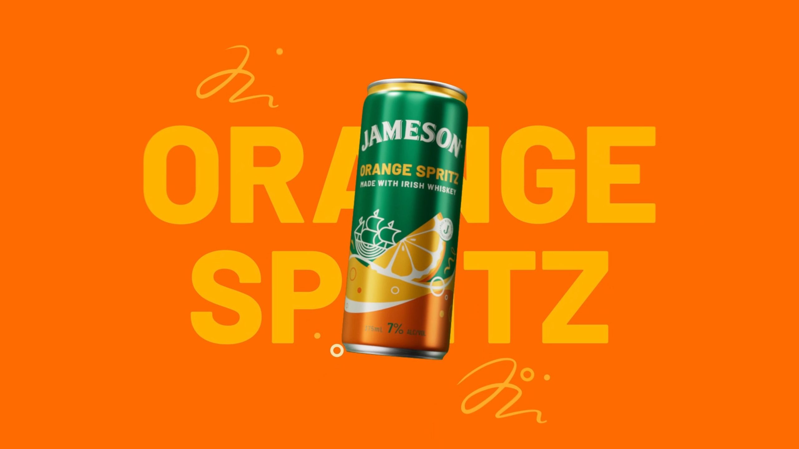
JDO’s approach zeroed in on amplifying Jameson’s iconic equities with a fresh twist. The wordmark now commands a bolder presence on pack, while Jameson’s signature green enhances brand recognition. A hand-drawn ship motif, extracted from the Jameson crest, adds a playful touch while also evoking the idea of exploration. The vibrant colors across the range create a dynamic portfolio that’s easy to navigate.
“JDO has powerfully captured the spirit of Jameson with a premium global design that speaks to the next generation of consumers” said Reine-Laure Decaudain, Senior Global Portfolio Manager, RTD & Convenience, Pernod Ricard.