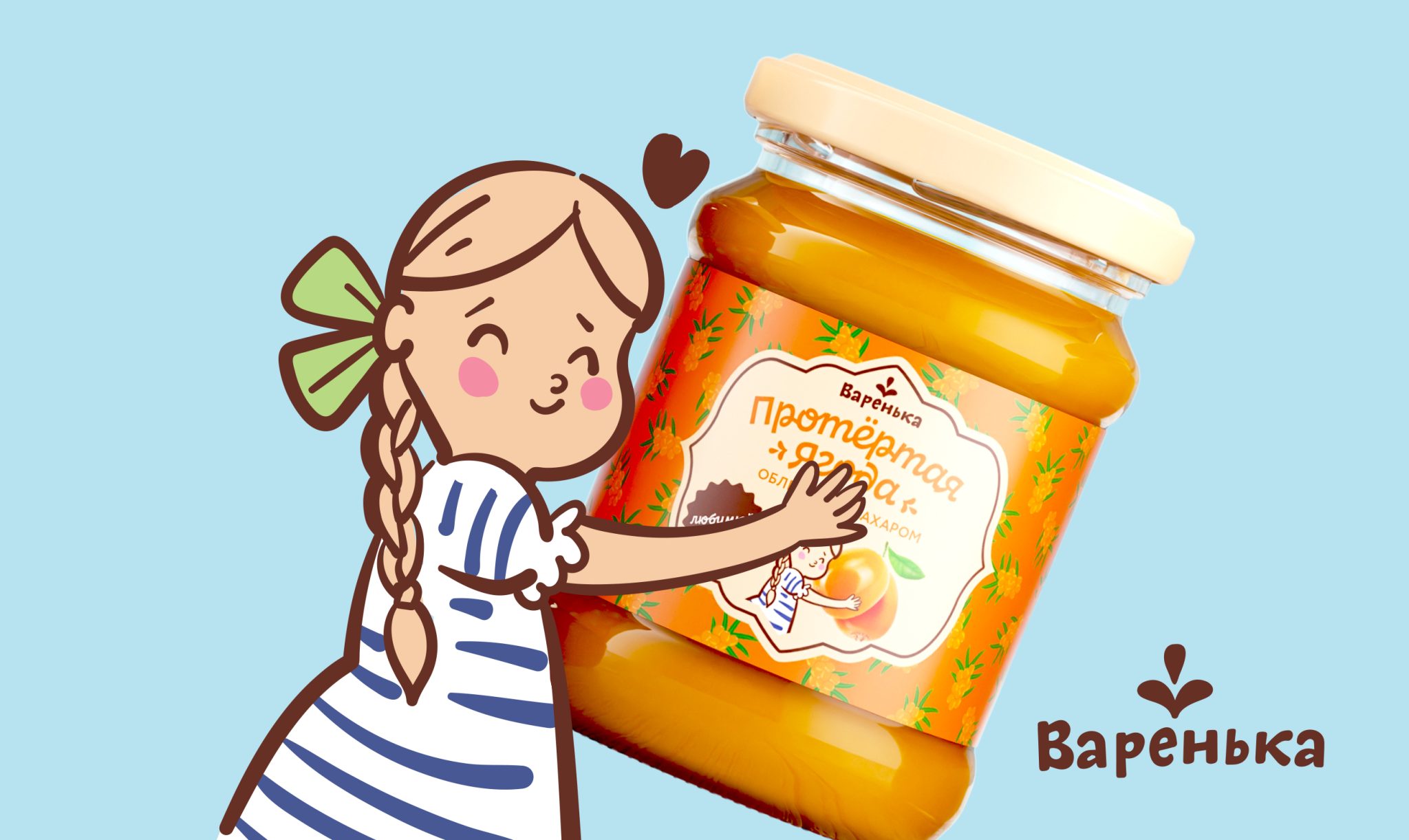

Varenka — Private Label Jam Packaging Redesign
Private labels, just like established brands, need to evolve alongside changing consumer expectations and the retail environment. For Varenka, a long-established jam brand, the challenge was to refresh its packaging while preserving the familiarity and emotional connection that had already been built with its audience.
Varenka had been successfully positioned on supermarket shelves for years, but changing consumer habits created an opportunity to rethink how the brand communicated its product quality and homemade character.
At Clever Branding, we approach private label projects through the connection between consumer → brand → retail. Even under tight project deadlines, we look for the key consumer motivations that can inform the design rather than relying on aesthetics alone.
For this project, we conducted a rapid qualitative analysis of consumer reviews and identified five key drivers of jam consumption:
- Fruit & Texture
Consumers want to see whole berries in the jam and experience their texture while eating. - Cooking at Home
Jam is not only consumed as a finished product. Consumers also use it when making cookies, rolls, muffins and cakes at home. - Simple Composition
A clear and understandable ingredient list matters: berries + sugar = jam. - Fresh Fruit
Consumers associate quality jam with fresh fruit rather than dried or processed fruit. - Homemade Character
One of the strongest emotional drivers is the desire to enjoy the taste and feeling of homemade jam without having to make it from scratch.
From Consumer Insights to Packaging
Based on these drivers, we developed several design directions and ultimately selected a concept built around a central composition on a decorative plate, supported by a redesigned character illustration.
We gave the character more personality and emotion, moving Varenka away from a realistic visual style towards a more playful, illustrative language. This helped reinforce the emotional association of “delicious, just like in childhood.”
We also replaced photorealistic fruit imagery with illustrations across the flavour range. This made the overall packaging system feel lighter, warmer and more contemporary, while maintaining the familiar character of the brand.
The result was a refreshed private label identity that balanced three important dimensions:
consumer appeal · shelf visibility · brand familiarity
Following the packaging redesign, we also developed a concept for the brand’s social media communication, extending the new visual language beyond the shelf.
The updated system was developed across 8 SKUs, creating a consistent and recognizable packaging family across the range.
Varenka — delicious, homemade and full of soul.


 lunapanda
 Tridimage
 Analoguecreative
 lettera7
 alchimistestudioParis
 Lana B
 Colossal
 Pivot Studio
 M&A CREATIVE AGENCY
 monther al omari
 Anastasia Cherepanova | xtramez
 Hollóka Grafikai Műhely / Graphic Design Studio
 BOLD branding
 Antonia Skaraki
 Pâmella Lorrany
 Z9BKAdsgn
 Francesco Paternoster
 b1studio.ro
 Chris Creative Works
 Boordon
 Dmitriy Kuzovlev
 Brand Society
 yasharpic